Plain text emails have been gathering interest among marketers recently, especially in the SaaS industry. Sure, they may seem “old school,” but sometimes going back to the classics is a good idea.
If used smartly, plain text emails can set you apart in today’s world where graphic-heavy emails dominate inboxes.
Do plain text emails really bring better conversion rates and results as many claim? We gathered the opinions of SaaS marketers and asked our community members. In this article, we talk about the benefits of using plain text emails, and include examples from real SaaS brands.
Don’t wait for the muse. Apply this step-by-step method to write high-performing email campaigns in hours, not weeks.
What is a plain text email?
Plain text emails are messages that intentionally lack styling and design in order to focus on content and building personal relationships.
They’re exactly what they sound like — words on a page, without formatting or designs. They are basic and minimalist. They look like they’ve been sent from Gmail and thus have a personal feel to it.
Many brands send out plain text emails in different stages of customer journeys, ranging from lead generation to onboarding.
In a survey by Databox, 62% of marketers said they send a hybrid of both plain text and HTML-designed emails as part of their strategy. In the next sections, we will explore why SaaS marketers choose to send out plain-text emails and some of the best practices you can follow.
Why do plain text emails work well for SaaS brands?
Here’s why SaaS marketing experts prefer to send plain text emails.
They stand out in the ocean of marketing emails
Plain text emails help marketers avoid “the banner blindness effect” when readers ignore promotional messages with heavy graphics.
Text-based emails don’t scream “marketing.” They look more natural and don’t fly under the radar in the same way. If nothing else, it would make readers remember your brand as a special one.
They help you build a personal connection
With its simple format, plain text emails help build a better connection with audiences as compared to HTML emails. They also encourage interactions and responses.
You can easily personalize a plain text email while keeping it professional.
Allan Stolc, founder and CEO of Bankly, a loan broker software, explains why they use plain text emails when communicating with customers and prospects:
“One client, in particular, responded positively to our plain text email, expressing gratitude for the reminder and stating that they had intended to complete their application but had been busy. They then completed the application process. The fast load time of the plain text email, combined with the personalized message, had a positive impact on our client. As a result, we see an increase in customer satisfaction and retention rates.”
Higher deliverability rate and accessibility
Plain text emails are less likely to be caught by spam filters, more likely to make it into the recipient’s inbox, and (perhaps) less likely to end up in the promotional folder. This is because plain text emails do not contain any hidden code or elements that could trigger spam filters.
This adds a layer of guarantee that the audience will receive your emails.
Logan Mallory, VP of Marketing at Motivosity, explains why they use combination of plain text and HTML emails in their email marketing strategy:
“The biggest benefit we’ve seen from sending plain text emails is that the deliverability rate is consistently high. They’re more likely to make it into users’ inboxes rather than in spam.”
Another characteristic of plain text emails is its accessibility. Email accessibility refers to designing and developing emails that can be easily accessed and understood by all recipients. Alex Chaidaroglou, director at Altosight, says:
“Plain text emails are accessible to everyone, including those who use screen readers or other assistive technology. Emails with formatting or design elements may be difficult for these users to read.”
Increased load time
This is an overlooked benefit of plain text emails. Emails with heavy formatting and large images take more time to load and hence affect click-through rates. When the email loads faster, it increases the likelihood of customers opening and reading the email in its entirety.
Saves time
Marketers save a lot of time when they opt for a plain text email rather than HTML-designed emails. We all know that designing an email, creating a template, and testing it out takes a lot of time. You can save all these efforts and focus only on the content when creating a plain text email.
What to consider before adopting the format
According to Carolyn Beaudoin, co-founder of Boxcar Agency, the plain text format only works for certain content and audiences:
“With AI-generated plain text outbound flooding inboxes, we ran an 8-week A/B test with a client comparing plain text vs. designed emails.
We found that plain text correlated with higher unsubscribe rates, except when the content was narrative-driven (like case studies), where both formats performed comparably. The takeaway: match your format to your content type, and test it with your own audience.”
How to create and send plain text emails
Let’s look at how you can create a well-performing plain text email.
Best practices to follow when crafting a plain text email
Here are some tips to help you craft effective plain text emails:
- Personalize your subject line and greeting.
- Use sender personalization. Mention your name, role, and make a personal-looking signature to establish credibility and professionalism. Also add your name to the ‘From’ field.
- Use short paragraphs and bullet points to keep your message readable.
- Make sure your call-to-action stands out by placing it on a separate line.
- Use the postscript wisely. Add a P.S. to highlight the key message of your email or lead readers to take a desired action.
- Don’t pretend it’s a manual message (please no “sent from my iPhone” signatures).
- Test on different devices to ensure readability and find any layout issues.
- Try combining plain text and designed emails in your email strategy. Choose the appropriate one based on the stage of the customer journey.
Tools for creating plain text emails
Not all tools support “plain text” look and feel, so you should check with your email provider. It can be a struggle finding an email tool that has a plain text template.
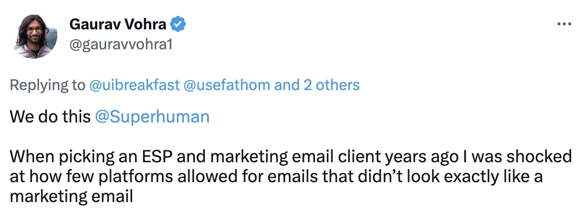
At Userlist, we have a special template called “Plain” — you can use it to make your emails look like they’ve been sent from your Gmail inbox. It will have the unsubscribe link and sender address in the footer, and will follow all other guidelines for marketing communications.
Plain text email examples from SaaS brands
#1. Clay
Subject line: feedback for clay.com?
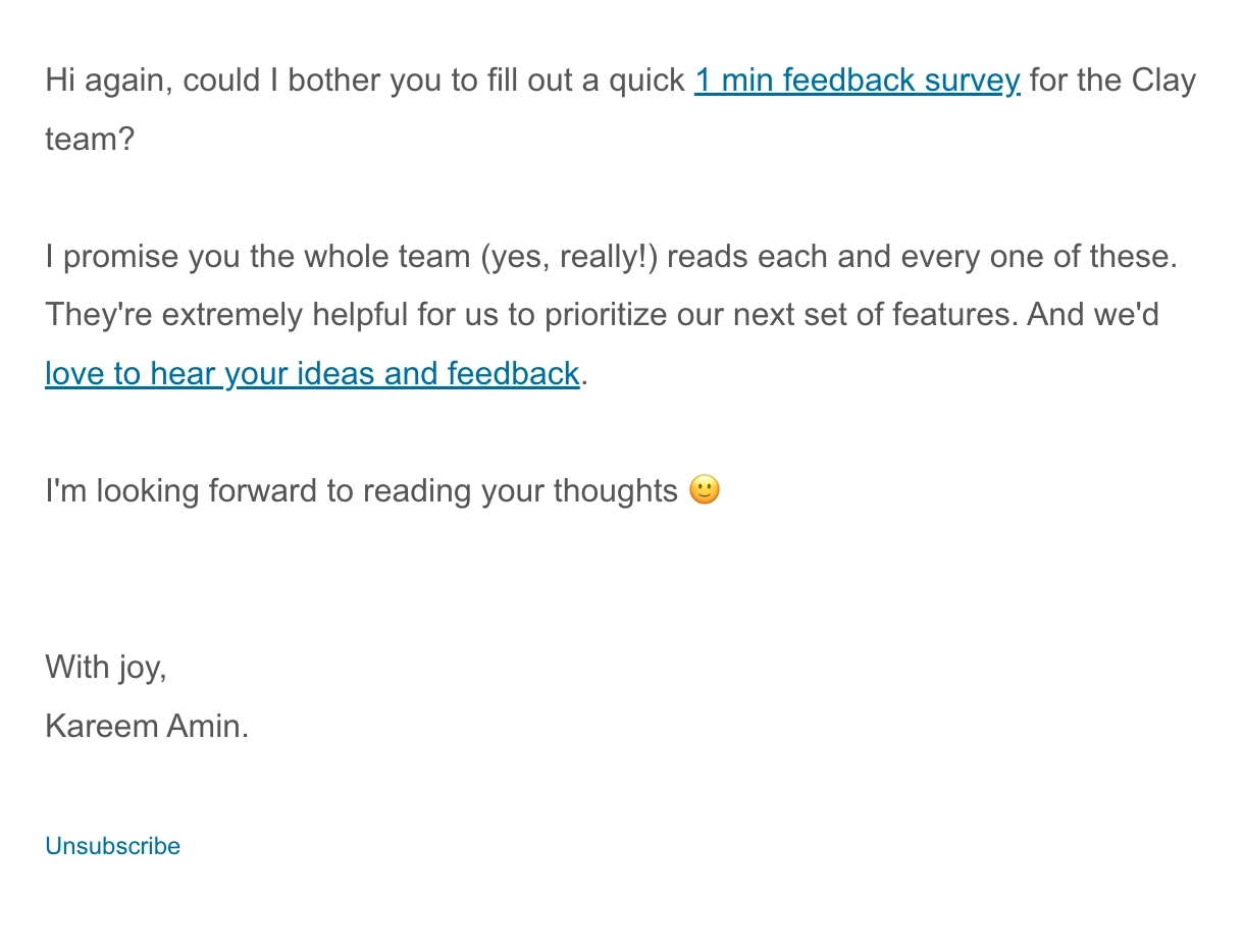
Clay is a platform that helps users scale their cold outreach with enriched lead data.
Their feedback email asks the user to fill out a quick survey about the product. To convince the reader to take action, they mention that the team reads and values all feedback. Using the important points as CTA makes it easily skimmable and brief.
#2. Grain
Subject line: Goodbye admin work, hello Grain AI
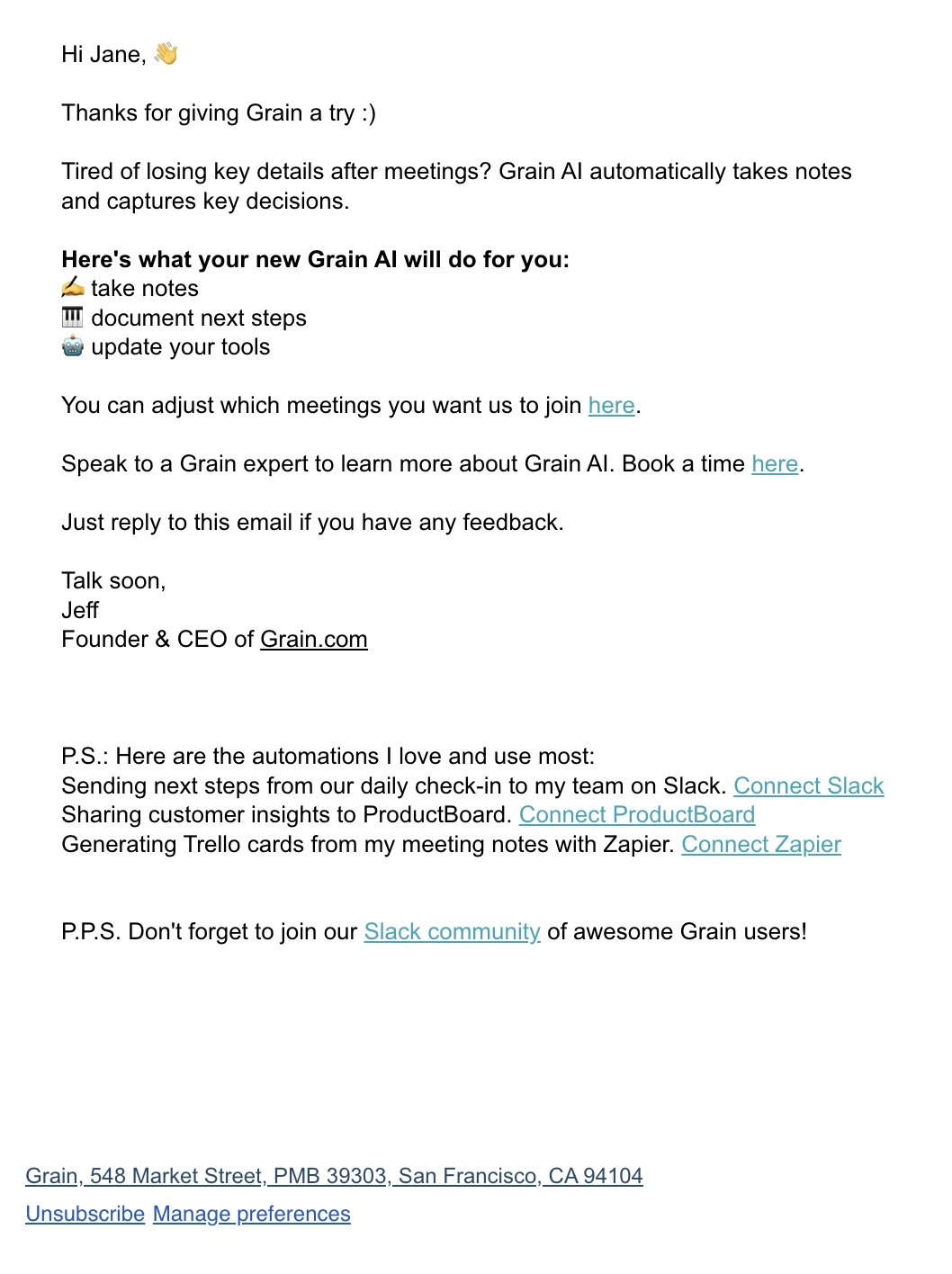
Grain is a meeting insights platform.
This email talks about how the platform can make note taking during meetings easier. The use of bold text and emojis in the bulleted list of product capabilities makes the section eye-catching, so you don’t miss the main gist of the email.
What could be improved
For a short email, there’s too many CTAs and they end up being too close together. To avoid overwhelming the reader, they should only place one in the main body and another one on the P.S. section.
#3. Keap
Subject line: 20 million words or 5 minutes to learn this?
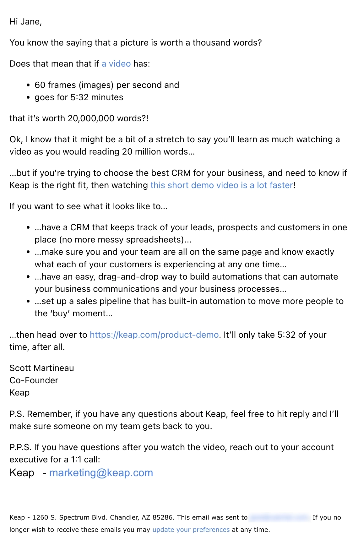
Keap is a CRM and automation platform for small businesses.
In the opening section, they use the idiom “a picture is worth a thousand words” to calculate the word equivalent of their short video. The second section then talks about use cases for their product. Three CTAs are spread across the main email body to urge the reader to watch their demo video.
#4. Koala
Subject line: “Holy sh*t, this is awesome.”
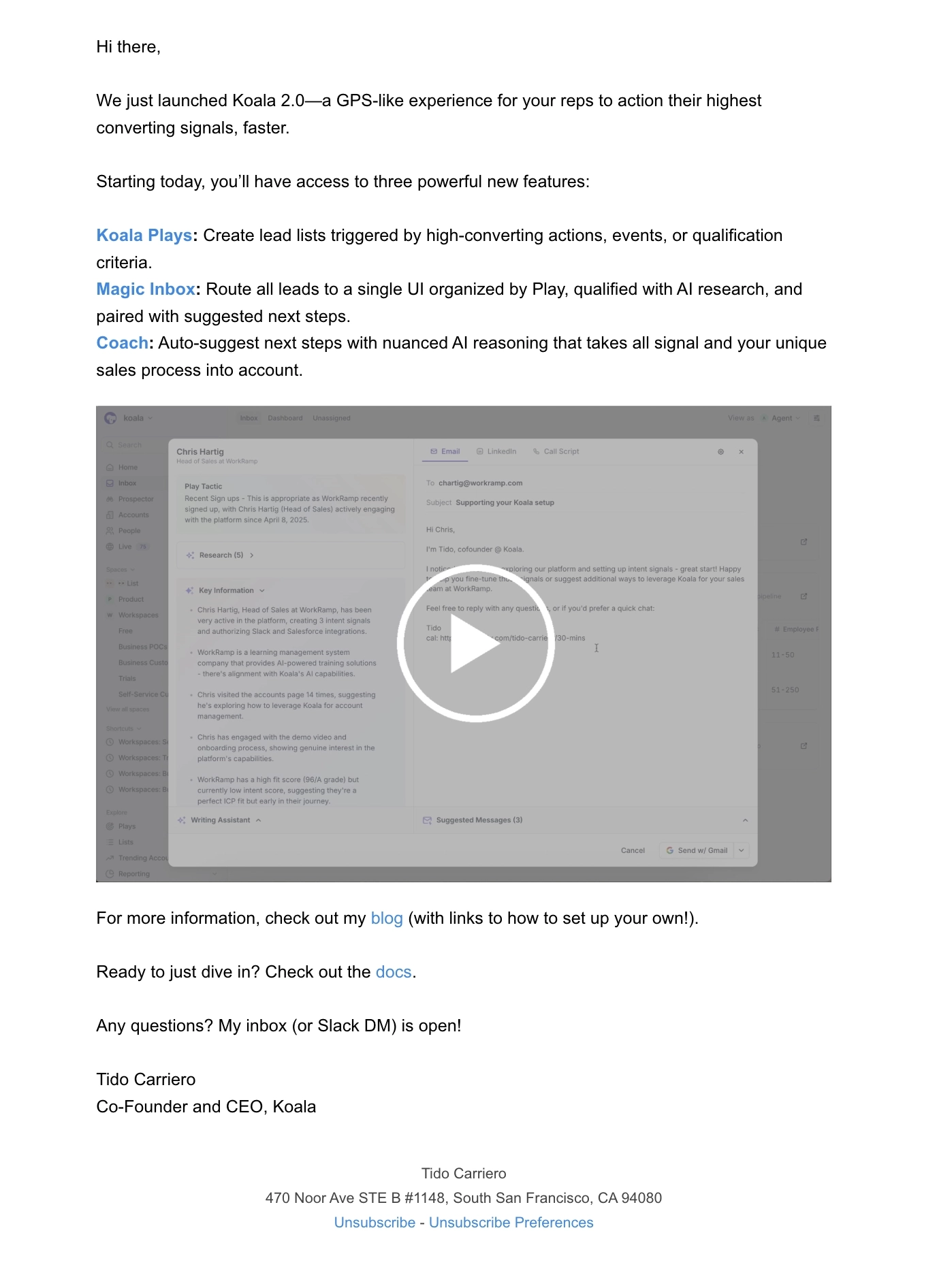
Koala is a customer intent platform.
This was their product launch email for Koala 2.0, highlighting three powerful features. Each feature came with a short blurb and a hyperlink so the reader can explore it further. Koala also linked to a video demo so the reader can see Koala 2.0 in action.
What could be improved
Having CTAs too close together might overwhelm the reader. They should only choose one for the last section of their email.
#5. Cursor
Thanks to Andrey Novikov for this example.
Subject line: Refund

Cursor is an AI code editor.
Going with the plain text format for their cancellation email makes it feel empathic and more personal to the reader. In this email, Cursor offers a refund for the account and asks for feedback on how they feel short.
#6. EngageBay
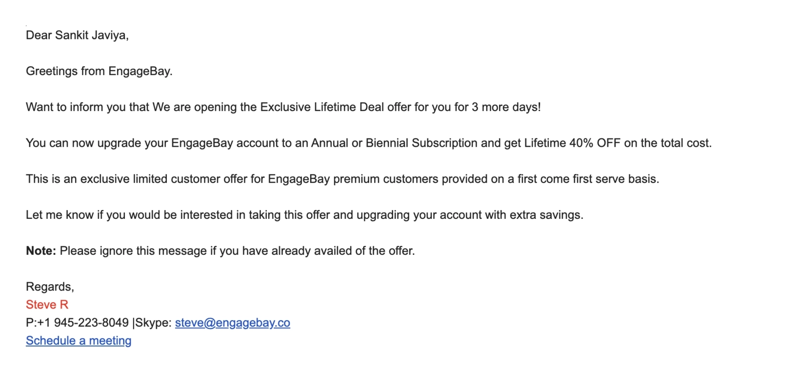
Thanks to Sangeet Javiya of Mailmodo for contributing to this example.
EngageBay is a CRM and marketing automation software to help brands deliver a great overall customer experience.
This email from Engagebay is about a special limited discount offered to customers if they upgrade their account to an annual subscription plan. It’s written with lots of white space and has a personalized sender detail at the end.
What could be improved
The core part of the message might be lost in this email. We think the line containing the limited period offer could have been highlighted or in bold letters so that it’s more noticeable to readers. There is no clear CTA or instructions to lead the reader to take action. Hyperlinking within the email body or placing a clear CTA at the end would have brought better results.
#7. SPP.co
Subject line: prime use case for SPP
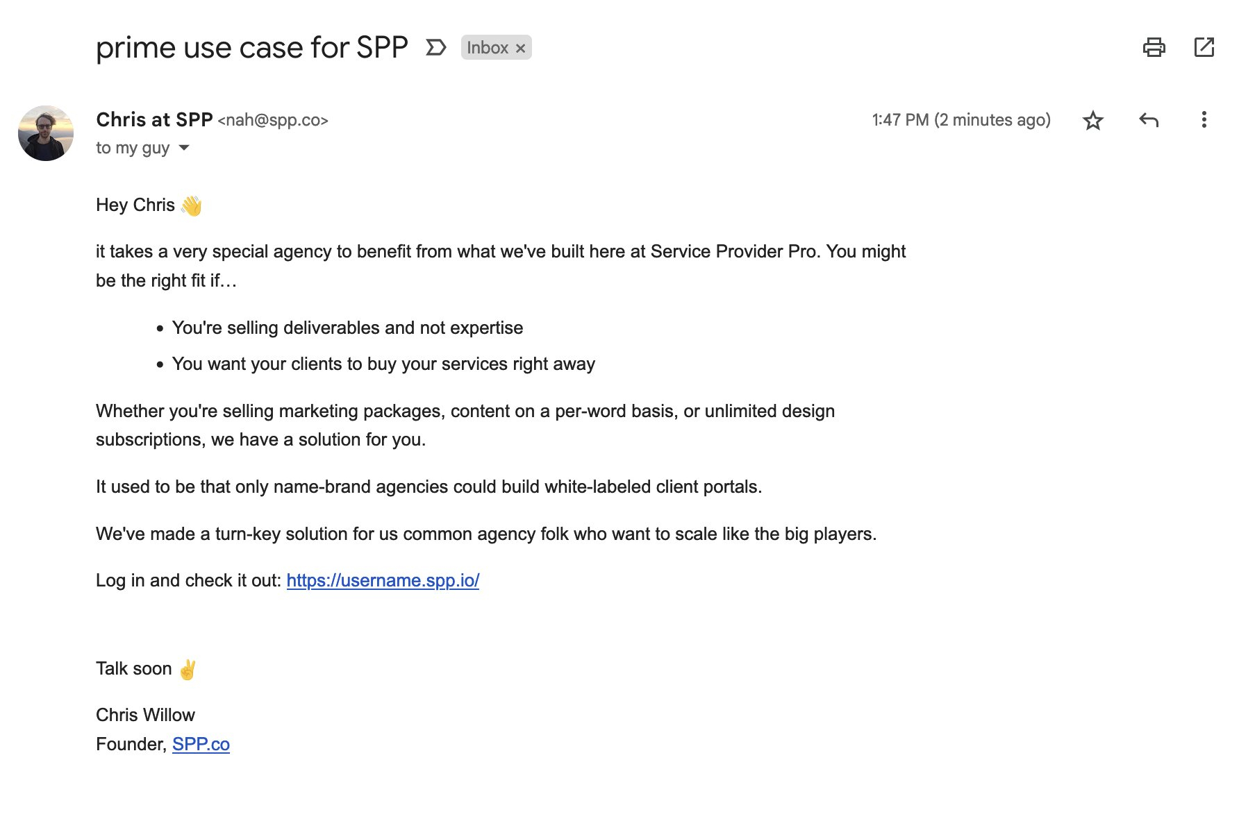
SPP is a client portal software for marketing agencies.
This plain text email is a sales email sent to leads. It has a personalized subject line and sender details. The copy clearly speaks directly to the reader and it has a personal feel. WIth bullet points and lots of white space, the email is easily readable. There’s also a clear CTA link at the end.
#8. CloudForecast
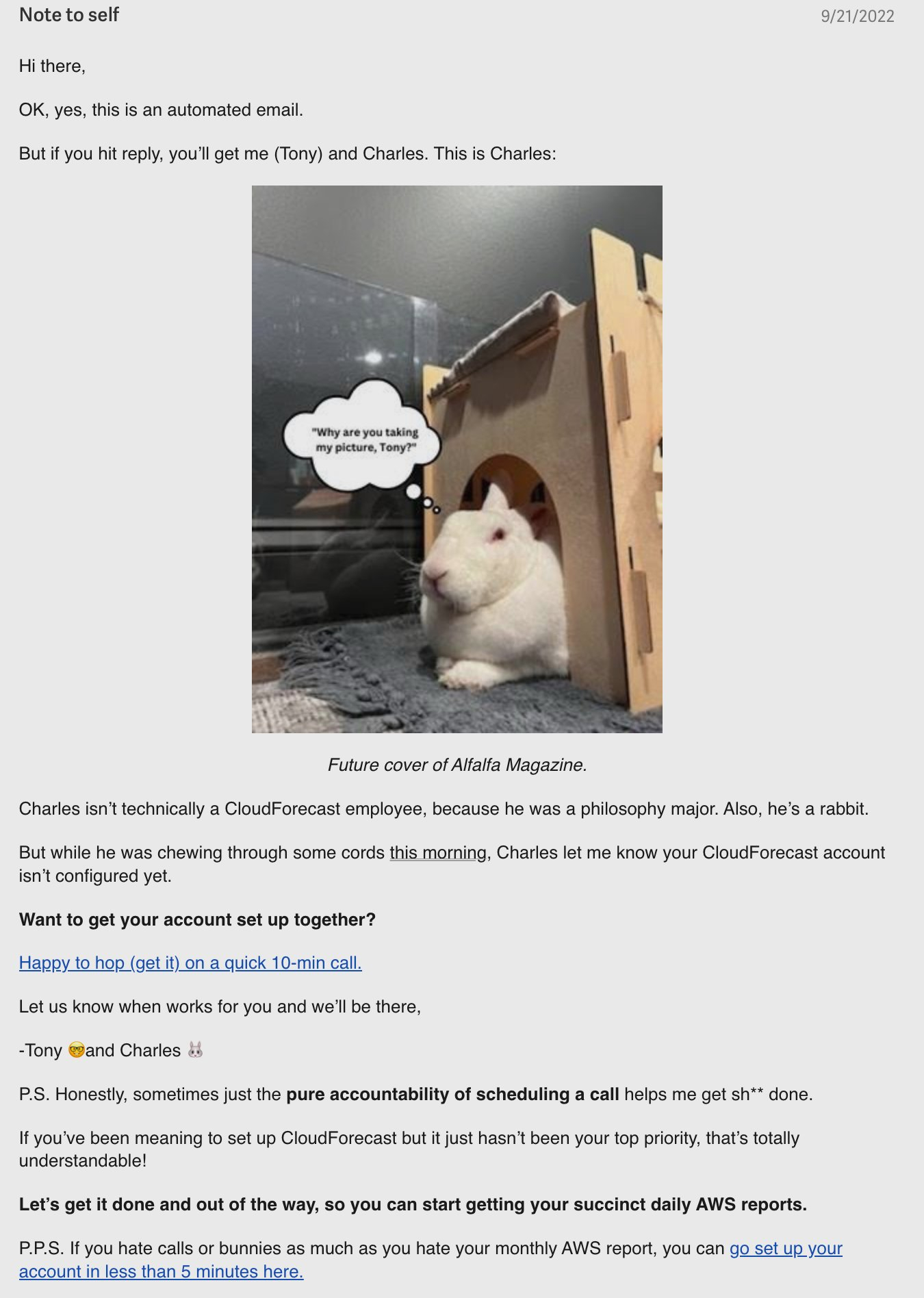
CloudForecast is an easy-to-use AWS cost management solution for tech teams.
Who said plain text emails have to be “plain” and boring? CloudForecast brings in creativity and humor in this customer onboarding email.
Apart from introducing their pet rabbit Charles, this email has a few creative elements you can steal when crafting yours. It starts off by mentioning that the reader will get hands-on assistance if they reply, despite being an automated email.
The main points of the email are in bold so that the reader doesn’t miss it. The sender detail is also personalized, which encourages interaction. Although there are two different CTAs, they are both clearly mentioned without confusing the reader. The second CTA is mentioned in the post-script — this helps draw the recipient’s attention to take action.
#9. Tuple
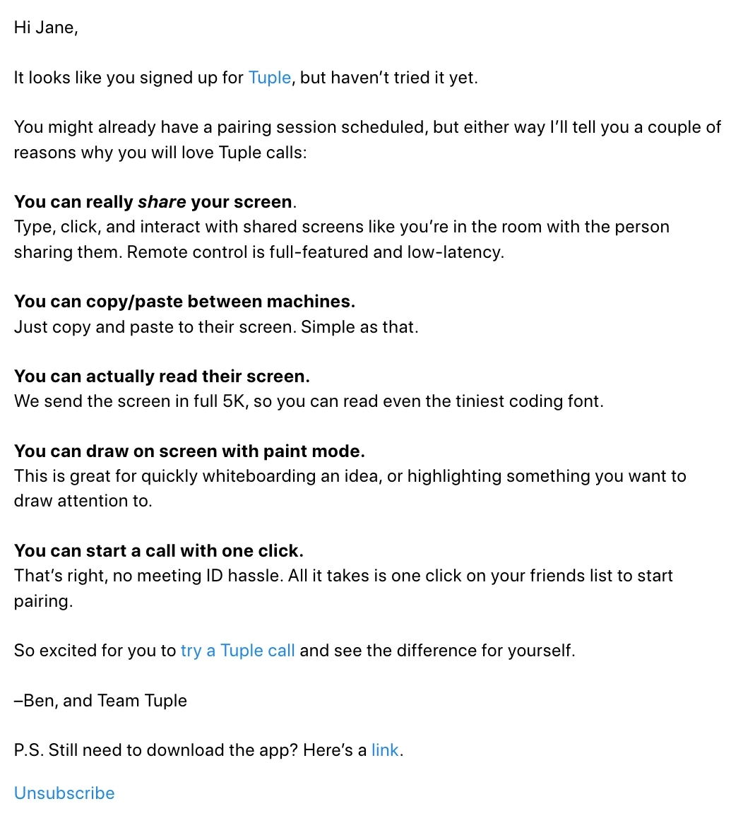
Tuple is a remote pair programming app on macOS and Linux.
This is an example of a well-formatted plain text email. It’s sent to users who have signed up but have yet to use the product. Although the email contains quite a lot of details on the benefits of the tool, they are well arranged and easy on the eyes.
The email has a personalized greeting and sender details, creating a positive first impression. The CTA is clearly mentioned towards the end. There is also a postscript text with another CTA.
#10. Clearbit
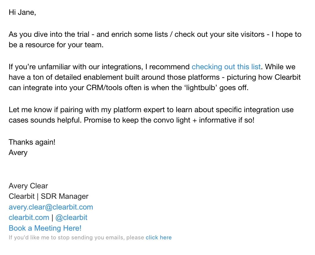
It’s worth mentioning that Clearbit mixes up these personal emails with fully branded newsletters.
Clearbit is a data activation platform for B2B marketing.
This is an email sent to users at the beginning of their free trial. The author mentions how they will be of help and recommends resources on how to use the tool better. We like how the tone of the email is personal and helpful. The email also encourages interaction and promises to be of service.
Clearbit sends out both personal emails and fully branded newsletters to their lists, which is part of their dynamic email strategy. They choose the most appropriate format for each situation and audience.
#11. Folderly
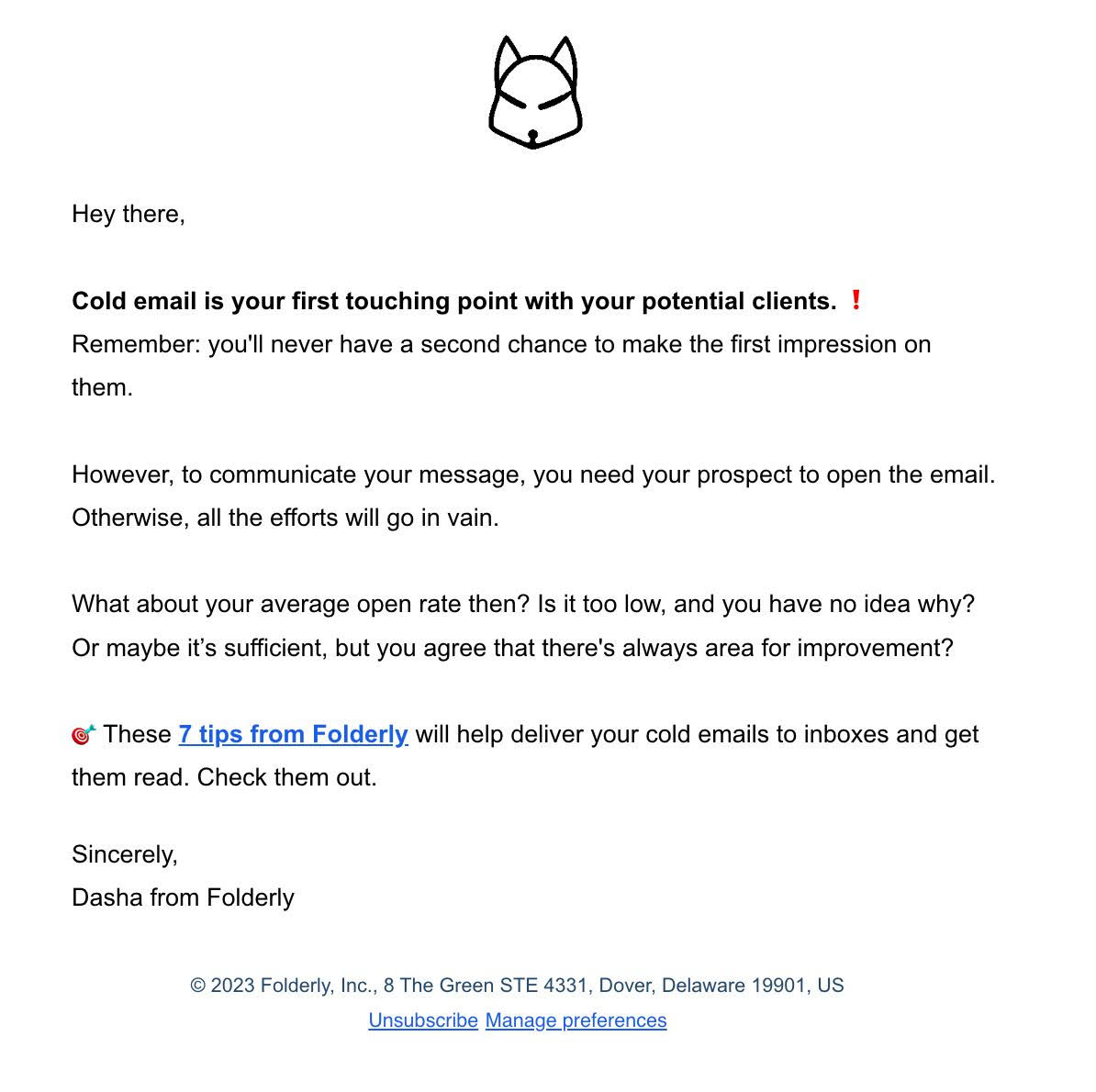
Folderly is an email deliverability software for cold email outreach.
This is an informative email by Folderly that promotes a blog post. We like how the author of the email uses emoticons occasionally to bring the reader’s attention to a particular point and convey the tone. As there are no other visual elements in plain text emails, emoticons are a great addition because it makes the message more engaging.
#12. Reflect
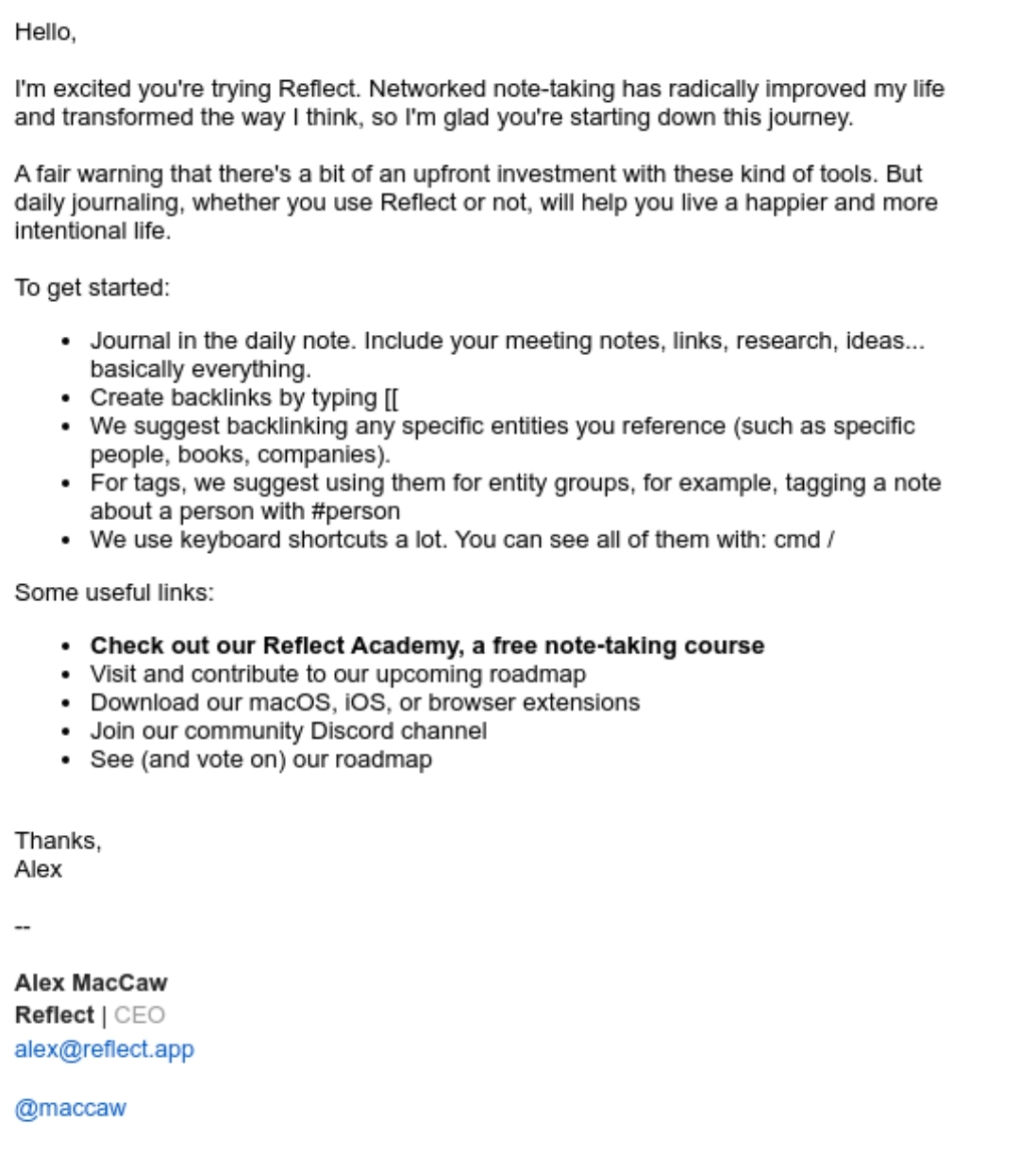
Reflect is a simple and intuitive note-taking app.
The above is a welcome email sent to new customers, explaining the app’s features briefly. It’s a standard email that you can use as an example when crafting welcome or onboarding emails. It follows all the best practices of crafting a plain text email.
What could be improved
To enhance readability, formatting the most important lines in bold in the email would be helpful as it contains a lot of information.
#13. Podia
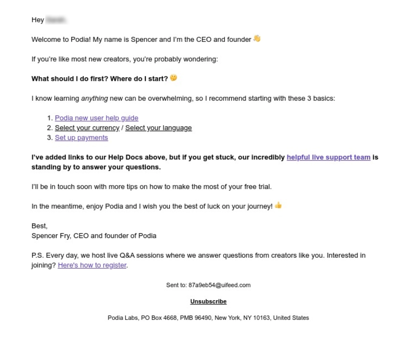
Podia is a software to build websites, host communities, and sell digital products.
This is another great example of a welcome email in plain text format. We like how the author begins by briefly introducing themself. The email is also well-formatted and the main points are not lost in the details. Bonus points for using emoticons to highlight a few lines.
#14. Versoly
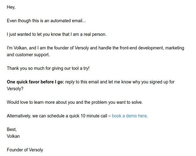
Versoly is a no-code builder used to design, develop and launch landing pages and websites.
This is a simple, personal email asking the customer to reply and to the email with feedback. Like the Podia email, it starts by introducing the author of the email and assuring them that their response will be acknowledged despite being an automated email.
#15. Lemlist
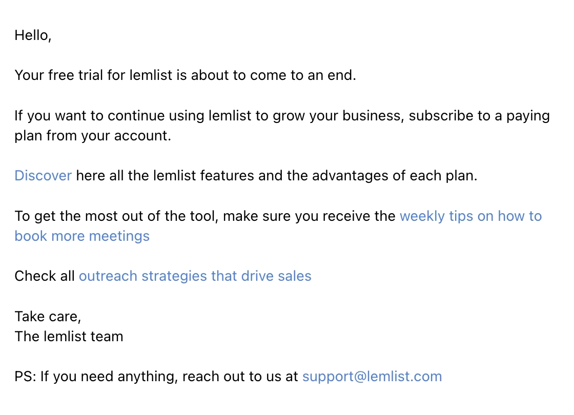
Lemlist is an email outreach and sales engagement platform that lets you start conversations with prospects, do outreach across channels, and build relationships.
This simple email lets the user know that their trial is ending soon, and they must get a paid subscription to continue using the tool. They link to a pricing page so the user knows how the plans compare to each other.
What could be improved
While linking to other resources is always helpful, too many links might overwhelm the reader and prevent them from taking the main action. They could have focused better on the trial expiration and the CTA to upgrade, which is especially crucial if leads are also looking at Lemlist alternatives.
#16. Buy Me a Coffee
Subject: Now you can video reply to your supporters!
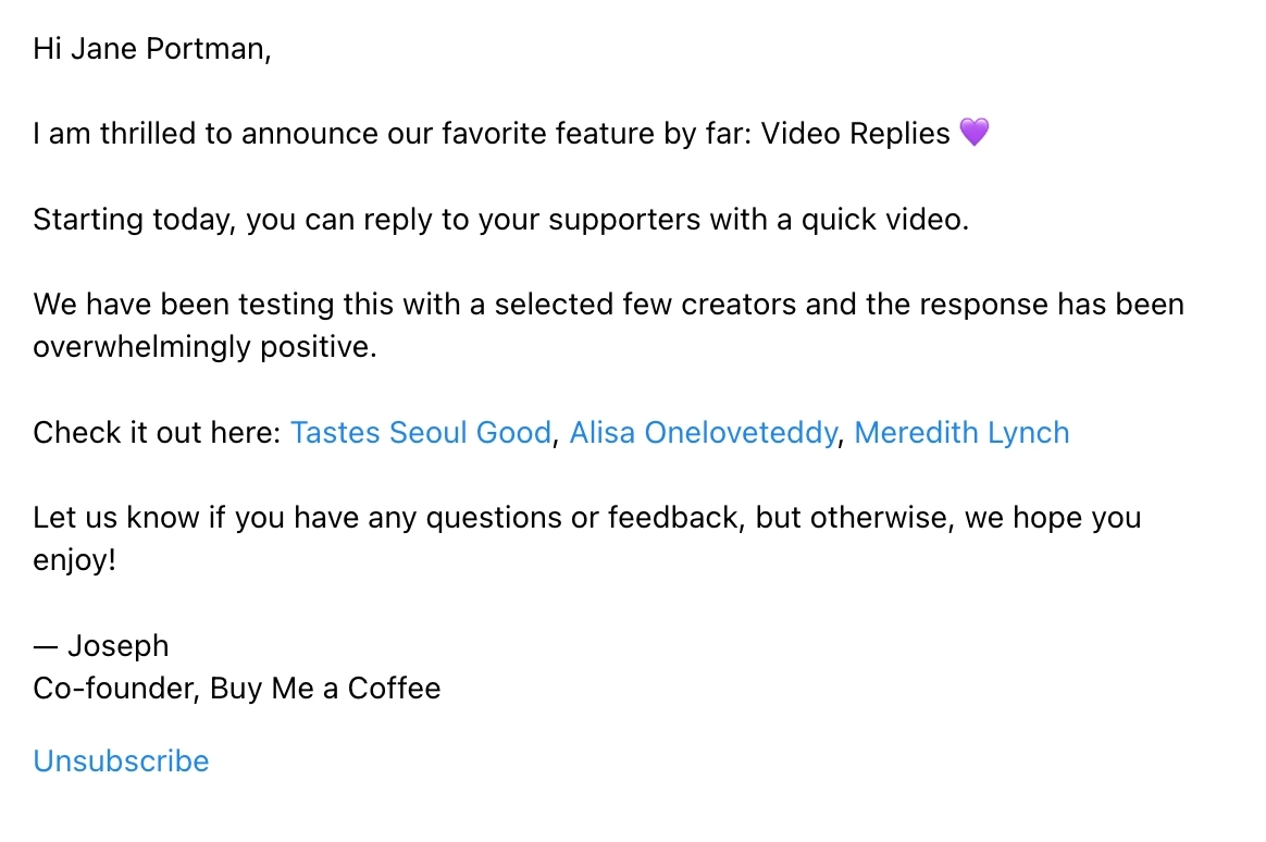
Buy Me a Coffee is a platform that helps creators and artists accept support and membership from their fans.
They sent out this email to announce their new feature, Video Replies. They talk about how they’ve beta tested these with a few creators and link to those creator’s feedback. The email ends by reminding the user that if they have any questions or feedback about the feature, they can reach out to the team.
What could be improved
- They could have added a CTA link that takes the user to the feature so they can try it out for themselves. That was the main purpose of the email, after all.
- They can be more clear about how the user can reach them with their questions and feedback. Can they simply reply to the email, or is a different way recommended?
Don’t wait for the muse. Apply this step-by-step method to write high-performing email campaigns in hours, not weeks.
Special nomination: “super short” plain text emails
Emails often bombard us with information, but some email marketers prefer to reduce the amount of information and prompt readers to take action. Here are some examples of such “short and sweet” plain text emails.
#17. Dubble
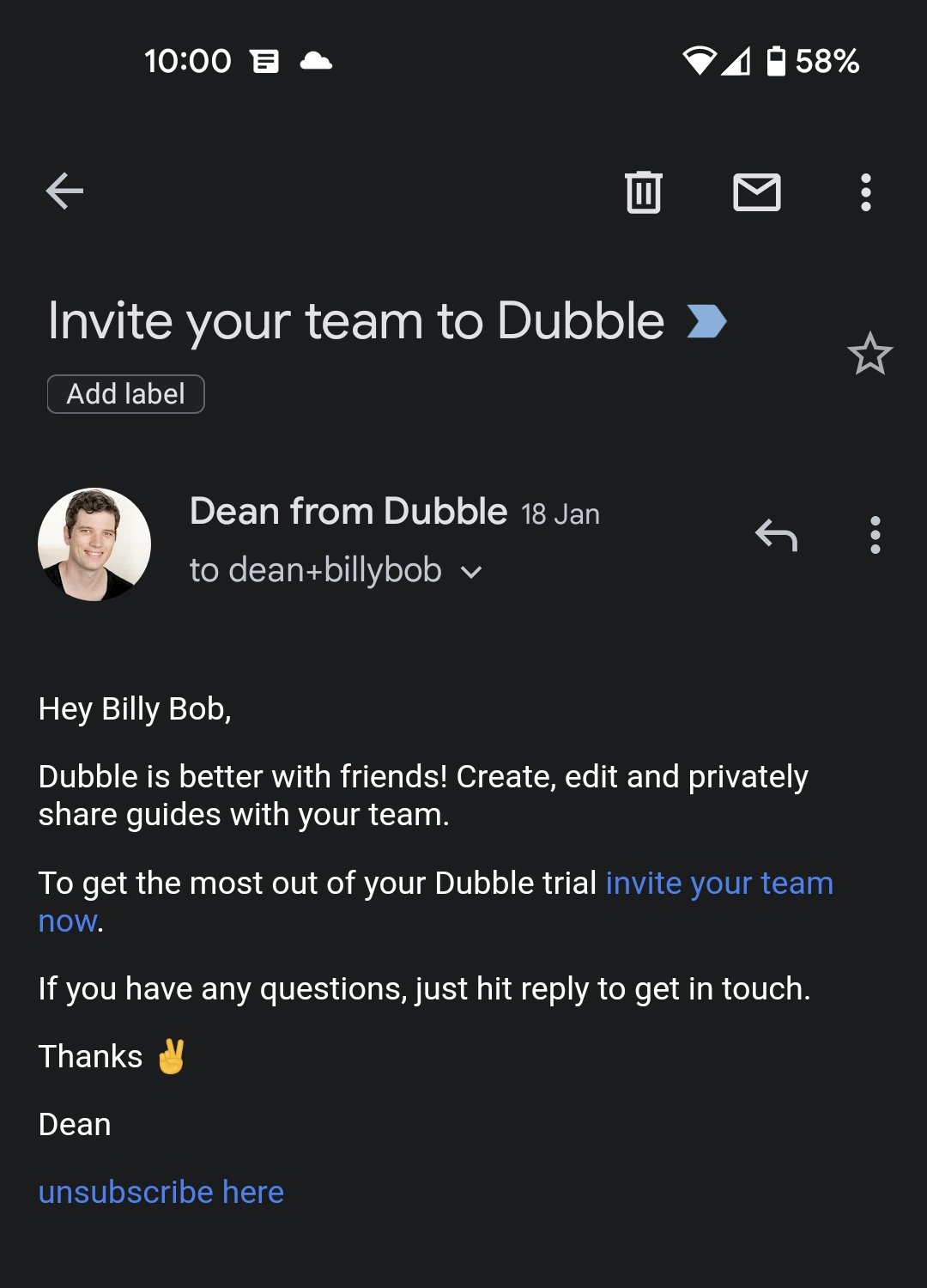
Dubble is a documentation tool that translates your actions into written step-by-step guides, videos and screenshots.
This is a very short and straightforward plain text email sent to free trial users. It asks the reader to invite team members to use Dubble. It doesn’t contain a lot of information and is a perfect format for this particular stage of the customer lifecycle.
#18. Copylime
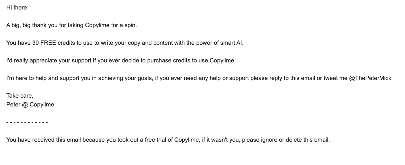
Copylime is a smart AI writing assistant for copywriting needs.
This is a short welcome email sent to those who subscribed to the free version of Copylime. It starts by thanking the reader for signing up and lets them know how much free credits are available. Using a plain text email format as a welcome email to customers can be a great way to establish a personal connection with them.
#19. Superhuman
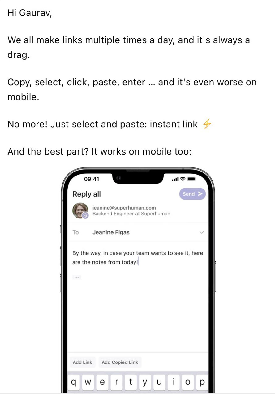
Superhuman is an exclusive email app with unique features.
This short plain text email briefly explains the benefit of their latest feature. They also added an image of the feature in action.
#20. Findymail
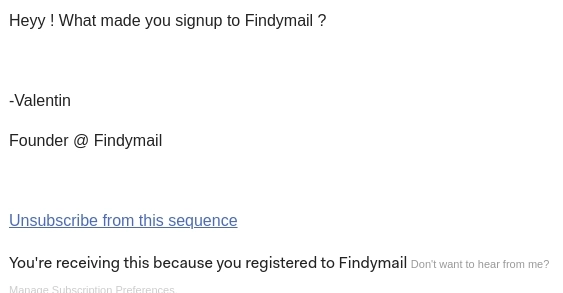
Findymail is a lead-sourcing tool that scrapes email and other contact details online.
We bet you haven’t seen a shorter email. Sent from the founder, this email simply asks the reader what made them sign up for the tool in literally 6 words. We have seen many emails that request feedback, but this one is definitely unique. And it will likely generate a good amount of responses because of its brevity.
Special nomination: “nearly” plain text emails
The emails below are not entirely plain text, as they include some light styling and branding. However, these messages still focus on the content and personal relationships.
#21. Buffer
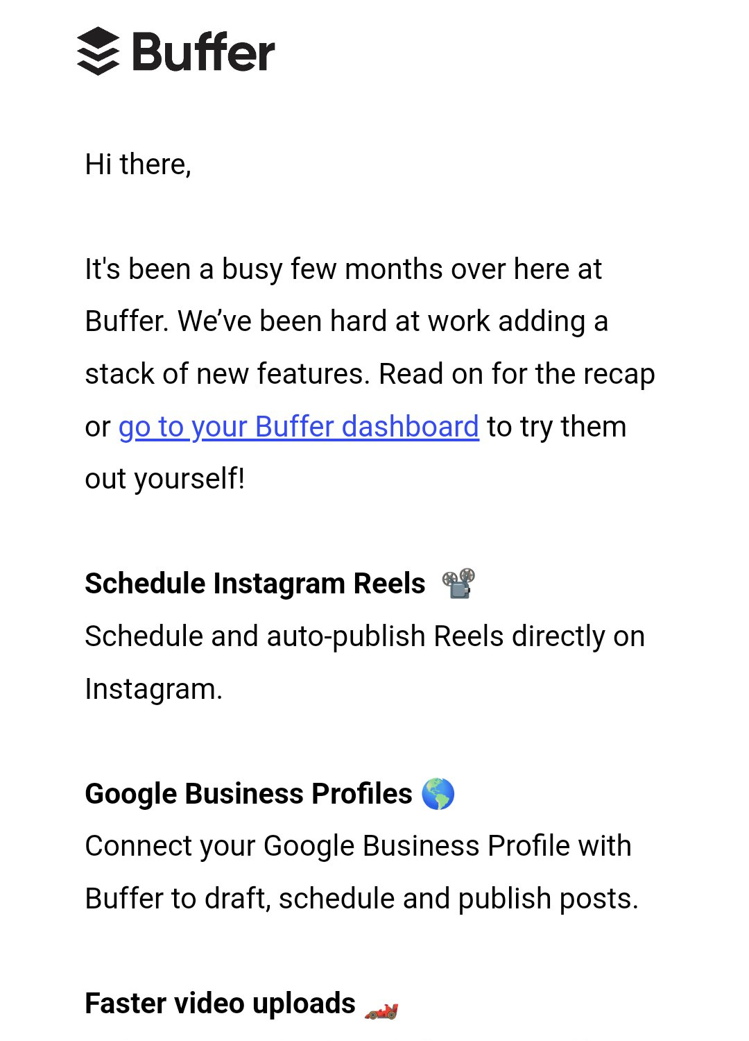
Buffer is a social media managing tool for brands and creators.
Another example of ‘nearly plain text email’, this one introduces the new features available in Buffer. It is a template-based email which is made with minimal formatting and only subtle icons.
#22. ZipMessage
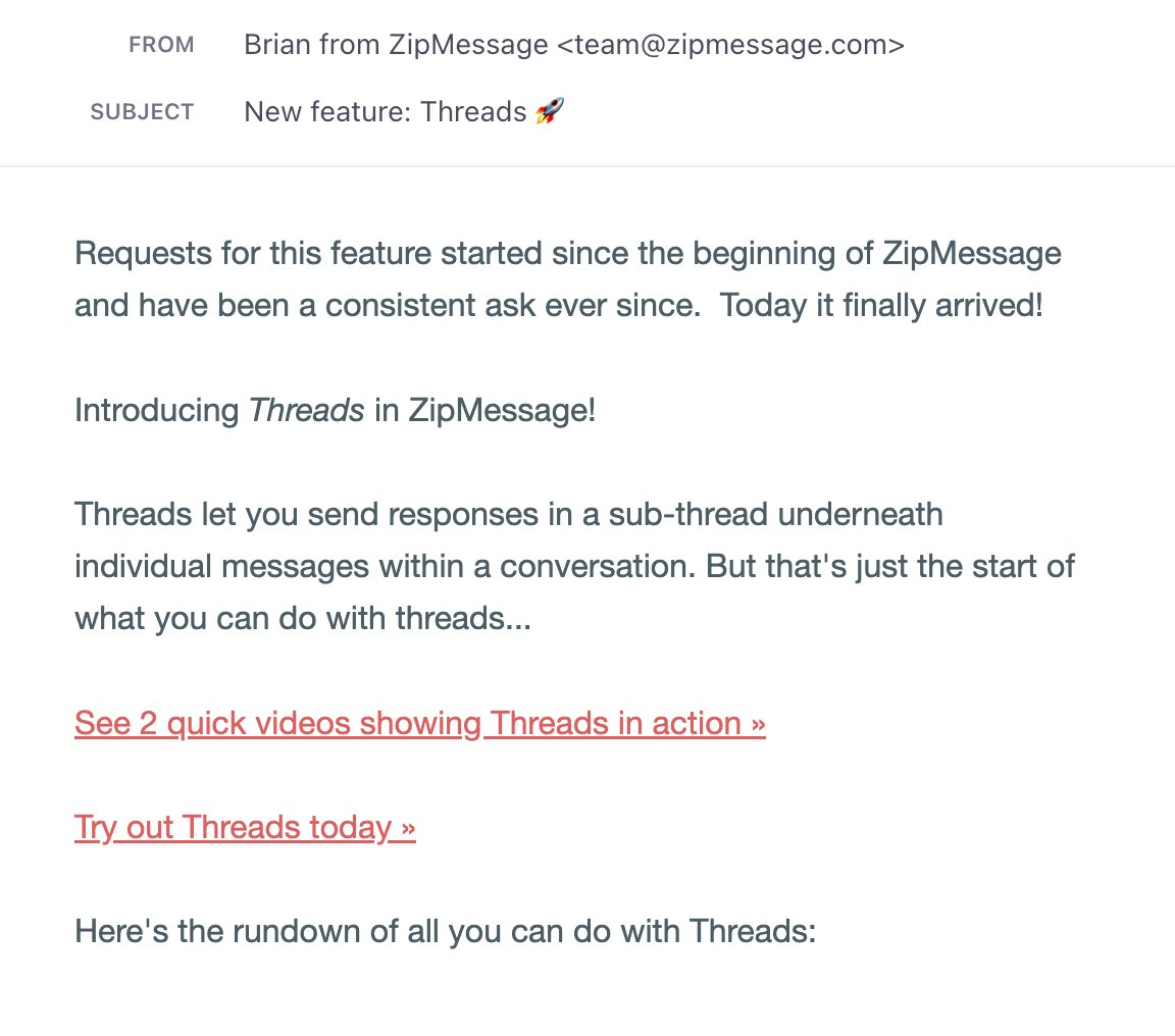
ZipMessage is a communication platform that helps keep a communication line always open with clients.
This email looks like a plain text email at a glance but it is actually template-based. However, it does carry the minimalistic design of a plain text email. ZipMessage announces their latest highly-requested feature. They provide details of the new feature and also has a clear CTA.
What could be improved
A personalized greeting could have made the email look more personal.
#23. Fathom Analytics
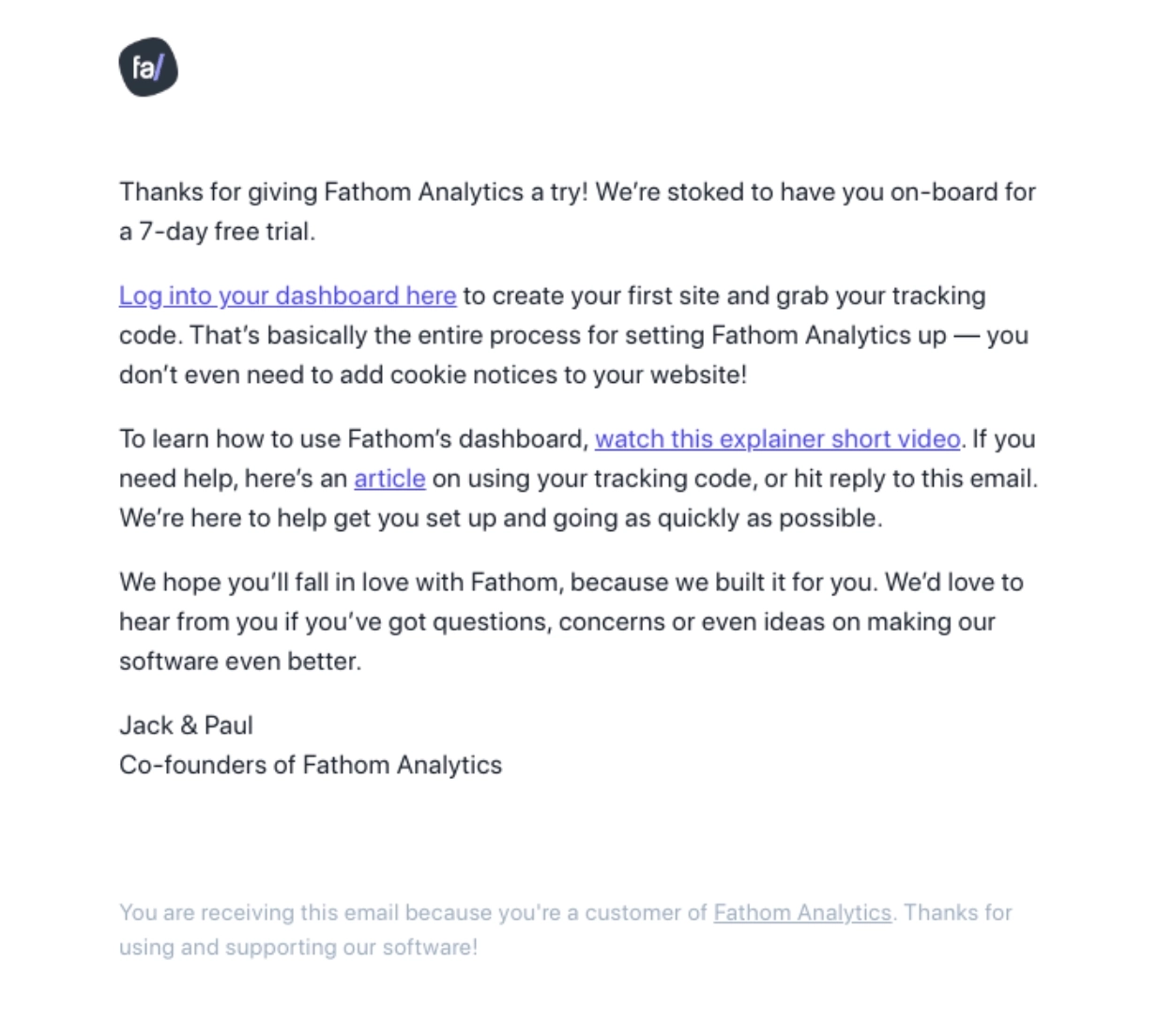
Fathom is a privacy-focused analytics tool, an alternative to Google Analytics.
Another example of a plain text email sent to free trial users. It gives them all the details needed to start using the software along with links. Because of the email’s simple design, the user can focus on the message and its content, which is especially important for free trial users who are still evaluating the product.
#24. HEY
Subject line: The All-New HEY Calendar is HERE 🗓
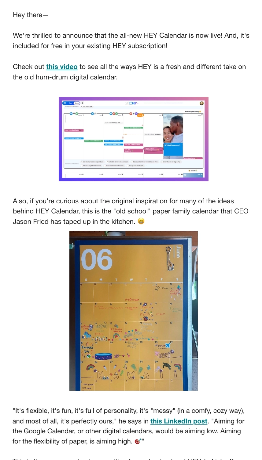
HEY is 37signals’ fresh take on email and calendar.
37signals sent out this email to announce HEY’s new feature, the HEY Calendar. Its simple layout lets readers easily spot the links included, a screenshot of the new feature, and the photo of the analog calendar that inspired the feature.
Try plain text emails for your next campaign
Here are the key takeaways from the examples:
- Understand whether or not plain text emails are appropriate for the situation and the audience.
- Personalization is important, if not compulsory, for plain text emails.
- Make sure to format your email properly with shorter paragraphs and bullet points.
- Follow all legal guidelines for marketing communications.
- A postscript with the CTA text of the email can go a long way.
- If necessary, add emoticons, images or gifs in moderation.
- Not every email software supports plain text formats. So make sure you do your research before beginning.
Plain text emails pack more power in less space. They’re easy to customize, and they engage customers far better than flashy templates.
We hope the above examples will guide you when crafting plain text emails for your SaaS brand. Good luck!
Don’t miss out on new articles. Subscribe to our newsletter and get your monthly dose of SaaS email marketing insights.


