

A pricing update is a hard decision for any SaaS company. The team is vulnerable and the stakes are high.
On the other side of the screen, the reader isn’t in zen-mode either. Their mind is spinning with questions: Why are they increasing the price? Does it apply to me? How much is it going to cost? Can I still afford to do business as usual?
The announcement email has big emotional leverage: you can calm them down, or you can make them furious.
In this post, we walk through the best practices and tear down 14 emails sent by real SaaS companies. This should give you inspiration for your next pricing announcement email.
First, let’s review the best practices.
Don’t wait for the muse. Apply this step-by-step method to write high-performing email campaigns in hours, not weeks.
What makes a great pricing update email?
TLDR, make your SaaS pricing update email short, kind, and clear. There’s a lot you need to include, so don’t overload your email with fluffy details. Use headlines, lists, and links to organize information.
What do you need to include?
What are the elements of a good pricing update email?
- TLDR (aka a summary). What’s happening? What’s the timeline? Is action required? A TLDR paragraph is not mandatory, but it eases the customer’s mind before reading the full story.
- The story. You want to share the reasoning behind the change, ideally tied to benefits, and how the product can help better. Please don’t make this a wall of text, but rather link to a blog post with detail.
- The new pricing details. What exactly does the new pricing look like? How does it compare to the current pricing? Bonus points for tables or other visuals, as they make things easier to comprehend. Sometimes — but not always — it also helps to pull the account usage stats, and calculate the full estimate for their next new bill.
- The timeline. When will the new pricing go into effect? The notice can be as short as 30 days, but must be longer for critical tools like email automation or banking services.
- The alternative path (optional). What if the new pricing isn’t a good fit? Can they migrate? Can they cancel? Also worth linking to the billing page in your app.
- Contact information. There should be a way to discuss, or even negotiate, the pricing change. It can be as easy as “hit reply”, or submit a contact form, or book a personal call.
Who should receive a pricing update email?
If you have your account roles assigned clearly, you could only send this email to e.g. the billing managers of the account.
However, this puts some customers at the risk of not being aware. The pricing update is an important piece of information, so it’s better to err on the side of telling more people.
Therefore, we recommend you don’t overthink it and just send the announcement email to all paying customers.
Should it be the same email for all customers?
If the pricing update affects different customers in different ways, then you should tailor your message to this specific customer. This may depend on their current plan or billing period (monthly vs annual).
There are two ways to customize your announcement:
- Send one email, but use Liquid conditions (if/else, case/when) to display the details relevant to this particular user.
- Send multiple announcements tailored to different segments, based on their billing situation.
This will make your email short & sweet, instead of including all the possible scenarios — see the Reform example below.
Should a pricing update email have a personal greeting?
In theory, any email would benefit from personalization. So the general recommendation is: yes, it should have a personalized greeting.
However, it’s also easy to make mistakes — very unpleasant mistakes! — if the database has an incorrect user name. As a result, most companies avoid having a personal greeting in their announcement emails.
It also depends on the general styling. Some companies prefer to send emails that look like articles (e.g. Postmark). Other companies send emails that resemble personal Gmail messages (e.g. Tuple).
No matter what you choose, we recommend sticking to your previous style guidelines. After all, this email is only a part of your whole email communication strategy.
Pricing update email examples
Now, let’s review specific emails sent by real SaaS companies.
1. Attio
Subject: Important updates to your Attio plan and pricing
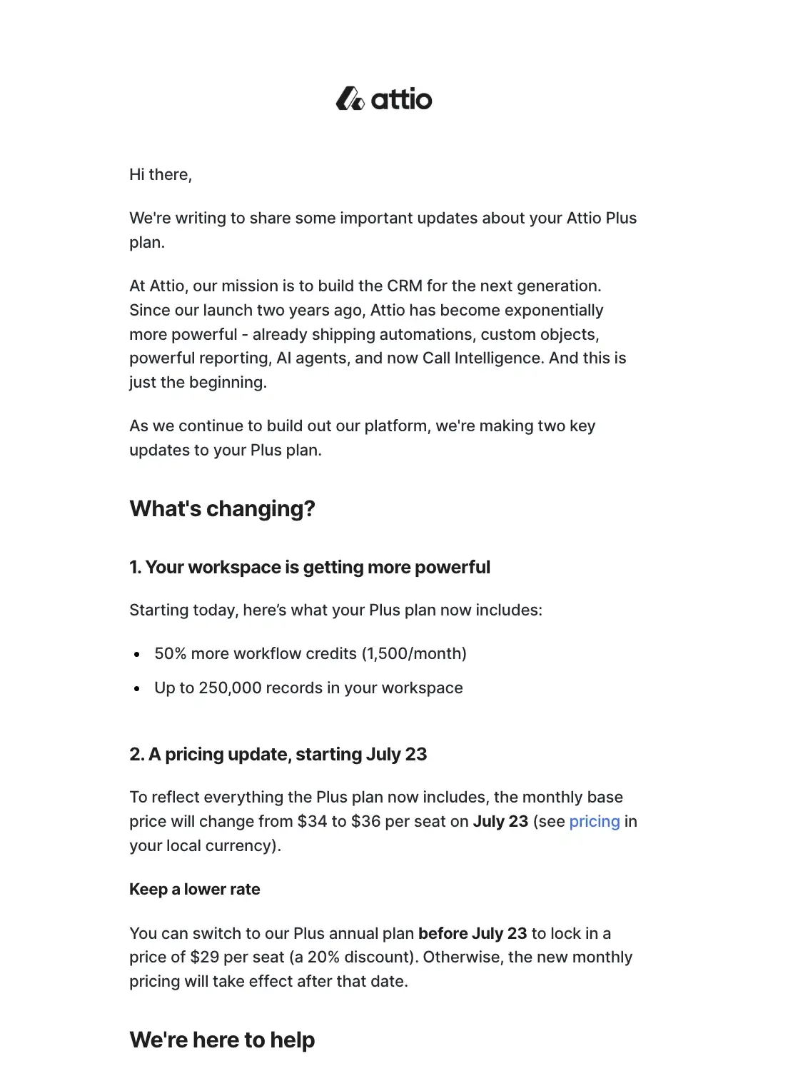
Attio is a CRM designed for modern teams to help them manage relationships and workflows.
To set the stage for the pricing update, Attio talks about their mission and how their product has evolved over the past years.
The second section details the changes that are coming to the user’s plan which are more workflow credits, max records in the workspace, and the seat pricing. In the pricing change subsection, Attio encourages the user to switch to annual pricing before the deadline so they can save up to 20% off.
The last section links to an FAQ and pricing pages should the user want to learn more.
2. AppSignal
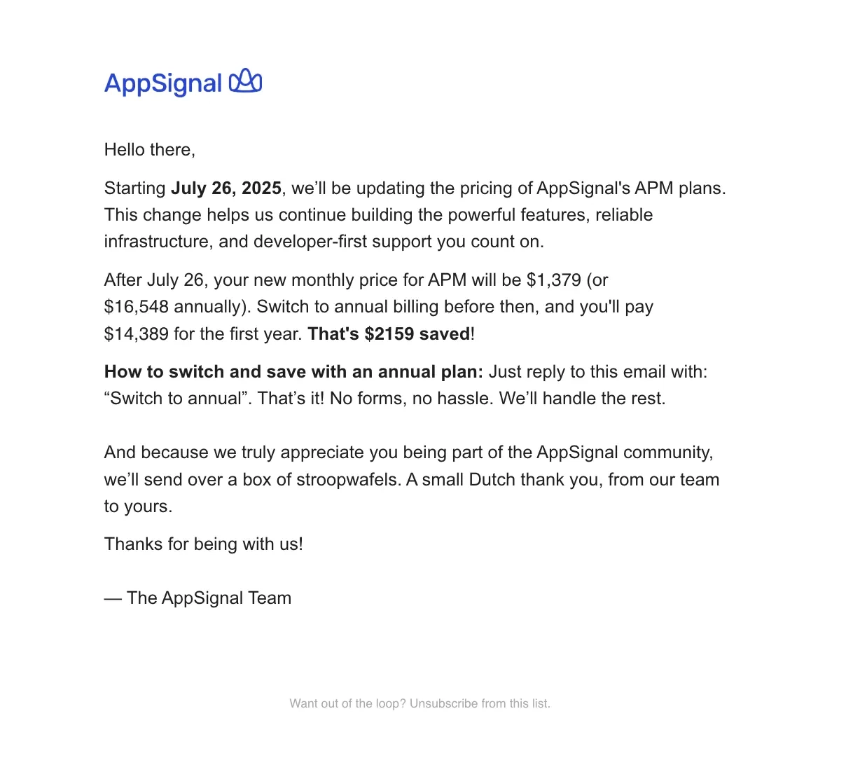
AppSignal is an all-in-one application performance monitoring platform.
The email starts off by saying that a price change will be implemented on July 26th and the reason for the change. The second paragraph breaks down the price change and encourages the user to switch to annual billing before the deadline so they can save. The next few sentences detail the steps on how the user can switch to annual billing.
AppSignal ends the email with thanking the user and that they’ll send them a box of stroopwafels to show their gratitude.
3. Make
Subject: Important update: Introducing Credits as our new billing unit
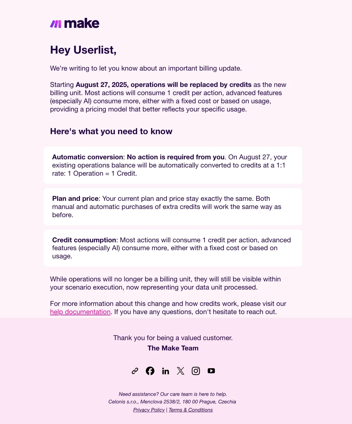
Make is an AI workflow automation platform.
In this email, ake announces that credits will now be used as the billing unit, replacing operations. The second section details the changes, specifically:
- That this is an automatic conversion and the user doesn’t need to do anything
- The plan and price stays the same
- How credit consumptions work
The last section mentions that while operations will cease being a billing unit, users can still view them and now represent the data units processed. They close the email by offering help to users who need more clarification about these changes.
4. Netlify
Subject: Update: Netlify pricing for new plans—your current plan is unchanged
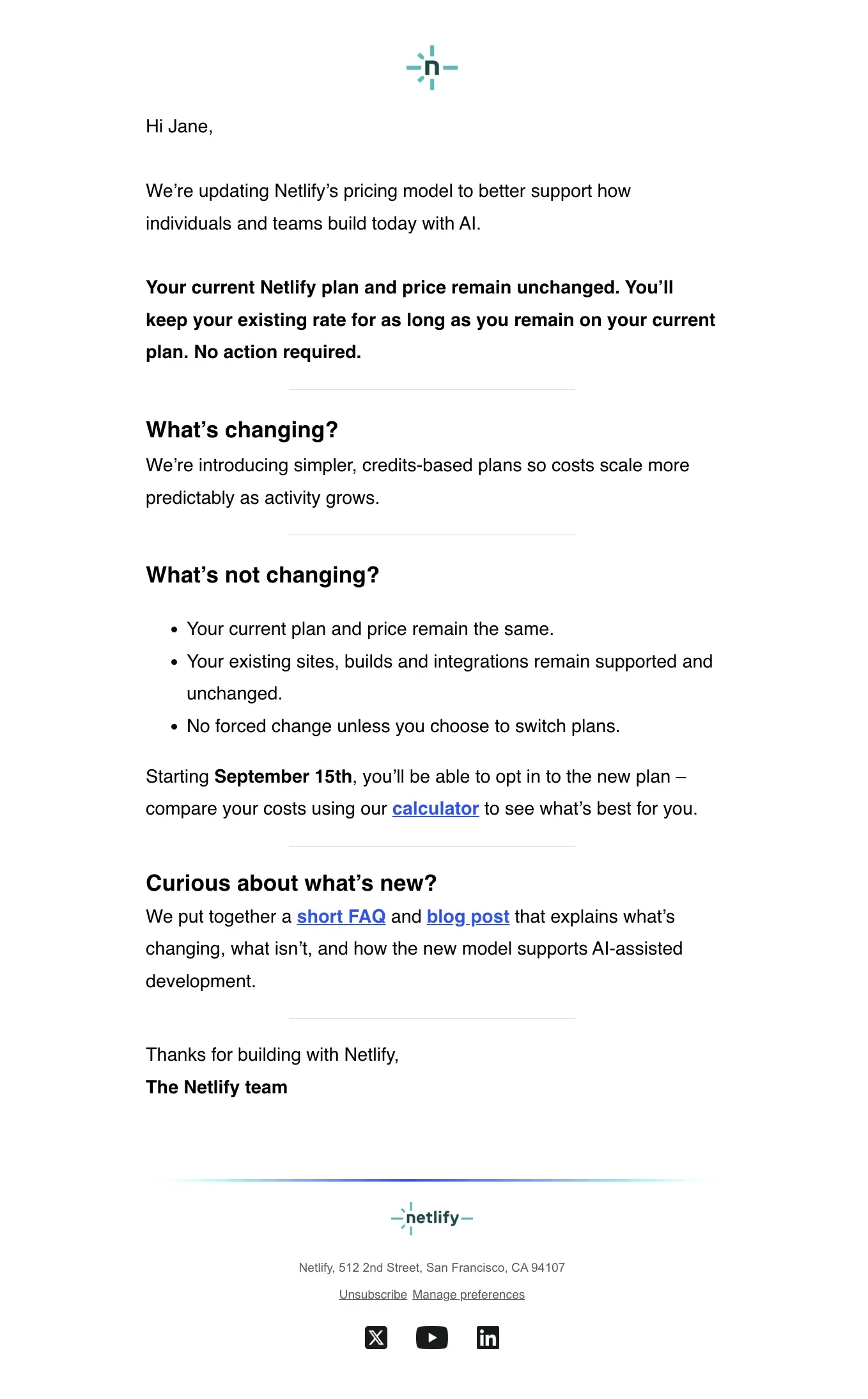
Netlify is a platform for developers to build dynamic websites, ecommerce stores, and web applications.
They kick off the email by saying that they’ve changed their pricing model to reflect how users currently build with AI. Netlify immediately answers any concerns about price increases by saying that there will be no changes to the user’s price and plan as long as they keep their current plan.
The second section explains what is changing and what is not, listing them in bullet points so it’s clear to the readers. Netlify mentions that the user can opt in to the new plans starting September 15th, linking to a calculator so they can evaluate the costs.
The last section links to an FAQ page and a blog post should the reader want to know more about what’s changing, what’s not, and how the change supports AI-assisted development.
5. Help Scout
Subject: Reminder: Help Scout pricing update coming this month
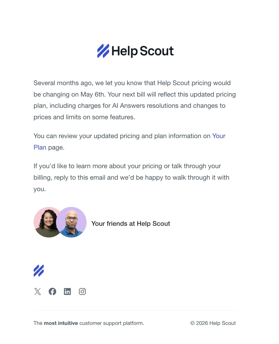
Help Scout is a customer service platform.
Ahead of the implementation, Help Scout sent an email reminding the user that the new pricing will take effect on May 6th and will reflect on the next billing. They link to the “Your Plan” page so the user can review their current pricing and plan. They end the email by offering help to users who want to know more about this change.
6. Polar Habits
Subject: 17 hours left until the price goes up! 💸

Polar Habits is a habit tracking tool without the guilt of broken streaks.
The founder writes theirs like a promo email. They emphasized the lower $99 lifetime price because compared to the new $150, this would be a better deal. They also included an explicit deadline and a clear upgrade CTA to convince the reader to act now.
7. Spotify
Subject: Upcoming changes to your Spotify Premium subscription
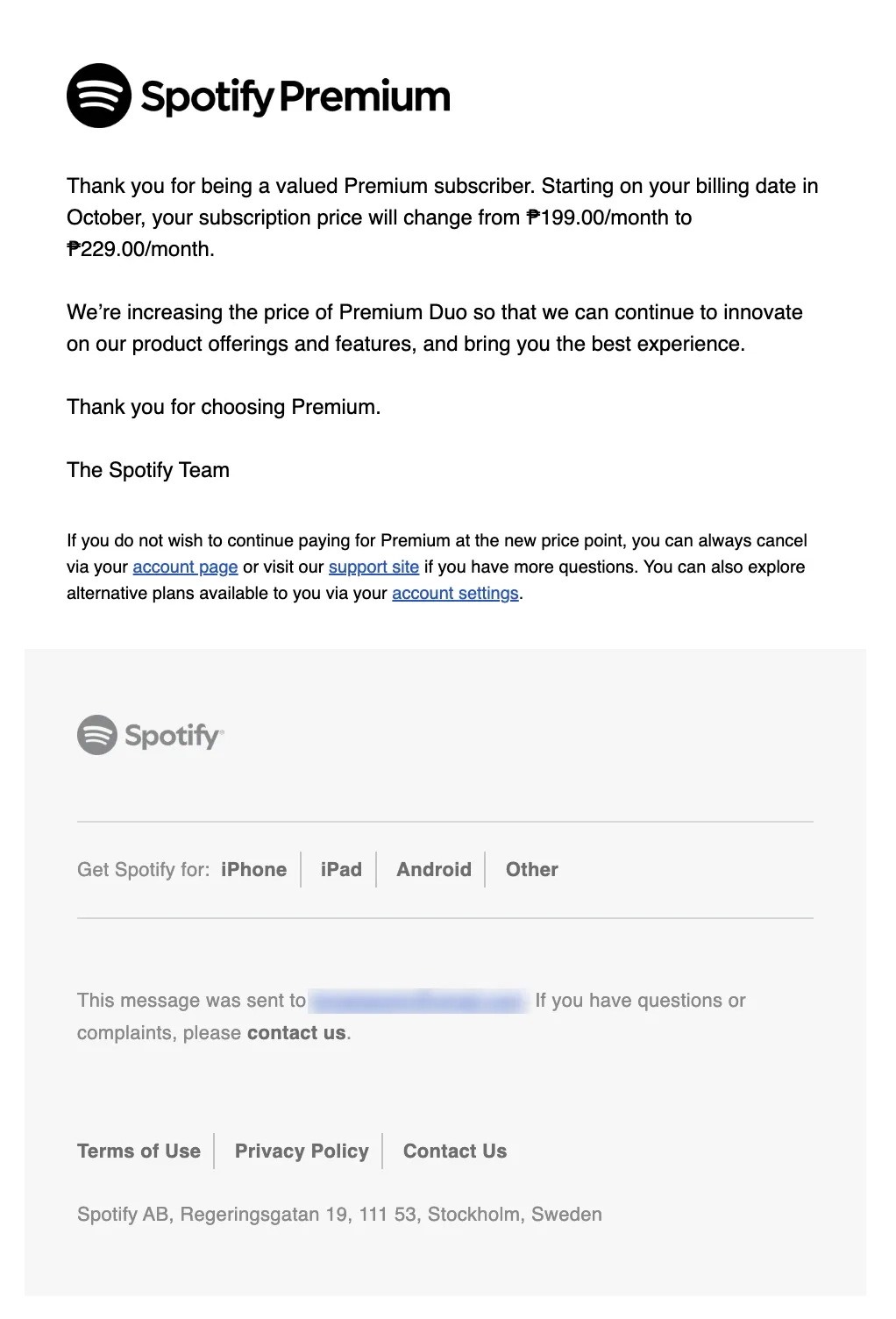
Spotify is a popular music streaming platform.
They went with a short and straightforward email, starting off with thanking the user for being a Premium subscriber. Spotify then discusses the details of the price change and why they’re doing it.
In the P.S. section of the email, they enumerate the next steps for users who wish to cancel or modify their subscription.
They sent an email reminder about the increase exactly a month after the first one.
Subject: Reminder: Upcoming changes to your Spotify Premium subscription
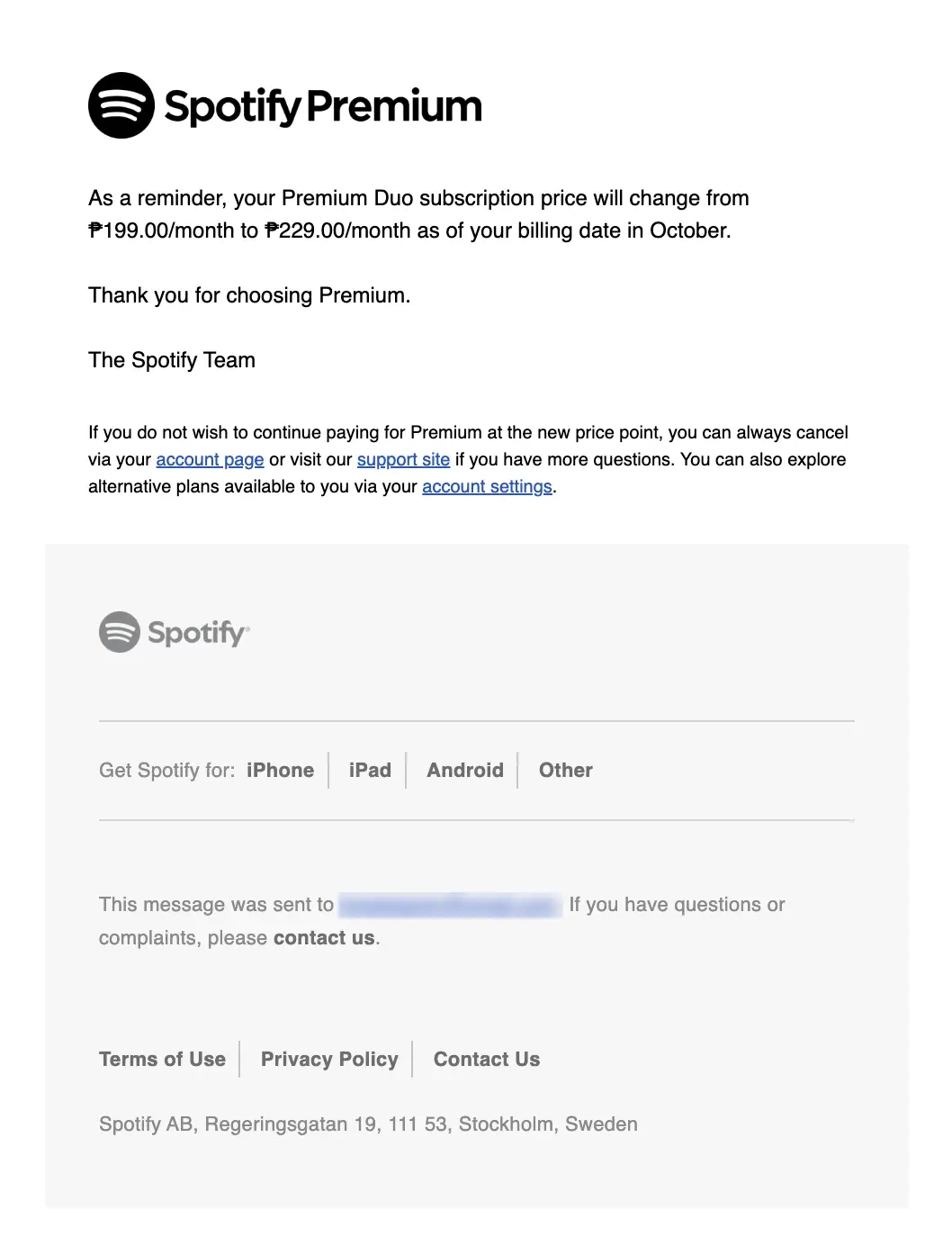
Since this is only a reminder, the email only mentions the price change and when the new prices will take effect. They also included the same phrases for the P.S. section.
8. HBO Max
Subject: Upcoming Price Change
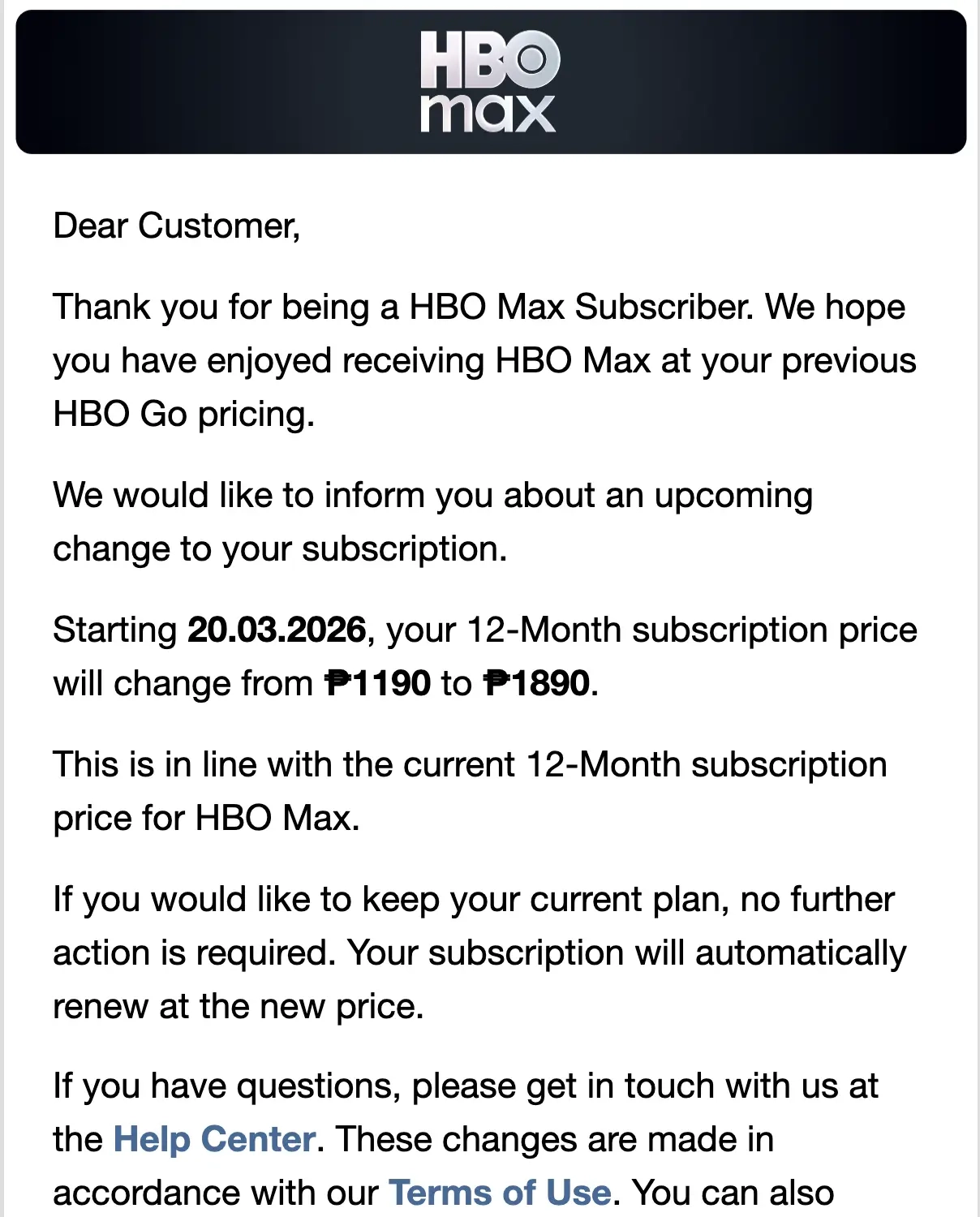
HBO Max is a popular video streaming platform.
Similar to previous examples, they start off by thanking the user for their subscription before proceeding to the details about the price increase. They state the exact price change and the exact date the new price will be implemented, both formatted in bold so the reader doesn’t miss it.
The next section tells the reader that they don’t have to do anything if they’re keeping the subscription because the renewal will be automatically applied. HBO Max included links in the final section of the email should the reader have questions, want to learn more about the changes, or review or cancel their subscription.
9. Google One
Subject: Upcoming price increase for your Google One subscription
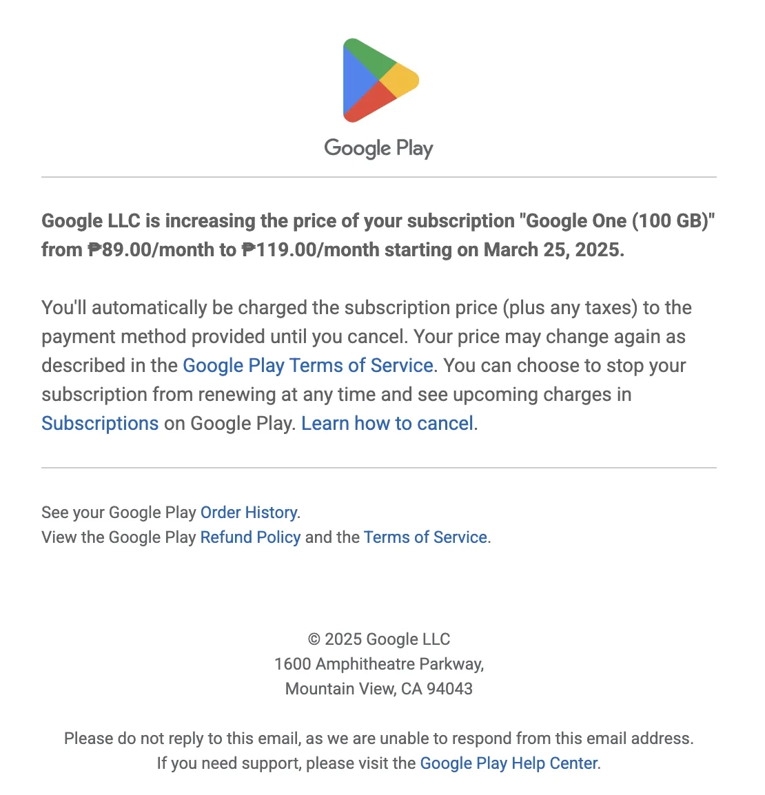
Google One is Google’s cloud storage service.
Google formats the headline about the price increase in bold so it immediately captures the reader’s attention. The next section tells the reader that this new price will be charged up until they cancel, that Google may change their prices again according to their terms of service, and how to review upcoming charges.
10. Front
Subject: Important: Updates to your Front plan
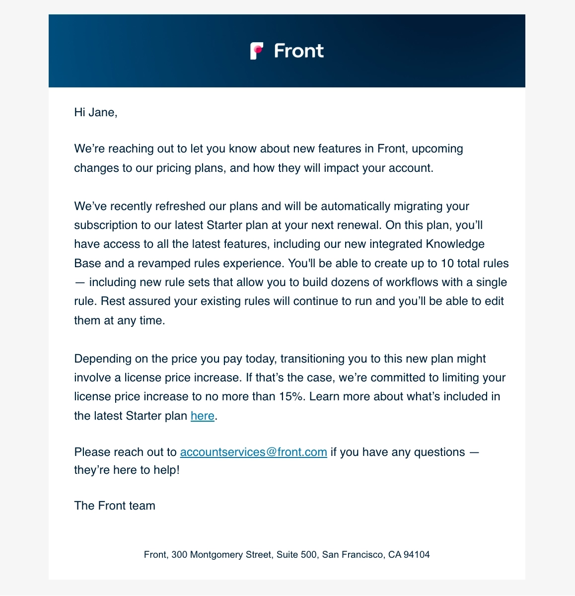
Front is a customer operations platform that funnels inbound messages from various channels into a single place.
In this email, Front lets their users know that they’ve added new features and refreshed their pricing plans. They go on to discuss how these changes will affect the user’s current subscription plan. They also provide a link to their website should their user want to know more about the latest Starter plan.
What can be improved?
They could have placed the first sentence in bold or at least the phrase “upcoming changes to our pricing plans” so that it’s easier for users to skim and get the major takeaway of this email.
11. FigJam
Subject: Changes coming to your Figma account
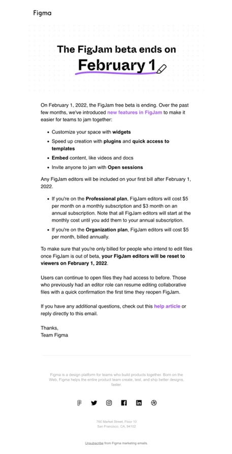
FigJam is a collaborative online whiteboard built by the Figma team, and this is their out-of-beta announcement.
We love how short it is!
The author starts the email with a clear statement of what is happening, and then they immediately give you the supporting reasons — features and/or benefits.
Next up are different scenarios — what the new pricing looks like based on the customer’s current Figma plan. This list has enough details, but is short and sweet. Compare that to Reform’s multiple sections below.
The author also addresses the biggest question of how exactly the customers will be billed, reassuring that all users won’t be billable by default.
In the end, they include a link to the help docs article for details and invite the user to interact with the email directly.
What can be improved?
Apart from personalizing the intro, we don’t see any ways to improve this email. Great job team!
12. Reform
Subject: We’ve updated our pricing for Reform - here’s what you’ll want to know
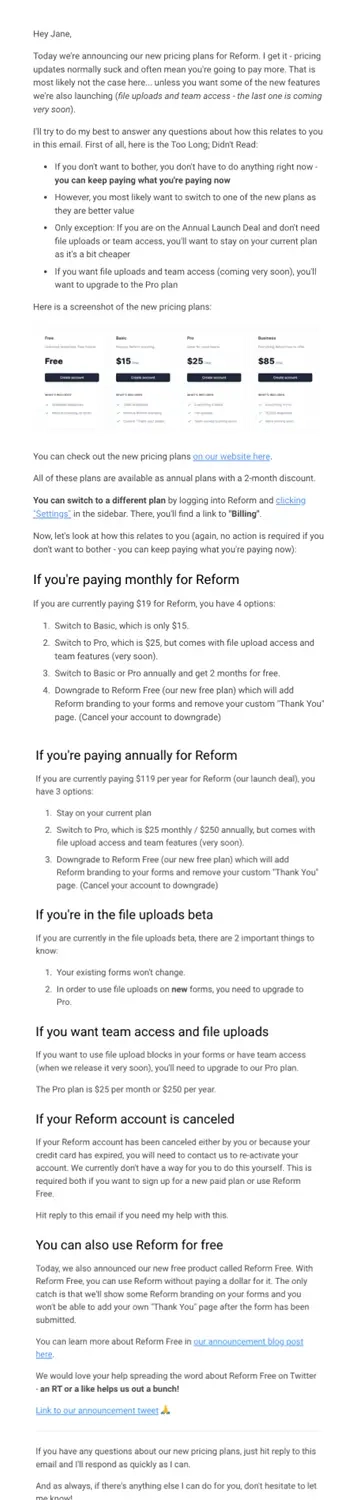
Reform is a modern form building tool. They’re going through a big change, including new pricing plans and a new free plan.
The first paragraph can probably be improved and shortened. The readers have already realized that this is a pricing update email, so they’re eager to learn the details. You can get straight through the foam to the beer.
The TLDR section is great, except that it could also be shortened.
A screenshot of new plans is a wonderful addition as soon as it provides clarity. For some SaaS companies it might not be the best choice — if the pricing table itself doesn’t give the user enough information about their own upcoming fees.
Peter did a great job describing different “what if” scenarios in detail. As a result, the user ends up with a very long — albeit well-structured — email. We’d recommend to customize the email.
Is it wise to promote the free plan? This is an open question. It’s almost too earnest to recommend a free plan in a pricing update email. If anything, this suggestion can be more subtle. This whole section looks like a perfect email to be sent separately, including the social media ask.
What can be improved?
- It’s better to strive for clarity, and to avoid tangents (like the free plan).
- The email could be shorter, if tailored to a particular user — see recommendations for customization in the beginning of this article.
- The intro and outro sections can be made half the size by removing “social courtesies” that don’t carry much meaning. While doing that, don’t forget to keep the positive wording. The message should still read as friendly.
13. Baremetrics
Subject: [Baremetrics] Important Notice: Plans Changing
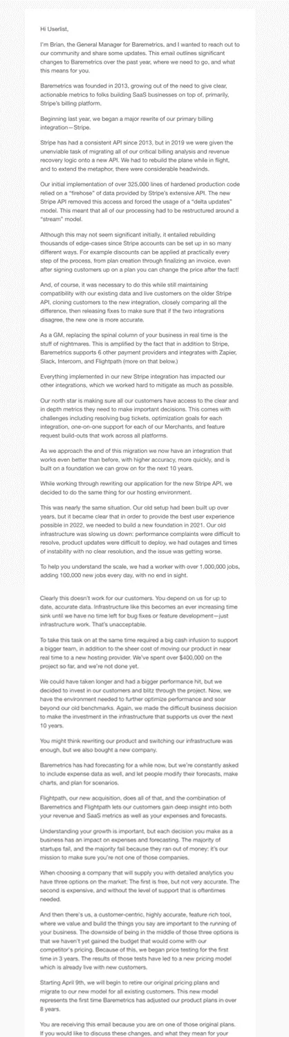
Baremetrics is a SaaS analytics platform that sits on top of your Stripe account.
Josh Pigford sold the company in 2020, and the team has faced many challenges since then. In this email, they describe their last few years in detail, and the reasoning behind the pricing increase.
Now, we thought Reform’s email was long! Meet this outstanding, earnest wall of text.
Honesty and vulnerability are appreciated. However, no reader can be expected to digest so much unstructured information.
What could be improved?
- A starting paragraph outlining what’s happening would be great. The existing intro is really vague.
- The whole business story could be condensed to 2-3 paragraphs, with a link to a detailed blog post.
- Specific information about new pricing is missing. This is the biggest sin of all: there’s no mention of any numbers, whatsoever, and that’s very confusing to the reader. Also, how exactly will the new pricing be rolled out?
- The CTA area invites the reader to contact Brian (the General Manager) directly. While this is sweet, it actually makes human contact less likely. Reasonable customers are not likely to contact the busy executive.
14. Tuple
Subject: We’re increasing our prices
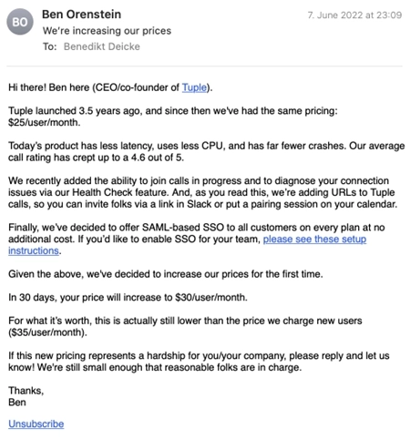
Tuple is a pair programming tool.
This short and sweet email fits their communication style perfectly.
The co-founder, Ben Orenstein, dives right in. He gives context about existing pricing, and the reasons behind the change. See how he leverages hard facts — less CPU, better call rating, SSO, other new features — instead of vague statements.
The mid-section gives you a clear new pricing and the timeline for the increase. It’s just 30 days of notice, but it’s okay for such a modest increase from $25 to $30 per user per month.
The end of email gives the reader the opportunity to ask for a discount. This is a sweet touch. Products like Tuple, supported by a large number of low-ARPU customers, can easily afford this. Meanwhile, larger-ARPU companies might need to be persistent with their updates.
What could be improved?
- A bit of personalization, like the notorious first name, would be nice.
- The SSO instructions are a tangent, and can be reduced to a subtle link.
- Those new features could be organized into a bulleted list, for better scannability. However, we suspect this was a conscious “relaxed style” choice.
15. Woodpecker
Subject: Announcing new, flexible pricing
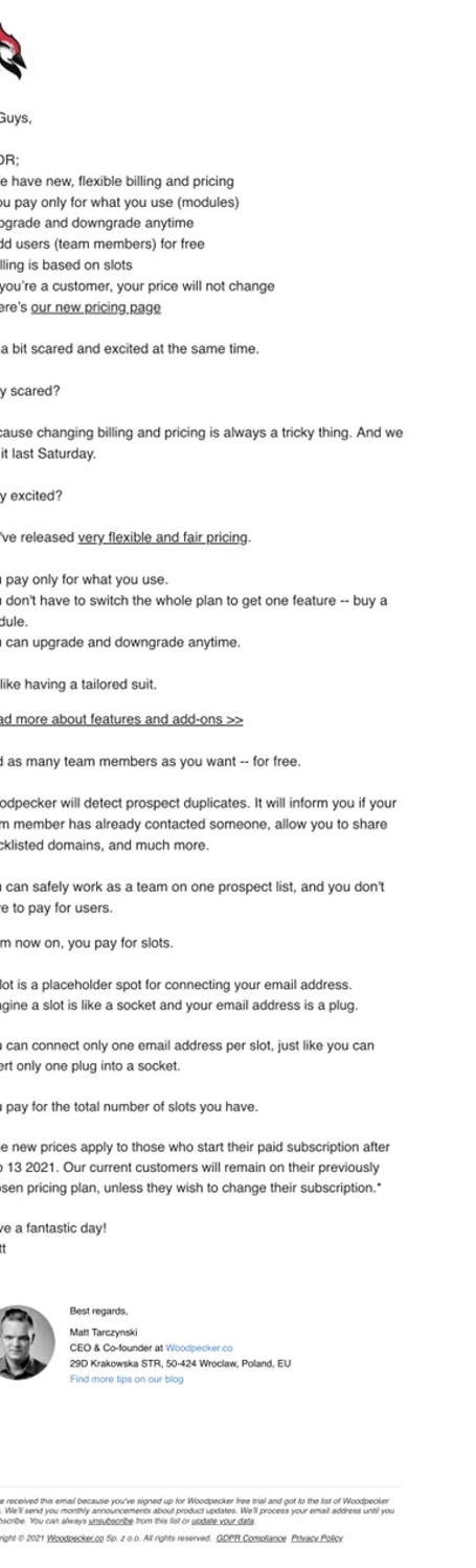
Woodpecker is a cold outreach tool.
We’ve seen them update pricing many times over the years, which is understandable: the email automation industry is a tough market. The pricing is tied to value (both real and perceived), usage, hard costs, and much more.
Apparently the team is tired of negotiating with their customers for each feature, so they are switching to a new usage-based (module-based, slot-based) pricing model. This email communicates exactly that, and we share the excitement. Such billing can be a big relief for the customer success team.
- We appreciate the TLDR section.
- The author keeps things short, using links to provide details.
- There’s a clear timeline.
- Existing customers are reassured that nothing changes for them, unless they want.
What can be improved?
- It would be nice to personalize the greeting with their first name. But even if you don’t, “guys” can be downright offensive for some people.
- There are no numbers or screenshots to indicate the new pricing. A link is okay, but some clues would be nice.
- The email could use a bit of structure for readability, like subheadings or bullet lists.
- The ending section could include some sort of contact suggestion, something as simple as “reply if you have any questions.”
Don’t wait for the muse. Apply this step-by-step method to write high-performing email campaigns in hours, not weeks.
16. Postmark
Subject: Now offering lower pricing and monthly plans
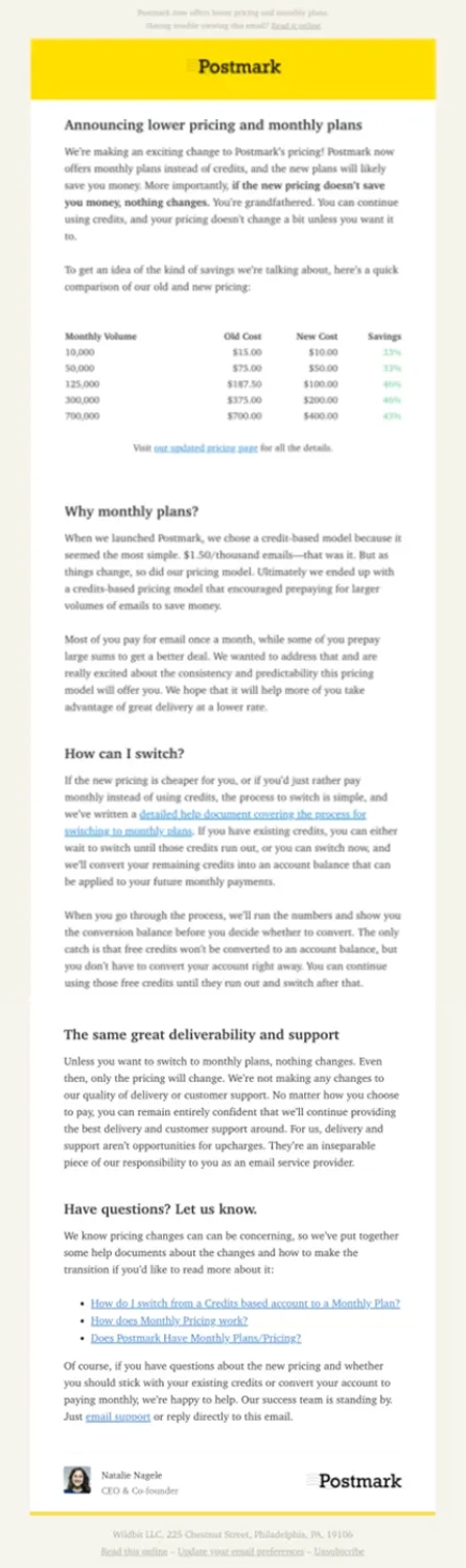
Postmark is a provider of transactional email, built by Wildbit and recently acquired by ActiveCampaign.
This email stands out because Postmark is actually making their pricing lower, while a typical pricing update increases the bill.
The structure of this email is fantastic: the first paragraph outlines what’s important for the reader. Then the team gives exact numbers for what the new pricing looks like — bonus points for the “show-not-tell” table format.
After we are done with this “above-the-fold” part, the team shares the full story. This information is split into readable sections with headlines.
In the “learn more” section they’re offering not just one, but multiple links.
The closing paragraph invites the reader to connect with the team and provides means for doing so — as it should.
What can be improved?
Really, not much.
- The detailed paragraphs could be a bit shorter. However, long-form newsletters are classic for Postmark.
- Technically speaking, this email lacks a personal intro. But we refer to Postmark’s style once again: their newsletters are styled as articles, as opposed to imitating a personal email.
- If this were a pricing increase, we’d like to see a specific timeline for the change. In this case, the changes are positive, and are effective immediately.
17. Mailchimp
We were able to collect two examples of the same pricing update. Thanks to Marty Aghajanyan of jBoard for contributing the second version.
Subject: An important update to our pricing plans
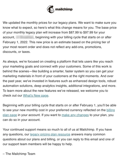
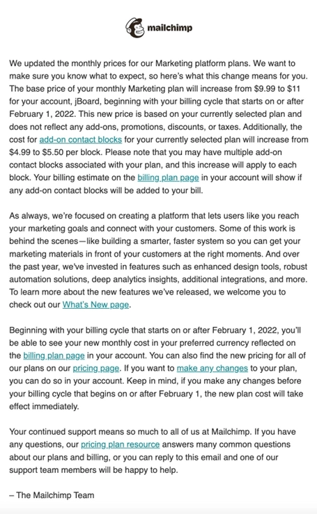
Mailchimp is the most famous general-purpose email marketing platform out there.
Looking at the two versions of the same email, we can see how they customize that email based on the customer’s plan — the exact recommendation we gave to Reform above.
Mailchimp team jumps straight to business, and outlines the new pricing details for this specific user.
The second bulky paragraph describes how awesome the tool is, and what has changed over the years. It’s a good attempt at justifying the pricing change, but it doesn’t sound very inspiring.
The next paragraph gives a clear timeline — great! — and provides helpful links
The closing part provides options to contact the team — as it should.
What can be improved?
This email follows the best practices, but doesn’t look too friendly.
- We’d love to see some personalization in the greeting. In fact, any greeting would be better than no greeting.
- The formatting isn’t great. If this is a personal email, then the paragraphs should be shorter and more emotional. If this is a formal email, extra bullets or headlines would be great.
- The wording is really dry and formal. Especially given that Mailchimp as a brand is famous for their friendly, neatly documented voice and tone.
18. Hotjar
Thanks to Monica Lent of Affilimate for contributing this example.
Subject: Hotjar is updating its pricing model
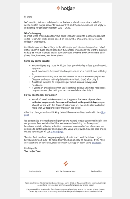
Hotjar is a tool for collecting website feedback and behavior analytics. By the way, we do love their new branding.
In this email, they announce a restructuring of their tools, which leads to a pricing change.
This email is written in the same neutral tone as the one from MailChimp. However, it reads much smoother. The author clearly put effort into making it readable. It’s not “a wall of text” due to shorter paragraphs, bold and italics for clarity, and bullet points.
The team does a great job at outlining the next steps. You can also see that they tailored the email to the existing user, giving them a specific scenario or what’s going to happen to their own plan. This is great.
Hotjar’s product restructuring is a big change. But they don’t overwhelm us with the details. Instead, they link to a blog post.
At the end of the email, they give the reader context about the timeline and a way to contact their support team — all the best practices.
What can be improved?
A personalized intro would be nice. Other than that, we don’t see any low-hanging fruit improvements. Great job, Hotjar!
19. Qwilr
Thanks to Ned Dwyer of Great Question for contributing this example.
Subject: Upcoming Qwilr Pricing Changes
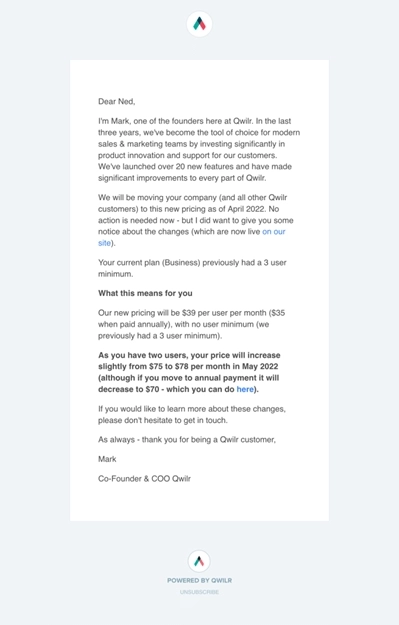
Qwilr is a tool for sending web-based proposals.
Apparently, they’re going from tier-based to user-based pricing, and this email announces the change.
We like how short and sweet this email is. It’s customized, and the user can see exactly how their bill will change. Bonus points for the annual upgrade idea.
What can be done better?
- The intro section sounds too generic, given how specific and personable the rest of the email appears. “Investing significantly in product innovation” can be replaced with specific improvements that make Qwilr special.
- The entire “pricing change” paragraph is styled in bold. While it definitely makes it stand out, it’s not the best practice. Instead, use bold for short phrases, ideally not more than one per paragraph.
20. DigitalOcean
Thanks to Pierre de Wulf of ScrapingBee for contributing this example.
Subject: DigitalOcean prices are changing July 1st. Here’s what you need to know.
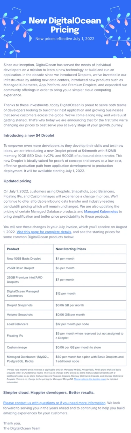
DigitalOcean is a developer cloud infrastructure tool.
The team starts with a couple paragraphs about their background story. Then they cut down to business, and tell us about their new $4 droplet, and the updated pricing. See how they use a table to outline the change for different products — that reads very well.
At the end of the email there’s a link to contact the team.
What can be improved?
- The first couple paragraphs can be shorter, and a little less real lyrical.
- A personalized intro would be great. But DigitalOcean doesn’t really need to appear too personable, as an industry giant.
- “Simpler cloud. Happier developers. Better results.” does look like a declarative enterprise slogan — not sure if it brings extra value to the email, apart from satisfying some bureaucratic need.
Other than that, the team is doing a great job at keeping things concise and readable.
21. QuickBooks
Thanks to Marty Aghajanyan of jBoard for contributing this example.
Subject: Pricing information: Your QuickBooks Online subscriptions
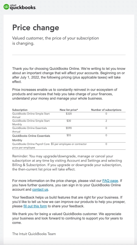
QuickBooks is a world-famous bookkeeping service by Intuit.
Can you think of a notification from bookkeeping software? This email meets that expectation, precisely.
It’s short, formal, and to the point. They don’t need to justify anything — beyond a few buzzwords — and they don’t bother to structure this email with headlines or lists. We do appreciate the table, though.
What can be improved?
This email checks all the boxes, but doesn’t build any personal connection. Does it need to? Probably not.
22. Ahrefs
Thanks to David Nge for contributing this example.
Subject: New pricing for Ahrefs coming soon
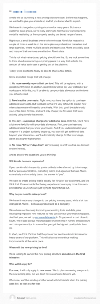
Ahrefs is the world-famous tool for SEO research and analytics.
Millions of users rely on the tool. To ease the pressure, they’re splitting the update in several emails.
This message is a “heads-up” email — it doesn’t outline all the next steps just yet. They promise to send another email when the pricing goes live.
They’re changing the way they bill for active vs inactive team members, and ditching their famous $7 for 7 days trial. They do a great job describing the changes, and justifying the new price.
What can be improved?
The email could be a bit shorter, but nothing critical. Ahrefs is a personable brand, so we expect more words and reasons from them.
23. June
Thanks to Cody Duval of Keeping for contributing this example.
Subject: Upcoming changes to your June plan
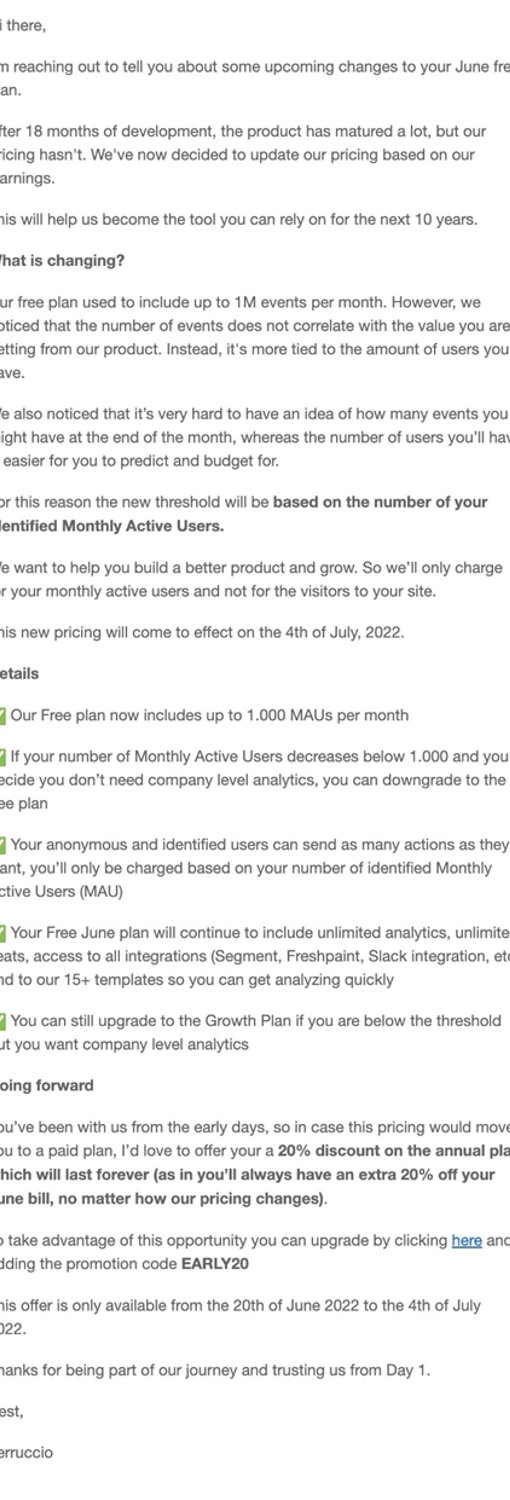
June is a tool for product-led analytics. The company was founded in 2020 and VC-backed.
After nearly two years of intensive product development, they arrived at a better pricing model, and now are letting the customers know.
This change ain’t small: they’re changing the billing metric from events tracked to monthly active users. Strategy-wise, it’s a great move, as event tracking volume has no connection to delivered value. (User count doesn’t always correlate with value either, but that’s a topic for another discussion.)
This email is on the longer side, but it’s well-structured. We like how they use check mark emojis instead of bullet points.
This message makes early customers feel special and appreciated — perfect language for those “out of beta” emails. It’s also sweetened with a lifetime 20% discount.
But look how they timebox this deal, stimulating the user to upgrade now. Very, very smart move.
What can be improved?
It’d be great to provide more details how the product has evolved — at least name a few key features or benefits.
24. Twilio SendGrid
Thanks to Pierre de Wulf of ScrapingBee for contributing this example.
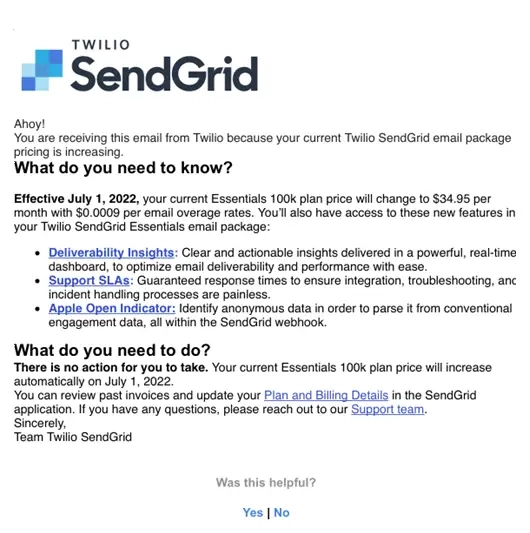
SendGrid is a provider of transactional email which was acquired by Twilio in 2019.
They’re a huge company and could bury us in a wall of faceless text. But look how short and sweet this email is.
The two sections — “What do you need to know?” and “What do you need to do?” — outline the necessary information. To justify the new pricing, the team highlights their new features, which are neatly structured in a bullet list with links. The plan of action is outlined clearly.
What can be improved?
The paragraph formatting looks weird, but we think it was stripped by the email client (95% looks like the doing of Outlook).
Content-wise, we can’t think of anything. Not a single word of fluff. Fantastic job, team.
25. Pitch
Subject: Action needed: We’re updating our pricing plans. Here’s everything you need to know about the changes →

Pitch is a presentation tool that lets any team quickly create sleek decks that get results.
In this email, the company announces their new pricing in line with the launch of Pitch 2.0.
To help ease the transition to the new pricing, Pitch offers an early-bird discount to users who will choose a new plan. And to help users decide on a new plan, they highlight specific use cases that each tier can address.
26. Zapier
Subject: We upgraded your Starter plan to Professional—for free 🎉
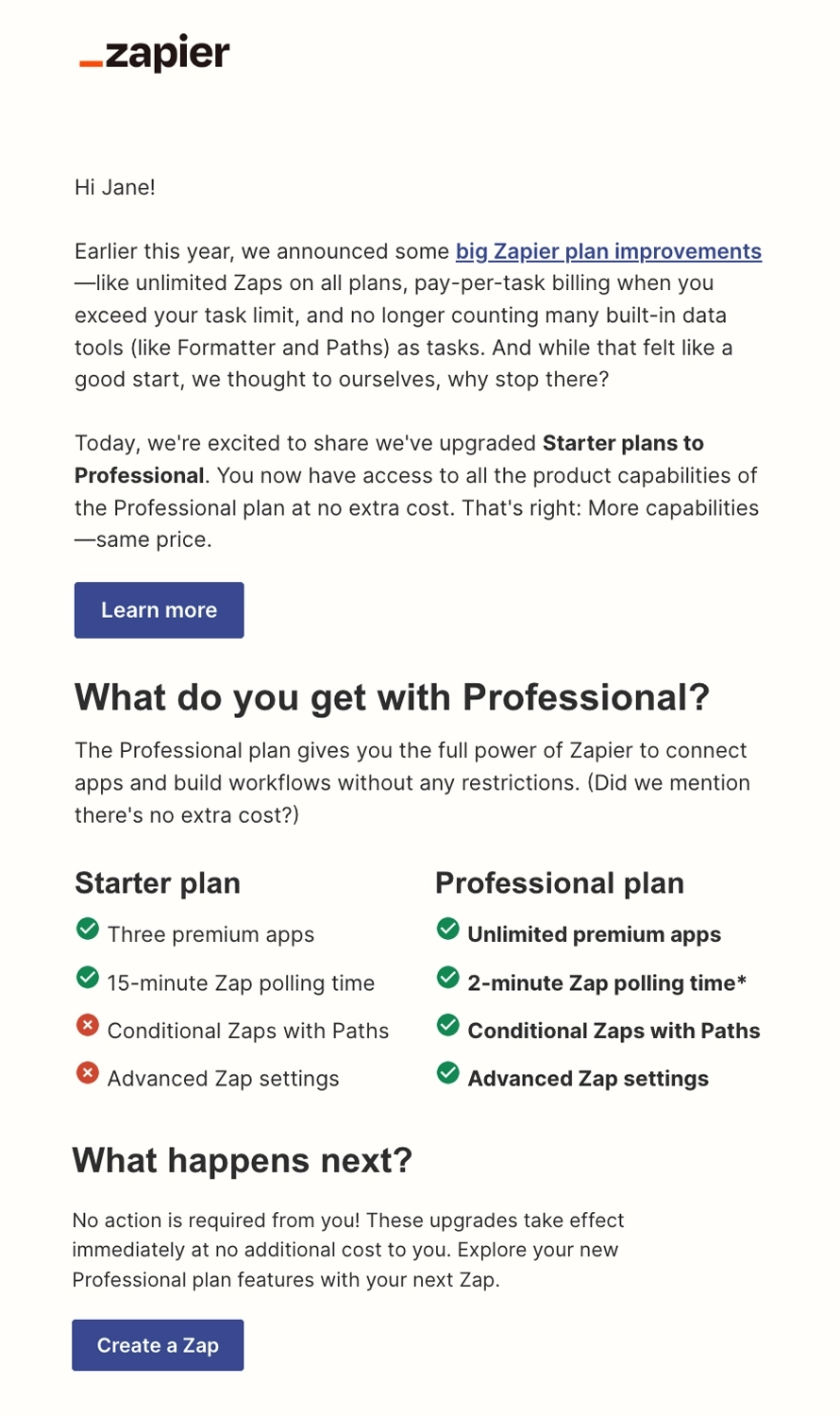
Zapier is a web automation tool that allows you to streamline your workflows and connect different web applications seamlessly.
In this email, Zapier lets the user know that they’ve upgraded the Starter plans to Professional plans without paying any extra fees. They show a comparison between the two plans so users know what changes they can expect.
We like that they included a “Don’t see these changes?” section in the email. This not only helps their own customer support team, but it also guides their users with troubleshooting.
27. 1Password
Subject: Action required: Unconfirmed users on your account will be billed for starting March 12th
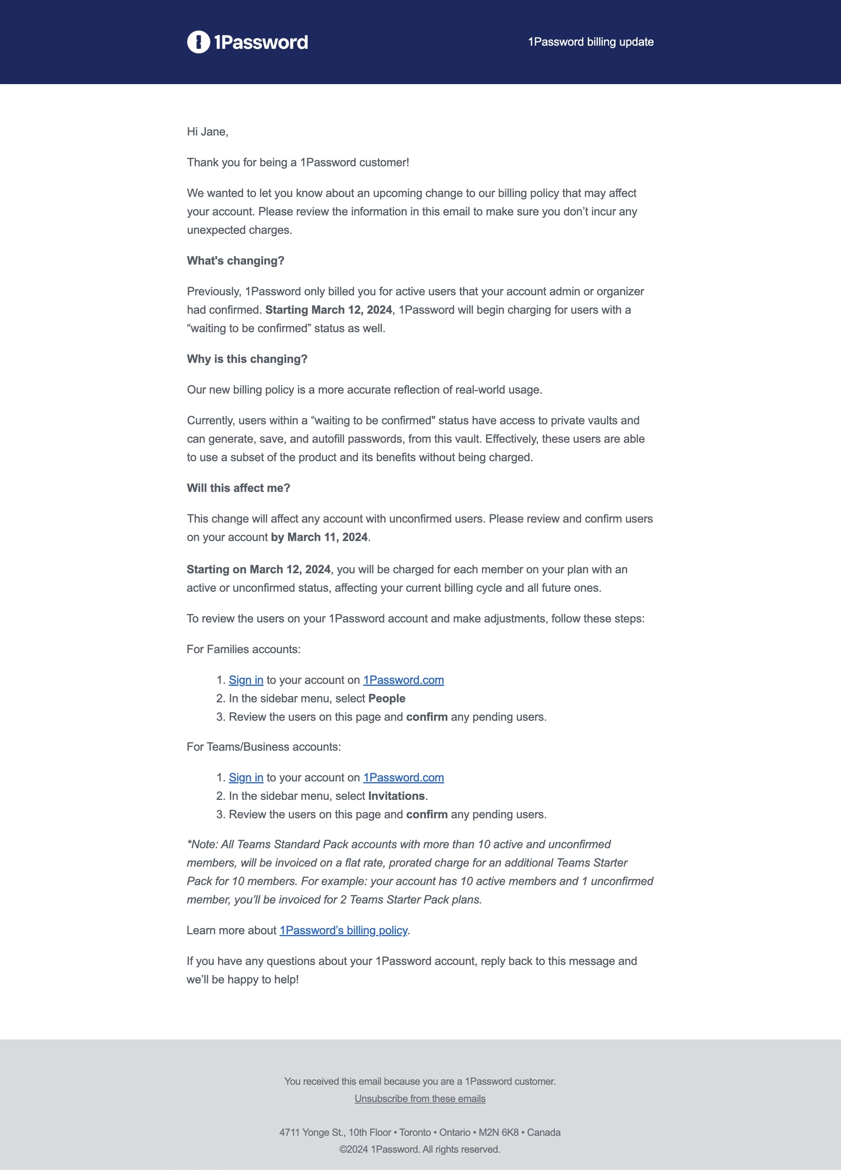
1Password is a password management platform.
Their pricing update email is divided into three parts that covers the essentials:
- What pricing change they’re implementing
- Why they’re implementing this change
- How this will affect the user and their account
We like that they highlighted the important dates: when the user should finalize their account details, and when the pricing changes will be implemented.
28. Descript
Subject: Important updates to your Descript plan
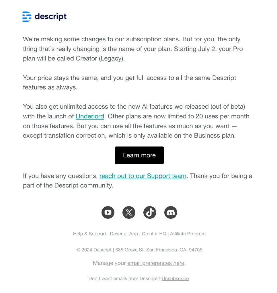
Descript is an all-in-one podcasting and video editing platform.
This email tells the user that they’re making a few changes with their pricing and what will happen specifically for their subscription plan:
- The Pro plan will now be called Creator (Legacy)
- There are no price changes for the Creator (Legacy) plan
- The user will still get full access to all features
- They will also get unlimited access to the newest AI features with Underlord
Here’s the email they sent for another pricing update the following year. Subject: Important updates to Descript plans
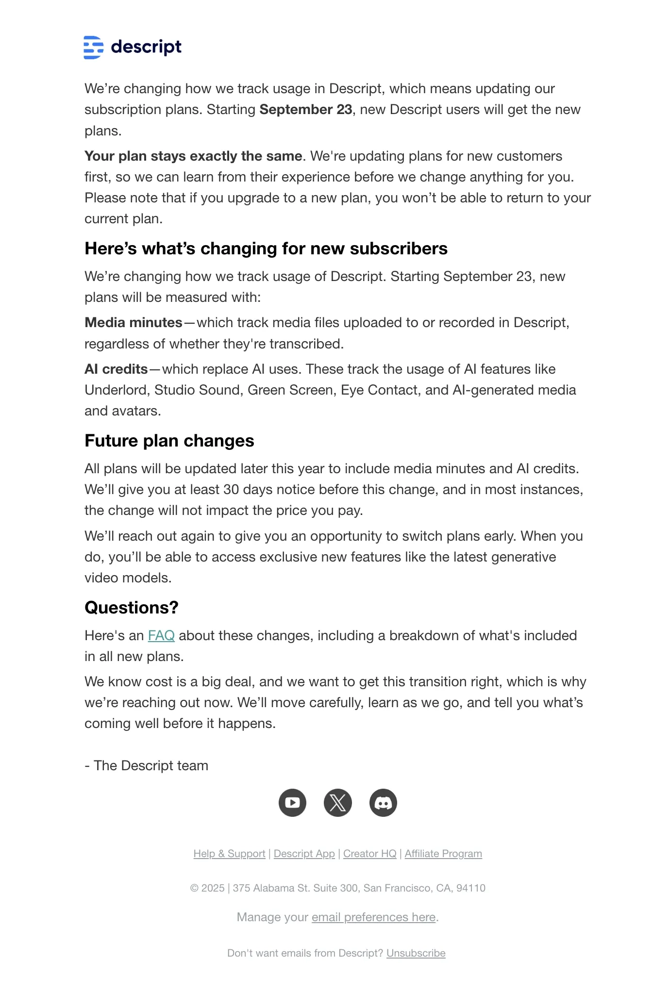
In this email, they tell the reader that this pricing update affects new users and will be implemented on September 23rd while plans for current paid subscribers won’t be affected for now.
The second section lists and describes what exactly changes for new subscribers, specifically how plans will be measured by media minutes and AI credits. The third section tells the readers that all plans will be updated later in the year and Descript will send a notice prior to implementing the changes.
The last section links to an FAQ page about these changes. Descript ends the email with an empathic message, saying that this change costs a big deal and they’re reaching out so they can get the transition right.
29. Notion
Subject: Important Changes Coming to Your Plus Plan
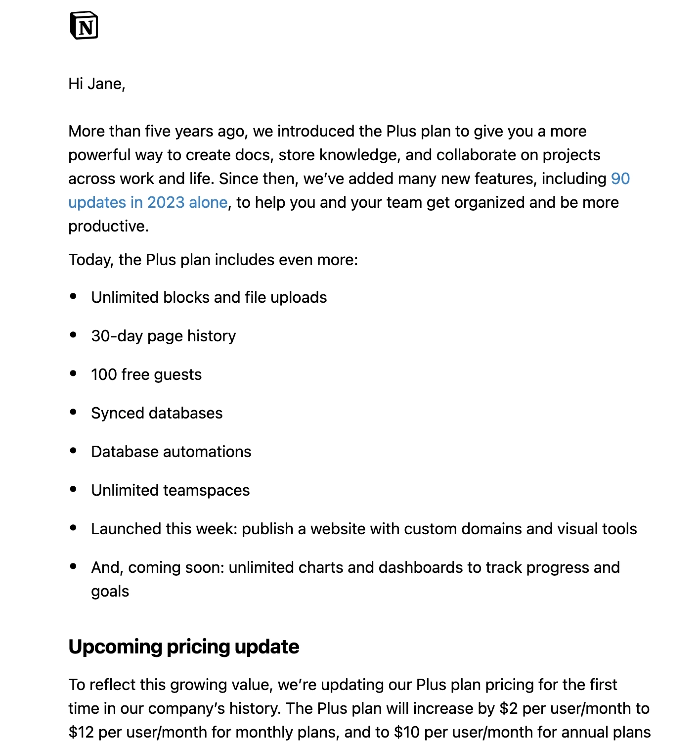
Notion is a freemium productivity and note-taking platform that lets you do task management, project tracking, to-do lists, and more.
In this email, Notion opens with reminding the user the value that their platform has been providing since the beginning. They then talk about how many updates they’ve rolled out in 2023 and enumerate the features that the Plus plan now includes, showing the user how much value they’re getting.
They then talk about their upcoming pricing update, stating that this is being done to match the growing value of the plan. This section includes all the important details which are:
- The amount of the price increase
- When the price increase will take effect for new customers
- They’re giving a three-month window for existing customers to switch to the annual plan so they can keep the current pricing
- When the price increase will take effect for existing customers should they decide to continue with a monthly subscription
Pricing is always a sensitive subject, so we think it’s a nice touch to end the email by thanking the customer for their business and that Notion will continue to make the product better.
What can be improved?
They could have formatted the amount of the upcoming price increase so the reader won’t miss this important information when skimming.
30. Stripe
Subject: Stripe Billing: product updates and new pricing
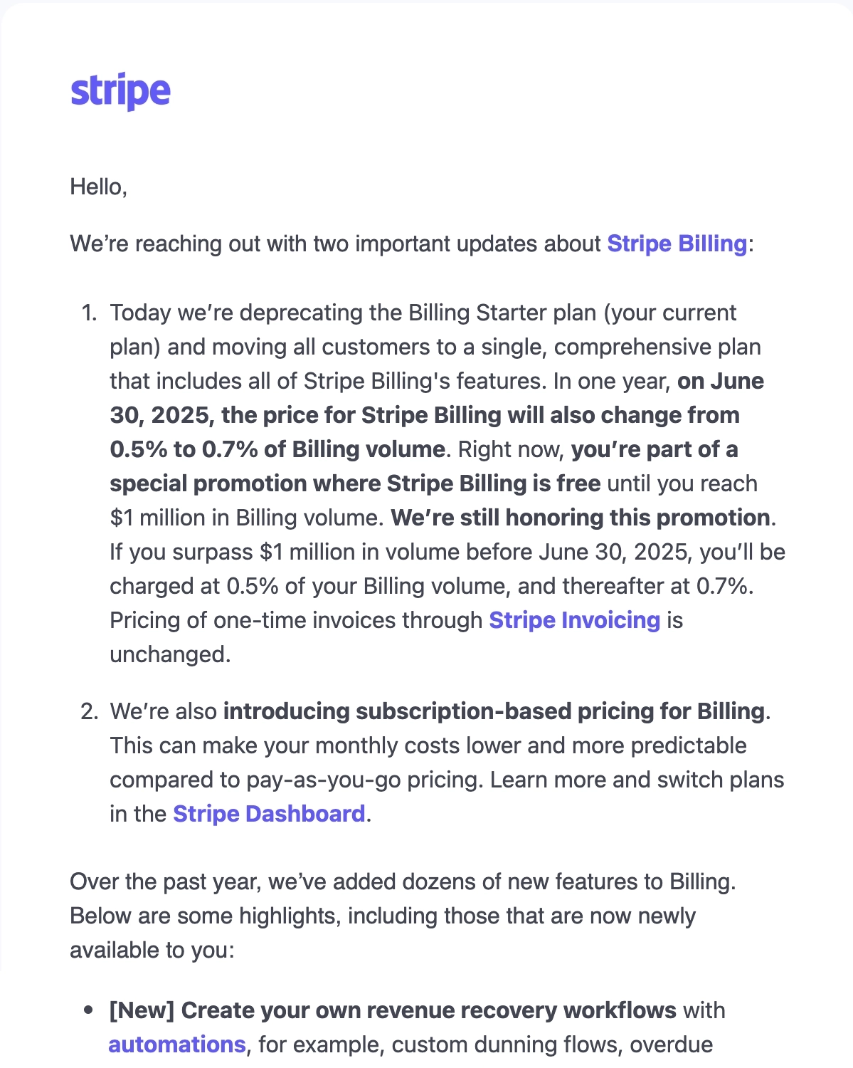
Stripe is a payment services provider that lets merchants accept credit and debit cards or other payments.
In comparison to the Notion example, Stripe’s email approaches it the other way around: talking about the pricing updates first before talking about the new features now available to the user.
What can be improved?
The first part of the email looks rather overwhelming. Splitting it into separate parts could be a better idea.
Closing words
It’s easy to criticize the emails from the outside. It’s a different story when it’s your own skin in the game, and your own customers at risk.
We hope these examples help you craft your own thoughtful announcement, when the time comes.
Good luck!
Don’t miss out on new articles. Subscribe to our newsletter and get your monthly dose of SaaS email marketing insights.