The end of year is a time to celebrate, review, and reflect on what you can do better next year. It’s also a perfect time to thank your users for their support. Year-in-review emails can help you nurture relationships with customers, placing them at the center of your story and your brand’s success.
Email is the perfect channel for this.
But how do you make it happen? Should you treat this as a newsletter, or send out custom reports?
In this post, we’ll go over the best practices for writing year-in-review emails, and share relevant examples to help you get started.
Don’t wait for the muse. Apply this step-by-step method to write high-performing email campaigns in hours, not weeks.
Why write a year-in-review email?
On average, SaaS businesses see a 66% open rate for their targeted email campaigns. Yet, 41% of subscribers skim emails.
So providing valuable content within your emails is mission-critical.
That’s what year-in-review emails are all about: recognizing your customers for what they’ve accomplished reminds them of how much your product or service has helped them. As a result, they’ll be more driven to accomplish even more next year. This keeps them engaged with your product, which reduces churn.
Year-in-review emails also share what you’ve accomplished as a business. Your customers will feel as part of this success, and remember why they chose your product in the first place.
Tips for writing your year-in-review email
Here are some best practices to follow when writing your year-in-review emails.
Gather data
Collect data on how your customers interact with your product.
For example, you could track the number of purchases, total savings, or the number of hours they spend using your service. Stick to 3 to 5 key metrics to keep it focused.
You can also take data from the department that provides customer support services to understand what customers are most satisfied and dissatisfied with your product.
Use this data to create personalized milestones. Spotify Wrapped is the epitome of using customer data to boost engagement rates. So, why not follow their lead?
Show gratitude
In your year-in-review emails, always include a token of thanks to let users know you appreciate andacknowledge their loyalty and what their business means to you.
Take it a step further and offer discounts or other perks to walk the walk.
Offer a glimpse into the future
Tease upcoming features, developments, or initiatives for the new year. Build anticipation and excitement for what’s to come.
It’s the perfect setup for future email marketing campaigns while simultaneously building momentum for the new year and sharing pricing updates.
Include visual elements for impact
Use popular color schemes, infographics, graphs, charts, or images to help customers visualize data points. This easy-to-understand format can make your information more engaging and easier to digest.
Recap new features
Summarize any new features you introduced during the year. Show how these features benefit users to encourage them to explore and utilize them.
Encourage social sharing
Get users to share their year-in-review experiences on social media. Provide shareable content or exclusive offers to increase your SaaS brand’s reach.
Tell a story
Emails that tell a story are more likely to engage customers. A remarkable brand story can generate a 20% increase in customer loyalty. The goal is to spark an emotional reaction in your customers that makes them want to take action.
Include a clear call to action (CTA)
Direct users to take a specific next step with clear CTAs. This might be to explore new features, access personalized milestones, or upgrade or renew their subscription.
Best year-in-review email examples
It can be tough to write a good year-in-review email if you don’t have anything to go on. So, we’ve rounded up the best year-in-review emails for your inspiration.
Check out some of our favorite examples below and why we love them.
#1. Buffer
Subject: You’re in the top 40% of Buffer users!
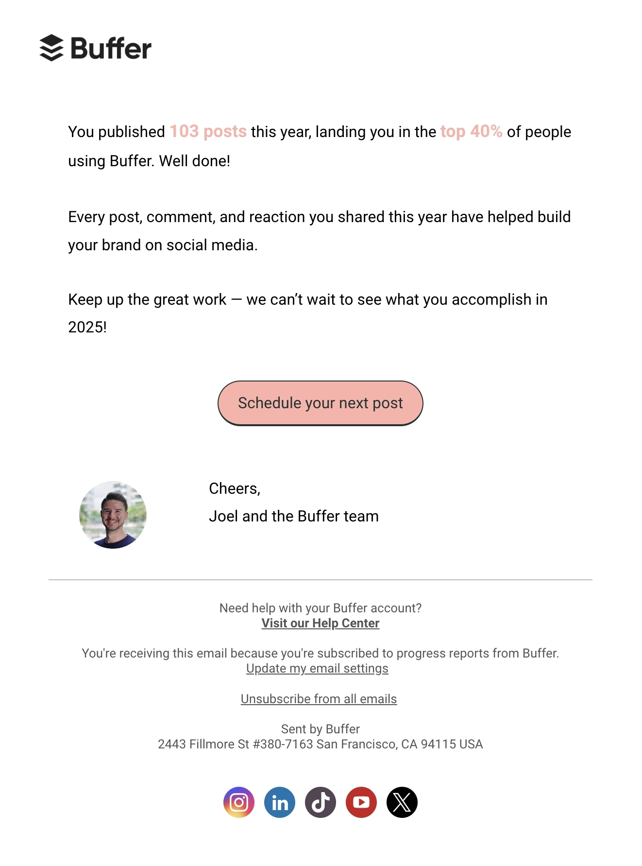
Main features of the email:
- Highlights customer milestone
- Clear CTA
Why we like it:
Buffer’s email is short and straightforward, focusing on the customer milestones for the year. They remind the user of how each post has helped build the brand (product value). The email ends by encouraging the reader to continue posting in the upcoming year and achieve more goals.
#2. Pitch
Subject: Pitch’s 2024 in review ✨ Enhanced analytics, interactive embeds, video editing, and more
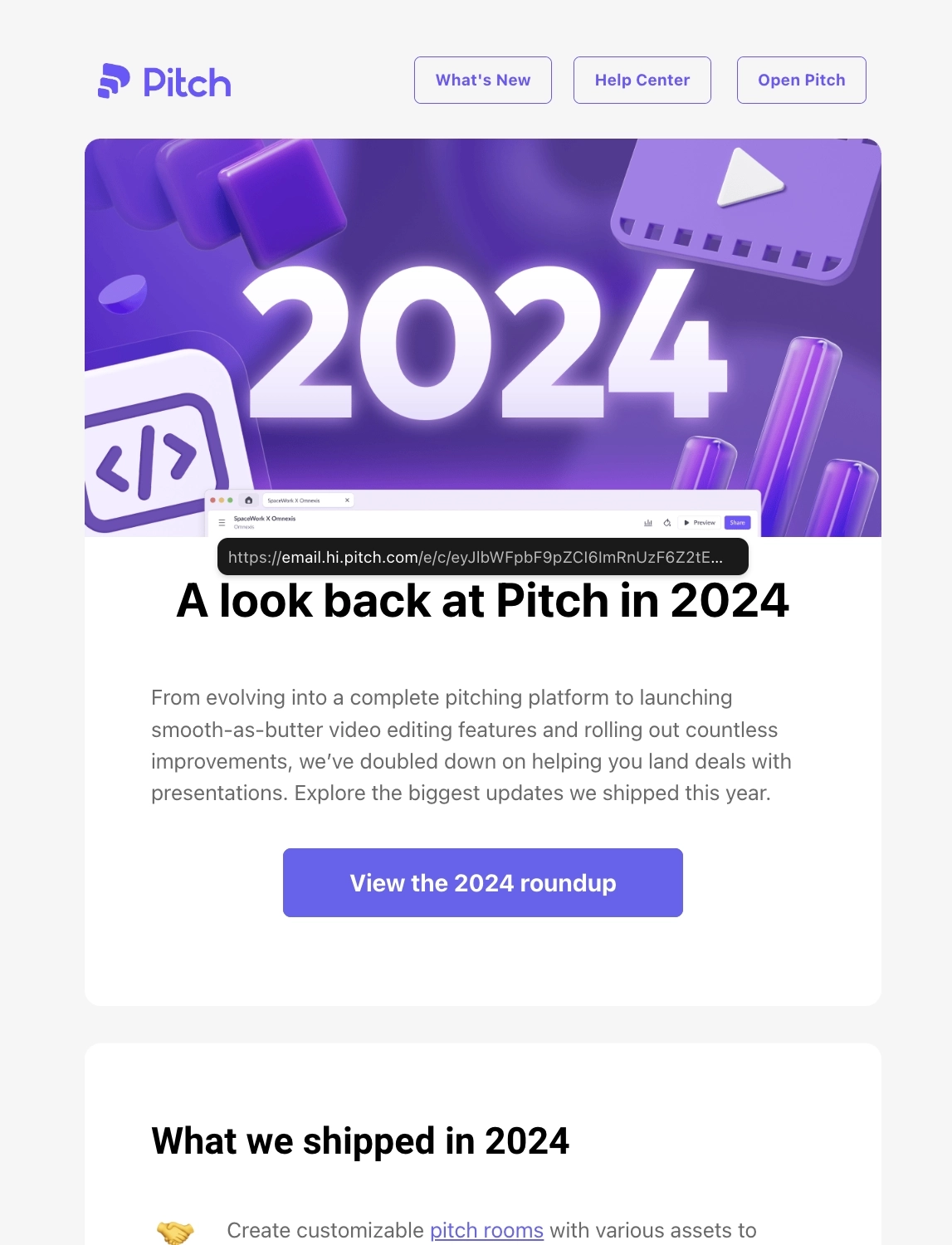
Main features of the email:
- Highlights product milestones for the year
Why we like it:
This email from Pitch focuses on their product milestones, listing the major features and updates they shipped during the year. They placed CTAs leading to the complete roundup should the reader want to know more about them.
They end the email with their commitment to build more exciting features for users in the upcoming year.
What can be done better?
Pitch could have included a section to thank the users for trusting their product.
Here’s the one they sent the year before.
Subject: Pitch’s 2023 in review ✨ Animations, analytics, AI, and more
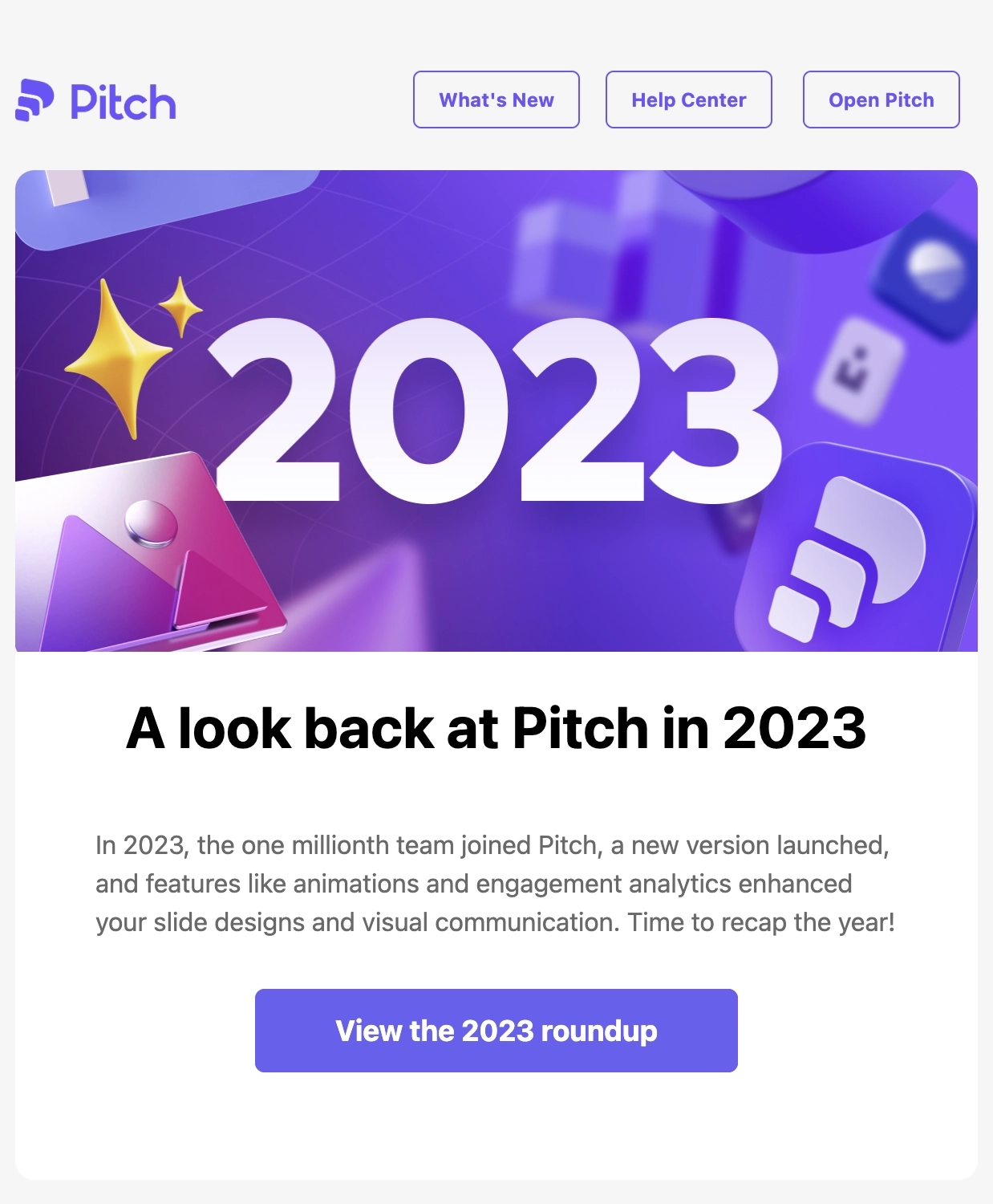
Main features of the email:
- Highlights the major product updates
- Has a dedicated section to thank the reader
Why we like it:
Similar to the previous example, Pitch’s year-in-review email talks mostly about the major product updates during the year. But instead of simply stating the feature, Pitch talks about each one and how it has helped the user with their tasks.
We also like that it has a dedicated section to thank the user but also highlighting a major milestone of reaching 1M teams in 2023.
#3. Koala
Subject: Looking back at 2024: a year of growth at Koala
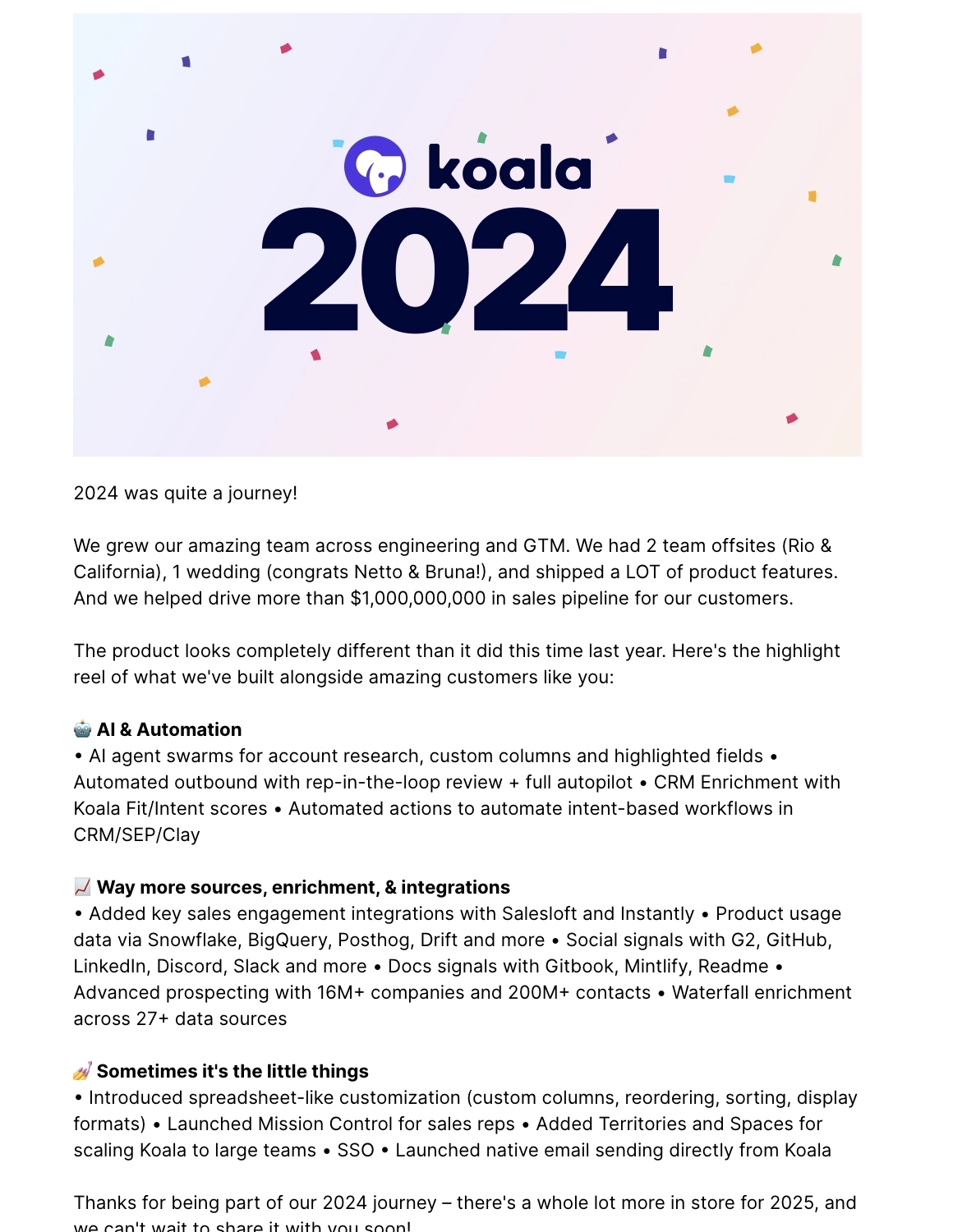
Main features of the email:
- Celebrates business and product milestones for the year
- Thanks the user for being part of their success
Why we like it:
Koala’s email talks about the business and product milestones for the year, and how their product helped drive revenue in customers’ sales pipelines. They do a rundown of the major features and updates they shipped during the year.
The email ends by thanking the user for being part of their journey and hopes to share more with them in the next year.
What can be done better?
A list format can make the highlights easier to skim.
#4. AIOSEO
Subject: 🎉 2024: A Year of SEO Wins Together (and a Big Thank You!)
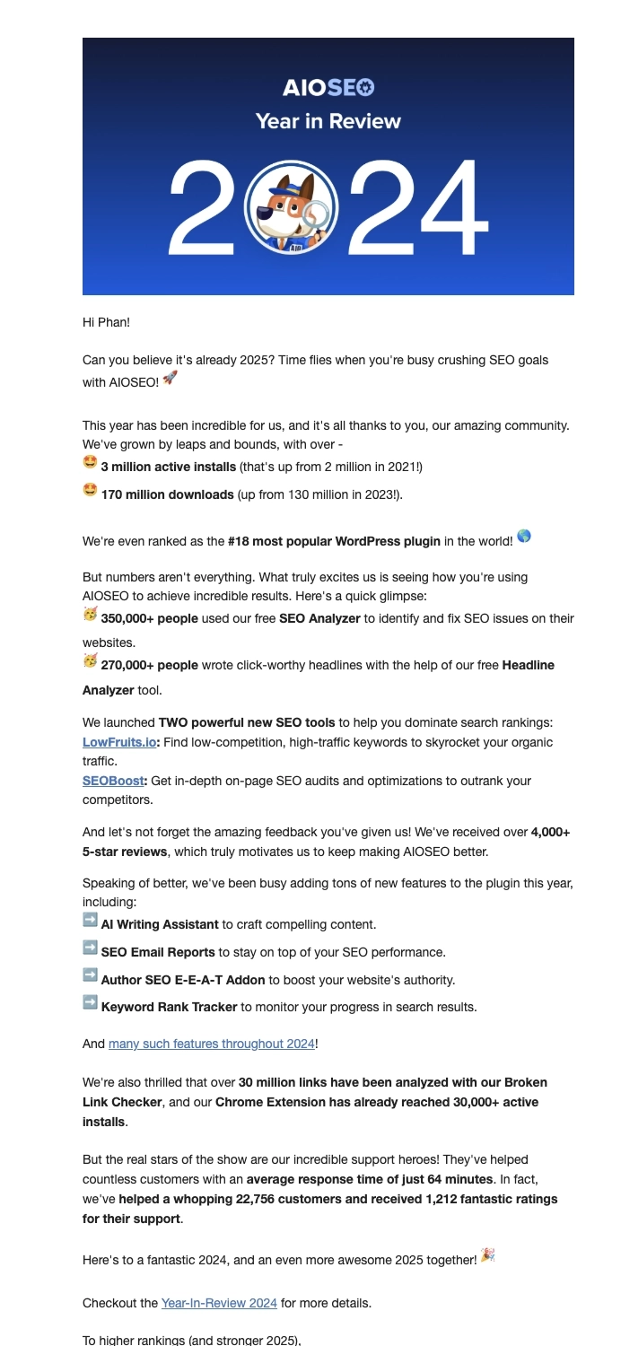
Main features of the email:
- Celebrates business and product growth
- Highlights product value
- Features and updates shipped during the year
Why we like it:
This email from AIOSEO starts off how their product grew in terms of active installs and downloads during the year, thanking the community for helping them achieve these milestones. The second section highlights the product value, showing how many users people have used their free tools.
The third section highlights the two new powerful SEO tools and other features they added to their plugin. The last section focuses on thanking their customer success team for their amazing work. AIOSEO included CTAs redirecting to their full year-in-review post should the reader want to learn more.
What can be done better?
Dividing the email into clearer sections would make it more cohesive and easier to read.
#5. Google One
Subject: [Name], your 2024 Google One year in review is here 🎉
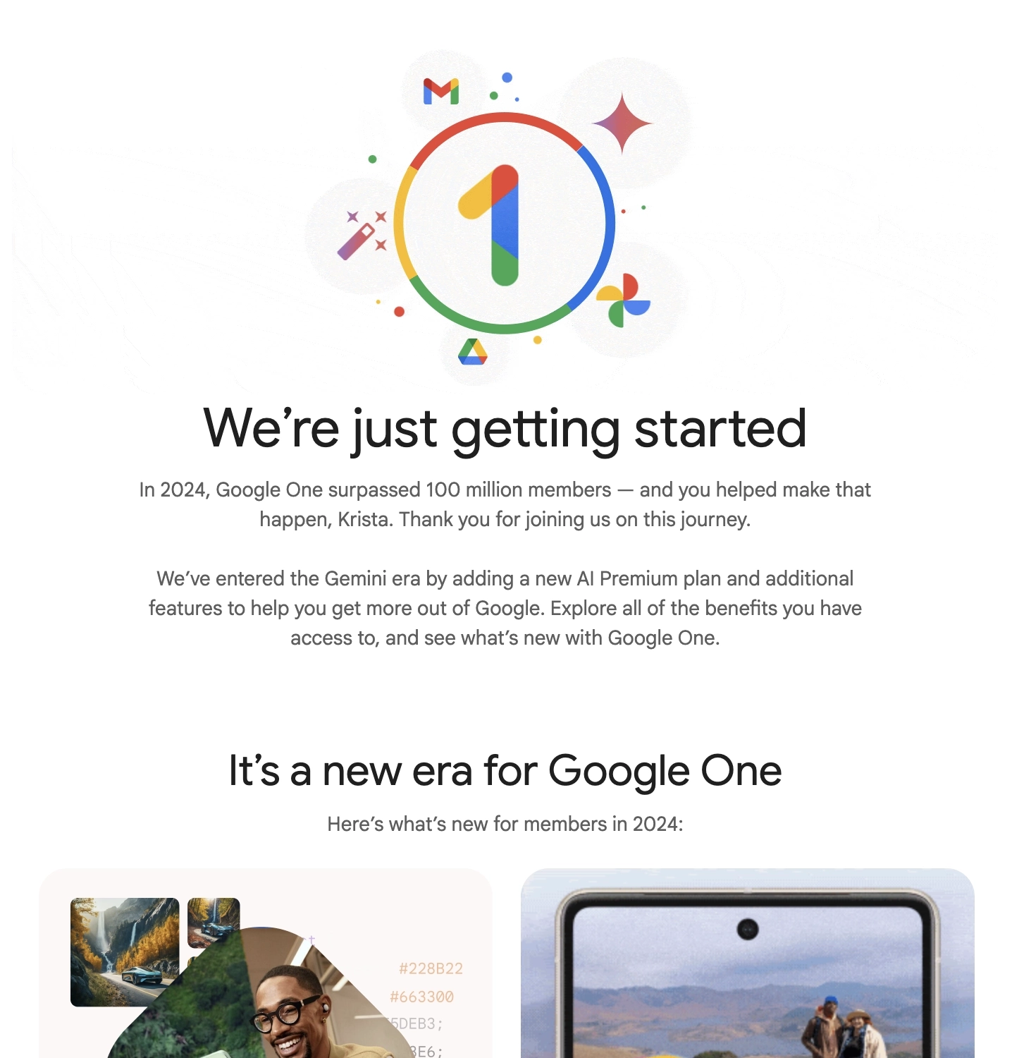
Main features of the email:
- Highlights features launched during the year
- Shows plan usage
- Upsells the user to unlock more features
Why we like it:
Google One’s email starts off by thanking the user for being part of their 2024 journey. The next section highlights the features they launched during the year in gallery form. Each major feature has a CTA to encourage the user to explore it.
The third section shows the plan usage, and a CTA to see plan options. The last section lists what features are available to the user with their current plan, and what they can unlock should they upgrade to a higher plan, ending with a CTA to upgrade to premium.
#6. Publer
Subject: Happy New Year and thank you for the remarkable 2024 🎉
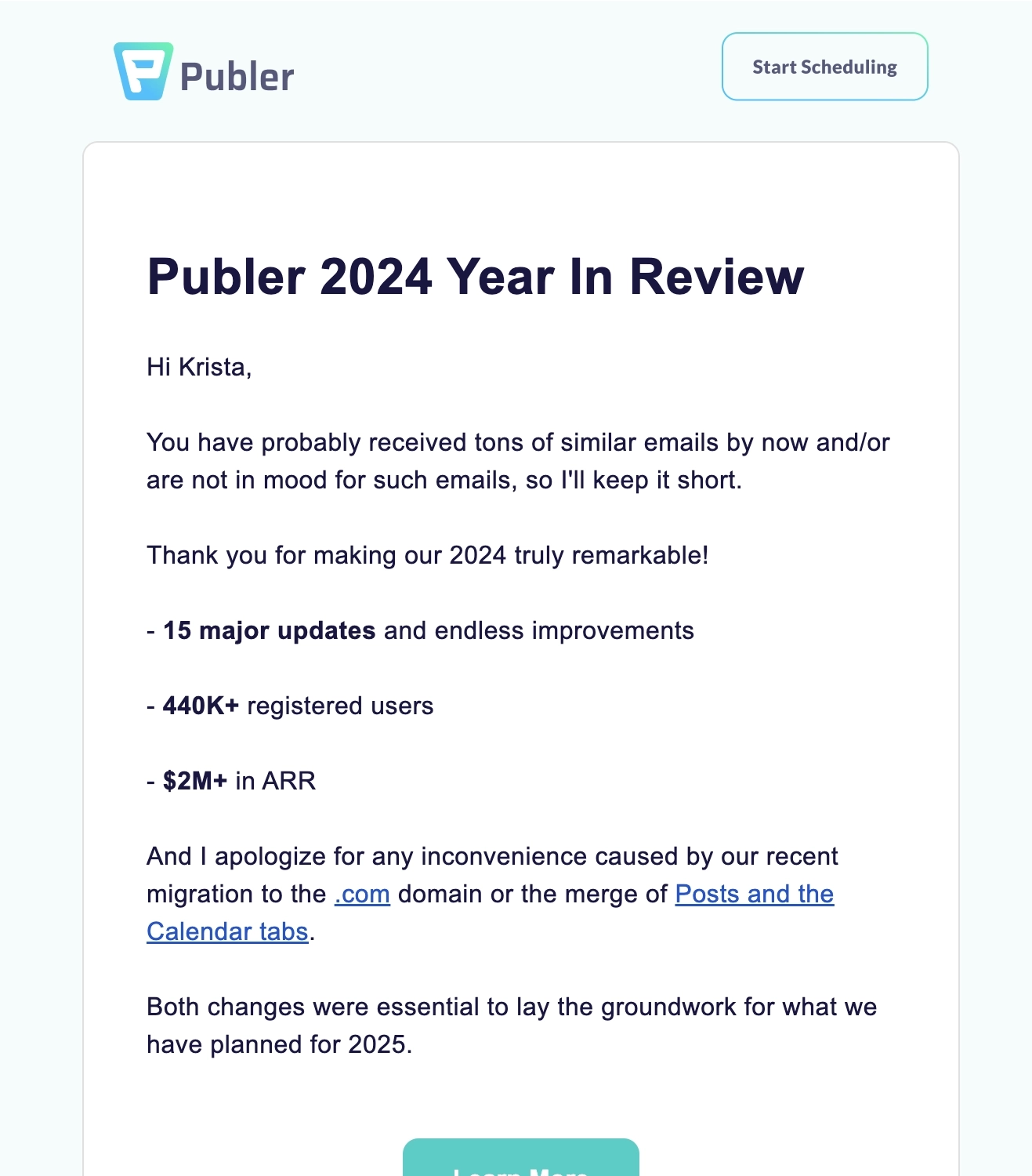
Main features of the email:
- Highlights business and product milestones
- Apologizes for the major technical issues experienced during the year
Why we like it:
Publer’s email is short and straight to the point. They do a quick rundown of why 2024 was remarkable for the platform, thanking the user for their contribution to their wins.
Publer also took this opportunity to apologize for the inconveniences caused during their domain migration and the merging of tabs. They also explained that these changes were necessary to improve the product further.
#7. Toggl Track
Subject: 👏 [X] 👏 time 👏 entries 👏 in 2024!
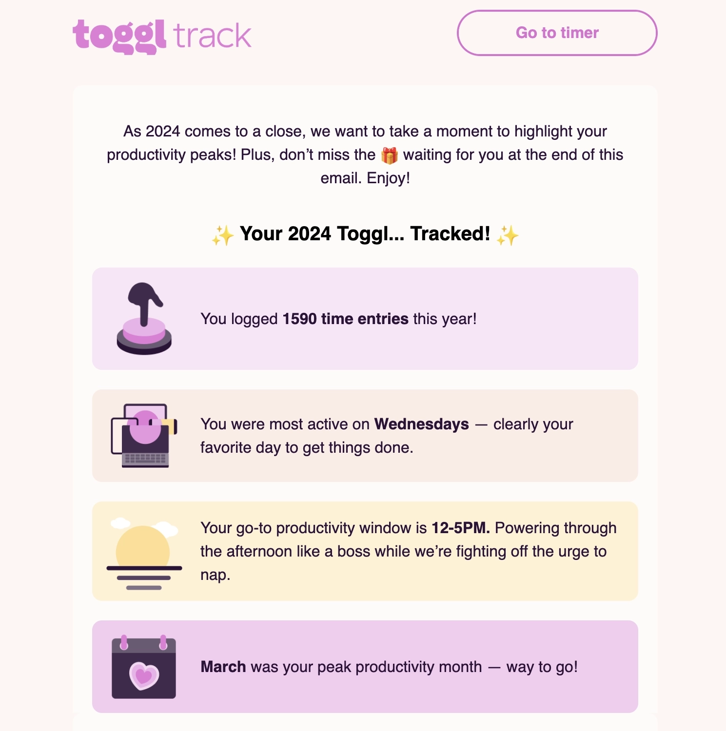
Main features of the email:
- Highlights customer milestones for the year (i.e. 1,590 time entires)
- Offers a discount so the user can do more next year
- Thanks the reader for using their tool
Why we like it:
This email from Toggl Track highlights customer milestones for their year-in-review email. Instead of just presenting the milestones, they take it a step further by adding a short blurb to each milestone to hype up and celebrate the customer’s productivity for the year.
They then offer a discount on their premium plans so the user can keep being productive in the upcoming year. Their email ends with a thank you and well wishes for the next year.
#8. Dreamdata
Thanks to Brendan Hufford of Growth Sprints for this example.
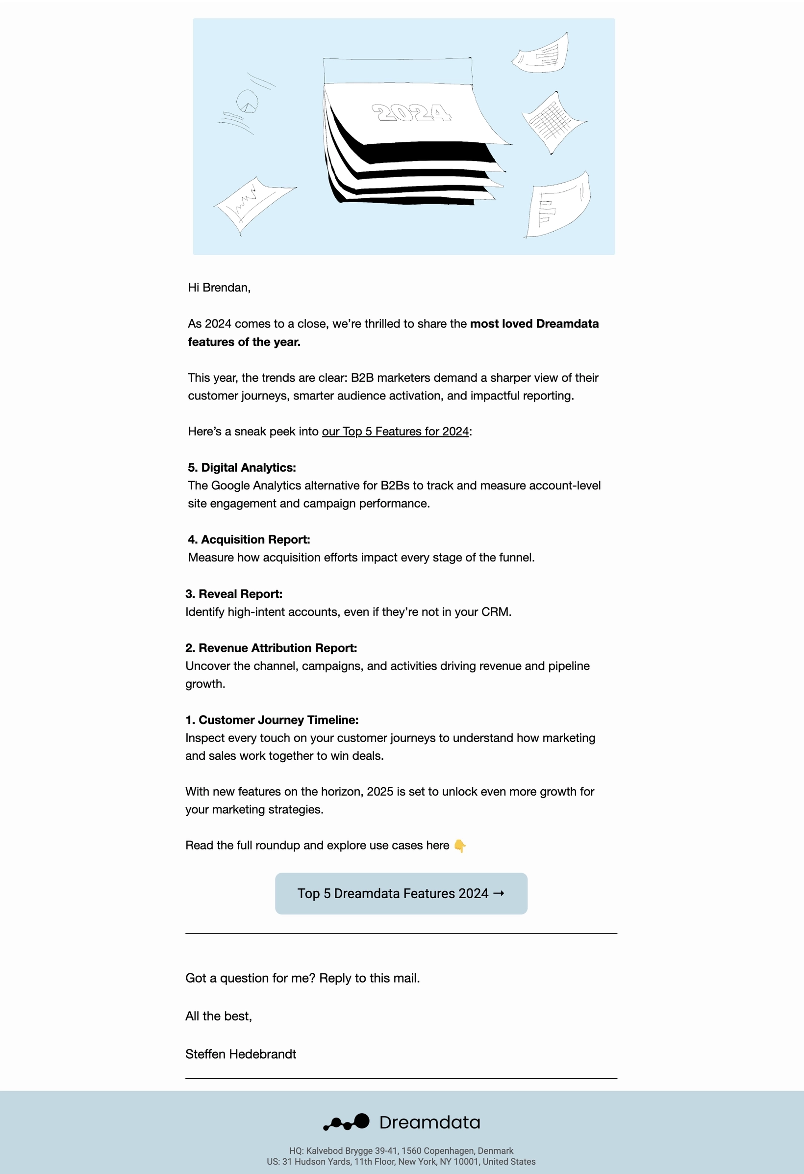
Subject: Your 2024 Dreamdata Wrapped: The Features You Couldn’t Stop Using 🎄
Main features of the email:
- Highlights the platform’s most loved features
- Clear CTA
Why we like it:
Dreamdata’s email gives a quick rundown about their Top 5 features for 2024. Each feature mentioned has a short blurb about what it exactly does so the reader can explore it if they are unfamiliar with the feature.
Should the user want to read more and explore use cases for the features, they have a clear CTA button that links to their full roundup. Dreamdata also made it easier for the reader to reach out to the founder should they want to ask questions.
#9. Equals
Subject: Equals in 2024
Main features of the email:
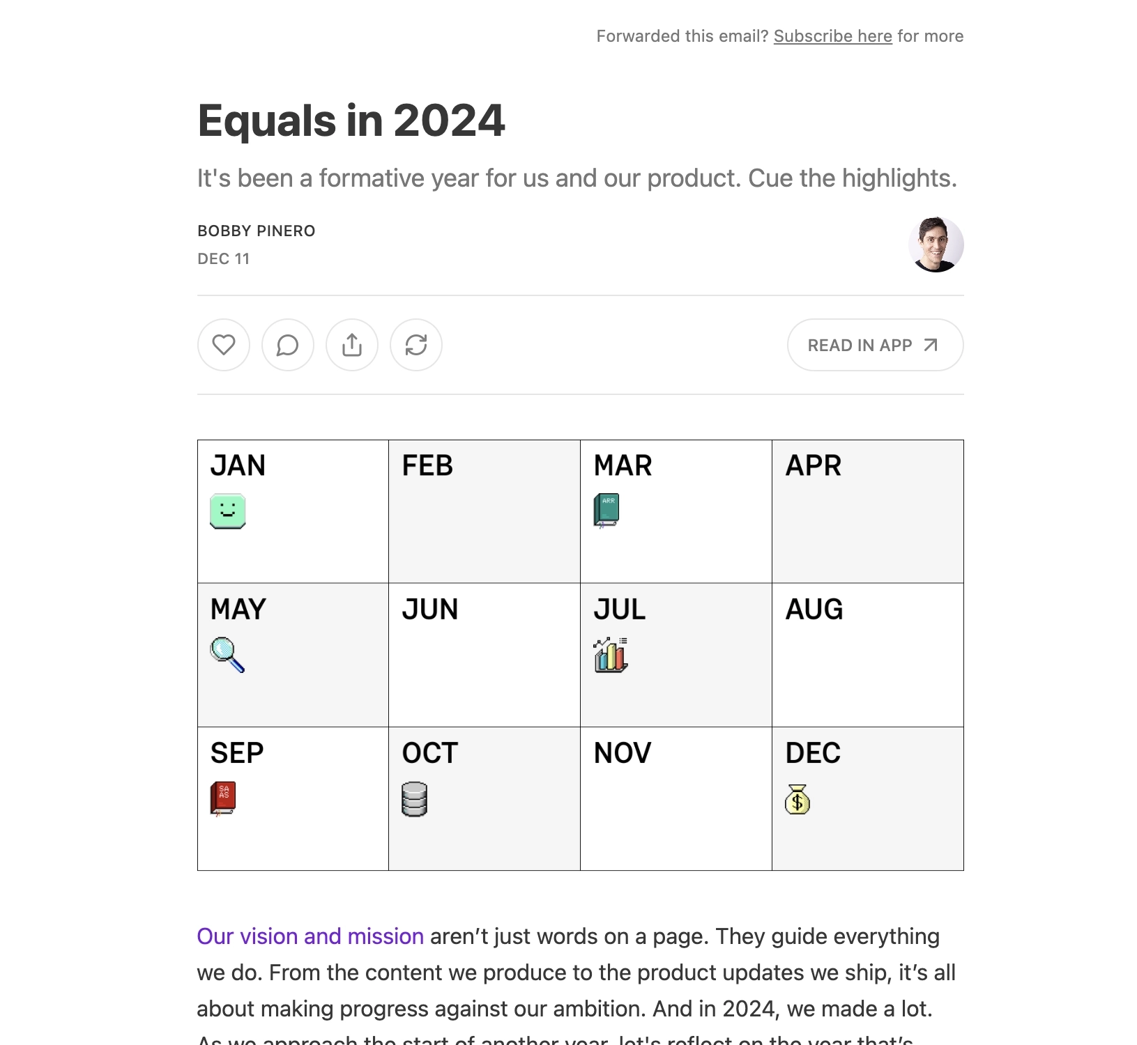
- Highlights company milestones for the year
- Uses visual elements to help illustrate milestones
- Links to relevant resources for each milestone
Why we like it:
Instead of just a quick rundown of their company highlights, Equals uses great storytelling to talk about their journey in 2024.
With the use of a graphic, the first section gives us a quick summary of their 2024 milestones, adding that these are all in line with their company mission and vision. The second section talks about their content-related milestones and their commitment to releasing more good stuff in the upcoming year. The final section showcases all their major product updates.
They end the email with a promise of improving their product to solve users’ problems in “new and better ways.”
#10. Stripo
Thanks to Oleksandra Khlystova for contributing this example.
Subject: Your 2023 in review
Main features of the email:
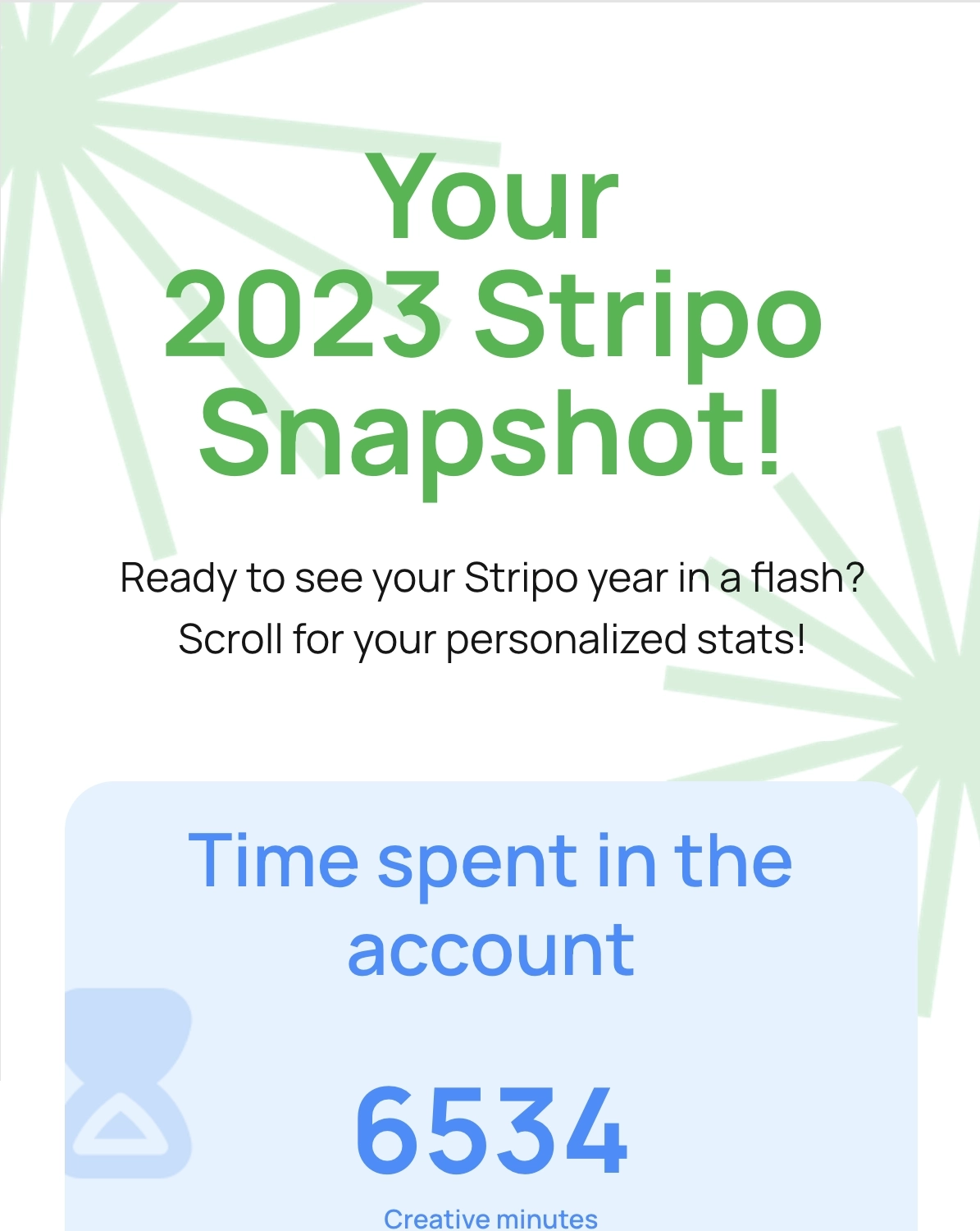
- Highlights customer milestones for the year (i.e. 6,354 creative minutes)
- Has a dedicated “thank you” section
Why we like it:
Stripo’s email highlights the user’s milestones for the year—a great way to remind them of the value they are getting with the tool. We also liked that they have a dedicated “thank you” section, which while simple, shows Stripo’s appreciation to the user.
What can be done better?
Instead of just having the “Contact Us” button, they could have added a CTA that encourages the user to continue using the platform or get them excited about the new year.
#11. FeedHive
Subject: Happy New Year 🎉 2023 Product Recap - New Features & Improvements
Main features of the email:
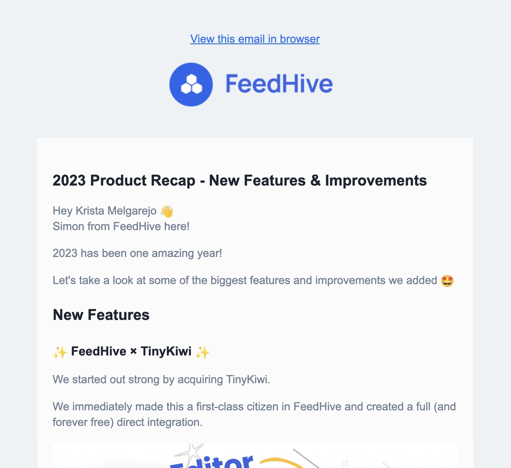
- Gives a recap about the new features rolled out during the year
- Ask the reader to give a review on G2
Why we like it:
Stripo’s email highlights the user’s milestones for the year—a great way to remind them of the value they are getting with the tool.
What can be done better?
Aside from wishing the user a fantastic year ahead, they could have also expressed their gratitude to the user. Remember, a simple “thank you” goes a long way in these emails.
#12. Loom
Subject: Your 2023 in Review: What Type of Loom Personality Are You?
Main features of the email:
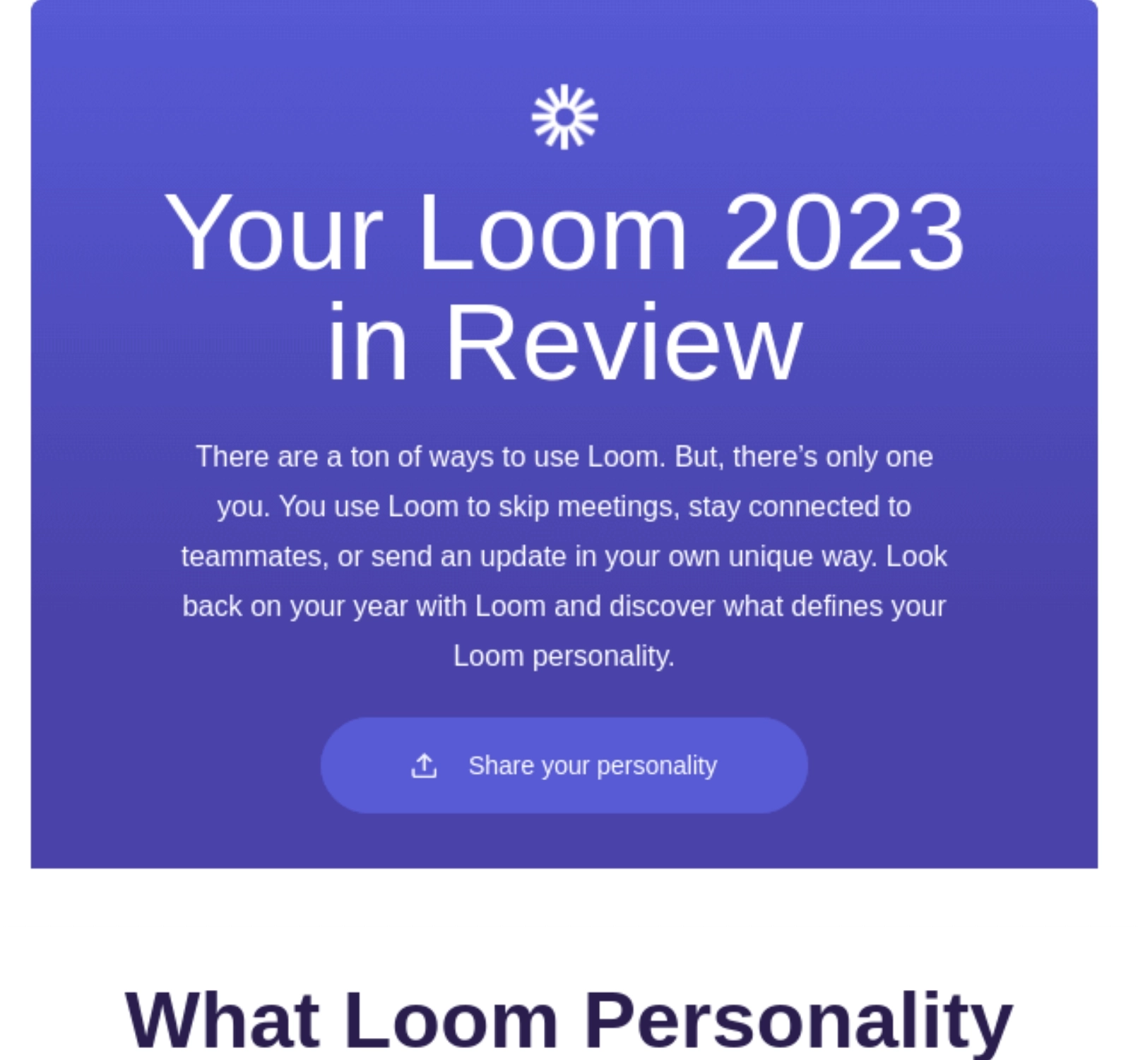
- Opening paragraph reminds user about how Loom solves their pain points
- Leverages customer data in a fun way by giving the user a Loom Personality
- Encourages social sharing
- Teases the user about what’s coming next year
Why we like it:
Loom went with a fun route in their year-in-review email. Instead of just presenting the user milestones, they took it a step further and assigned the user a Loom Personality based on the data.
It shares how many videos the user recorded, how many meetings the user eliminated, who they collaborated with the most, and more.
The email concludes with a CTA that teases the user about the new features coming next year.
#13. YouTube
Subject: [Username], your 2023 year in review is here.
Main features of the email:
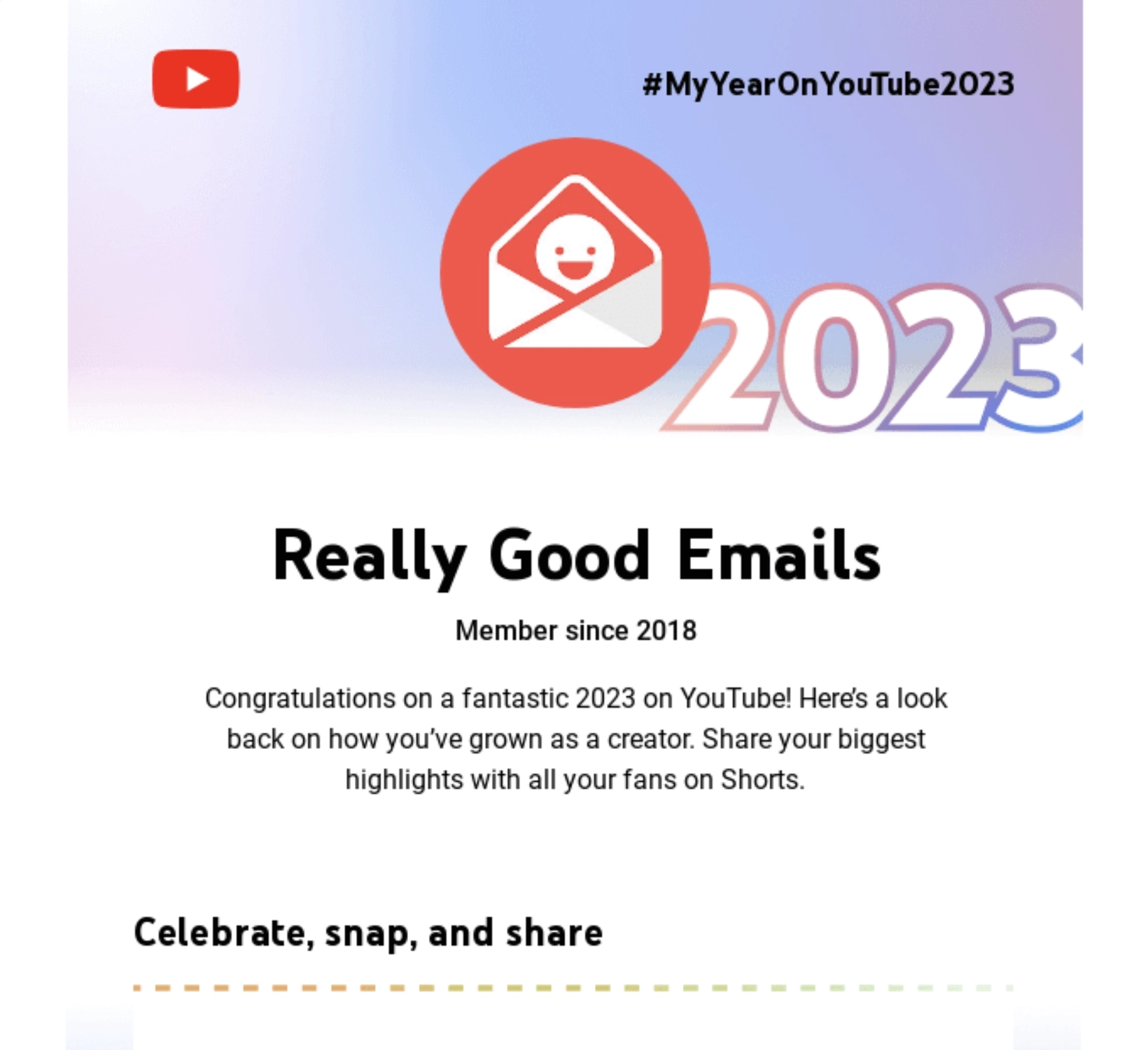
- Highlights customer milestones for the year (i.e. Top Video)
- CTA encourages user to post on the platform
Why we like it:
YouTube’s year-in-review email also highlights user milestones to remind them how they’ve grown as a creator. The CTA asks the user to create a Short so they could also thank their subscribers.
Don’t wait for the muse. Apply this step-by-step method to write high-performing email campaigns in hours, not weeks.
#14. Bubble
Subject: #BubbleWrapped: Our 2023 in Review

Main features of the email:
- Has a video embed that links to the founders’ message
- Links to a blog post should the user want to read the full founders’ message
- Highlights company milestones for the year (i.e. 3.6M Bubble apps)
Why we like it:
Bubble’s email focuses on company milestones and recognizes how the community members have contributed to these achievements. The CTAs encourage the reader to watch/read the full message so the founders could properly thank the user.
#15. Buy Me a Coffee
Subject: 2023 Wrapped Up!
Main features of the email:
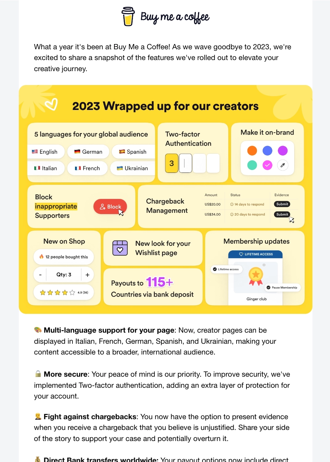
- Enumerates the exciting features and improvements rolled out during the year
- Graphics make it visually appealing and easier to skim through
- Asks the reader to share their suggestions for a better product
Why we like it:
While this email mainly talks about the product’s milestones, Buy Me A Coffee still thanks the reader for the support they’ve given to the product and the community.
We also like that it encourages readers to pitch ideas for new features and improvements for the next year.
#16. Bear
Subject: 🐻🎉 Celebrating 2023 with a big new feature: Quick Open
Main features of the email:
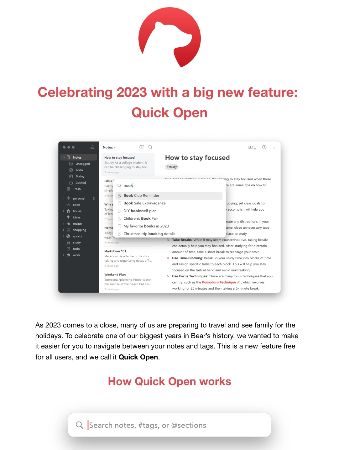
- Major feature announcement
- Copy talks about the holidays
Why we like it:
Instead of the usual feature and milestone roundup, Bear’s year-in-review email doubles as a feature announcement email.
This email talks about their new major feature, Quick Open, and how this will help the user easily navigate between their notes and tags.
#17. Netlify
Subject: New dev report, features, and integrations
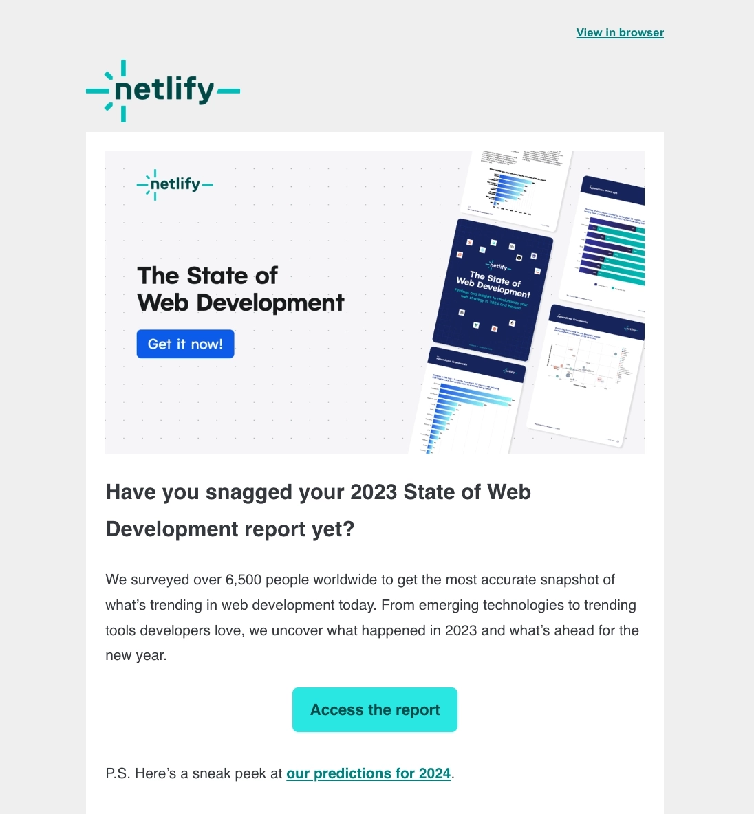
Main features of the email:
- Gives the user brief summary about the report
- Clear CTA
- Teases the user about their predictions for the next year
Why we like it:
Instead of putting all the highlights in the email body, Netlify’s year-in-review email gives the reader a brief summary of their State of Web Development report. Should the reader want to read the whole thing, they can easily download a copy through the CTAs.
As a bonus, Netlify also includes a link to their predictions for the upcoming year.
#18. Travelpayouts
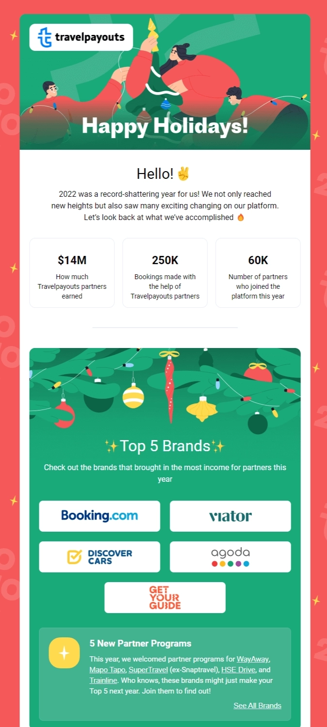
Main features of the email:
- Shares Travelpayouts’ accomplishments with key figures
- Major changes to Travelpayouts
- Includes holiday-themed graphics
- A clear, compelling CTA
Why we like it:
We like Travelpayouts’ year-in-review email because it shares the company’s achievements in a visually appealing way that represents the holidays, marking the end of the year.
The email also includes key figures (e.g., $14M, 250K, 60K) to illustrate Travelpayouts’ success in helping partners increase bookings and generate revenue.
This reminds users about the platform’s benefits and reinforces why they chose Travelpayouts in the first place. They also highlight major changes to the platform, including a URL shortener, an antibot filter, and an improved referral program.
The email content encourages customers to visit the Travelpayouts website to read more about the changes.
#19. CoSchedule
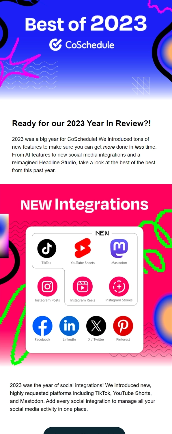
Main features of the email:
- Builds excitement and anticipation
- Shares new features and updates
- Encourages users to take action
Why we like it:
One thing we like about CoSchedule’s year-in-review email is that it’s short and to the point. People don’t want to read through a long email just for a recap of the year. The fact that this email gets the job done in just a few words makes it more likely to engage readers.
Plus, the language is highly engaging to make users feel excited about the year to come.
Then, it gets straight to the meat of the message: new social integrations. That’s what people use the platform for, so they’re eager to see what’s changed and why they should stick around.
CoSchedule ends the email with a CTA that compels users to integrate more social platforms.
#20. SiteGround
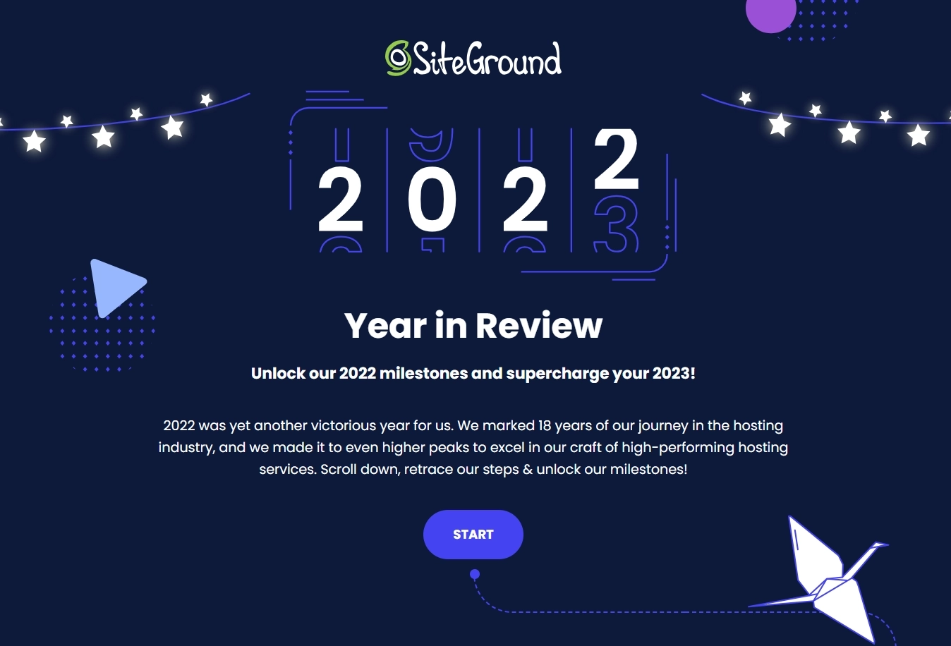
Main features of the email:
- Shares SiteGround’s milestones
- Includes a simple CTA
Why we like it:
Even though it’s simple and brief, SiteGround’s email is a prime example of how to update users without a long, complicated email.
It mentions how much the company has accomplished with high-performing hosting services.
The email creates a sense of momentum with the CTA, “Start.”
#21. Jasper
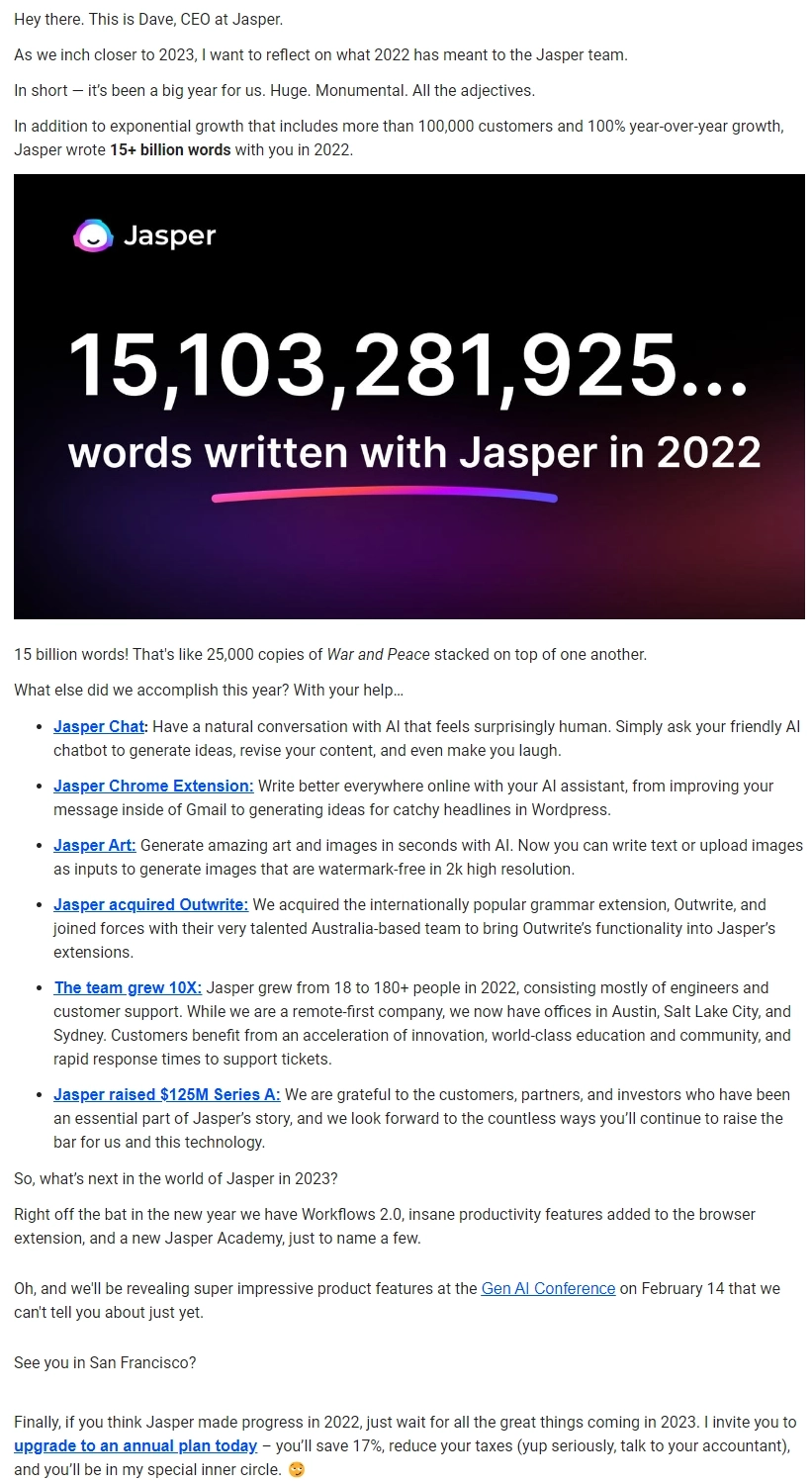
Main features of the email:
- Uses figures to show the growth of the Jasper platform
- Includes insights into how the customer used Jasper
- Shares a message from the CEO for impact
- Creates a personal connection
- Recaps new features
- Includes a clear CTA
Why we like it:
In this year-in-review email, Jasper’s CEO introduces himself in the first line, which creates an immediate personal connection.
Then, he talks about the number of customers Jasper has gained and shares how many words the subscriber wrote using Jasper (e.g., 15+ billion).
The email is also effective because it recaps the new features they introduced during the year and shares a sneak peek of what’s to come. It includes a CTA to upgrade to the annual plan to save money on the subscription.
#22. AllTrails
Subject: It’s that time! The 2022 Year in Review is here
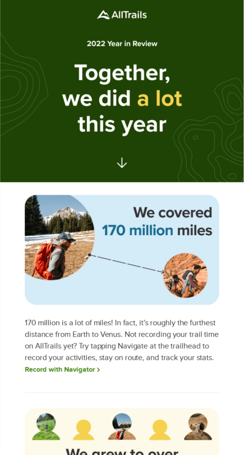
Main features of the email:
- Uses numbers to illustrate accomplishments (e.g., 170 million miles)
- Builds a sense of unity with language (e.g., “Together, we…”)
- Shows growth (e.g., grew to 46 million members)
- Includes personalized CTAs
Why we like it:
AllTrails hits the mark with its year-in-review email because it makes customers feel a part of the company’s achievements by showing them how many miles they’ve traveled and reminding them that they’re members of a huge outdoor community.
It also includes personalized CTAs for different users (e.g., “Record with Navigator” for people who aren’t recording their trail time and “File trail-goers like you” for people who want to connect with others).
#23. Webflow
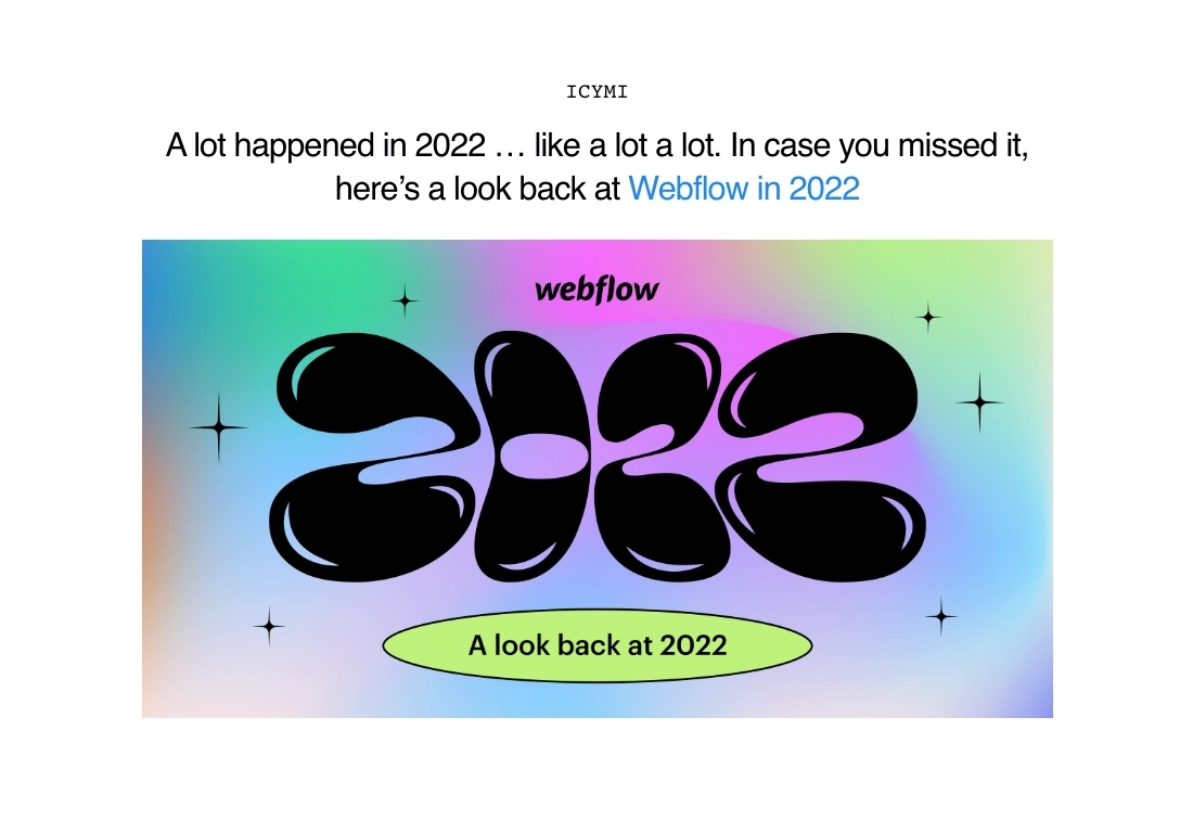
Main features of the email:
- Teases the user and entices them to click the CTA to learn more
- Visually pleasing
Why we like it:
It may sound counterintuitive, but Webflow hits the mark with its year-in-review email because the email doesn’t include more details and only teases about the roundup.
This encourages subscribers to click the CTA (e.g., “A look back at 2022”) so that they don’t miss out on what happened during the year. The fear of missing out (FOMO) is what makes the email so effective.
#24. Product Hunt
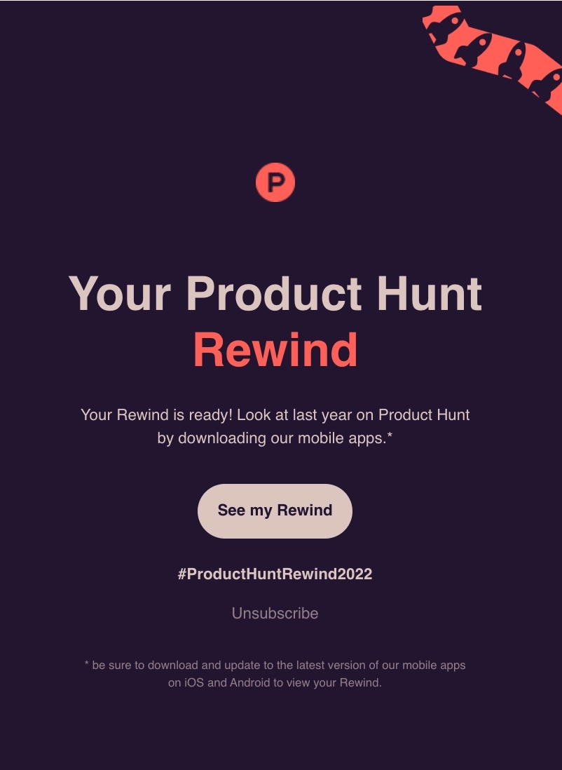
Main features of the email:
- Teases the user and instills FOMO
- Includes a compelling CTA
Why we like it:
Product Hunt’s email is very similar to Webflow because it encourages users to click the CTA to look at the previous year’s Product Hunt Rewind by downloading their mobile apps.
#25. Coda
Subject: 2023 Year in Review: Documenting the delightful

Main features of the email:
- Features customer success stories and each one’s personal stats on the platform
- CTAs to encourage the reader to try out a feature
- CTA to register for their virtual event
- A dedicated thank you section to end the email
Why we like it:
Coda creatively used their customer success stories to highlight how certain features have helped each one. After the end of each story, it encourages the reader to try out the feature themselves.
We like that the email ends with a section that thanks the reader for their support and invites them to a virtual event to get a sneak peek of what’s to come in the next year.
#26. Wise
Subject: Here’s how we wrapped up 2023
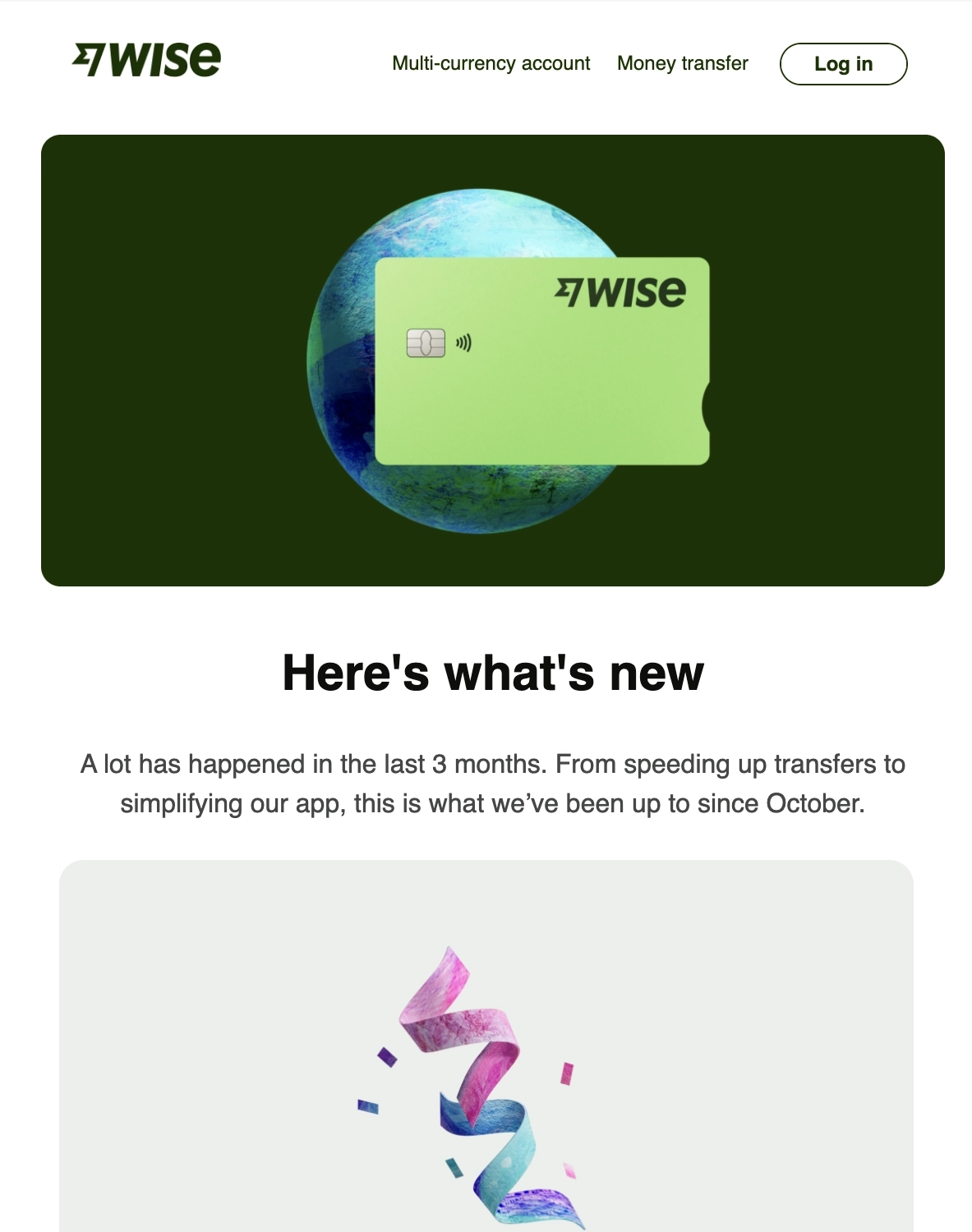
Main features of the email:
- Highlights the major updates and improvements of the quarter
- Gallery-type layout that makes it easy to skim
Why we like it:
Wise sent this end-of-year roundup for the last quarter of 2023. It features all the major updates and improvements they rolled out during the period. Because it’s presented in a gallery-type layout, it makes it easily skimmable.
Should the reader want to read more about their updates for the quarter, the CTA leads them to the report on their website.
And here’s their year-in-review email that focuses more on customer milestones.
Subject: Here’s how your 2023 adds up

Main features of the email:
- Highlights customer milestones for the year (i.e. £147 saved in fees)
- A clear CTA section
Why we like it:
This email is composed of short but sweet sections that highlight customer milestones. By doing so, Wise reminds the user of their platform’s value and how it compares to other forms of international money transfers.
They nicely wrap up the email with a clear and well written CTA section that encourages the user to save even more in the coming year.
Time to write your own year-in-review
SaaS is all about providing value. That’s exactly what year-in-review emails aim to do.
When you recap the year with key product updates, new features, and striking visuals that show and don’t tell, you boost customer engagement with your product and re-activate interest in inactive users.
So show gratitude to your loyal customers, highlight their milestones, and showcase how they’re a big part of your achievements in your own year-in-review emails.
Don’t miss out on new articles. Subscribe to our newsletter and get your monthly dose of SaaS email marketing insights.


