
Unlike other pages on a website, landing pages are designed to achieve one goal: to get users to take action. Having worked with over 100 SaaS companies on their landing pages, Josh Garofalo of Sway Copy sums it up pretty well in this definition:
“Landing pages are the web pages that are really close to the sign-up, sale, or upsell.”
This singular goal makes it an effective asset to increase the conversion rates of marketing campaigns. According to this report, the average conversion rate for SaaS landing pages is around 2.9% while the best converting ones are at 24.2%.
So how exactly can you improve your landing pages?
Josh and Jane give out some teaching moments as they dissect several SaaS landing pages. Watch the full recording of the teardowns, or read on for the bite-sized learnings and best practices.
Don’t wait for the muse. Apply this step-by-step method to write high-performing email campaigns in hours, not weeks.
25 best practices for your next SaaS landing page
#1. Tell the category story
Many companies fail to tell their “category story” in their landing pages. In crowded spaces with a lot of competition, it’s not enough for companies to merely get into their customers’ decision-making “sets.” Not only you need to show that you are good enough to be in the decision set. You need to show why you’re the only choice, and why other companies aren’t the choice.
This is what Josh calls the “category story.” Companies like Fathom Analytics and hey.com do a good job at it with their homepages.
“Really show them that you understand their specific pain points, and that you solve them in a way that these other companies are just never going to do. Just make that crystal clear.”
#2. Use design to communicate the value
Instead of describing what your product is all about through copy, you also need to convey the quality and the brand value through design (website design, logo design, etc).
“If you’re targeting something like a creative agency, your site should be the envy of your customers. They should look at your site and be like: ‘Wow! I want my site to look like that.’ I think that’s really important because it reflects it.”
#3. Great guarantees deserve being in the headline
If you have a great offer, a great guarantee, and can actually deliver on it, then they deserve being in the headline of your landing page.
“In copywriting, there’s nothing more powerful than a great offer mashed with a great guarantee. That’s why you see it in all of those infomercials. It’s extremely powerful. So if you are able to actually back that up, we’ve got to get that into the headline and subhead.”
#4. Be specific in your headlines if you can
Can be improved:
Being among the first things your customers see when they land on the website, headlines should be as specific as possible.
Josh explains what can be improved in this headline:
“This headline is a little bit vague, and at the bottom I see a word or a phrase that should probably include an ecommerce help desk. I imagine this is what people are looking for when they find you. And if that is correct, I would include that in the headlines. As soon as someone lands on this website, they know exactly what type of software they’re looking at here.”
However, this depends on the company’s direction if they want to go deep into a specific niche or if they want to broaden their horizons.
#5. Don’t be afraid to go deep into your niche and use their language
Often, bootstrapped Saas companies will call out their very specific niche, but the copies on their pages are very broad and generic.
Companies shouldn’t be afraid to get really specific and deep into their niche to target their ideal customers. While this might take more words, this will pay off if you’re speaking to the right people while using the words they care about.
“Anytime you see an opportunity to make your copy more specific to the people you’re targeting, definitely go for it.”
#6. Say the important things multiple times, in different ways
When writing copy, Josh advises repeating the most important things many times in different ways because users aren’t taking it all in at once.
“They’re not reading this like a storybook and so they’re skipping around. If they skip around, you want to make sure that they will definitely get the most important.”
#7. De-emphasize negative language
Can be improved:
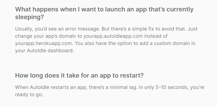
Josh suggests de-emphasizing the use of negative language. However, this doesn’t mean omitting the truth from users. Instead, you’re just not putting the spotlight on these negatives.
“So for example, as a developer, I probably don’t want to hear, ‘usually you’d see an error message.’ Cut that and just change it to ‘change your app’s domain to your app.autoidle.com instead of your app, to avoid any error messages.’ Same thing with the next section. I think we can make the sound a little bit better by cutting out some of the negative language and just saying: ‘It only takes five to 10 seconds for Autoidle to restart an app’ which is still accurate.”
#8. Make sure you’re using terms correctly
When writing landing pages copy, make sure you’re using terms the same way as your potential users. To do this, Josh advises companies to get in touch and interview customers.
“Make sure simple means what you think it means. I think you’re trying to say it doesn’t include a whole bunch of features that you’re not going to use and a long learning curve. While people might see this as something they’re going to quickly outgrow. And so they might as well just go with the more complicated solution now, and grow into it, versus having to switch a year or two from now.”
#9. Don’t introduce doubt if you don’t have to
Can be improved:
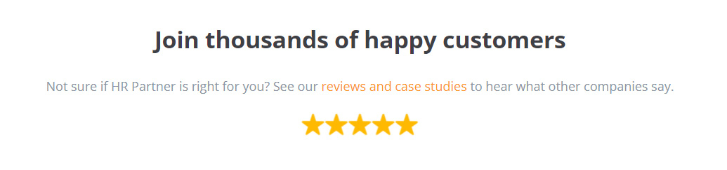
Landing pages are designed to build confidence in your brand, which is why Josh advises avoiding introducing doubt if it’s unnecessary.
“Don’t introduce doubt if you don’t have to. I don’t think there’s any reason for us to assume that, we have to talk about them being ‘not sure’ if HR Partner is for them. Cut that out and go straight to ‘see reviews and case studies’.”
#10. Highlight your customers’ pain points and present solutions
Can be improved:
Showcasing product features is an important part of SaaS marketing. But instead of simply listing them, why not go a little further and show how they address your customers’ pain points. After all, good marketing is showing how you can solve customers’ problems.
“I’d want to go a little bit deeper on the story and focus on those specific features. And show them that I understand their problems, their pain points, and high-level solutions to those.”
#11. De-risk the click
Good example:
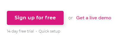
When setting up CTAs, Josh advises telling users what will happen next after the click.
“De-risk the click. Tell me what’s on the other side of it. How long is this trial? Is it full-featured? Am I giving you my credit card? That can help just make it more predictable about what’s going to happen next.”
#12. Highlight your main call to action
Can be improved:
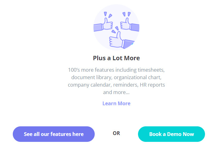
While one of the goals of creating a landing page is to convince users to take action, you wouldn’t want users to become too overwhelmed with your CTAs. Josh says it’s not a good idea to lump too many of them together in one place.
Instead, decide on your main CTA and highlight it.
“These are evenly weighted in my opinion, which one do you want people to choose? Make that one more visible. And the other one could be like, you know, like a ghost button or an underlined link or something like that.”
#13. Give customers what they can have now rather than later
Can be improved:
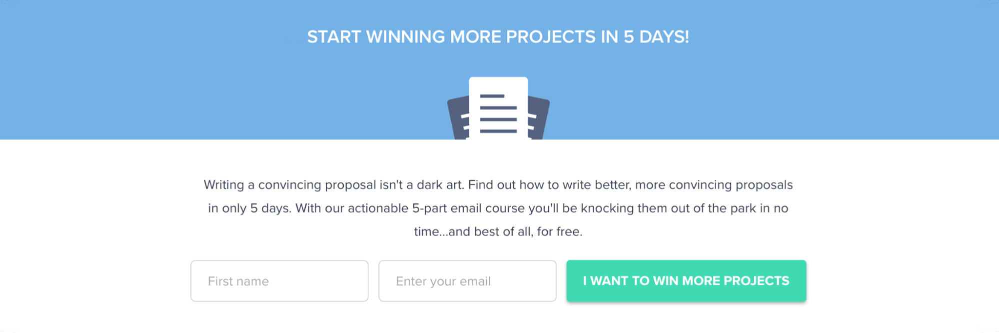
While drip campaigns are still an effective tactic for convincing potential customers, Josh says you can level up your CTA by allowing users to get everything all at once.
“This could still like continue to be a five-day drip campaign, but if you provide people the opportunity and the first email to get the rest of it all at once, then we can, we can sort of spice this up a little bit and talk about getting this lesson now, versus having to wait until five days from now before I’ll know how to win more projects.”
Jane added that this is similar to the rule of thumb with good lead magnets.
“Something that can be consumed immediately versus something that gives work to people. So a report trumps a book, for example, and a little cheat sheet or a checklist trumps something bigger as well.”
Don’t wait for the muse. Apply this step-by-step method to write high-performing email campaigns in hours, not weeks.
#14. Show what you can do over what you charge
Can be improved:
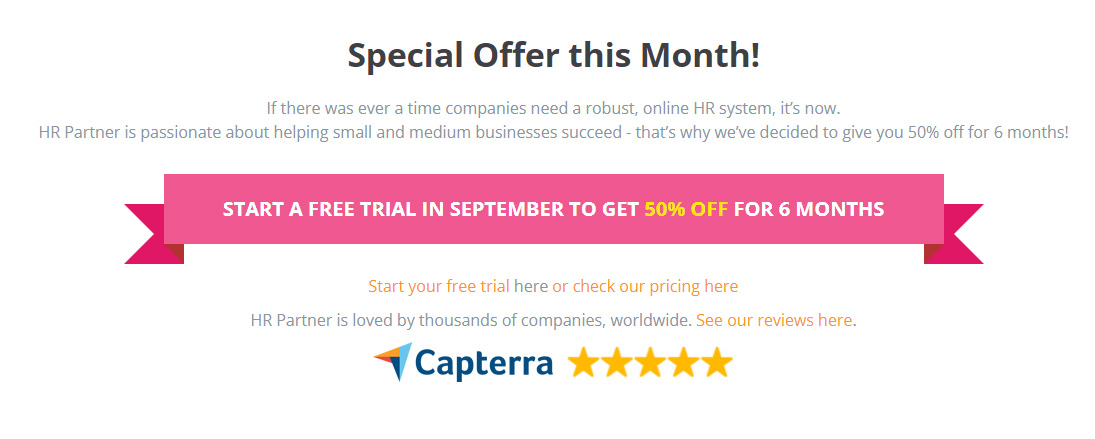
While the price tag does help users reach a decision, Josh advises highlighting your product’s strengths instead. You might even be surprised to find that people are more willing to buy and adopt with a higher price tag.
“So I would let those things (strengths) be the star rather than competing on price, because you might find through tests that you’re able to charge more for your product than you are, and people are happily ready to pay that. But if you’re competing on price, that’s going to annoy the types of customers that are actually signing up.”
#15. Add more value to your pricing pages
A very common — and disruptive! — user behavior pattern is clicking right to pricing sooner than you would want them to. In that case, they’re looking at the prices without any real idea of what your product offers in terms of features and value.
Instead of just talking about the details of your pricing packages, Josh suggests adding more value to pricing pages. This way, users have a better idea of what your product does.
“I’ll include things like the top three to six capabilities or features or benefits that our customers enjoy when they sign up. And then I’ll support that with one or two quotes above the pricing table that talk about money saved, time saved, more money made, things that shrink the price. So that if someone does that thing where they land on the site and I click right to pricing, they have a high-level idea of what it is.”
#16. Make the copy more compelling to customers
While it’s good to show customers how much money they can save, Josh says there’s still a more compelling way to show potential savings that is still honest.
Can be improved:
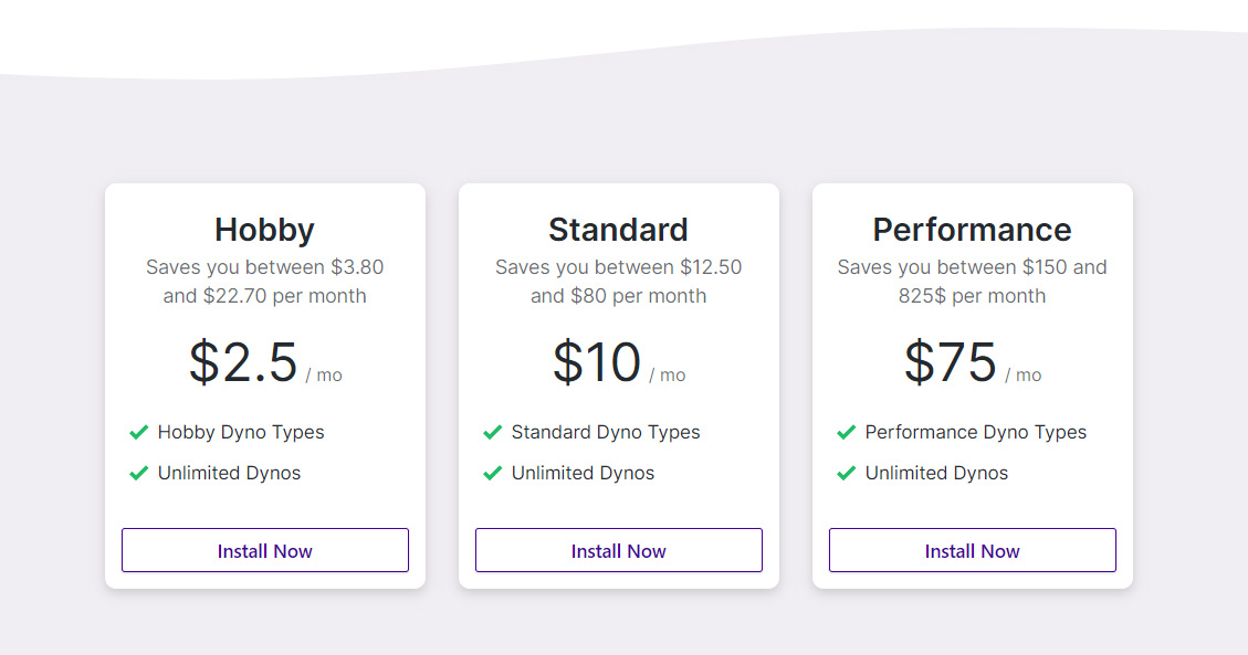
Instead of presenting it this way, Josh suggests presenting average values. This way, the prices seem more enticing but are still truthful.
“So you could say like save an average of up to $22.70 per month. And that would create a little bit more gap between the low end and the actual price per month. For example, $10 to save $12.50, and $75 to save $150, that’s a little bit more enticing. But for these two, I would take a look at the average savings and mentioned the top end, and that would still be accurate. It would still encompass all the different amounts that you might save in a month, but it’s just a little bit more enticing from the product standpoint.”
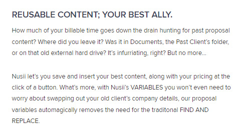
#17. Use contextual social proof to make your claims more believable
Can be improved:
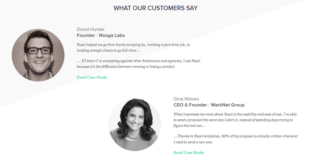
It’s pretty common to see testimonials lumped together in one section of many landing pages. But these would be better used to back up your marketing claims to make them more credible.
“What I prefer to see are what I like to call ‘contextual social proof.’ Rather than just creating this little social proof spot, when we make a claim about, say, being able to create a proposal that actually showcases your creative agency’s ability to create, I’d want to back that up with a testimonial that actually reiterates what I’ve said.”
Testimonials can still be lumped together in one section, but only when there are many paying customers.
#18. Pull out your most popular integrations
Can be improved:
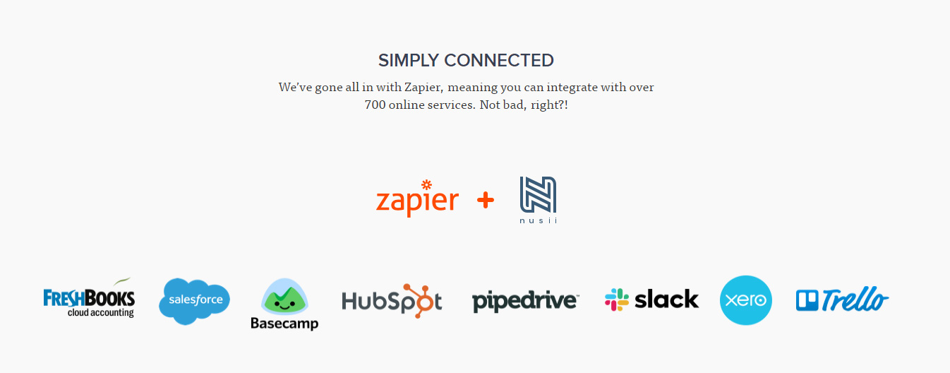
Instead of just showcasing what apps yours can integrate with, Josh suggests going up a notch and highlighting the ones with the most value.
“If you were to speak to your customers, you’d probably find a few of the integrations account for most of the value. And so if you can kind of pull those out and help people imagine what they’re going to be able to do. With these integrations. It doesn’t mean you don’t mention the other ones, but it just means you kind of put the spotlight on some of the big ones that a prospect might come to your site and see those and be like: ‘Okay, I can imagine using this tool.’”
#19. Make documentation available on your website
Especially for products targeted at developers, it’s good to have detailed documentation readily available on your website. According to Josh, developers aren’t your typical buyers and are very quick on jumping into the documentation.
“My hypothesis is that they are slightly skeptical of a lot of marketing messaging out there for good reason. Because there are a lot of marketers that go overboard and over-promise, just like a lot of salespeople will sometimes go overboard and over-promise. So if they can go in the documentation as a technical person, they will be able to see exactly what the product can and can’t do, and they’ll decide whether or not it matches their use case.”
SEO experts also advise that having the documentation available on the main domain expands your content footprint as an authority.
#20. Showcase your clients
Just like testimonials, displaying your customer list helps build confidence in your tool. Think of this section as a mini portfolio to convince users that you are the right fit for their needs.
“I would want to know that you are serving creative agencies like mine. So maybe share something about the types of agencies that you’re supporting whether that’s a vertical or a certain size.”
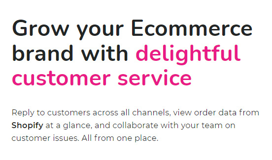
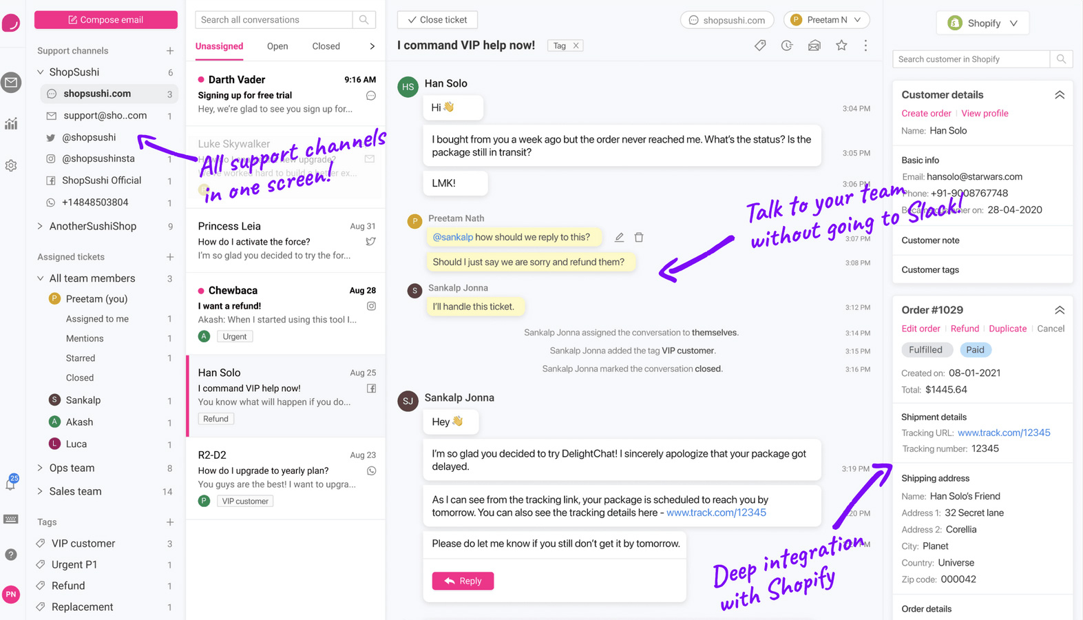
#21. Select visuals that resonate with your target customers
Use elements that not only capture what your product can do, but also resonate with the target customer persona.
Illustrations are trendy, but are typically used for marketing software. They might not work for a product targeted to developers. Instead, he advises using screenshots, videos, and GIFs for such products.
However, this doesn’t mean just taking real-life screenshots and placing them on the page. Jane shares that screenshots need a lot of design treatment to make them look nice and highlight the value. This is not easy.
Delightchat does a good job of it.
Good example:
#22. Produce condensed product demos
In the case of product demos, the shorter is the better. Josh recommends using concise, pre-recorded videos.”This does take some work, but if you take a look at what a client of mine did, Tom’s Planner. If you look at some of their videos, you’ll see how they really take you through the product in a faster, more efficient way, but they still show all the main points.”
#23. Don’t divert users to another page (unless necessary)
Can be improved:
Landing pages are designed to convince users take action. By unnecessarily diverting them to another page, you destroy that clear big picture of what your product does.
“What this will do is it will encourage people to get a fragmented view of what it is the HR Platform does. So rather than pointing to these pages at this point, if people have a specific thing that they want to know all about custom forms, have a features tab at the top and allow people to select that.”
#24. Get inspiration from other landing pages
Don’t know where to start? Josh and Jane suggest looking at other landing pages. While you won’t have a detailed picture, this will point you in the right direction.
“For example, things like some block typography, how they organize their docs, stuff like that. Don’t reinvent the wheel. Just go look at what industry giants do.”
#25. Do not worry if less people are reaching the end of your landing page
Think of the landing page as a funnel. As you go down the page, usually the lesser people there will be. This is why the decrease in the number of people who are reaching the end of the page isn’t really a cause for concern as long as people are signing up.
“That’s one of those, it ‘depends on’ basis if they’re not getting to the bottom of the page because they’re making a decision in signing up.”
Instead of looking at this metric, look at your conversions to see if your landing page is effective or not.
“So 35% of the bottom is fine if that number increases. That’s okay too, as long as we’re not decreasing the number of good people who are signing up because sometimes the reason people get to the bottom of the pages is because you haven’t told them what they need to hear yet.”
Learn more from Josh Garofalo
You heard Josh hint at the importance of telling a Category Story. If you found this idea interesting, join his mailing list to get his free monthly newsletter and related content (this is the first time he has shared the link).
Don’t miss out on new articles. Subscribe to our newsletter and get your monthly dose of SaaS email marketing insights.