You’ve worked hard for months and now it’s time to share your exciting new feature with the world. Email is still one of the best channels for delivering the news. You can reach out to the entire user base, take advantage of rich text and visual elements, and enjoy dedicated readers’ attention (unlike in-app notifications or social media).
But how do you write this feature announcement email?
- Do you make it short and catchy, or long and detailed?
- Do you drive your readers to the feature page or to your social media post?
- Can you use this email to achieve other goals like sales?
In this article, we’ll answer these questions in detail. You’ll learn if that new feature really deserves a dedicated email broadcast, what to include in the announcement email, and see how other SaaS brands are doing theirs.
Don’t wait for the muse. Apply this step-by-step method to write high-performing email campaigns in hours, not weeks.
Does this feature deserve a dedicated broadcast?
Not all features are created equal, so you have to ask yourself: does this feature really deserve a dedicated email broadcast?
Only special features deserve a dedicated email announcement. Meanwhile, your regular product updates (like small improvements and bug fixes) can be included in your monthly newsletter.
Decide on a specific feature name
As you iterate and polish your latest feature, sometimes the work-in-progress name doesn’t quite fit anymore. So when deciding on the finalized name, here are some things to consider:
- Make sure the new name is catchy. It doesn’t have to be eccentric to be memorable.
- Make sure it aligns with your product positioning. Because your product is addressing a need for a specific niche and audience, it follows that the language you’re using should resonate with them.
- Make sure it reflects the benefits. One common trap is to highlight the technology but forget about the benefits. Meanwhile, the entire feature name can be benefit-driven, not technology-driven.
Decide on the status and billing setup
Depending on the goal(s) of the feature launch, the availability of the new feature usually falls under one of three scenarios:
- Live and available for everyone. Aside from showing your users that you listen to their feedback, this is also done if you want leads to convert into users.
- Available upon request. This is usually done if you’re soft-launching a new feature and want to get feedback from early adopters.
- Available based on the subscription plan. Used for advanced features that help you upgrade users to a paid or higher plan.
The reader should understand how your feature gating works, and if they can start using the new feature right away.
Define who will be receiving the announcement email
After deciding who will have access to the feature, you’ll need to define who will be receiving this dedicated email blast. This could be:
- The entire audience, including your marketing email list and your customers
- Customers only
- A specific segment of your customer base
Make sure to segment your email list so only the target audience receives this email.
Expert tip. We recommend setting up a segment named Qualified for Updates. This segment will exclude users who are going through critical flows like user onboarding or lead nurture.
Define your goal
Depending on the target audience, this email broadcast can have one or multiple goals.
Your goals may include:
- Drive engagement (make customers use this new feature)
- Drive general awareness about your product and what it can do
- Drive conversions from a free plan to a paid plan (if the new features are Pro only)
- Drive conversions from email subscribers to trials or free users
- Educate customers on how to use the new feature (especially if training is necessary)
- Drive customer loyalty (show that you care about their requests)
- Promote your brand (show how cool and awesome you are)
What to include in the feature announcement email
Emails let you take advantage of text and visual elements that let you briefly but comprehensively explain how your new feature works and how it can help the user. New feature announcement emails usually include one or more of the following:
- A screenshot (or a GIF preview) of the new feature in action
- Link to the feature page
- Link to the announcement post
- Link to the demo video or overview
- Call to action (especially if you’re using the new feature to drive trial signups or demo bookings)
Individual feature announcement examples
#1. SavvyCal
Subject line: 🚀 SavvyCal for Chrome is now available!
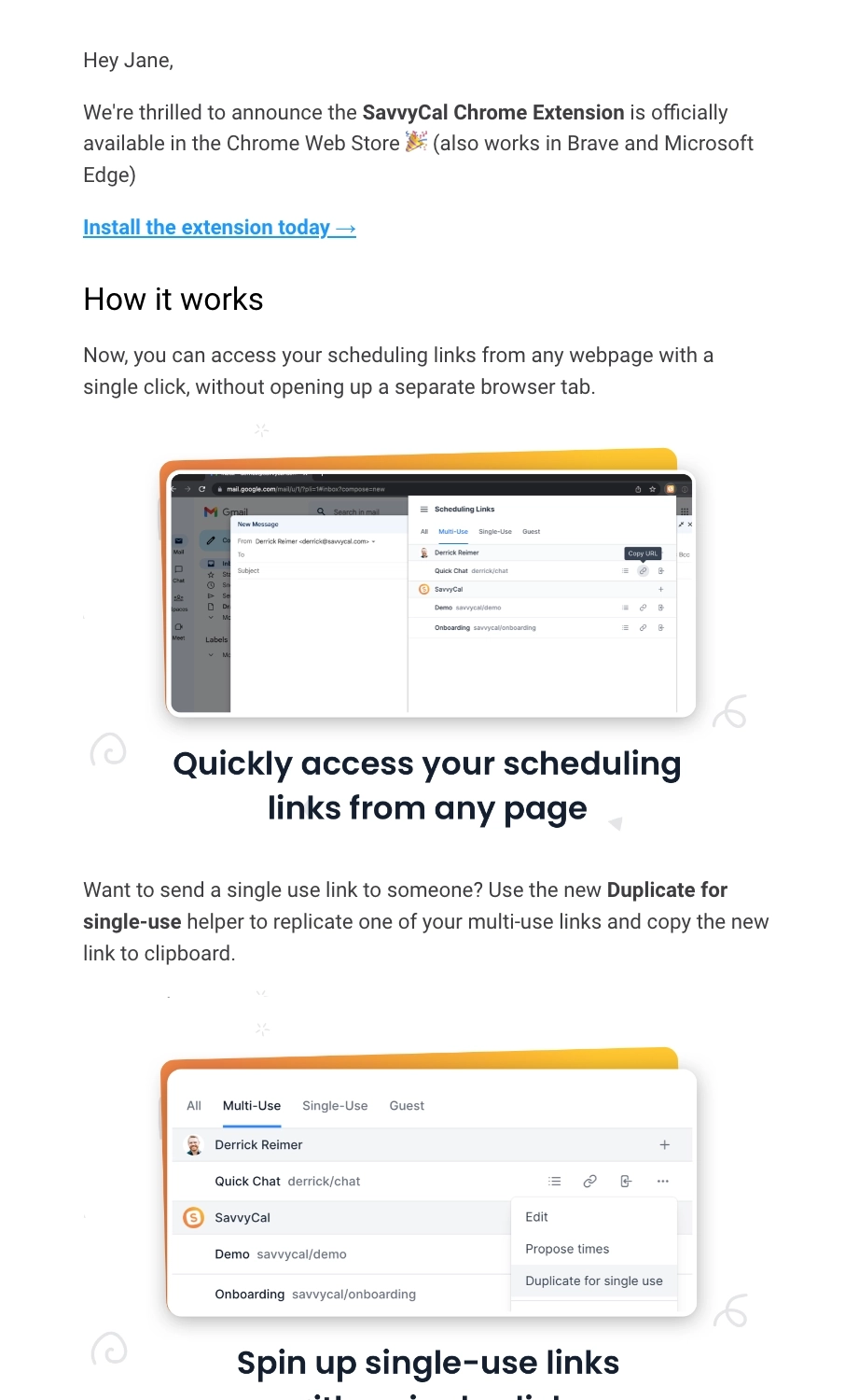
SavvyCal is a scheduling tool that helps people find a time to meet instantly.
SavvyCal highlights the benefits of their new Chrome extension by using them as subheadings in this email. They included screenshots for each benefit so the users can get an idea of what it looks like in action. CTAs are spread throughout their email to encourage users to install the extension and try it out for themselves.
In the last section of the email, they hint about upcoming features and improvements. We think it’s great that they also ask users for any feature ideas for the browser extension.
#2. Ranking Raccoon
Subject line: Boom! 💥 We just dropped site profiles
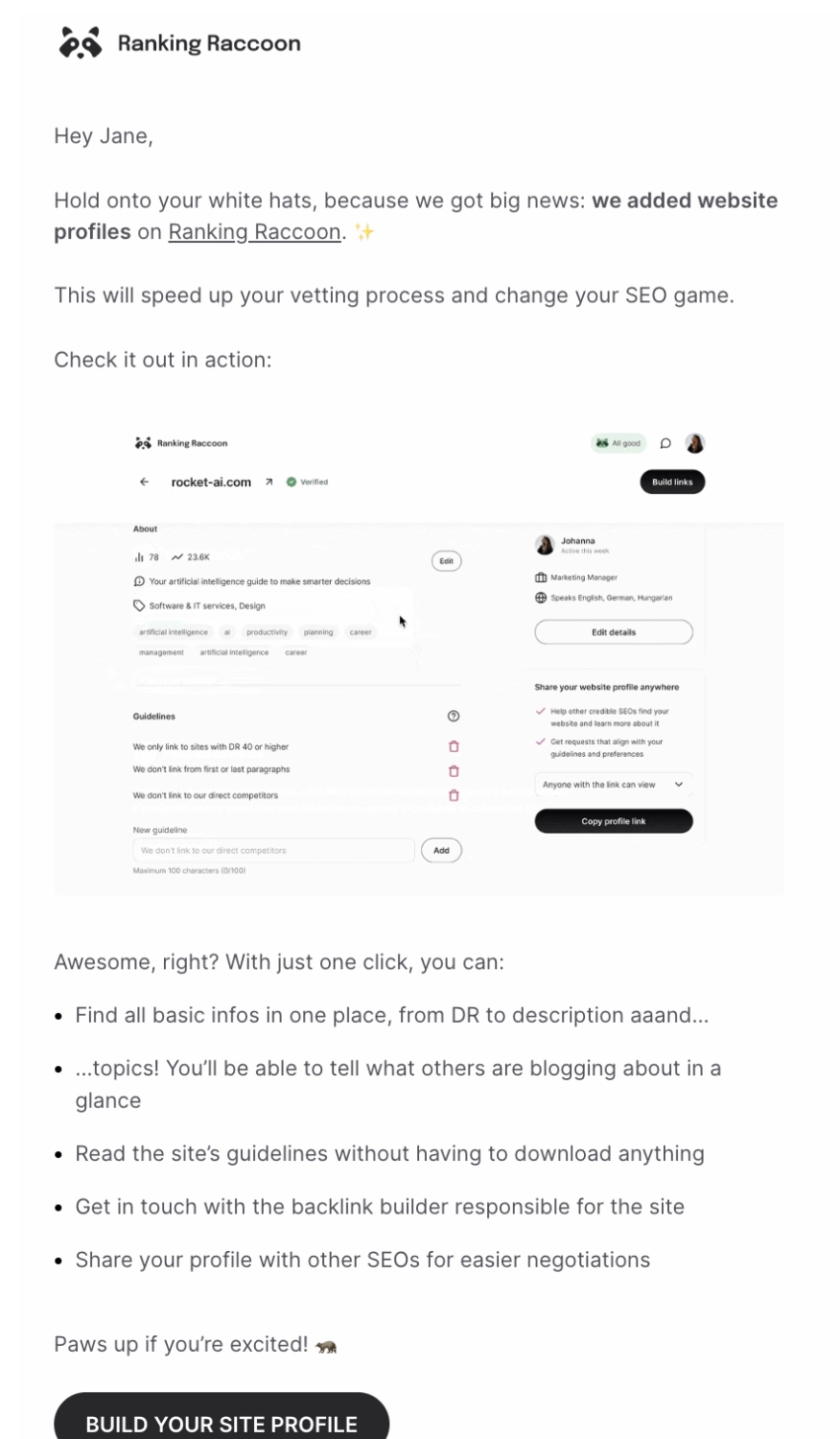
Ranking Raccoon is an SEO tool that helps you get genuine backlinks from vetted websites.
The email talks about their latest feature, site profiles. We like that they put the feature name in bold so that it’s easier for the reader to skim and get the gist.
The centerpiece of the email is a brilliant GIF, showing users how they can access and edit their site profiles:
They also enumerated a couple of benefits when users take advantage of their new feature. The email ends with a CTA button to encourage users to try out the site profiles for themselves.
#3. Userlist
Subject: Drumroll… Meet the new visual workflows 🔥
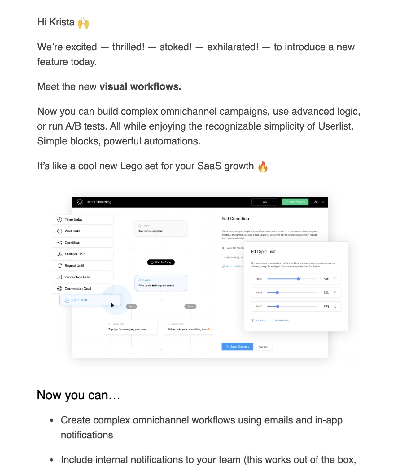
Userlist (disclaimer: this is our platform) is an email marketing platform that is built specifically for SaaS companies.
In this email broadcast for the visual workflows, we included a screenshot to give users an idea of what it looks like. It’s then followed by a list of things you can do with the latest feature, and a link to the feature page if readers would like to know more.
The email also mentions who gets access to the visual workflows. E.g. advanced features like A/B testing and conversion goals are only available for certain plans. We also included a Special thanks section to show gratitude to everyone who helped for their valuable contribution.
At the end of the email, we encourage our readers to reach out to us if they have questions and to join the Happy Hours session celebrating the launch.
#4. Brex
Subject line: Pay bills from any bank account
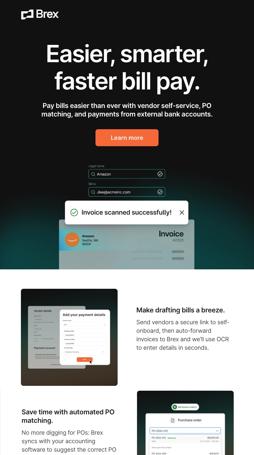
Brex is the AI-powered spend platform that lets you spend smarter with integrated cards, expenses, travel, and payments.
The headline above the fold highlights the major benefit of their latest feature: easier, smarter, faster bill payments. And instead of listing it down in bullets, the email is divided into subsections to highlight the benefits of bill pay. Each subsection also includes a relevant screenshot.
They end their email by encouraging the reader to set up a call with their customer success team so they can start using the new feature for free.
What can be improved?
Since it’s not mentioned in their subject line, Brex could have highlighted the specific name of the feature so as not to confuse readers (especially new users).
#5. HEY (37signals)
Subject line: The All-New HEY Calendar is HERE 🗓
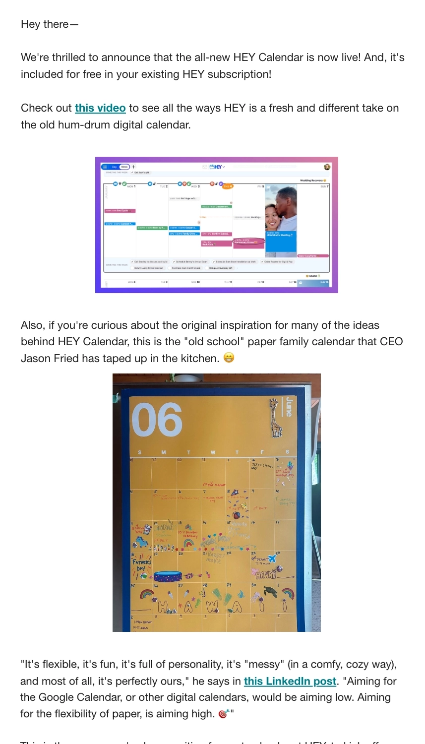
HEY is 37signals’ fresh take on email and calendar.
In a simple and straightforward plain text email, readers can easily see the important stuff: the relevant links and the visual elements.
We think they added a nice touch by including a photo of the original inspiration for the HEY Calendar and a short fun story about why they’re aiming for the functionality of an old-school paper calendar.
What can be improved?
- They could have highlighted “included free in your existing HEY subscription” so readers will immediately know if they have access to the new feature.
- They could have linked to a separate post to highlight the benefits/advantages of the HEY Calendar so readers will know what sets it apart from other digital calendars.
#6. Polar Habits
Subject line: Calm, Daring, or Heroic? Pick your challenge!
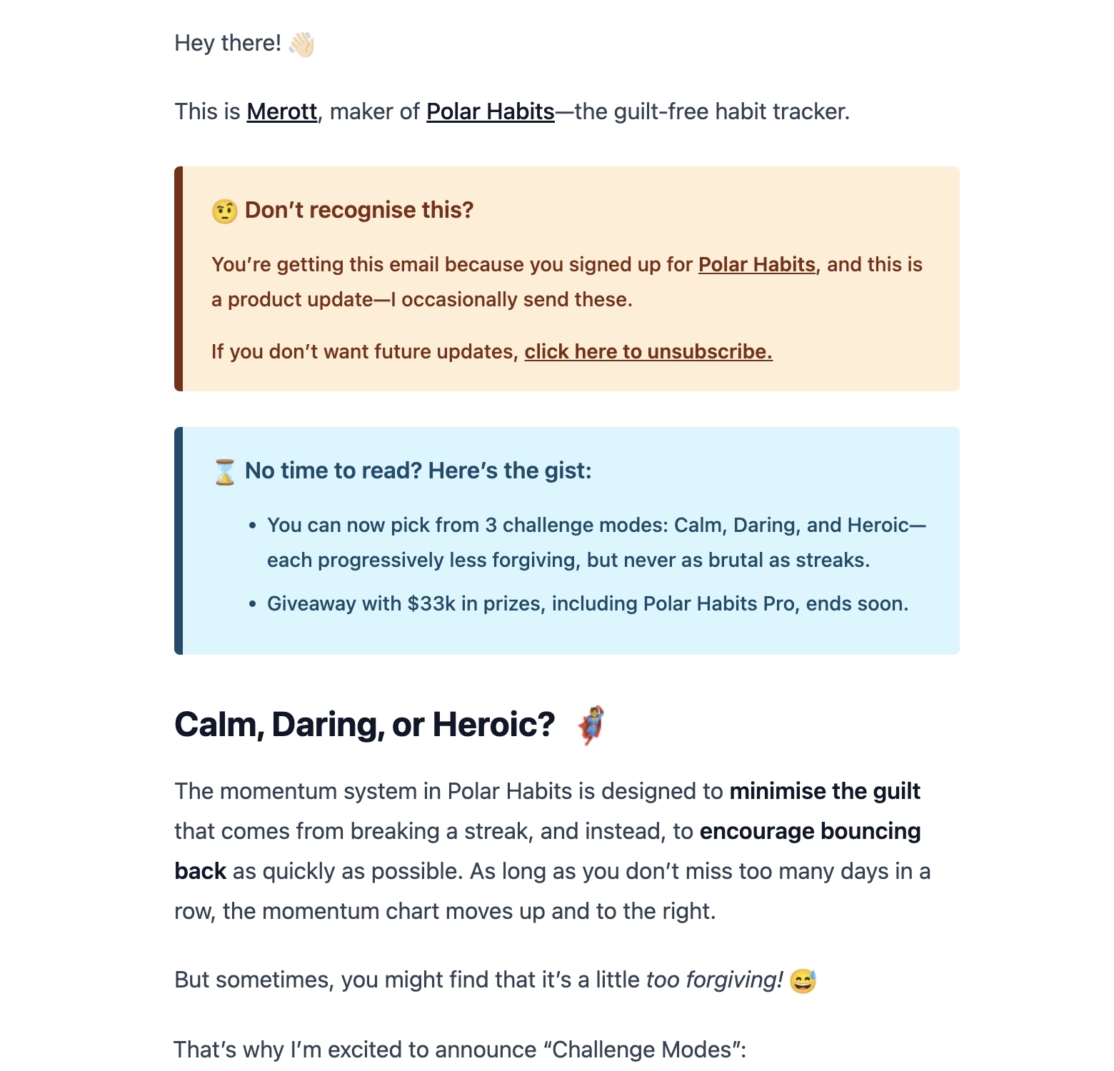
Polar Habits is a guilt-free habit tracker with no streaks and momentum system to help you keep moving forward.
We like that they included a small TLDR section above the fold so that users get the gist of the email immediately.
The main body of the email starts by talking about the platform’s momentum system instead of streaks to encourage users to bounce back on habit building. It’s followed by a solid bridge that introduces the new feature by saying that this system might not be as challenging for some users.
It then proceeds to talk about the three different Challenge Modes: Calm, Daring, and Heroic. By including a visual comparison of the three modes through graphs, readers can easily see the difference between the three modes. The succeeding paragraphs then explain that users can change Challenge Modes in their habit tracking journey.
Polar Habits then ends the email by encouraging users to reach out if they have questions or feedback.
What can be improved?
“This is a Pro feature” should be highlighted so readers immediately know who has access to all Challenge Modes.
#7. Campsite
Subject line: Feedback request email from Campsite
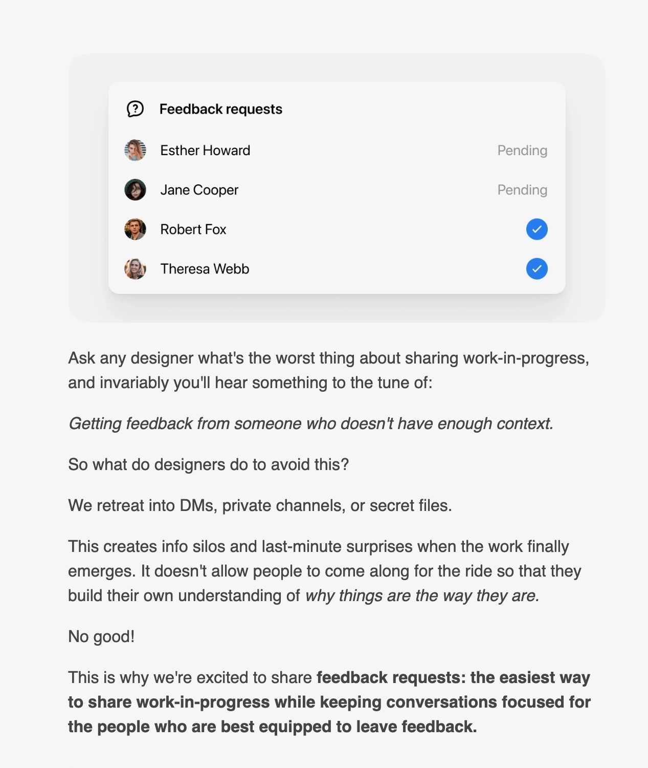
Campsite is a collaboration tool for teams.
The hero section shows a screenshot of their latest feedback request feature.
The email then proceeds to tell a short story about a common pain point experienced by designers: the horror of getting feedback on your design from someone who has no context. They create a good bridge between the conflict and the solution (the feedback request feature) by talking about how the resulting info silos affect the entire workflow across the company.
In the last paragraph of the first section, they highlighted the major benefit of the new feature in bold. This is then followed by a CTA button so users can try out the new feature themselves.
At the end of the email, Campsite encourages users to send feedback about the new feature or any other feature requests they might have.
What can be improved?
While you should let your readers know about other improvements and bug fixes, the email should have focused only on the feedback request feature.
#8. Transistor
Subject: AI Transcription is now available!
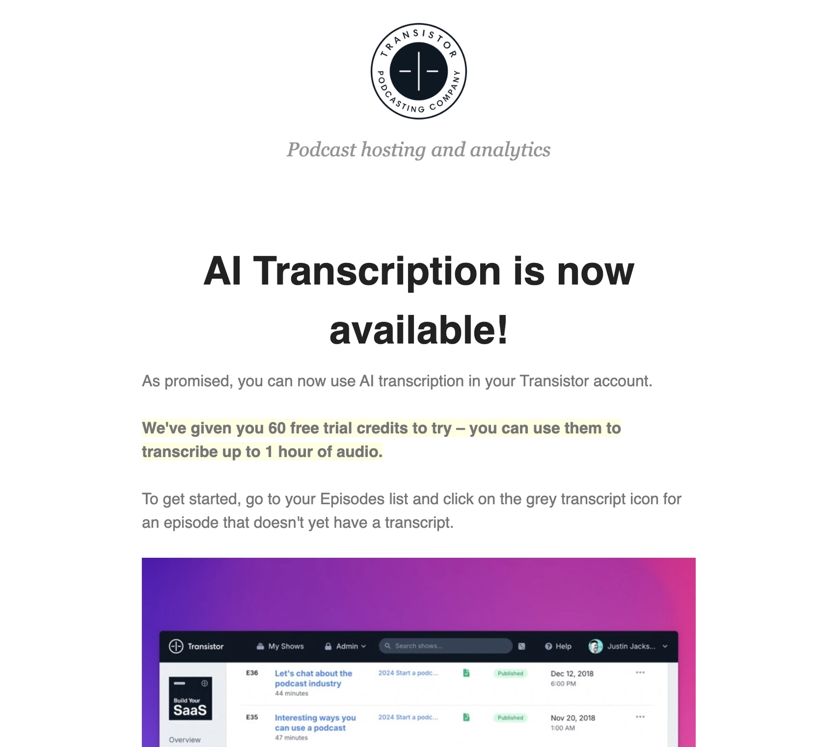
Transistor is a podcast hosting platform.
After mentioning that the AI transcription feature is now available for the account, they help the user navigate to it on the platform. It also includes a screenshot so that the user knows what the transcription icon looks like.
The email then mentions that this is a paid add-on. But while the feature requires an additional payment, we think it’s smart that they compared it to the prices of other transcription services to show that theirs is relatively cheaper.
If users want to know more about the latest feature, they include a link to their docs on how the new feature works. And for those who prefer videos, they also embedded their video demo of the AI transcription.
#9. Asana
Subject: Introducing Asana’s 🆕 Workflow Builder
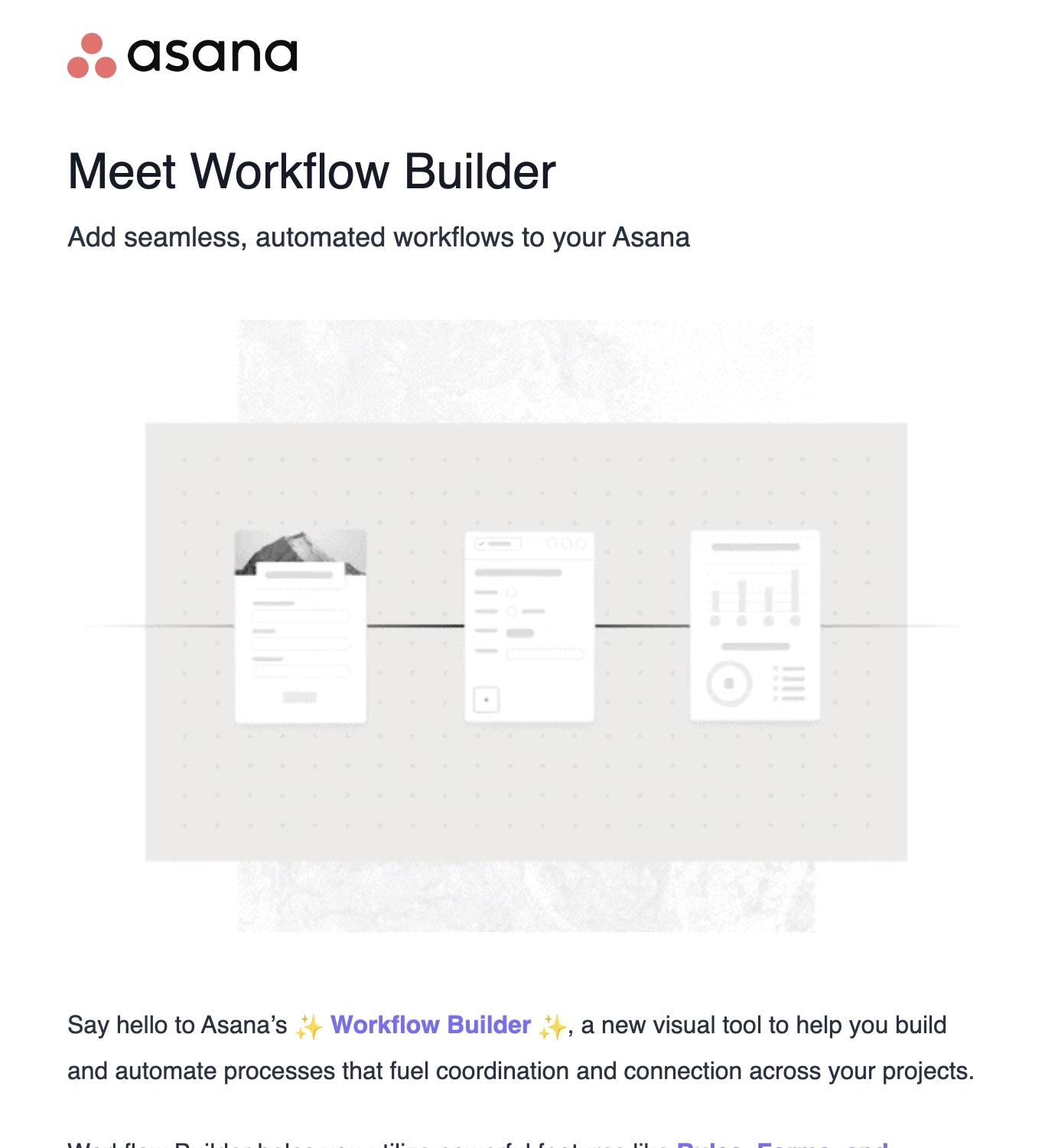
Asana is a work management platform that lets you stay on track, keep projects organized, and hit deadlines.
We immediately see the name of the new feature and a short blurb of what it can do at the hero section. Asana also included a GIF to illustrate how the workflow builder can help automate processes seamlessly across projects.
The email then proceeds to talk about how this new feature can solve several challenges of managing projects. They also include a link to their feature post if users would like to know more about the workflow builder.
And unlike our previous examples that link to a video demo or a feature page, Asana invites users to a live demo of the new feature in action.
#10. Help Scout
Subject: The new conversation editor is here!
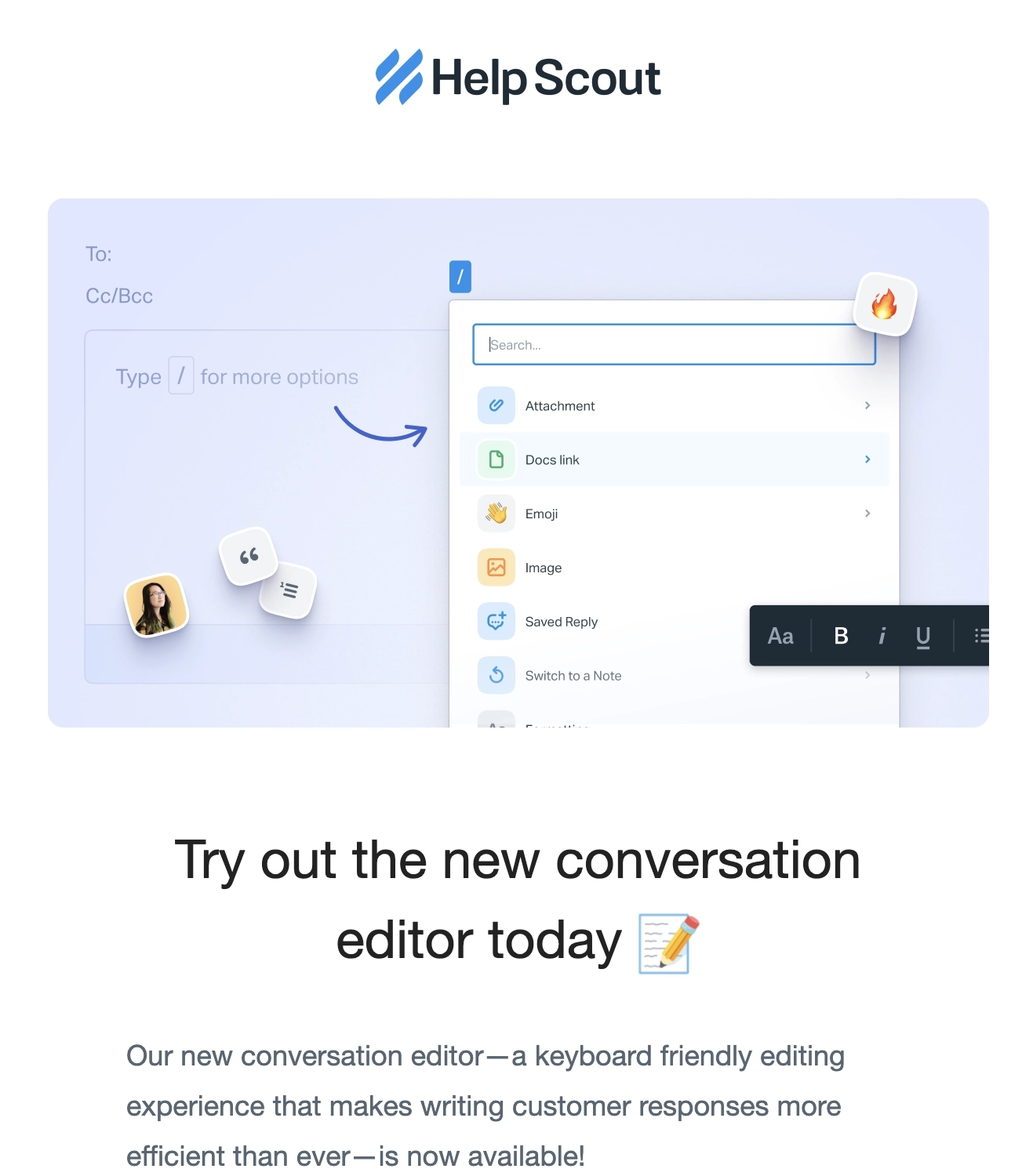
Help Scout is a dedicated customer support platform built for growing teams.
The hero section shows an illustration of the new conversation editor, which lets users easily access what they need with a simple type of a slash.
The email then describes how the user can access the new editor on their platform along with a screenshot to make navigation easier. They also include a few tips on how users can maximize the new feature.
At the end of the email, they direct readers to their docs and their support team if they’d like to know more or have further questions.
#11. Hipcamp
Thanks to Jenna Valdespino for this example.
Subject: 🚨 Introducing Hipcamp Alerts: Unlimited free availability alerts for sold-out campsites
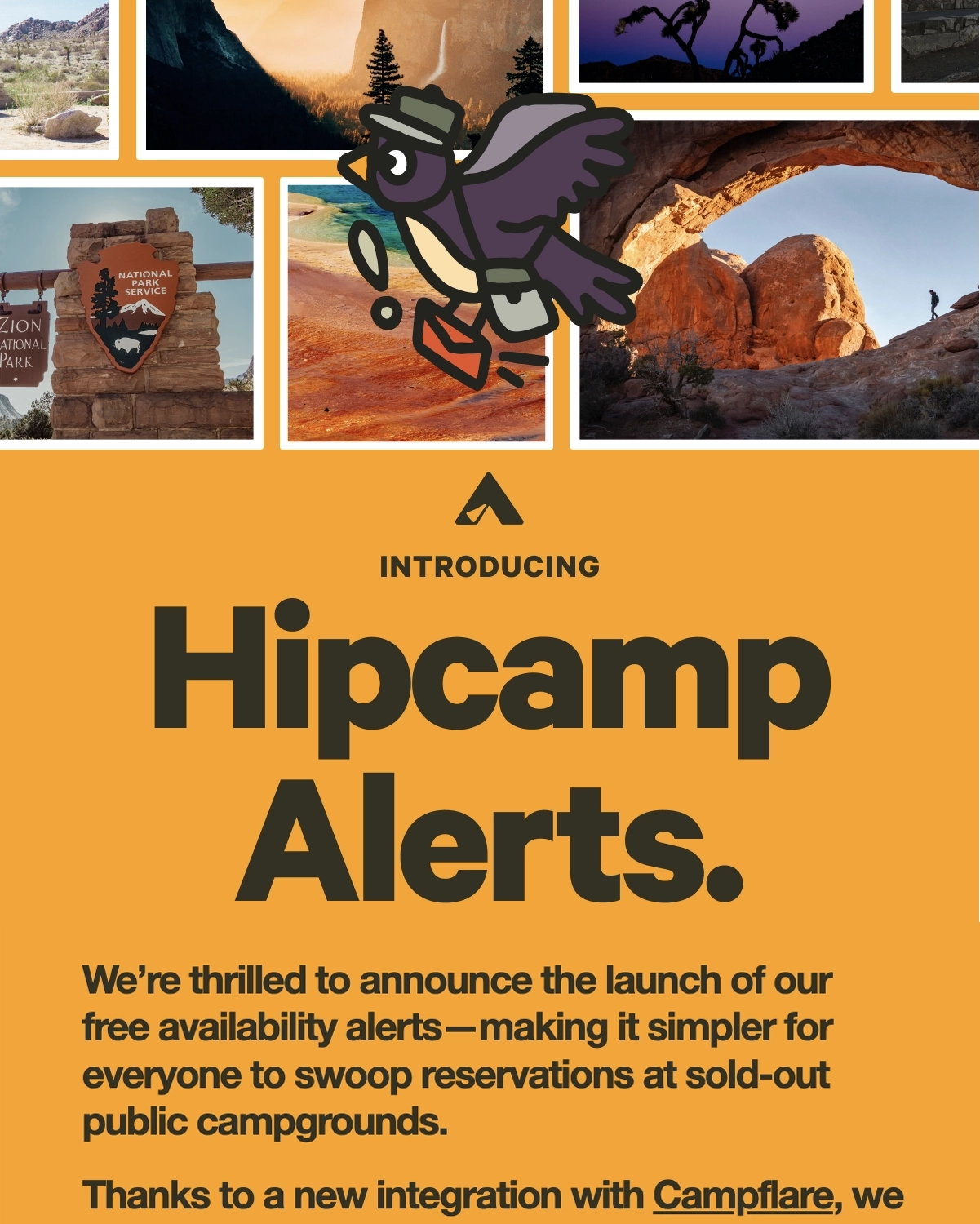
Hipcamp is an online marketplace that offers outdoor stays and camping experiences.
The email begins by discussing how their free availability alerts can help users place reservations easier. They then mention that this is made possible with their Campflare integration. Followed by a CTA encouraging users to create their first free alert, and a breakdown of how the alerts work.
We like their use of illustrations and how they used the bold styling for the email altogether.
#12. Grammarly
Thanks to Syed Balkhi of WPBeginner.com for these examples.

Grammarly is an AI-powered writing tool that provides grammar and spell checking, plagiarism detection, and more.
The header features an image visualizing how a user can take advantage of App Actions: they can simply schedule a meeting time without having to leave the email client. The email then talks about how their new feature solves the pain of toggling between apps.
To agitate the conflict further, they mention that professionals waste 200 hours a year by toggling between apps. They then list down some of the things you can do with their latest feature.

On a different occasion, Grammarly announced the launch of their new writing progress dashboard.
The email starts by showing screenshots of the new progress dashboard while the heading indicates that you can use their latest product update to improve your writing skills. They then discuss how this is better than waiting for the weekly progress reports.
Grammarly then gives the readers a quick tour of the new dashboard with screenshots and its key features. The email then ends with a CTA to encourage users to view the latest dashboard.
#13. Keyword Insights
Thanks to Yuri Burchenya of ClickCrab for contributing this example.

Keyword Insights is an advanced content optimization platform designed to enhance and expedite your content strategy through its powerful features.
They sent this email to re-engage with churned users. The heading gives the reader a gist about the email content: a new feature and an incentive to come back and try it out.
The email includes an illustration of what you can do with their new AI content writing tool and then discusses the key features.They also included a video embed for users who want a visual explanation of this new feature.
The next section then details the incentive and how churned users can receive it. The CTA then encourages the reader to check out this new feature.
What can be improved?
The email could be shorter if they instead linked to a dedicated blog post or feature page discussing the other details and benefits.
#14. Claude (Anthropic)
Thanks to David Baum of Relato for this example.
Subject line: Messages API update, plus Claude for coders and lawyers
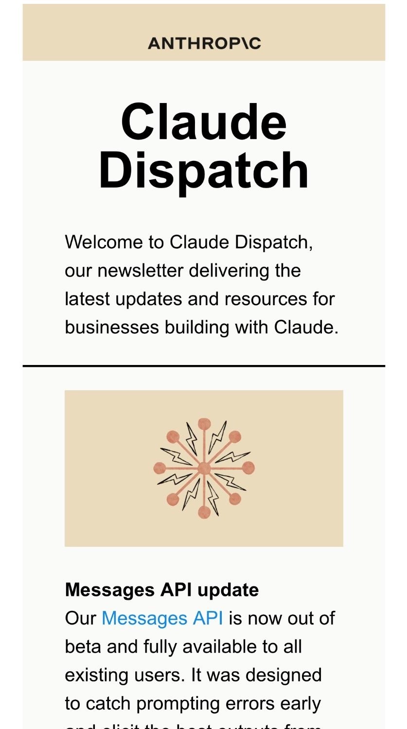
Claude is Anthropic’s family of foundational AI models that can be used in a variety of applications.
In this case, Anthropic didn’t dedicate a whole email to the announcement, rather incorporated it into their regular newsletter. The top section of their email newsletter talks about their Messages API update. While most SaaS newsletters would place their product updates in the middle or at the end, this example shows us that you can begin the email by featuring a prominent feature.
Anthropic then links to the docs if users want to know more about this update.
#15. Buy Me a Coffee
Subject: Now you can video reply to your supporters!
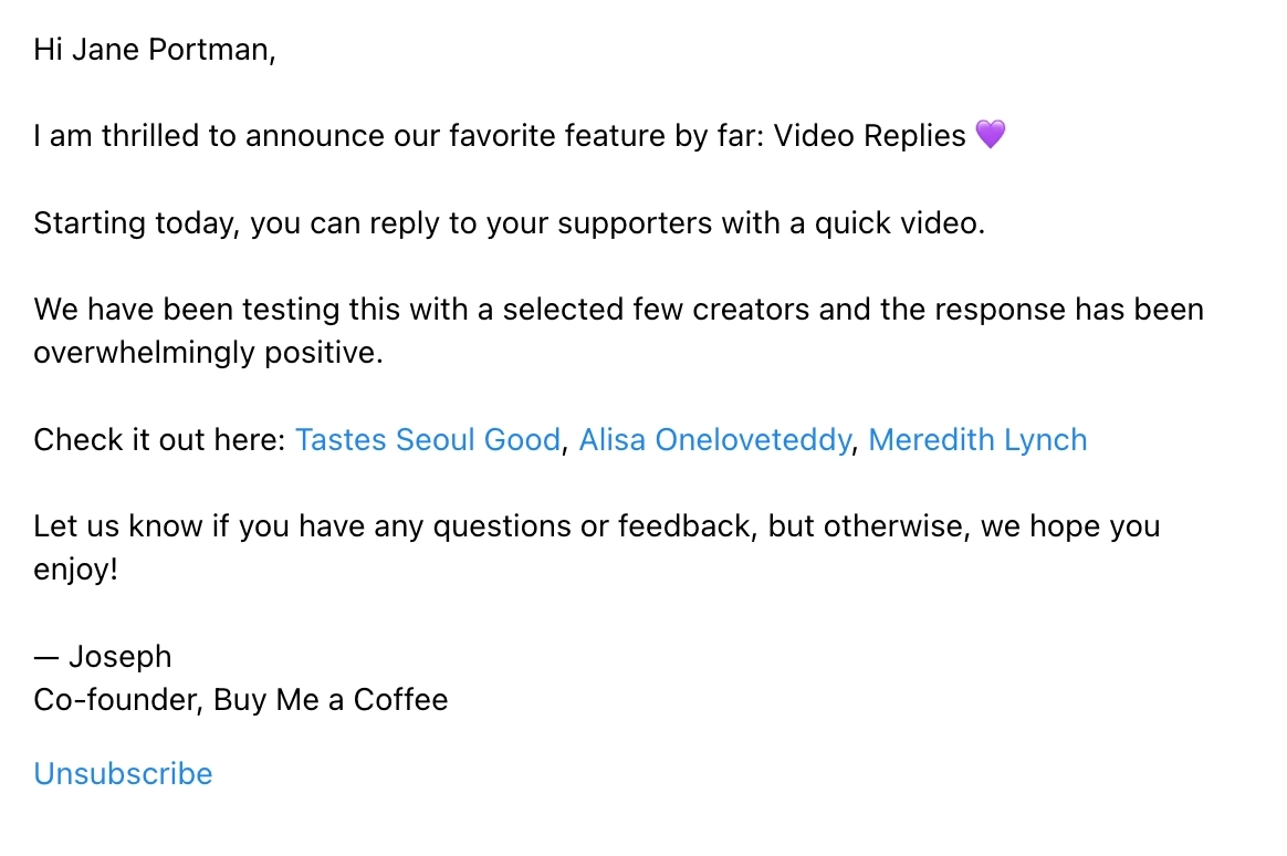
Buy Me a Coffee is a platform that helps creators and artists accept support and membership from their fans.
Unlike the previous examples, Buy Me a Coffee went with the plain text email format to announce their latest feature, voice notes. They skillfully leveraged customer names who gave them overwhelmingly positive feedback after they beta tested it.
What can be improved?
- They should have added a CTA link that takes the user to the feature so they can try it out for themselves. That was the main purpose of the email, after all.
- They can be more clear about how the user can reach them with their questions and feedback.
Don’t wait for the muse. Apply this step-by-step method to write high-performing email campaigns in hours, not weeks.
Round-up announcements for multiple features
#16. Mercury
Subject line: 🕊 The Messenger: Let us read your mind.
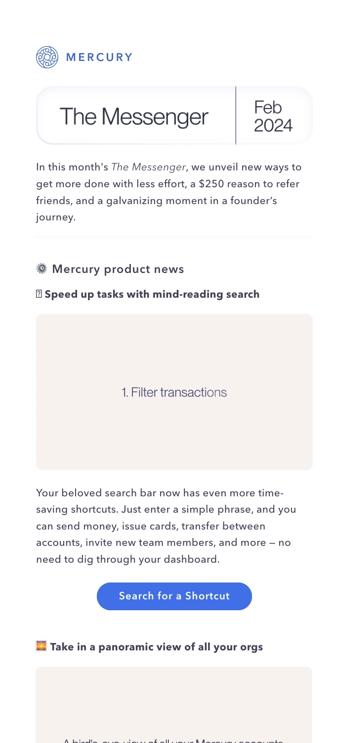
Mercury is a bank for startups.
In the February 2024 issue of their newsletter, Mercury started off with their product updates. Each of the product updates came with a brief explanation and a GIF to help users visualize and navigate it on the platform.
For example, this GIF below is used to demonstrate Mercury’s Panorama view:
Each product update mentioned also includes a link to the feature so that users can try it out for themselves.
#17. Pitch
Subject: New in Pitch ✨ Slide transitions, recolorable SVGs and bullet points, and more
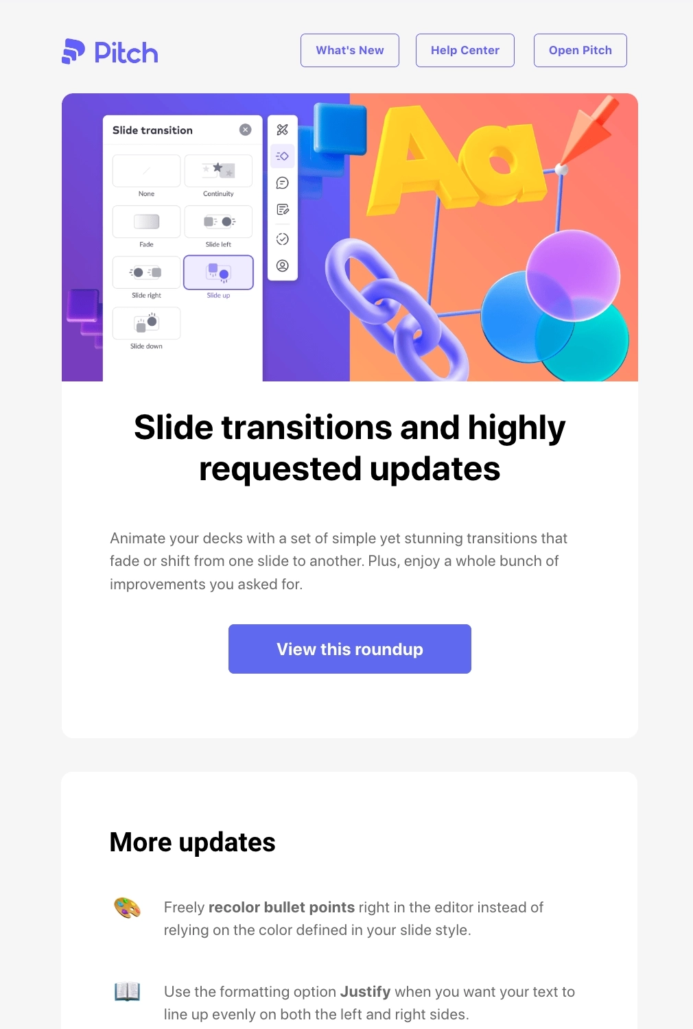
Pitch is a tool used by teams to create beautiful decks and presentations easily.
The email starts with a heading that wants to build anticipation with users by talking about slide transitions (the prominent feature) and other highly requested features. Then they link to the roundup page if users want to know more.
The latter half of the email contains their regular product updates and improvements. And while these might not be prominent features, we like that Pitch used emojis instead of bullet points to encourage readers to skim through to the end of the email.
#18. Wise
Subject line: Here’s how we wrapped up 2023
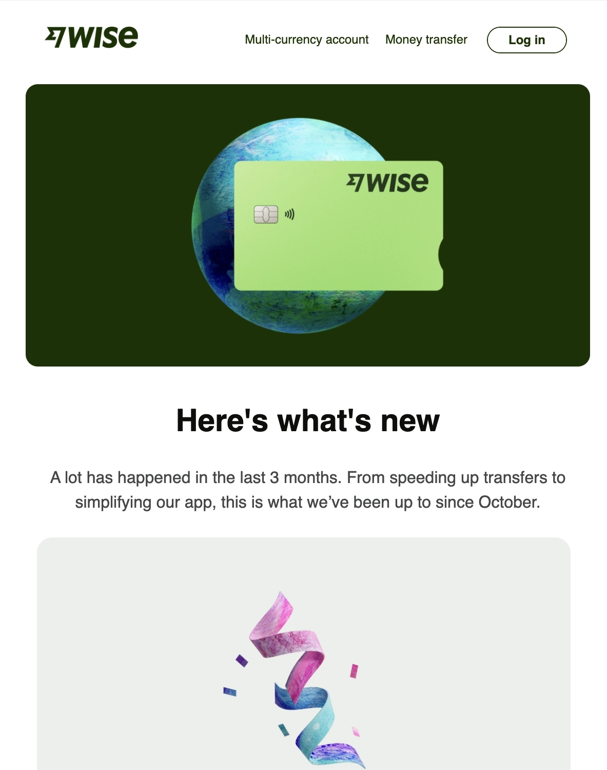
Wise is an international money transfer company.
They sent this email as an end-of-year roundup for 2023. The first section gives the reader a brief overview of what Wise has released during the last quarter of the year.
The email then shows each of the updates in a gallery-type presentation for easier skimming, starting with their most prominent update: faster fund transfers. The email ends with a CTA that redirects the reader to their Q4 2023 report about the new features and more:
#19. eWebinar
Subject line: NEW: Third-Party Chat Integrations + New Chat Preferences
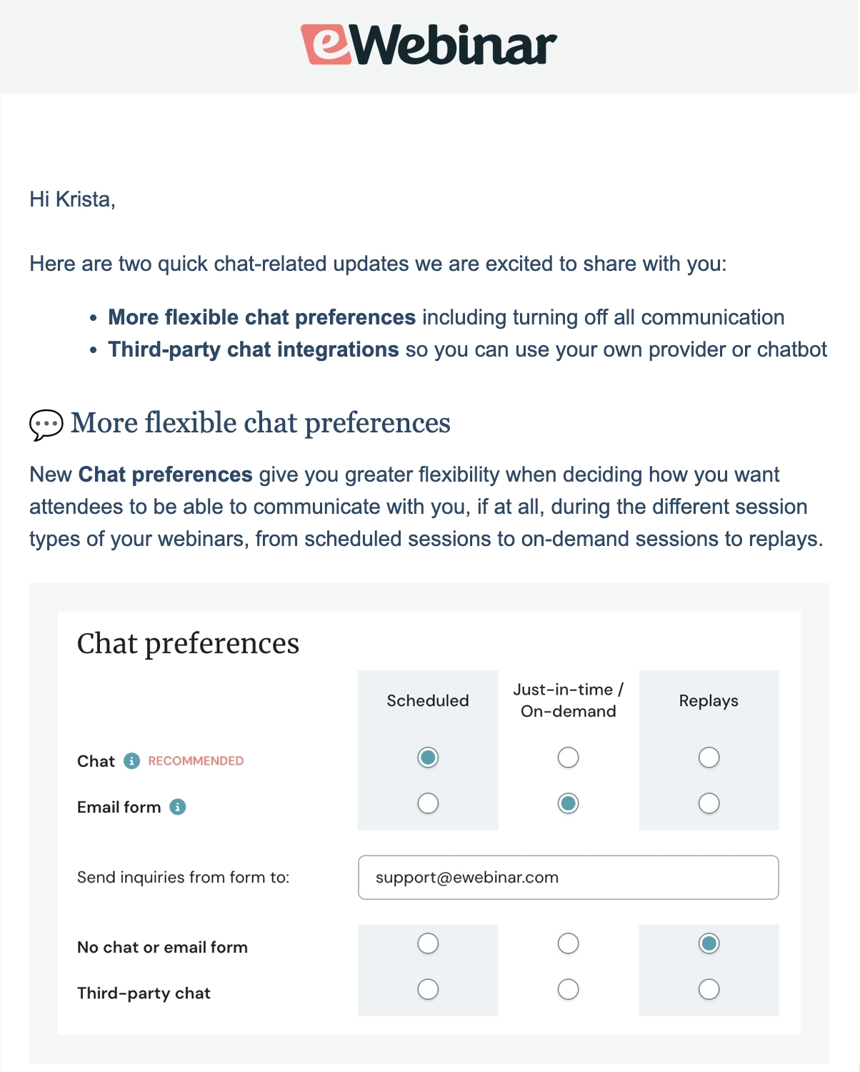
eWebinar is an on-demand webinar platform.
The email starts with a TLDR version of what they’ll be talking about. The main email body is divided into two main sections: one talking about the flexible chat preferences, and the other for third-party chat integrations. Each section comes with a screenshot to show the reader how this would look like on the eWebinar platform.
The email closes by thanking the reader and encouraging them to reach out if they have any questions.
#20. ClickUp
Subject line: Introducing ClickUp Brain
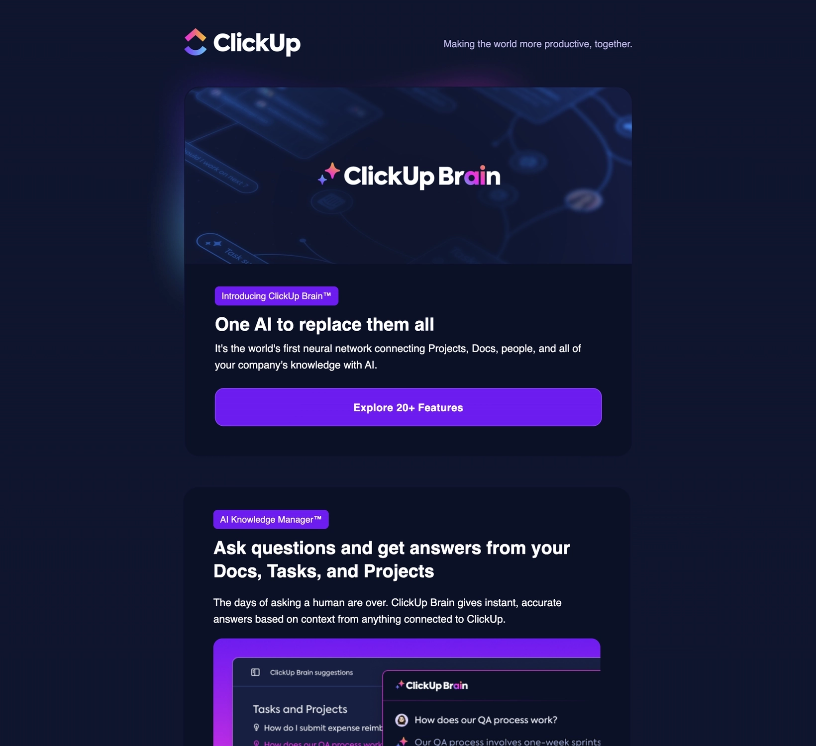
ClickUp is a project management software designed to make it easier for teams to stay on schedule and get work done.
The email is divided into several sections that talk about the key features of ClickUp Brain. Each section has a subheading that talks about the benefit, a brief blurb, and a screenshot that shows ClickUp Brain in action.
The CTAs in the email redirects the reader to the dedicated feature page if they want to know more.
#21. FeedHive
Subject line: January 2024, Product Update - New Features & Improvements
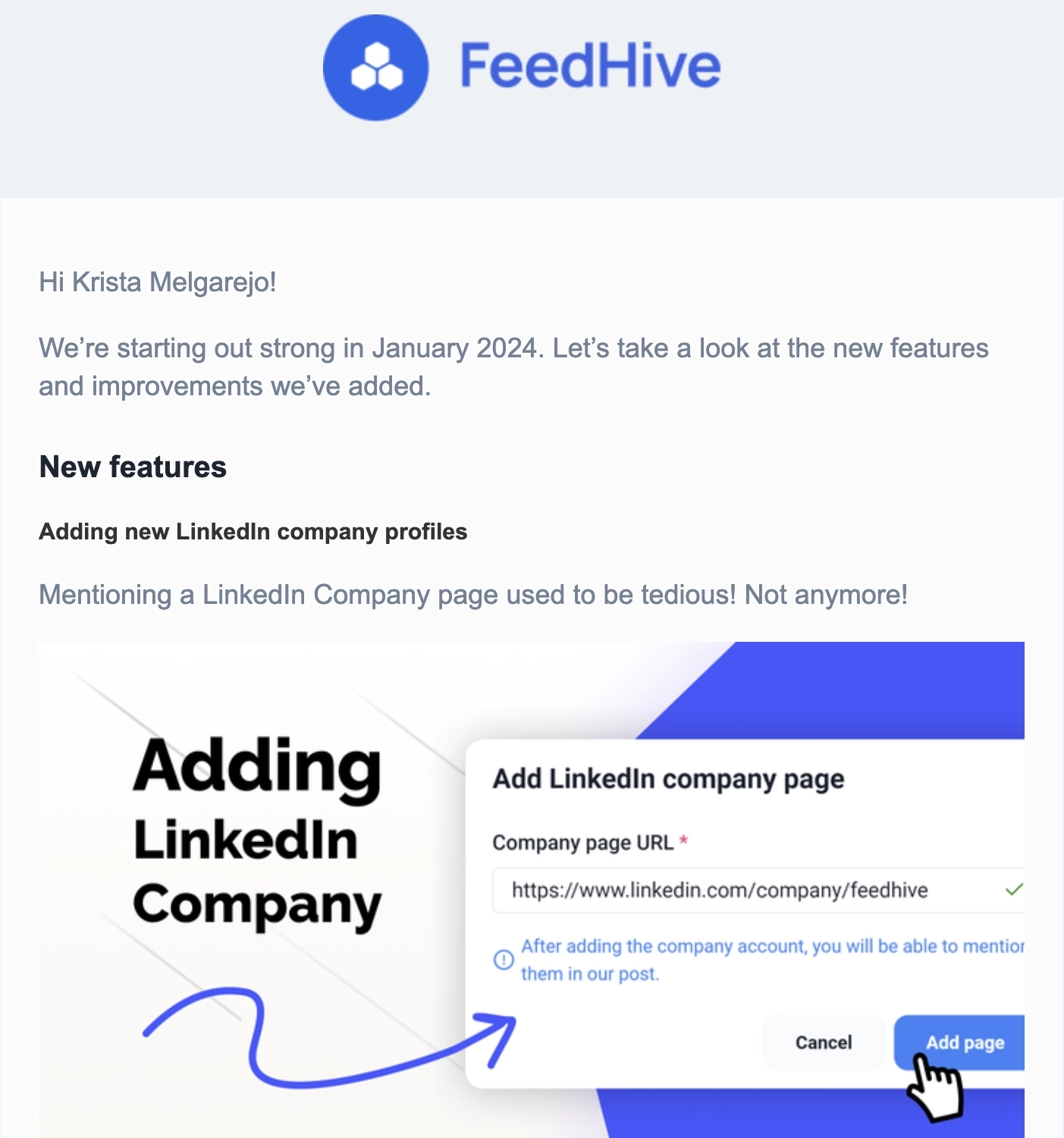
FeedHive is a social media management platform that helps users create, schedule, publish, and analyze content across social networks.
In this roundup email, prominent new features are featured in sections. Each section has a graphic that has a screenshot and the name of the new feature, making it easier for readers to skim through. Meanwhile, the last section talks about recent bug fixes, improvements, and upcoming features.
FeedHive also includes a link to their Public Roadmap if users want to know more.
#22. SeedProd
Thanks to John Turner for this example.
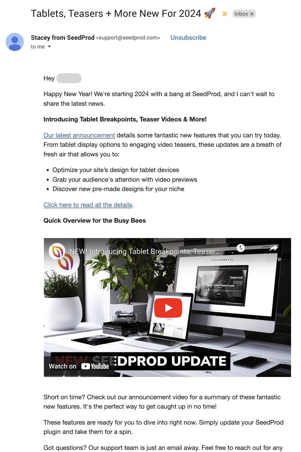
SeedProd is a WordPress website and landing page builder.
Unlike the previous examples, this email just gives a brief overview of all their product updates without going into detail for each one. They include a link to their website if users would like to know more. The email also contains a video embed for those who are in a hurry and/or prefer a visual overview of the updates.
They end the email by encouraging the reader to reach out if they have any questions or feedback.
What can be improved?
Instead of saying it in the P.S. section, it’s better to mention that some of these updates are only available to premium users at the main body because that’s a crucial piece of information.
#23. Airtable
Thanks to Syed Balkhi of WPBeginner.com for this example.
Subject: Build Airtable Apps in a snap with App Quick Start

Airtable is a low-code platform to build next generation apps.
Each new feature mentioned comes with a simple graphic, a subheading that describes the benefit, a short blurb, and a link if the reader wants to know more.
We like that for certain features, they mentioned that only certain tiers have access to them and are emphasized by using a red font color.
What can be improved?
It seems like App quick start is a prominent feature, so it would be better if it was formatted in bold when it was mentioned in the introduction.
New feature announcement email template
Here’s a template that you can use for your upcoming feature announcement email.
Hi [first name],
We’re introducing [name of latest feature] to [how it addresses a customer pain point]. This feature is available to [everyone or certain subscription plans only].
[Visual element showing the latest feature in action]
With [name of latest feature], you can:
- Benefit 1
- Benefit 2
- Benefit 3
You can read more about it here [include link to a feature page or feature announcement post].
Do you have questions or feedback about our latest feature? Simply hit reply to this email or feel free to reach out to us at [support email address].
Thanks,
[signature]
Ready to share the exciting news with your readers?
With all the time and effort you poured into your new feature, it deserves no less than a well-crafted email that will get users to try it out and see it in action for themselves.
By including the right text and visual elements, you can give users a sneak peek of how they could do things easier and faster with your latest feature.
Don’t miss out on new articles. Subscribe to our newsletter and get your monthly dose of SaaS email marketing insights.

