Most SaaS email marketing is about delicate nurturing and building authority, loyalty, and reputation. But sometimes you just need to drive conversions with a strong, clear call-to-action email.
In this post, you’ll learn some best practices on how to write effective CTA emails, and see how other SaaS brands did theirs.
Don’t wait for the muse. Apply this step-by-step method to write high-performing email campaigns in hours, not weeks.
Why you must use strong calls-to-action in your emails
In order to harvest the ROI from your email marketing efforts, you need to nudge your audience to take action.
You do that by sending a focused message with an obvious CTA to convert to the next stage: start a trial, purchase a subscription, upgrade to the next plan. With CTA emails, you’re putting the user in “shopping mode” even if they’re not making a purchase at the moment. At the very least, they’re assessing your offer against their current needs.
Learn how to write focused emails with our Atomic Emails method.
Best practices for email CTAs
Give readers a compelling reason to act
Whether you’re urging them to sign up for a trial or upgrading to a paid account, giving readers a compelling reason in your email copy will help them decide when they see your CTA.
For SaaS emails, you will usually find any of the things below that help set the stage for the CTA:
- A relatable pain point
- How the tool or platform addresses their pain point
- What the user can achieve with the tool or platform
- The X amount they’re saving with the discount/promotion
Create a sense of urgency
Whether you’re sending a trial expiring or discount email, you can urge the reader to act now by including a specific deadline in your email.
Don’t put too many CTAs in your email
Without a CTA your reader might not do anything. Add too many, and you’ll overwhelm them. Find the balance between your CTAs and the other email elements by running tests.
If your email is short, stick to one prominent CTA button per email. If your email is long, it’s helpful to repeat the same CTA twice.
Make your CTA eye-catching
Email design options are limited, but there are a few things you can do to make your CTAs stand out.
For CTA buttons:
- Use contrasting colors for your button and font
- Provide enough negative space around the CTA button
For CTA text links:
- Use a different color and font weight from the rest of the email copy
- Don’t forget about special symbols (like arrows “→”)
Keep the CTA copy simple and straightforward
Like anything else in copywriting, keeping it short and sweet is always best.
- Use an action verb
- Be clear and direct about what you want the reader to do.
- Make sure it matches the destination experience
Experiment with creative CTA copies
However, simple doesn’t mean generic. Just like the rest of your email copy, your audience will only take action if your CTA also resonates with them.
So instead of using the typical “click here” or “sign up now”, you can experiment and test different CTA copies with your readers.
Call-to-action email examples from SaaS companies
Now let’s see how other SaaS companies are urging their subscribers to take action.
Driving leads to sign up for a trial
#1. Livestorm
Subject: How to onboard your customers effectively 🚅
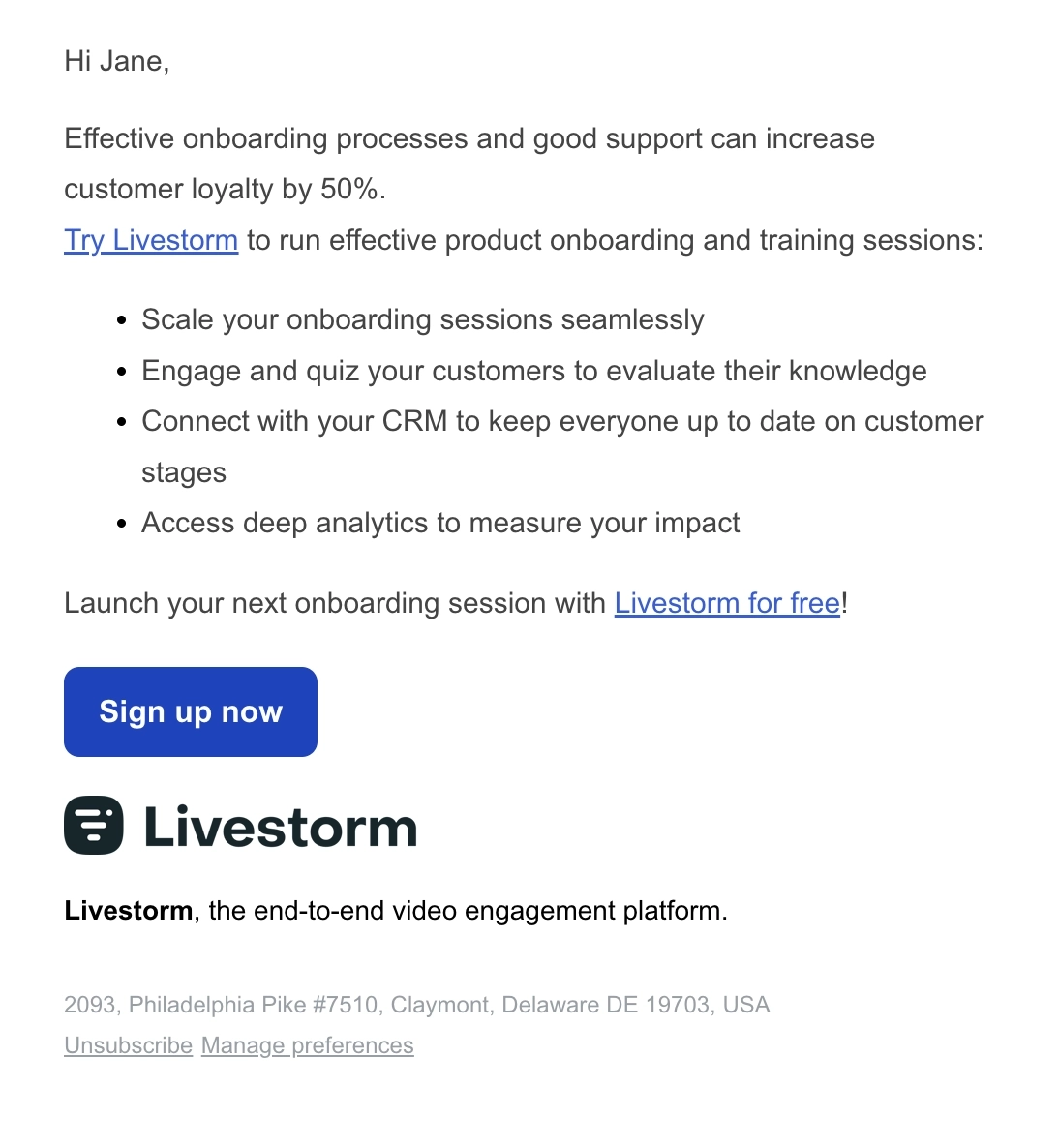
Livestorm is a browser based video conferencing and webinar platform.
Their email starts by mentioning how effective onboarding positively impacts customer loyalty. They then pitch their platform as the solution with specific examples of how to use it for onboarding.
What can be done better?
They should have used just 2 CTAs since this is a short email.
#2. Keap
Subject: 20 million words or 5 minutes to learn this?
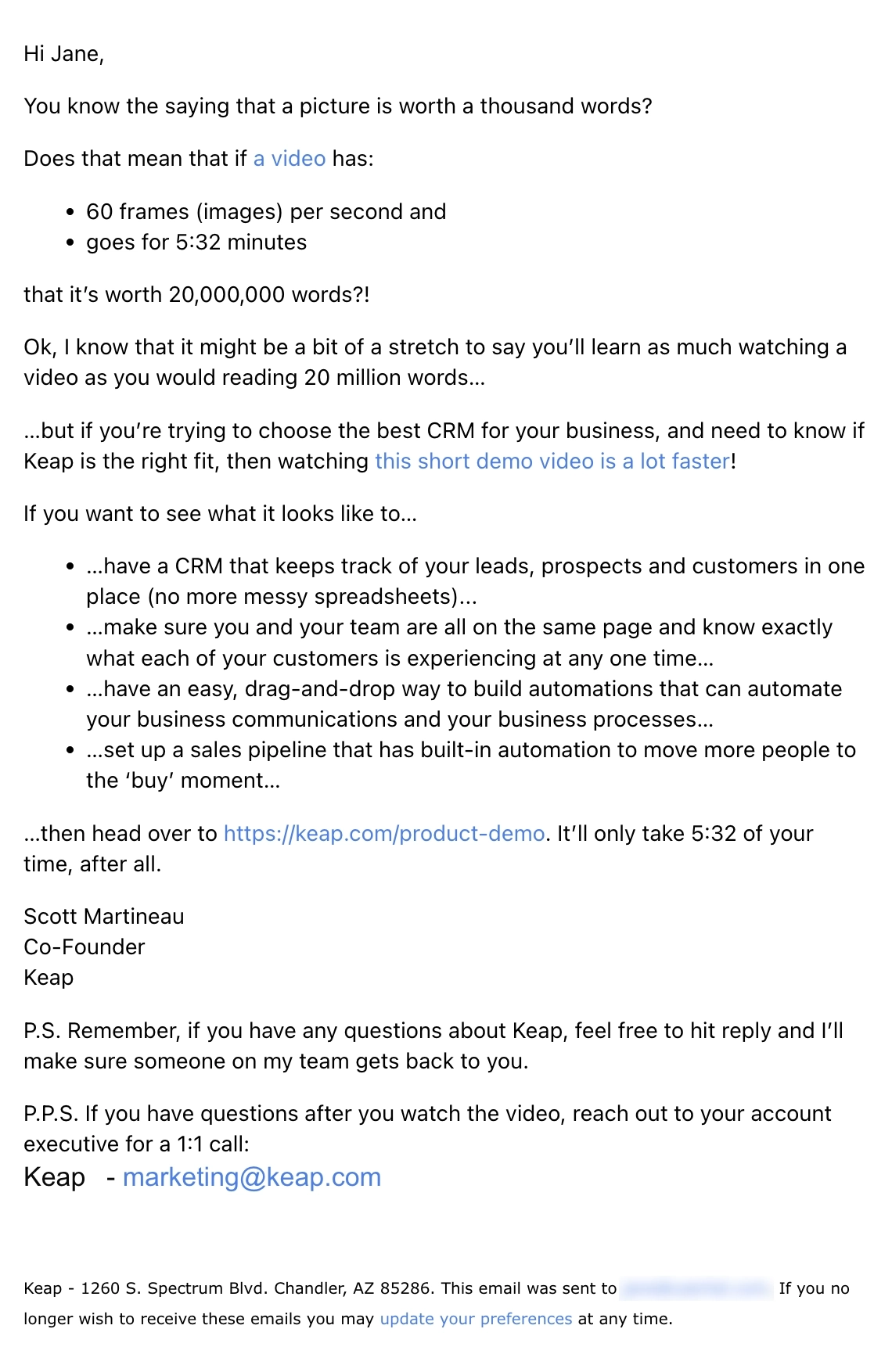
Keap is a CRM and automation platform for small businesses.
They injected humor into their email by using the idiom “a picture is worth a thousand words” to come up with the word equivalent of their short video, hopefully convincing the reader that it’s faster to watch the video instead of reading. They list some use cases and tease the reader that if they want to see it in action, they should watch their demo video.
Keap followed up a few days later with the email below.
Subject: Your network just got bigger. Way bigger.
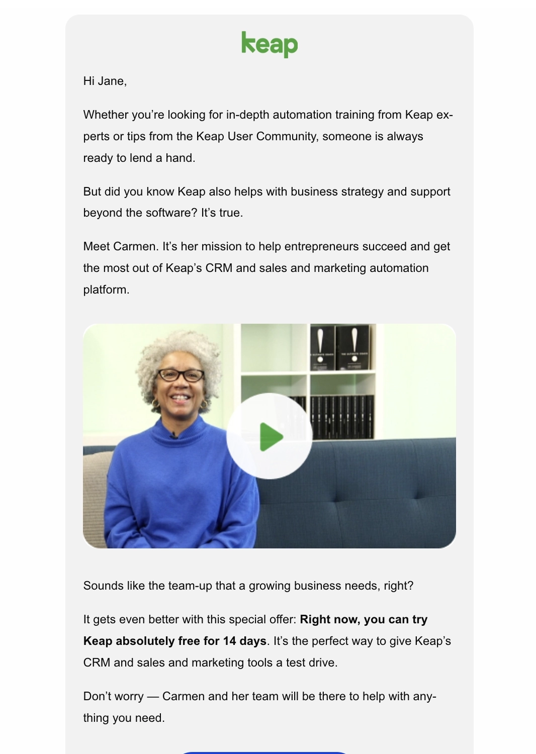
This email highlights the support of Keap experts so users can make the most out of the platform. Keap also presents a special 14-day free trial offer to convince the reader to sign up, ending with a clear CTA.
#3. Virtual Soul
Subject: Stay Close Forever: Keep Connected with Loved Ones, Even After Life
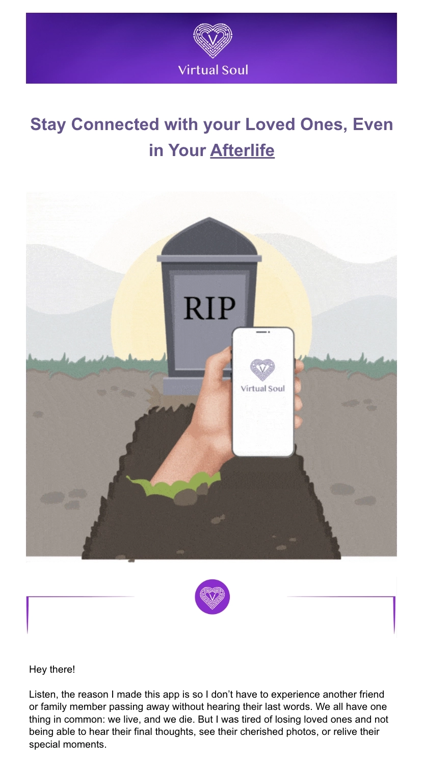
Virtual Soul is a social platform that lets you create and preserve your legacy in digital form.
Their email leans into emotional vulnerability by talking about why they created the platform. They injected some dark humor in their CTA text (“…before it’s too late”) to convince the reader to download the app.
#4. ClassPass
Subject: 1 month for PHP 250 starts NOW ⏰
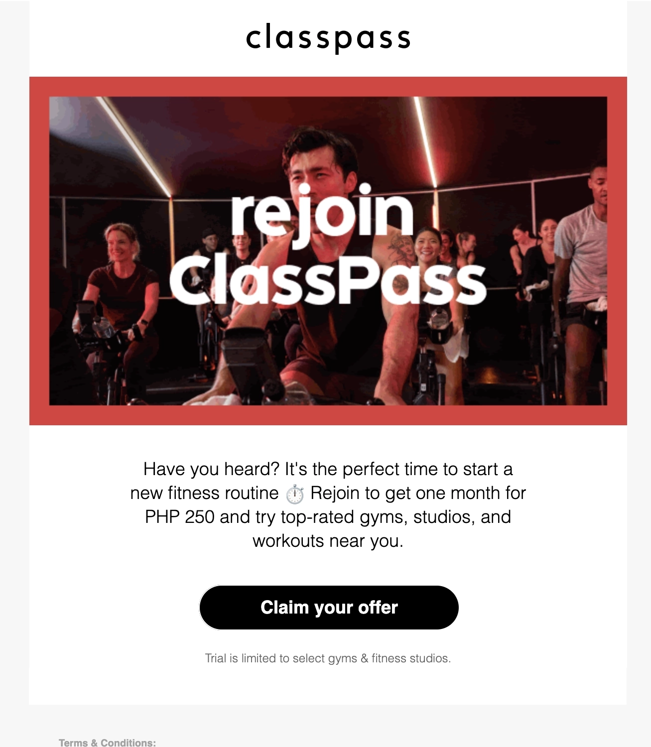
ClassPass is a fitness and wellness membership platform that lets users access fitness studios, gyms, salons, and spas around the globe.
Their re-engagement email urges the reader to rejoin and restart their trial at a discounted price. The email copy is short and direct, telling the reader about what they get access to when they rejoin the platform.
The copy under the CTA button sets readers’ expectations about what gyms and studios they have access to during the trial.
#5. Google One
Subject: Try the best of Google AI with our new AI Premium plan

Google One is a cloud subscription service that gives users more storage across Google Drive, GMail, and Google Photos.
Their email opens with a summary of what you can get with the AI Premium plan, immediately followed by a CTA. The email talks about a few use cases where you can apply their AI in your daily life, so the reader can better understand its value.
At the last section of the email, we find a summary that contains the details of the monetary and product value the reader can get if they redeem the trial.
#6. Apple TV+
Subject: Get Apple TV+ free for 3 months.
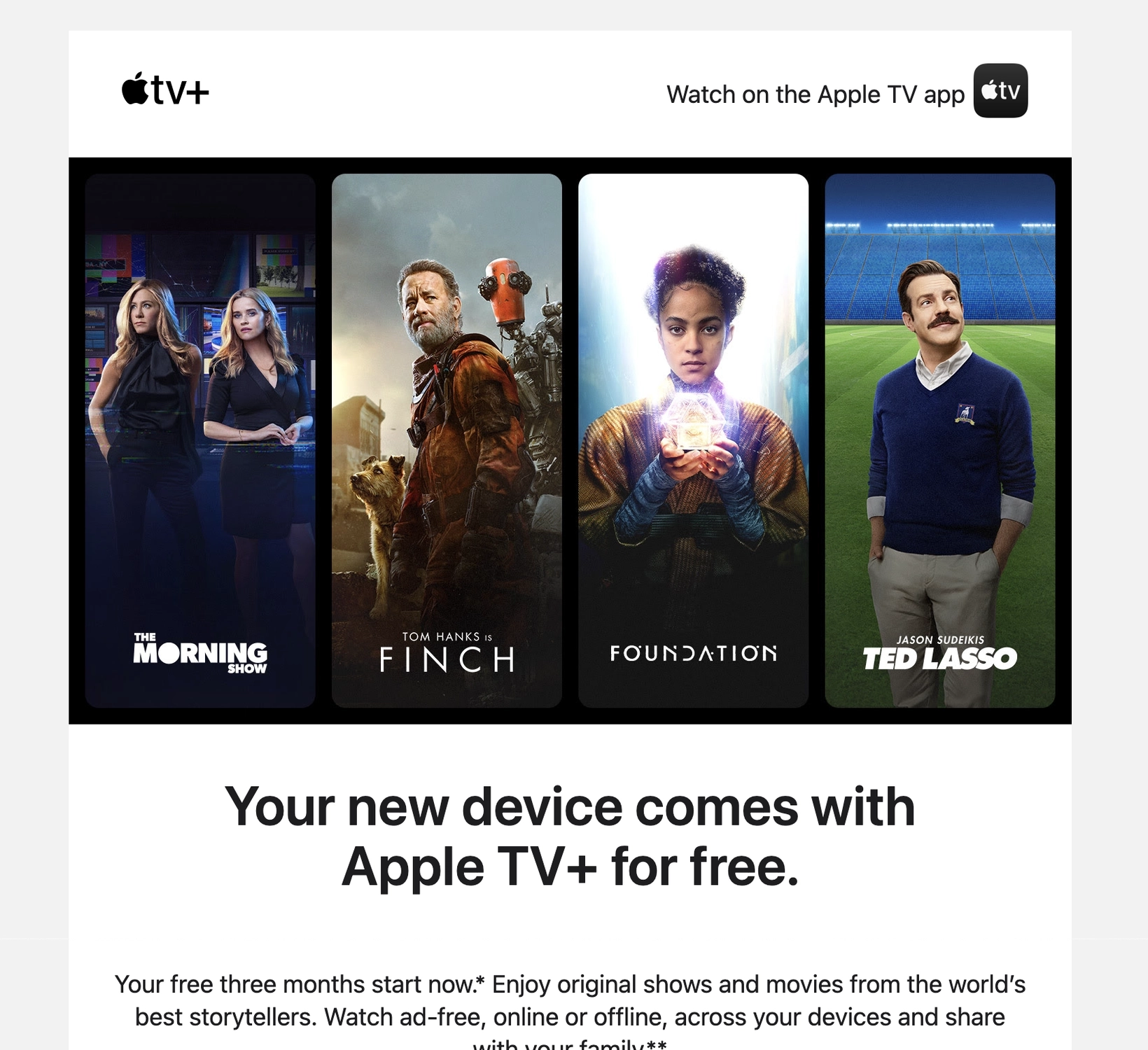
Apple TV+ is a streaming service that features Apple Original shows and movies.
Apple’s email talks about their free 3-month Apple TV+ offer for the customer’s new device purchase. The first half of their email showcases the platform’s top-rated shows to encourage the reader to take the offer. The CTA “accept 3 months free” is effective because there’s little to no commitment required of the reader compared to a generic CTA (like “sign up now”).
To create that sense of urgency, Apple tells the user that this offer should be redeemed within 90 days of activation. Using the red font color ensures that the reader won’t miss out on this important detail.
And should the reader want to know more about the platform, Apple adds a secondary CTA at the end of the email.
#7. Semrush
Subject: Put SEO success in your own hands with Semrush 👏

Source: Really Good Emails
Semrush is an all-in-one tool suite for improving online visibility and discovering marketing insights.
The email opens with a simple headline, describing SEO success in layman’s terms. The rest of the email describes what features and benefits the reader can enjoy with their 7-day free trial.
The email ends by telling the user that SEO success is theirs for the taking and they can do so with Semrush. Telling the user that they can “cancel anytime” assures the user they don’t have to commit to anything once they sign up for the trial.
What can be improved?
- Instead of promising high rankings during the free trial, maybe the email copy should be more realistic and instead use language like “improve rankings” so that they’re setting the right expectations with the reader.
- The second CTA “start your free 7-day trial” can be shortened since they’ve repeatedly mentioned the duration of the trial throughout the email.
#8. Headspace
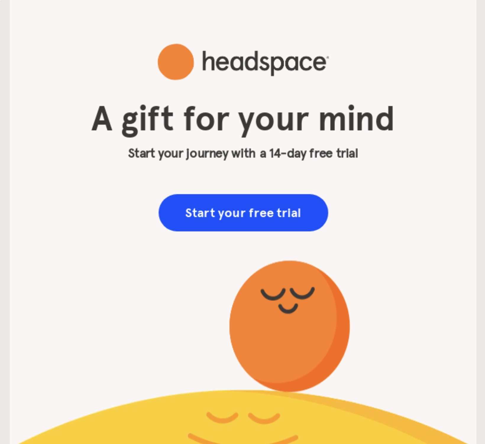
Subject: Start your journey with 14-days free
Source: Really Good Emails
Headspace is an app that helps users achieve better mental health.
This email talks about the best gift you can give your mind. By adding a graphic that evokes a sense of calm, but also fits their branding, it helps the reader envision what they can achieve with the platform.
Headspace then talks about the different features that the user can explore to achieve health and happiness before the second CTA button.
#9. YouTube TV
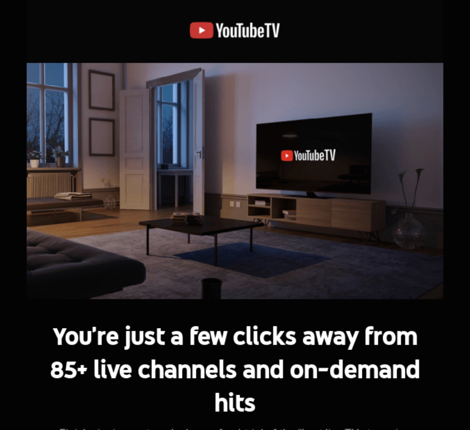
Subject: Psst … don’t miss your free YouTube TV trial
Source: Really Good Emails
YouTube TV is Google’s TV streaming service that gives users access to live TV content from hundreds of broadcast, cable, and regional sports networks.
Compared to the other emails that only talk about the benefit of a product with the headline, this one from Google instead talks about how easy it is for the reader to get access to tons of live channels (“just a few clicks away”).
After the CTA, the email also mentions other important details including the regular subscription price, who this trial is applicable to, and other YouTube TV features.
What can be improved?
They could have mentioned the duration of the free trial (i.e. 7 days, 1 month) so users know exactly what they’re signing up for.
Don’t wait for the muse. Apply this step-by-step method to write high-performing email campaigns in hours, not weeks.
Driving trials to become paying customers
#10. LeadGen App
Thanks to Christopher Lier of LinkPanda for contributing this example.
Subject: Limited time: 30% off on LeadGen App plans
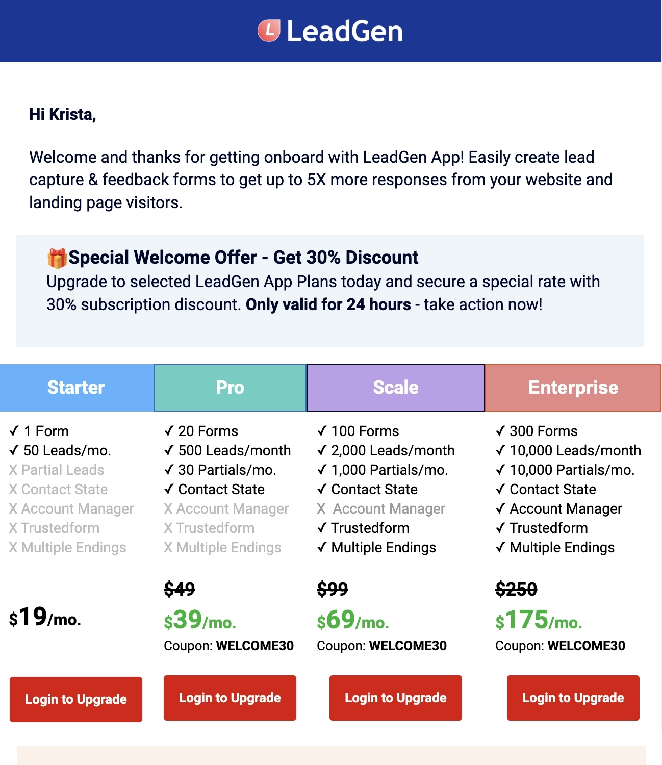
LeadGen App is a platform that lets you easily create user-friendly online forms for your lead generation campaigns.
As the first email in their free trial onboarding sequence, LeadGen App welcomes the new user by immediately presenting them with a special offer to upgrade to an annual plan. To convince the user, they use the following tactics:
- Sets a deadline of 24 hours for claiming the special offer
- Present the differences between tiers
- How much value they’ll save when they upgrade
The next sections details clear steps on:
- How the reader can claim the offer
- How to start capturing leads using the platform; and
- How to keep seeing LeadGen’s emails in their inboxes
What can be done better?
- Since the email mainly talks about upgrading to a paid annual subscription, their main CTA should be “Upgrade to a Paid Plan” instead of “Log in to Your Account”
- The email can do without the last section about how to move emails to the Primary tab
#11. NordPass
Subject: Your free trial has expired. Get Premium for only $1.69/mo
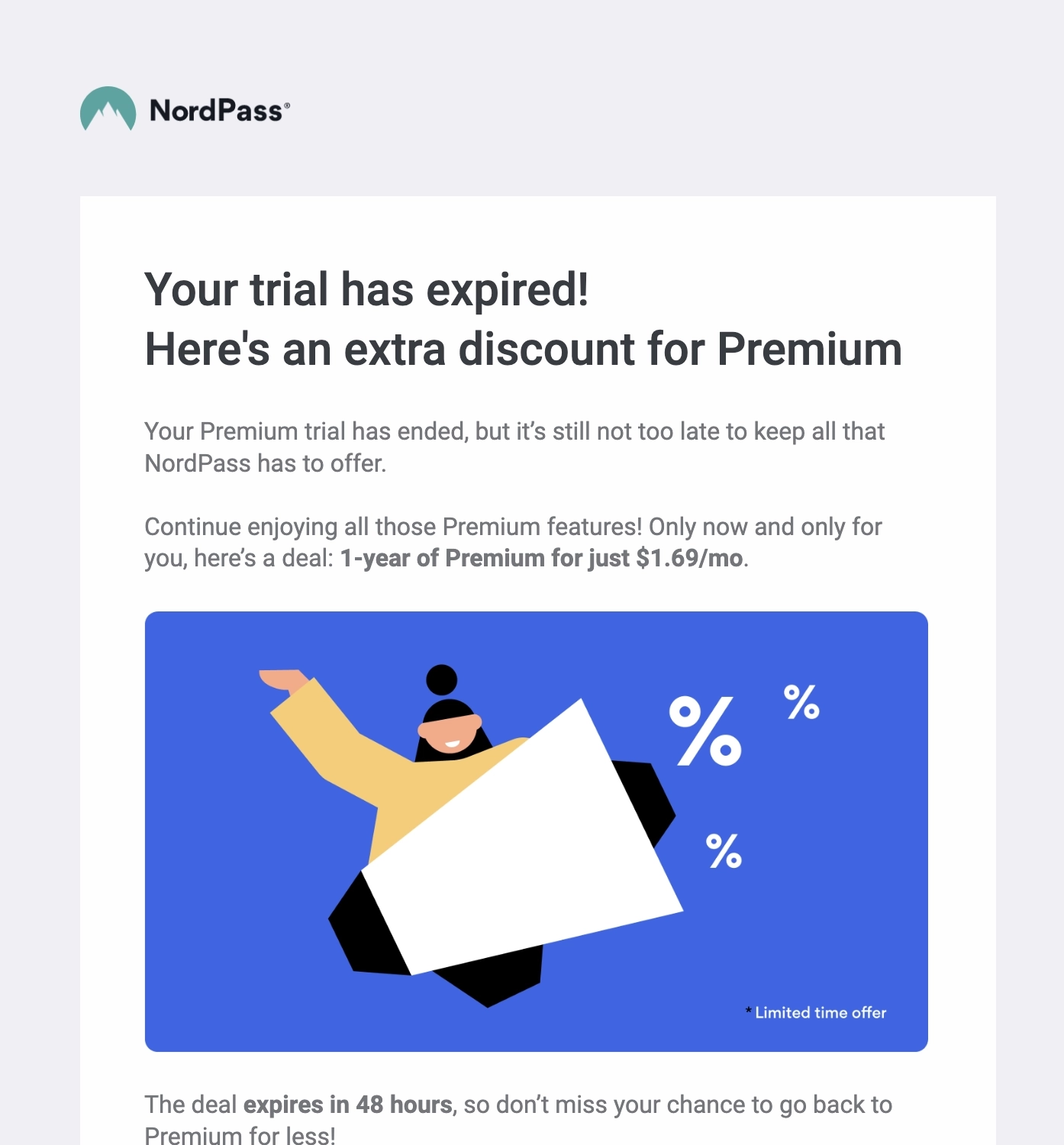
NordPass is a password manager.
This short email was sent to users whose trial expired, urging them to rejoin at a discounted price for a limited time only.
What can be done better?
- Instead of stating “48 hours”, they could have been more specific about the deadline (date and time zone) so users know exactly when the offer expires.
- They could have used a different font color to further emphasize the important details of the deal.
#12. Programa
Subject: ⏳ Your Programa trial ends tomorrow.
Source: Really Good Emails
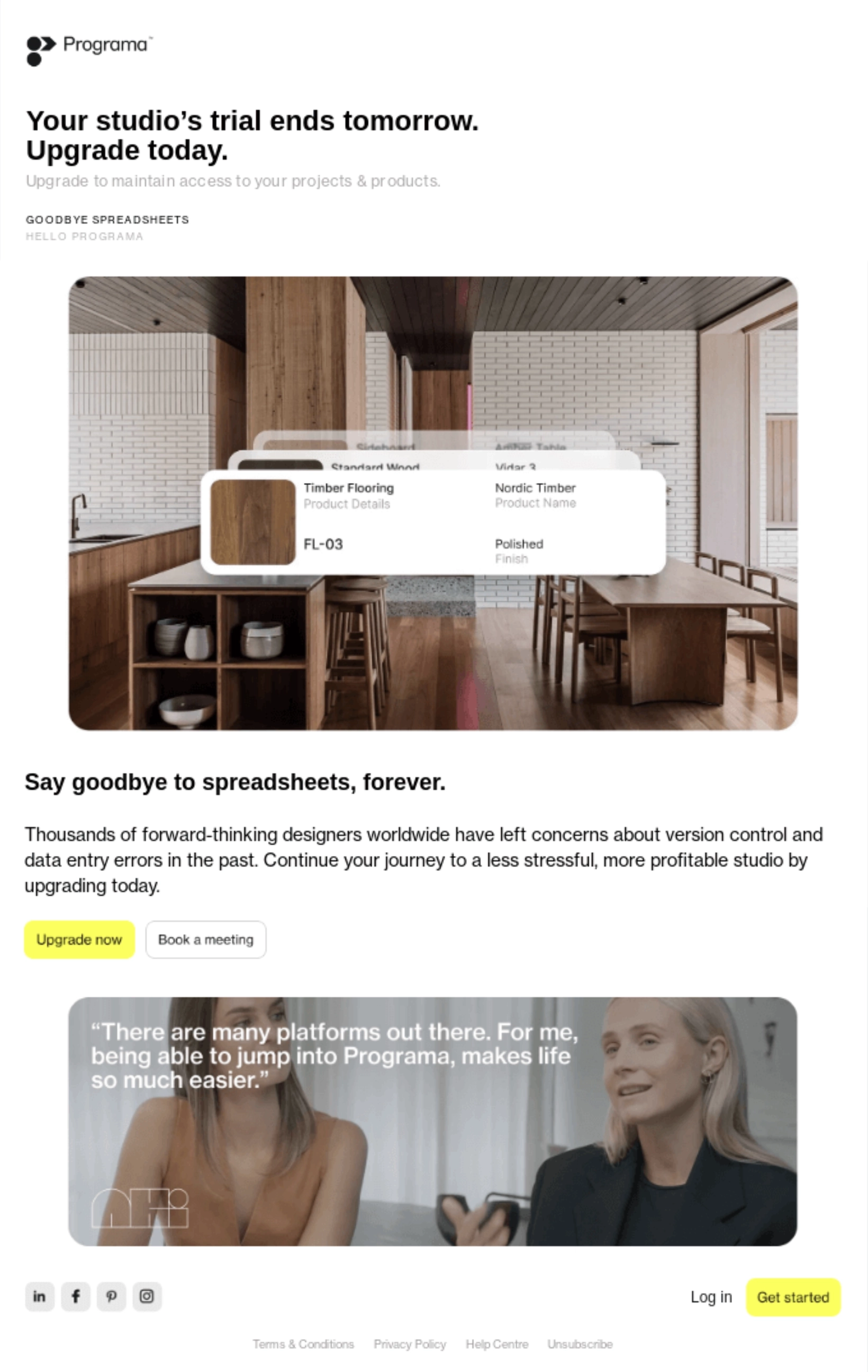
Programa is an innovative project management tool for architects and interior designers.
Their email talks about the pain of using spreadsheets for architectural and interior design projects, highlighting designers’ experience with version control. By triggering this pain point, Programa then presents its platform as the less stressful alternative to spreadsheets so designers can work on more projects.
What can be done better?
Having the primary and secondary CTA in the same place might confuse the reader about what they should do. They should have added another section for that secondary “book a meeting” CTA.
#13. Sprout Social
Subject: Your trial has ended, but it’s not too late.
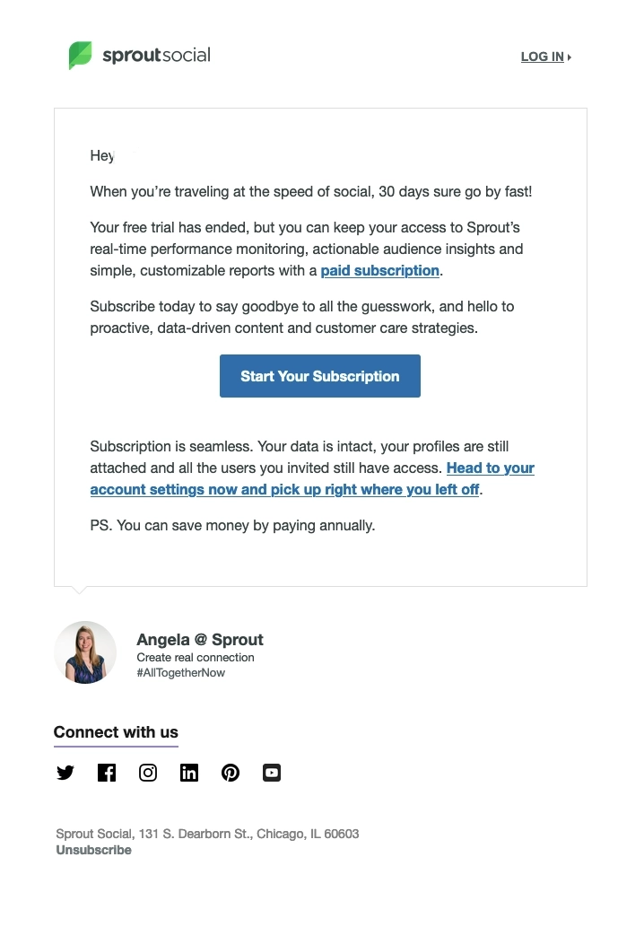
Sprout Social is a social media management and intelligence tool for brands and agencies of all sizes.
They sent this email to users whose trials have recently expired. They tell the user that despite the end of their 1-month trial, their data is still intact and they can get access to that if they upgrade to a paid subscription.
What can be done better?
Because the email is short, having three CTAs on there is too overwhelming for the reader. They could have limited it to two at most.
#14. ConvertKit
Subject: Your trial is half over: Do this next
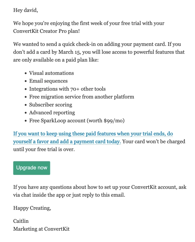
ConvertKit (now Kit) is an email marketing software for professional creators.
They send this email a week before the trial expires, urging the user to add a payment card by a specified date so they can continue using the paid-only features.
What can be improved?
- The two CTAs are so near each other (“…add a payment card today” and “upgrade now”) that one CTA is more than enough for this email.
- Instead of making the secondary CTA a full-length sentence, they could have just limited the CTA copy to “add a payment card today”.
Driving free users to upgrade to a paid plan
#15. StreamYard
Subject: Final Reminder
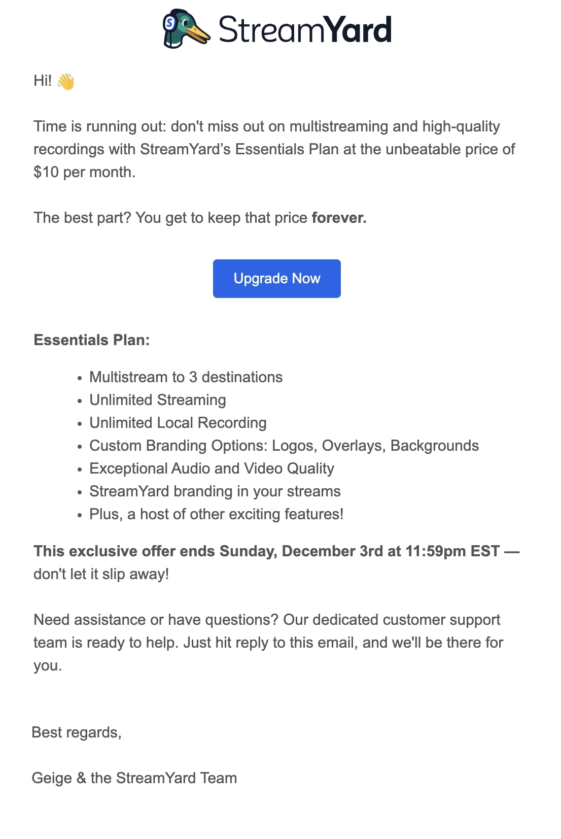
StreamYard is a professional live streaming, recording, and webinar tool.
The email immediately triggers a sense of urgency in the reader. To further convince the reader, StreamYard tells them that they’ll get to keep the price forever should they upgrade now.
They then go on to list down the features the user will get access to and states the deadline of this exclusive offer.
What can be done better?
They could have added another CTA after the deadline so the reader doesn’t need to scroll back up to the button.
#16. Descript
Subject: [First name], save $72 by upgrading to Descript Pro
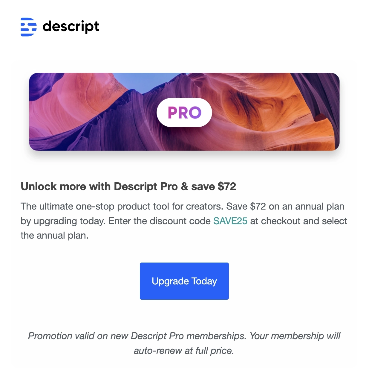
Descript is an all-in-one video and audio editing software built for creators.
In this brief promotion email, Descript highlights how much the user can save on an annual Pro plan if they upgrade today using a special discount code.
What can be done better?
Unless the reader has already experienced a trial of the Pro plan, their email should have provided more context about what the user can get when they upgrade.
#17. Canva
Subject: Upgrade to Canva Pro for free
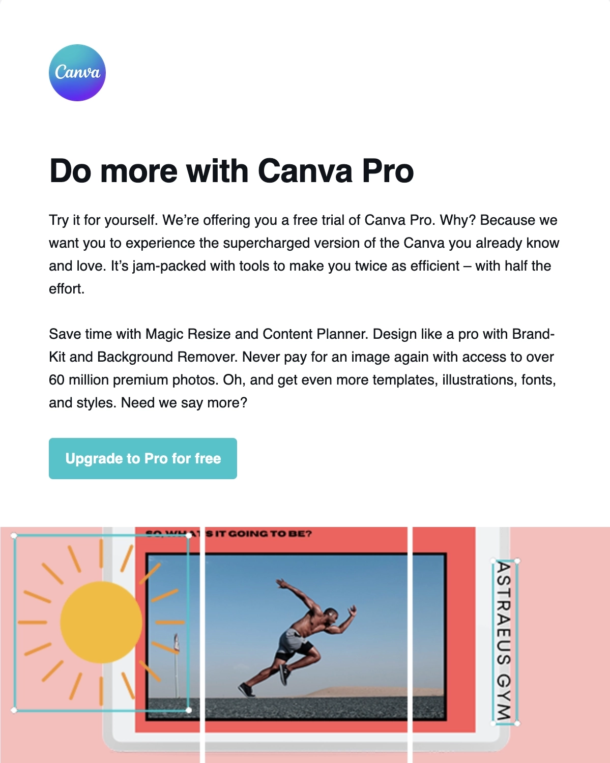
Canva is an online graphic design tool.
While this isn’t exactly an upgrade email, Canva tries to get a foot in the door by offering a free trial of their Pro plan.
The first section talks about how they want the user to experience the supercharged features with the free trial of their Pro plan. The next sections then show (instead of just telling) all the different features the user can explore.
What can be done better?
They should have mentioned the duration of the free trial (i.e. 7 days, 1 month) so users know exactly what they’re signing up for.
#18. Hootsuite
Subject: Time’s ticking. Your Free plan will be gone in 4 days ⏰
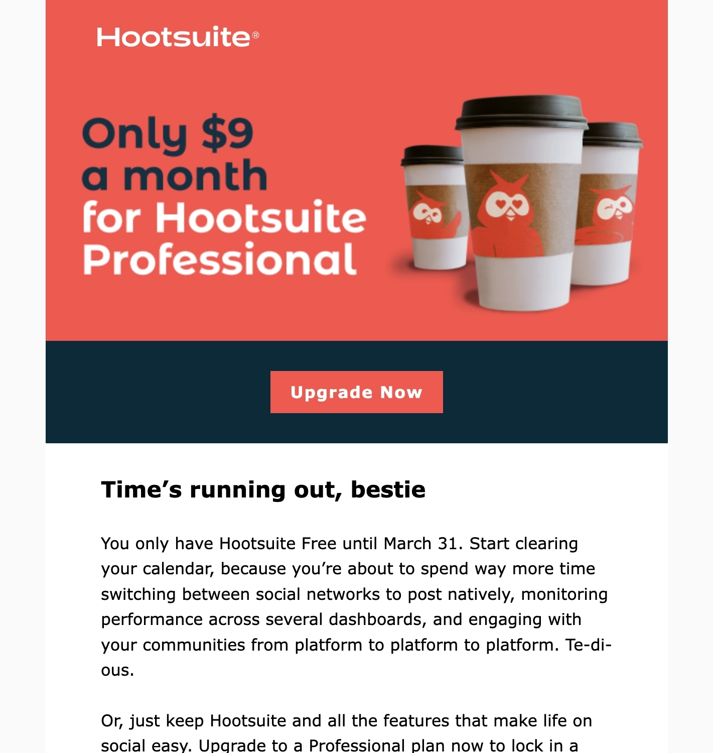
Hootsuite is a social media marketing and management tool.
This meaty upgrade-to-paid email has three sections, each ending with a CTA button.
The first section shows a simple graphic with a clear and brief headline talking about the price of their Professional plan.
The second section of the email perfectly makes the case for the upgrade, describing how painful and tedious it is to handle several social media platforms natively. The next paragraph then talks about how the reader has the choice of making social media management easier for the low price of their Professional plan.
The third section then lays out all the benefits of using Hootsuite to manage their social media platforms.
Should the reader want to learn more about the Professional plan, Hootsuite placed a secondary CTA (“Learn more about these changes”) at the end of the email.
#19. Untappd
Subject: 🧨 LAST CALL for 36% Off
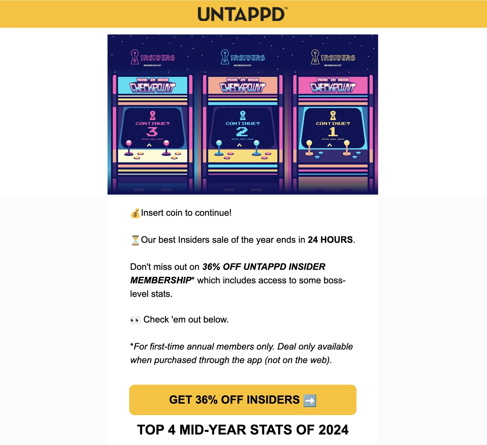
Untappd is a mobile app that lets you discover and share great beers, breweries, and venues with your friends.
Starting with the subject line, this email immediately creates a sense of urgency by telling the reader that this is their final chance to get a discounted price on the Insider membership.
Instead of merely talking about the stats and perks, these features come with screenshots and graphics to show the reader exactly what members can enjoy with a paid membership. They then reiterate the 36% discount by using it as their CTA copy.
Deliver a powerful pitch with your CTA emails
Just like a great salesperson, your CTA emails can help you drive conversions by giving your audience a compelling reason to move to the next step. It may feel intimidating, but you must ask your users directly to sign up for a trial or upgrade to a paid plan. Make sure you sprinkle such CTA emails throughout your campaigns.
Check out these guides for further inspiration:
- SaaS Email Marketing Strategy: Everything You Need to Know
- Atomic Emails: Our Proven Method for Writing Email Campaigns
- How to Trigger a Behavior-based Email Campaign
If you need specific help with email marketing for your SaaS product, welcome to book a demo call or check out our done-for-you services.
Don’t miss out on new articles. Subscribe to our newsletter and get your monthly dose of SaaS email marketing insights.


