
One bright day in March 2025, an angel investor said to my face in a call, “It just doesn’t look like a modern app.” Thank you, Fredrik. It was the last drop.
It was time for a change.
Our team of SaaS artisans embarked on a redesign.
Userlist went out of beta in August 2019. It was a minimalist web app with essential automation features. It was good enough to land us the first paying customers.
Fast forward to 2025, and the platform is an automation powerhouse trying to fit in a garden shed. Too much whitespace, cramped forms, kitchen-sink navigation.
Today, September 9, 2025, we’re proud to announce the new major version of Userlist: improved navigation, higher information density, and quirky illustrations.
We wrote this post to share what went into this project. We also want to keep the old screenshots as a memory.
Our goals for this redesign
It wasn’t just a facelift. We had business goals on multiple levels.
Product goals (targeting product users):
- Make the app feel modern
- Solve UX challenges caused by product growth (navigation, information density)
- Expose our industry-leading expert content to customers as they’re using the app
- Improve our internal design system
- Work on our apps route architecture
Positioning goals (targeting website visitors):
- Demonstrate how powerful the platform is, compared to other tools (think “platform for marketing geeks”) — and do this with specific features, not vague words
- Create memorable aesthetics
- Show that email platforms can be beautiful and enjoyable (dare to say, fun)
- Highlight our story as artisans crafting quality software
The design process
Product redesign is a chicken-and-egg process. Multiple assets must harmoniously work together: product interface, end user pages, marketing website, docs.
Doug Hughmanick of ANML recommends the “experience-first” approach. It means you develop the brand in the context of its main assets and experiences.
We followed his method, and went the “website-first” route:
- Stage 1. Creative direction + website. Website homepage (including illustrations, colors, and typography) and social media “preview”. No logo at this stage, just a placeholder.
- Stage 2. Logo mark. We tested multiple logos in the context of the new website and social media assets.
- Stage 3. Interface screens. With the website styling in mind, we designed a handful of UI screens that included main component decisions (tables, filters, buttons, modals).
At each stage, the previous deliverables could still be tweaked. But we tried to stick with the main decisions. Otherwise, it would’ve been borderline impossible to decide on so many things at once.
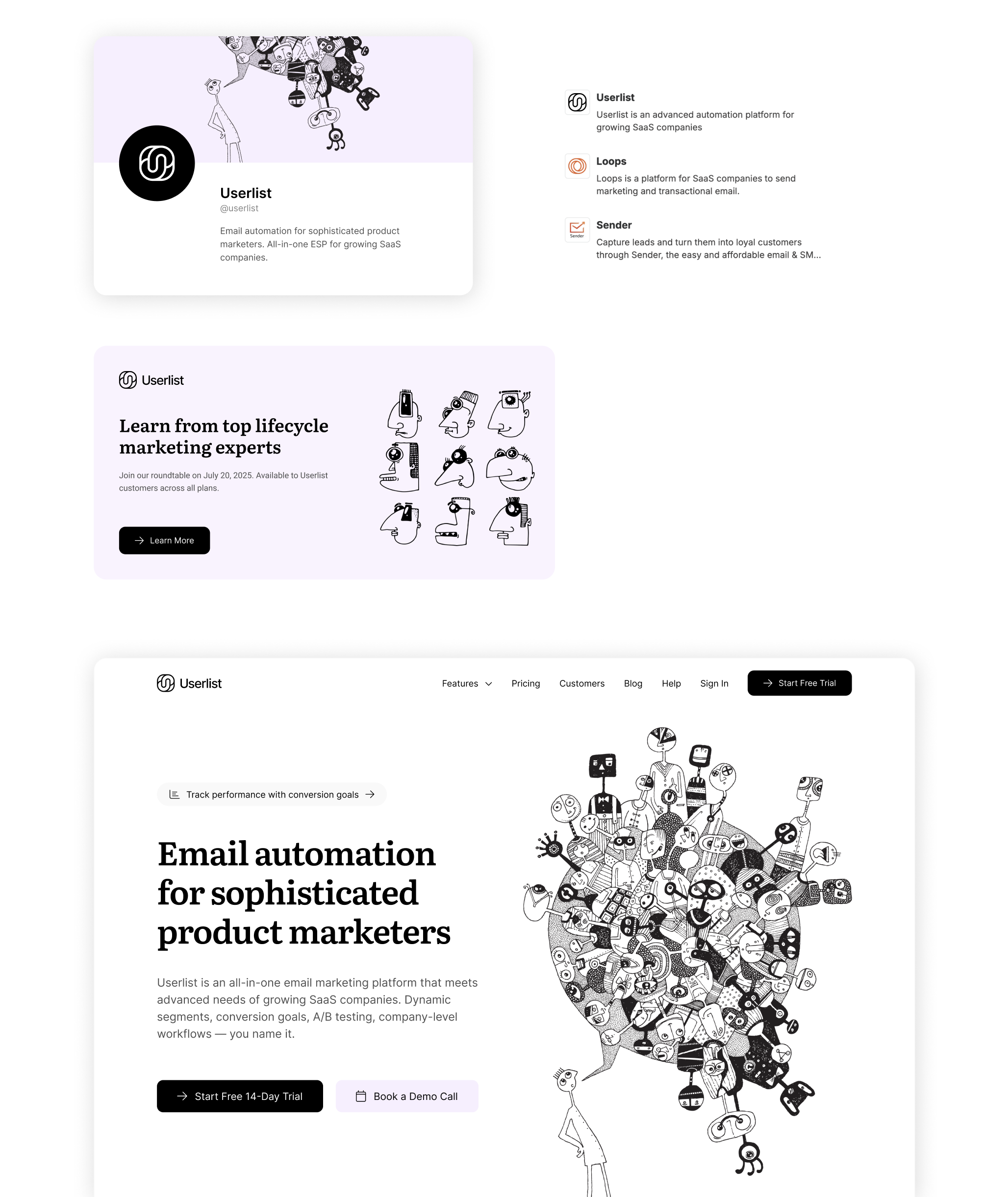
Creative direction & website styling
Here’s the brand we had before: minimalist, black-and-white, using abstract 3D images as illustrations. Blue was the primary accent color. The epitome of pragmatism and consistency.
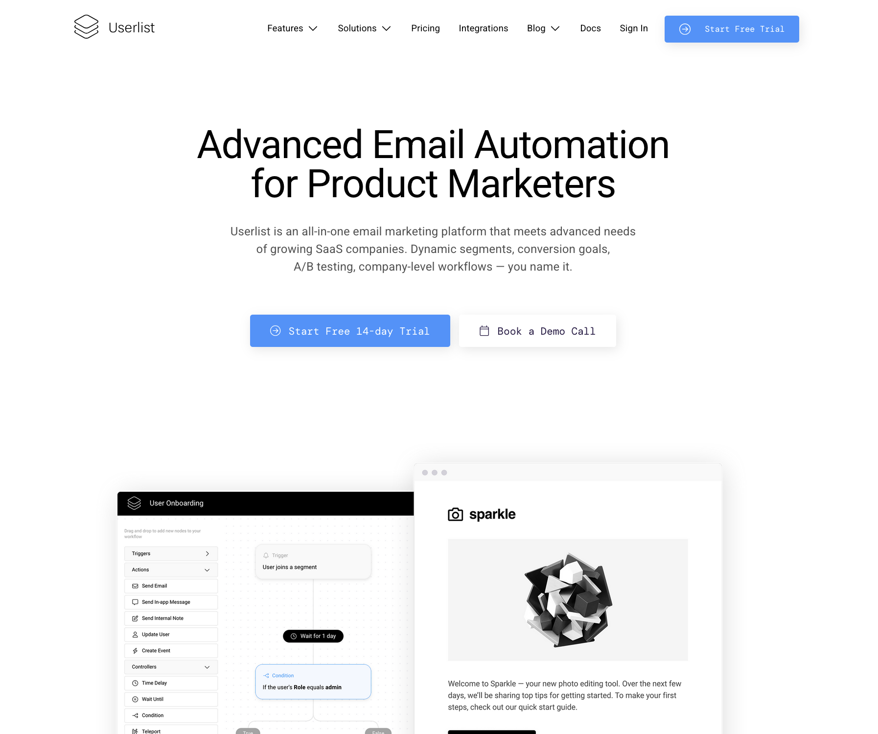
What we decided to do this time: keep the black-and-white, but add more whimsy with illustrations, serif fonts, and pastel purple backgrounds.
Here’s the new homepage styling:
The main question was: how do we use the website homepage to reflect all the sophistication and extra geeky powerful features of the product? All while using facts, features, and not vague words.
Here’s one of the new website sections we created to address this:
Are these custom illustrations?
We’d like you to think so. But no, we found a great artist on Shutterstock, and used a large number of his illustrations (I learned to work with stocks in my old days as a creative director).
Why did you go with black-and-white again?
As designers, we’re taught to use sophisticated hues. However, for larger software products, you need to make practical choices. Colors must work in multiple contexts, including email editing, and be easy to maintain.
Our first 2018 version used shades of muted purple. These colors were insanely impractical to work with. We switched to black-and-white in 2021 and never looked back.
Logo mark
We wanted a classic logo including a visual logo mark and the word Userlist.
The logo mark needed to be:
- Friendly and whimsical
- Solid enough for people to trust us with their marketing
- Work on its own — in social media and integration platforms like Zapier
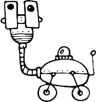
We tested a lot of options: from playing with U letters, to abstract forms, to kittens, dandelions, and propellers.
Here are the mockups with the dandelion seed (natural virality) and the propeller (automation, engines):
![]()
I was stoked about the dandelion, but Benedikt wasn’t.
So he went ahead and started dabbling in Figma (a clear sign that I was failing as a logo designer). His experiments resulted in two intertwined U letters. This logo looked friendly but not too childish. It could survive the next generation of the product, even if we change up the style. It felt right.
I thought, wow. What a wonderful story — a logo designed by a CTO.
So we settled on Benedikt’s version:
Improved navigation & usability
Now it was time to redesign the app.
Here’s the main user list of the app before the redesign:
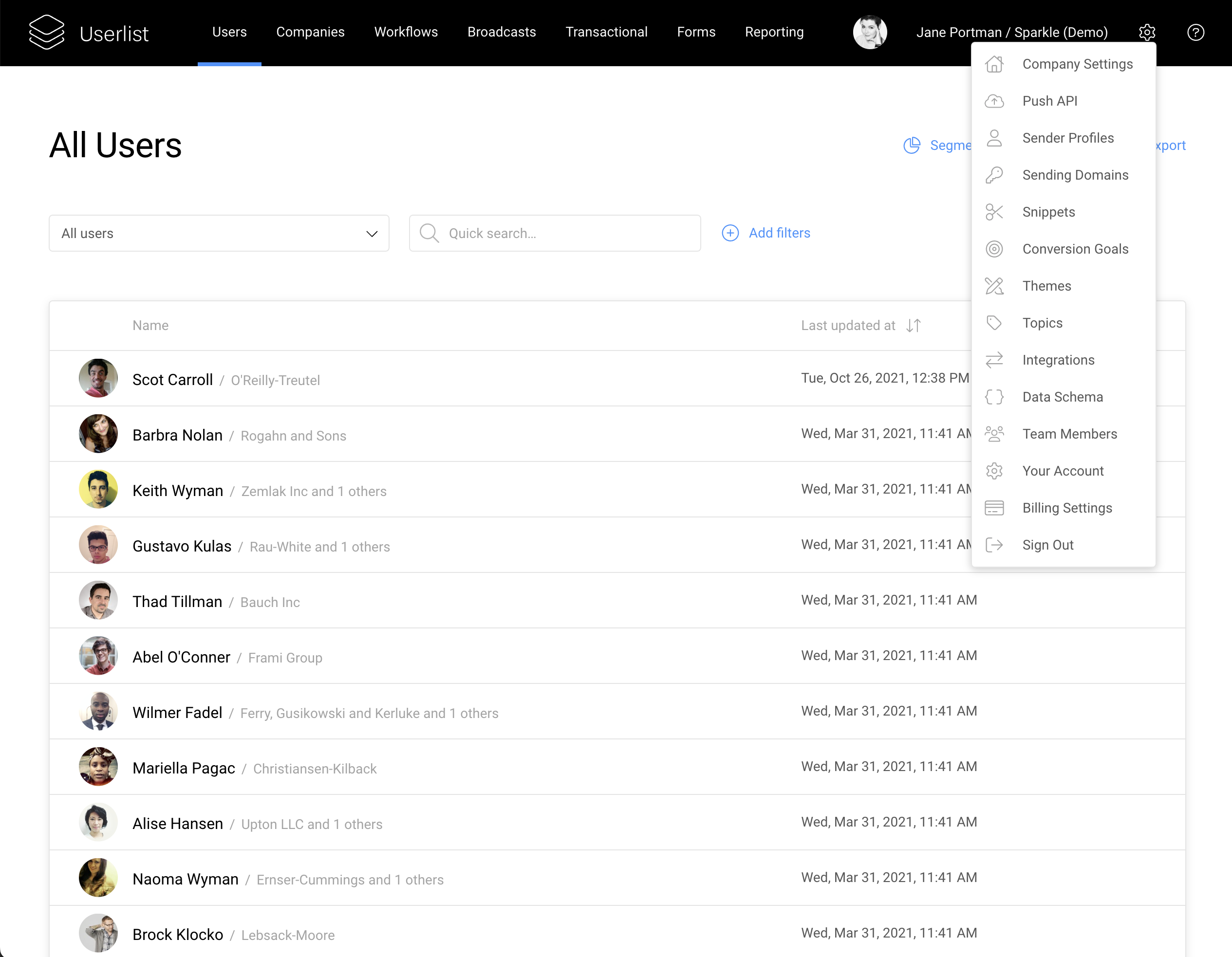
Usability-wise, the previous version had several issues:
- Top navigation. The platform’s feature set has outgrown the top navigation bar.
- Settings. All assets and settings were crammed into a single dropdown menu, and were hard to access. Over time, this menu became the kitchen sink of Userlist. “When in doubt, put it into settings.”
- Information density. Tables, filters, forms, and buttons were too large for the amount of information we needed to present.
The new version has a much denser layout. Smaller fonts. Smaller buttons and input fields.
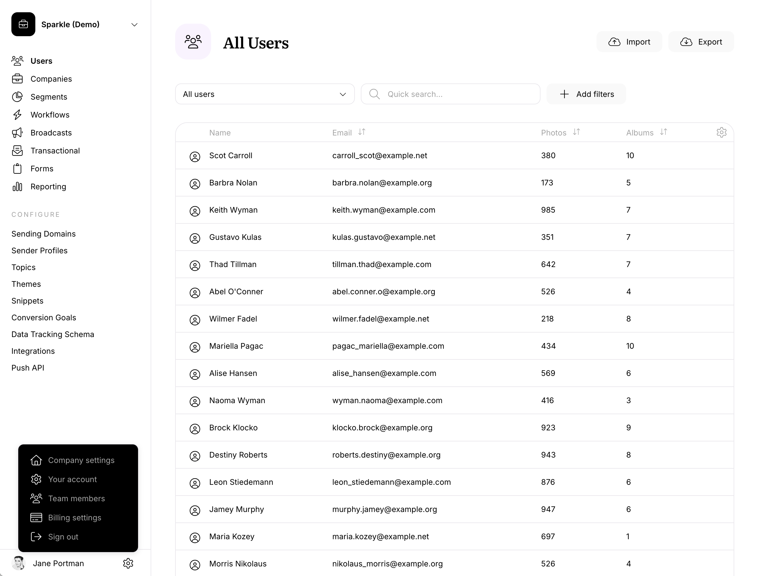
The new navigation works much better:
- Vertical navigation fits more items
- Assets like topics, themes, goals, etc are available for immediate access
- Account title is clearly visible
We also made UI components more uniform:
- All buttons and input fields (including black CTA buttons) now have the same height and border radius
- All copy (inputs, buttons, navigation, user content) has the same small font size, the smallest that made sense
- There are no more “blue links”, they were turned into secondary buttons
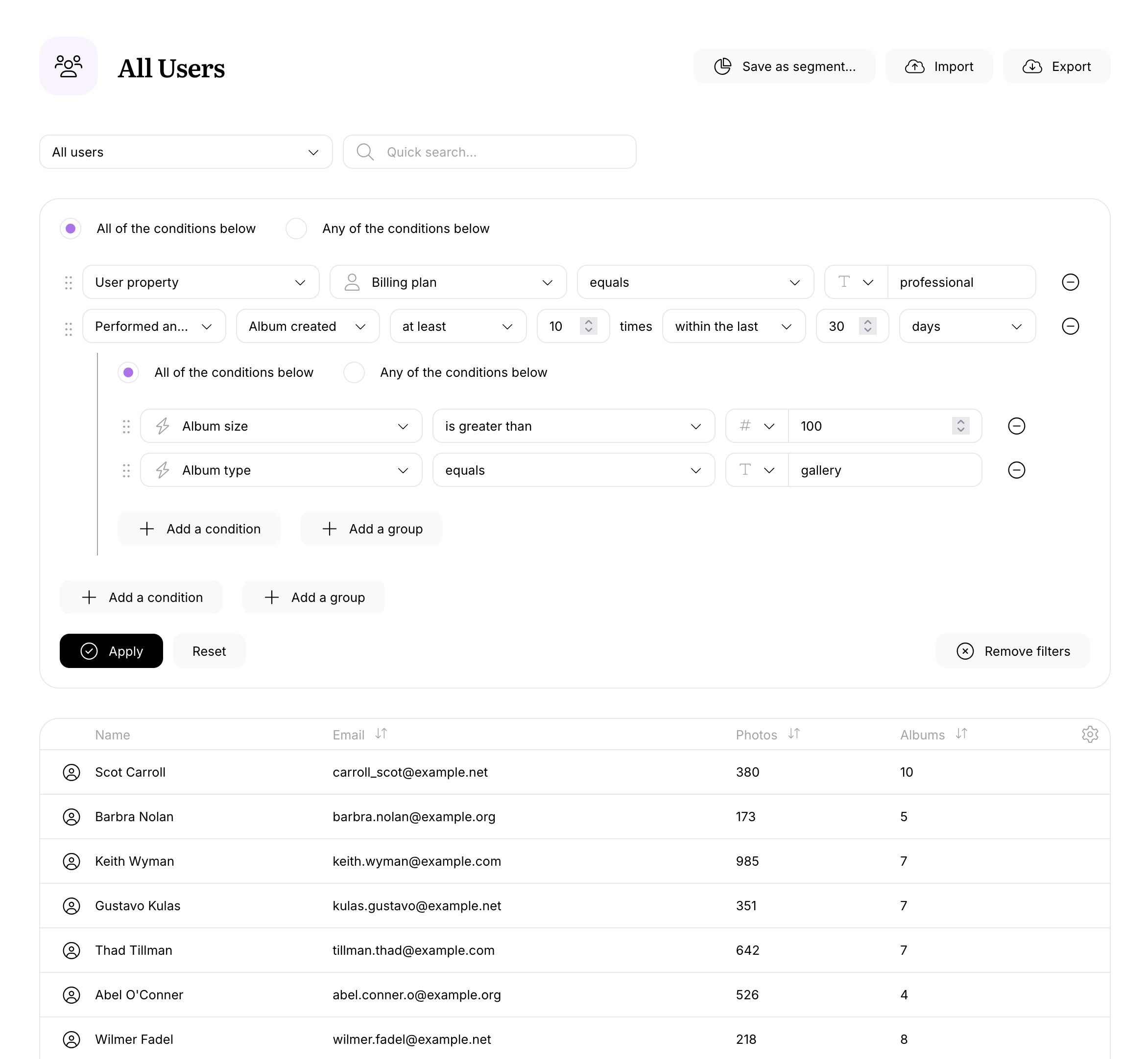
Filters now look super tidy:
Specific parts of the app
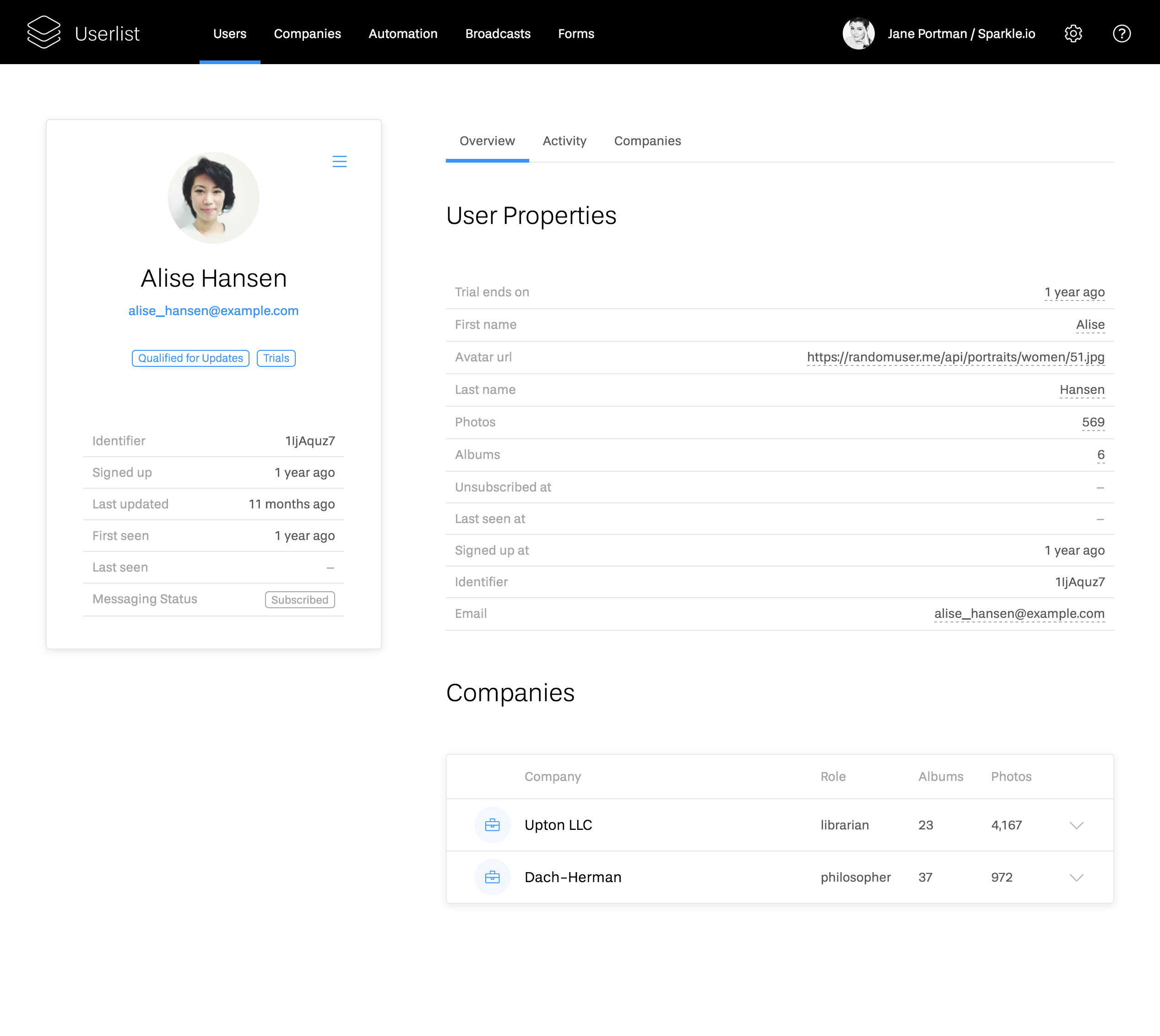
User profile
The previous user profile was fine, but didn’t fit too much data:
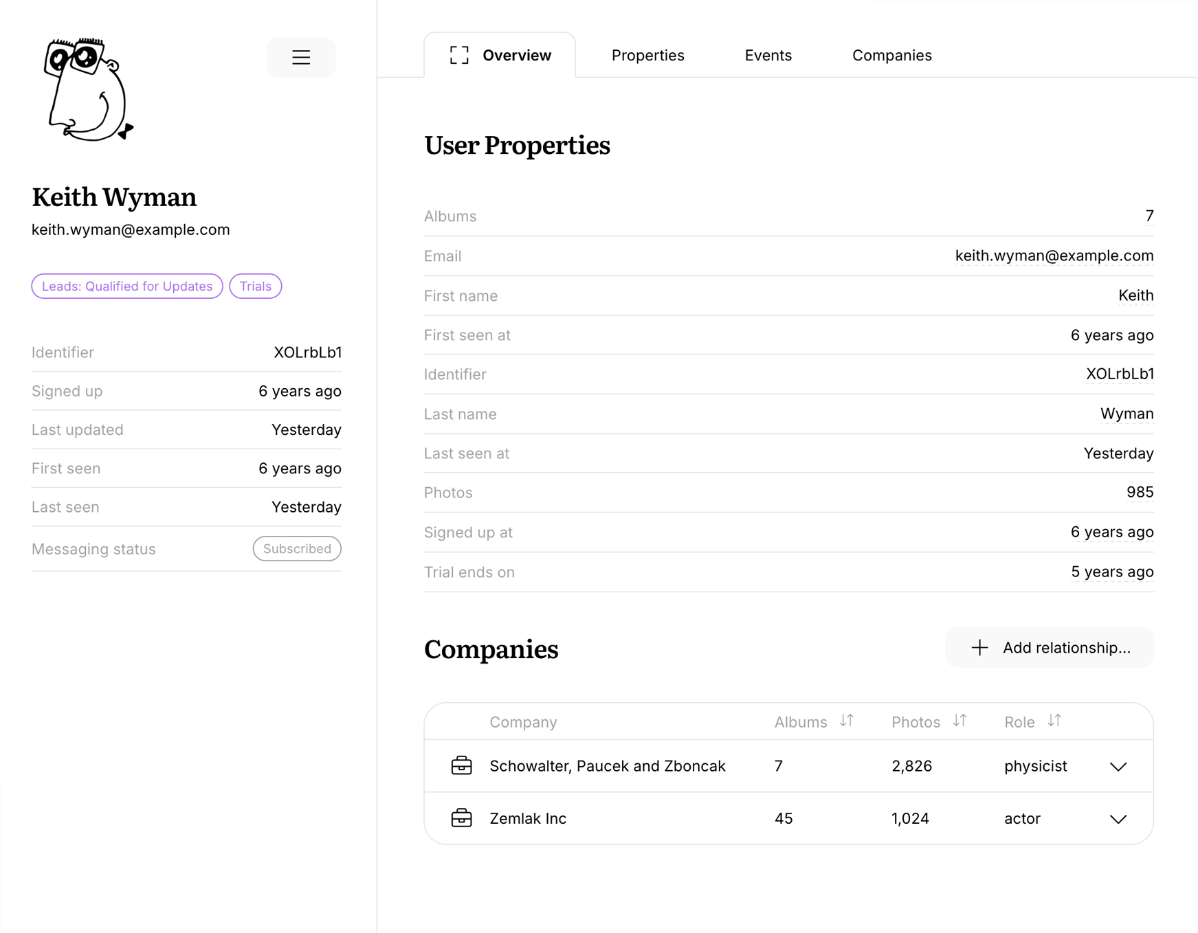
The new version has better information density, and features cute illustration placeholders:
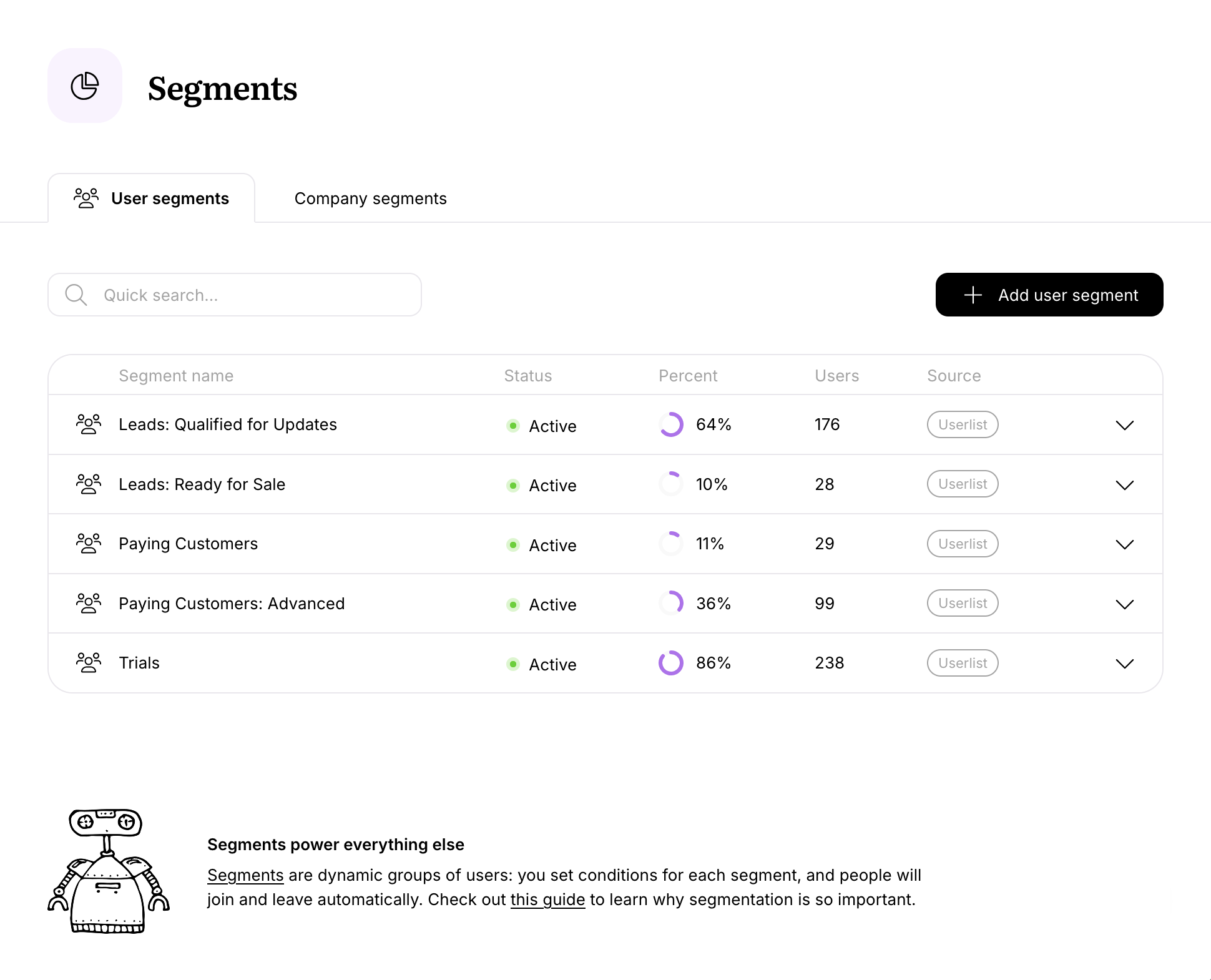
Segments
Userlist has two sets of segments, for users and companies. According to our customers, it’s one of our most useful (and powerful) features.
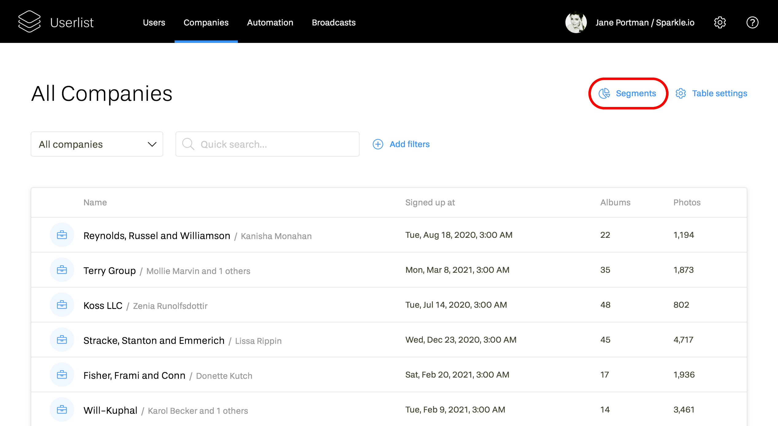
The biggest problem was that these segments lived in the user/company list, and were hard to find:
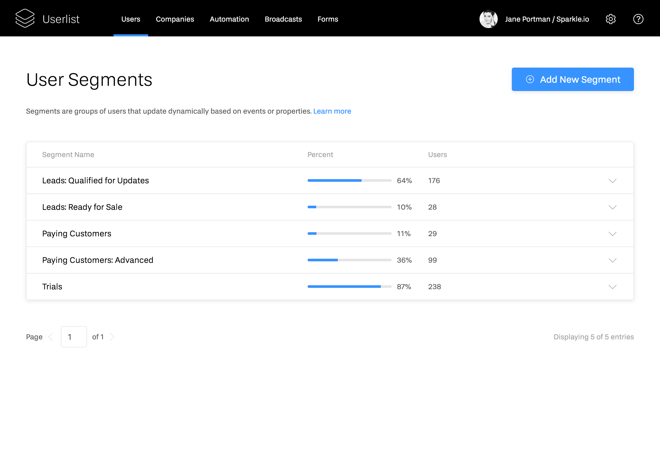
Here’s the actual list of segments:
After the redesign, both sets of segments live together, under two tabs:
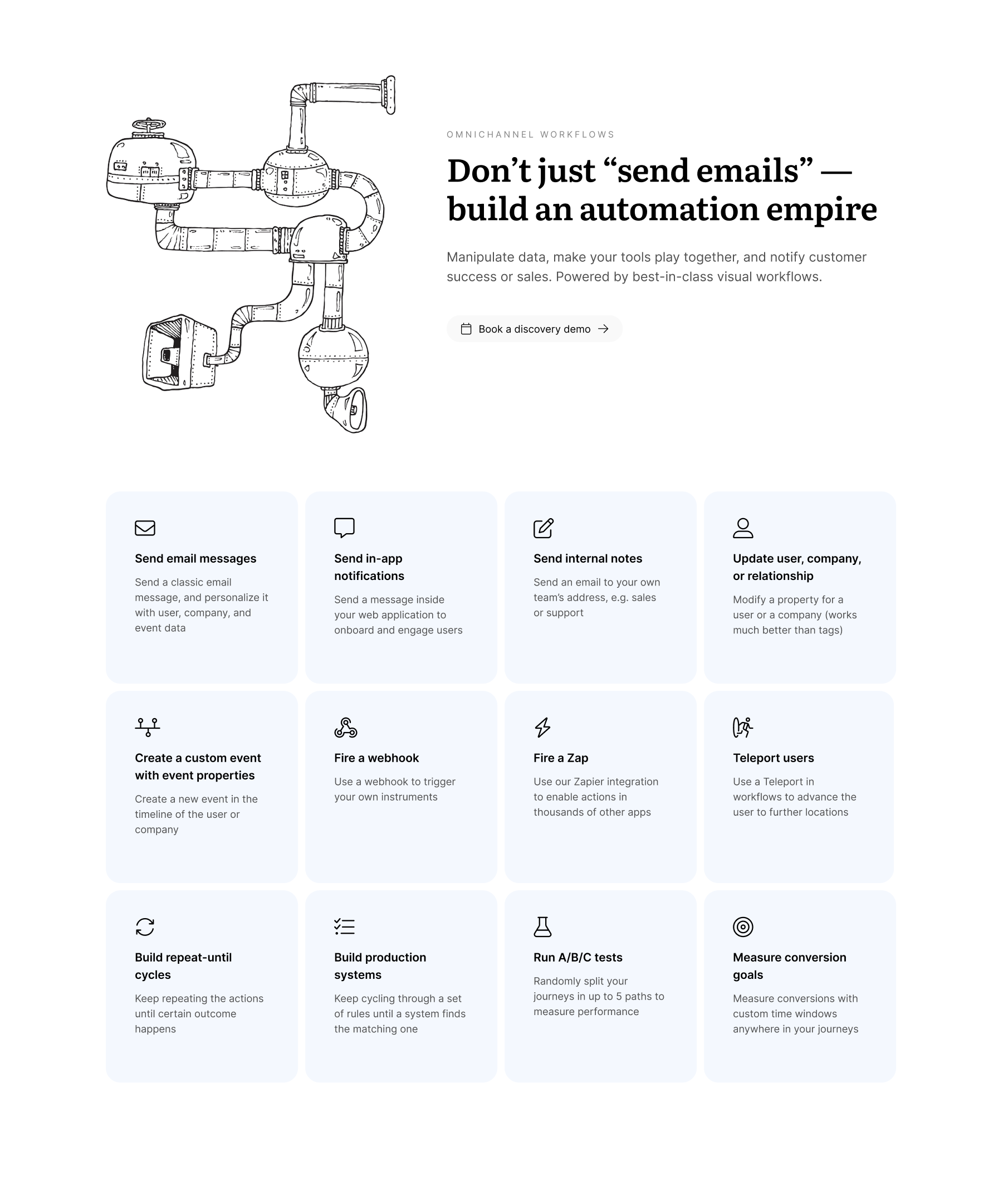
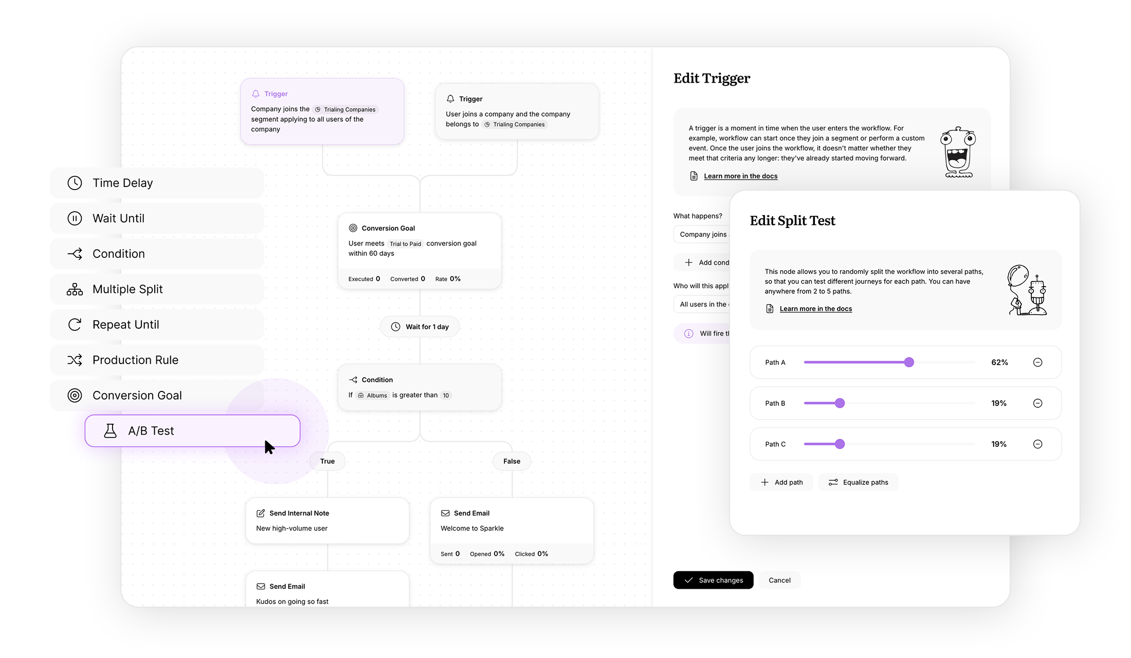
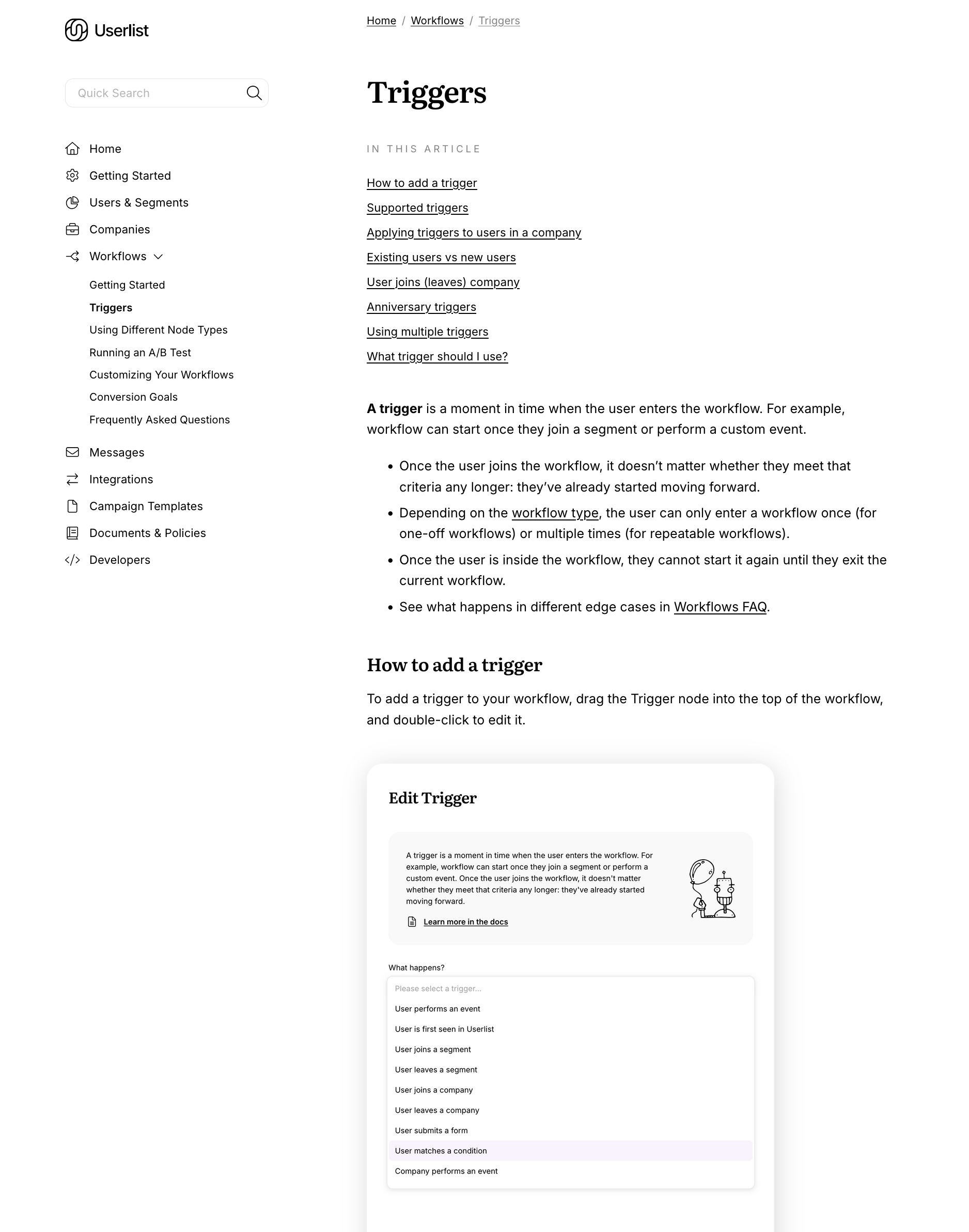
Workflows
Visual workflows have been getting the most love and attention from our team over the last few years, so they didn’t need a major overhaul. But we did extend the new styling and added fun characters.
Before:
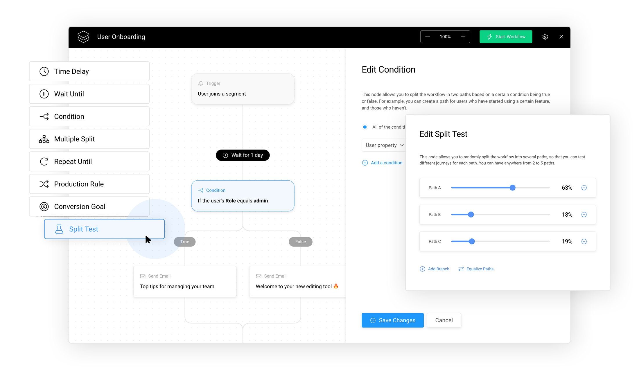
After:
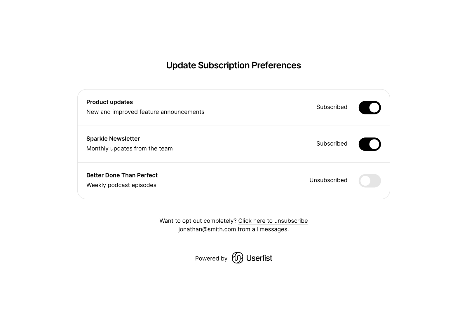
Subscription preferences & forms
As an email marketing platform, Userlist also interacts directly with end users. Subscribers manage their subscription preferences and work with forms.
These parts need to be extremely neutral. Our customers’ product could be anywhere on the spectrum from a meme generator to funeral home software. So we applied the new styling while removing anything whimsical or fun.
Here’s our interface for managing subscription preferences:
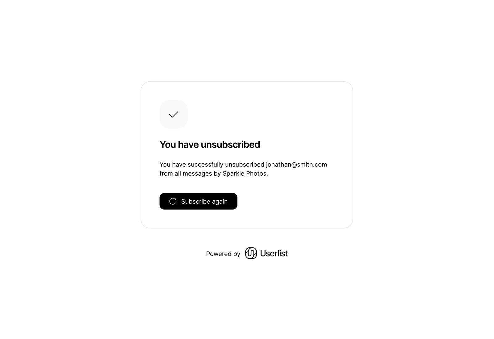
The unsubscribe experience:
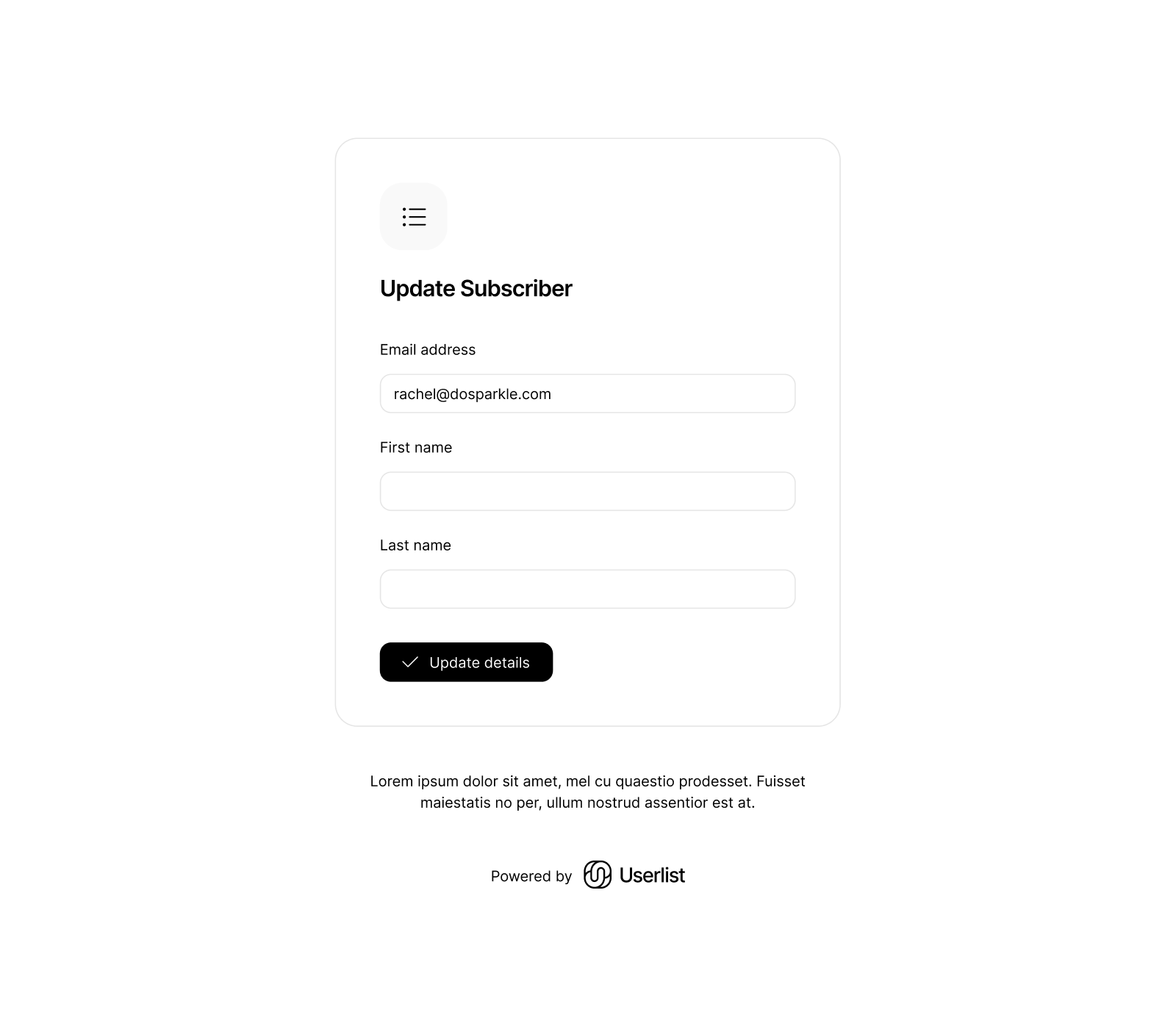
And here’s the look and feel of our hosted forms:
Illustrations
This is where we had fun.
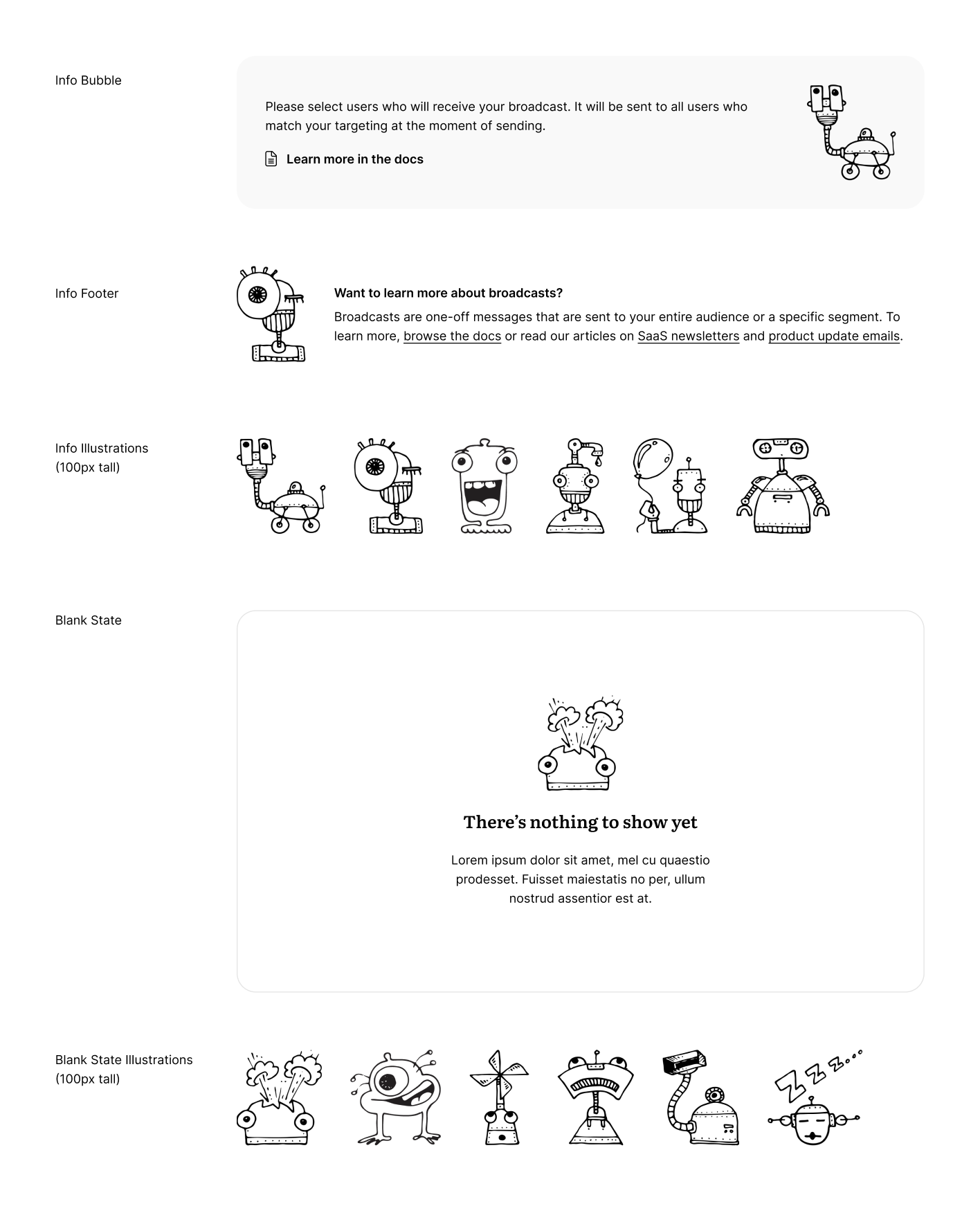
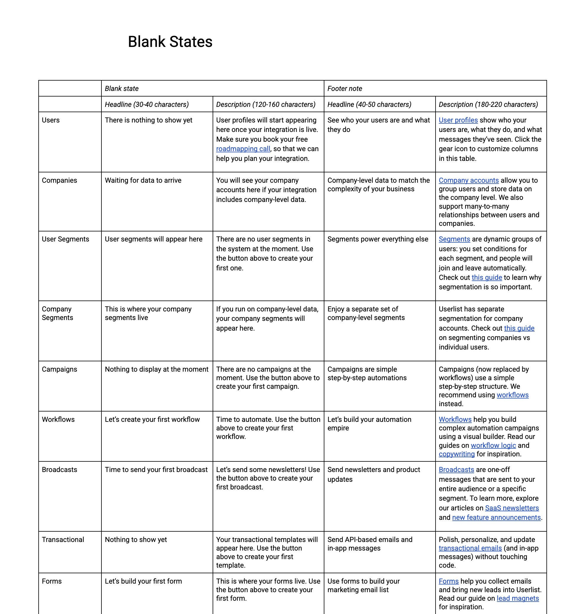
We paid special attention to blank states, and added “info footers” to each screen, to promote blog posts and knowledge base articles.
Here’s a fragment of our style guide:
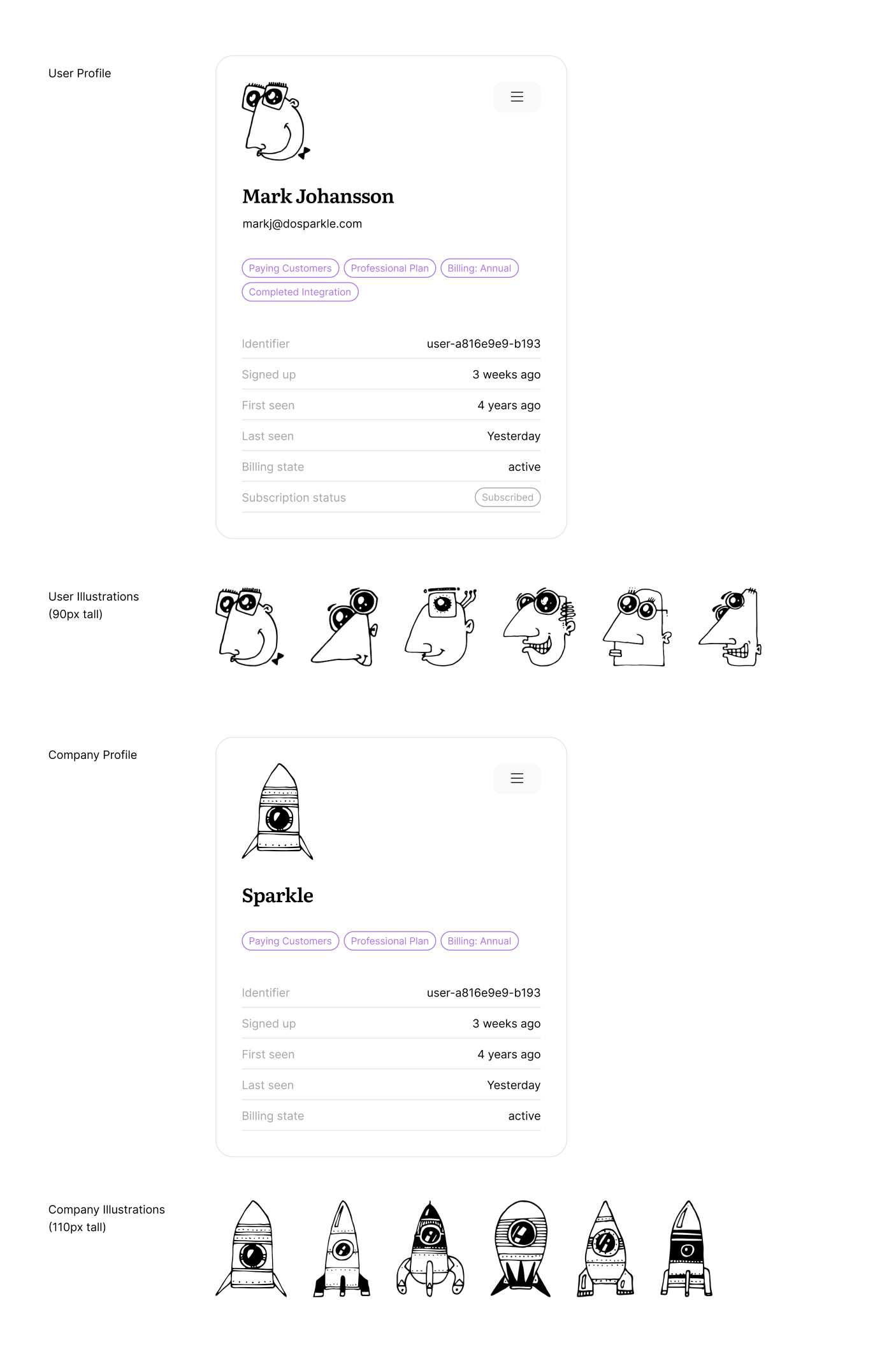
User and company profiles now have cute placeholder portraits:
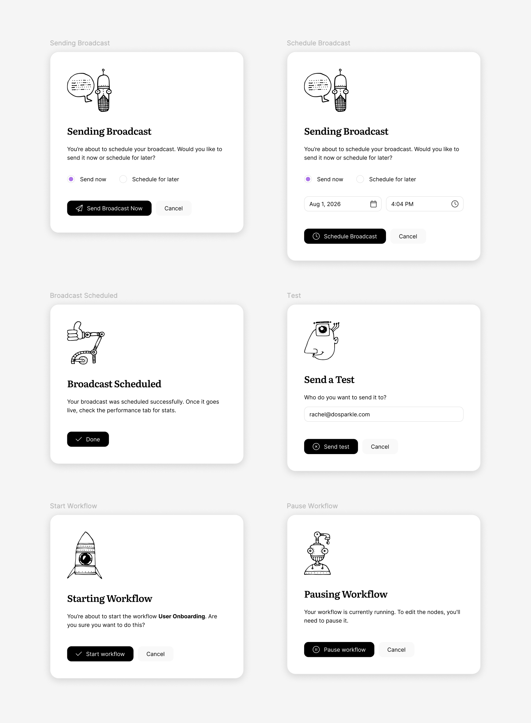
We also spruced up the modals. We have a lot of modals. Here are just a few, related to broadcasts and workflows:
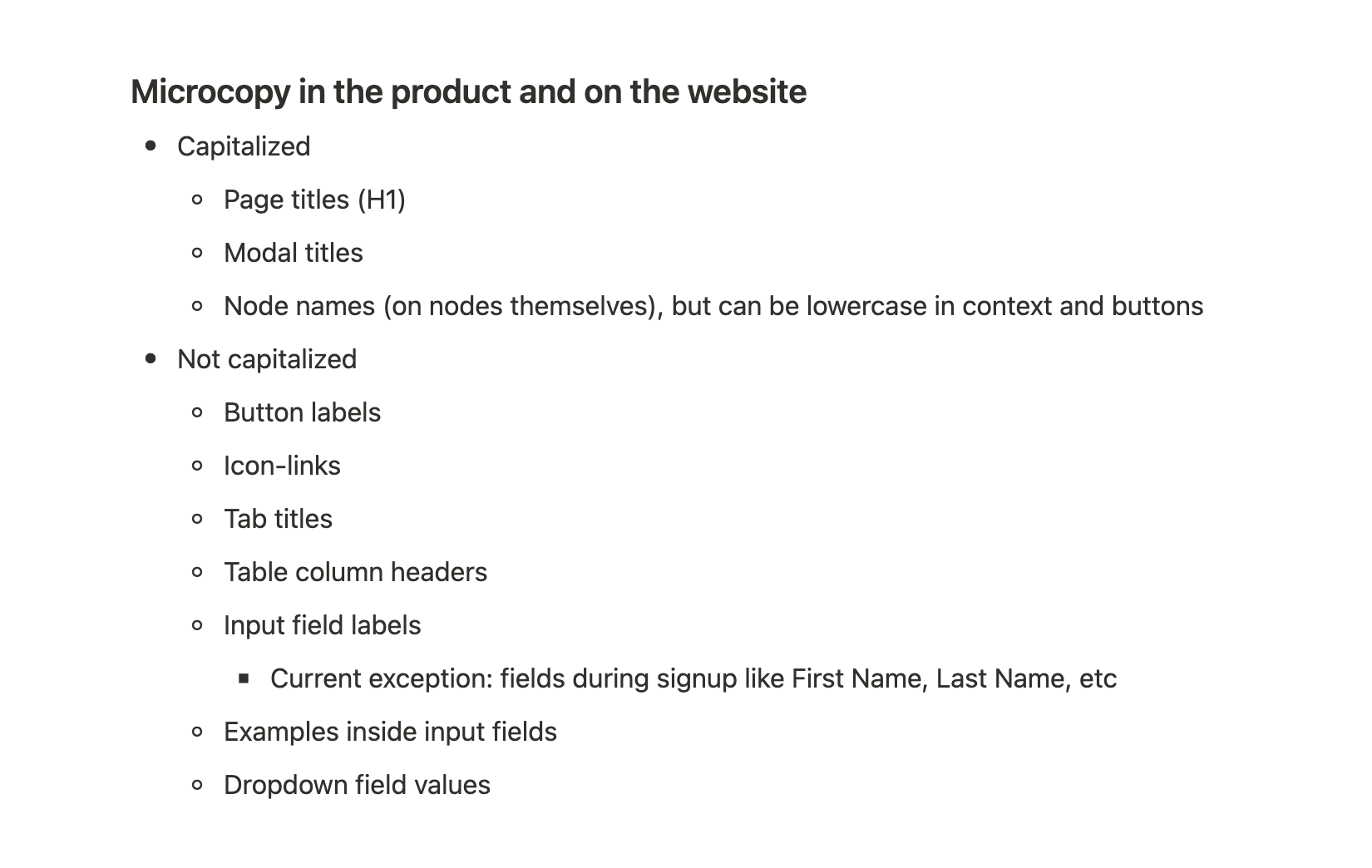
Microcopy
In the previous version, microcopy evolved naturally without any system. But the new version required more. Footer bubbles and blank states were now custom for each part of the app.
So we organized microcopy into a dedicated document (see, it only took us 8 years to tackle UX copywriting).
Here’s a snapshot of blank states microcopy:
Capitalization rules
Consistent capitalization is surprisingly difficult to achieve in a big product.
We did have some level of consistency before, but the new design raised new questions. Specifically, we wanted to do more things in lowercase, including some buttons.
After a big discussion, we developed a new set of capitalization rules:
Testing and polishing
I asked Benedikt to write this section, but he said there isn’t much. “Just grind it out. There’s no magic.”
We had multiple passes to polish the details:
- Automated testing to ensure key features function
- Several rounds of design polishing (me filing a gazillion little problems for fonts, colors, margins; and our front-end engineer Leo fixing them)
- Final round of functional testing by Mia, our customer success engineer
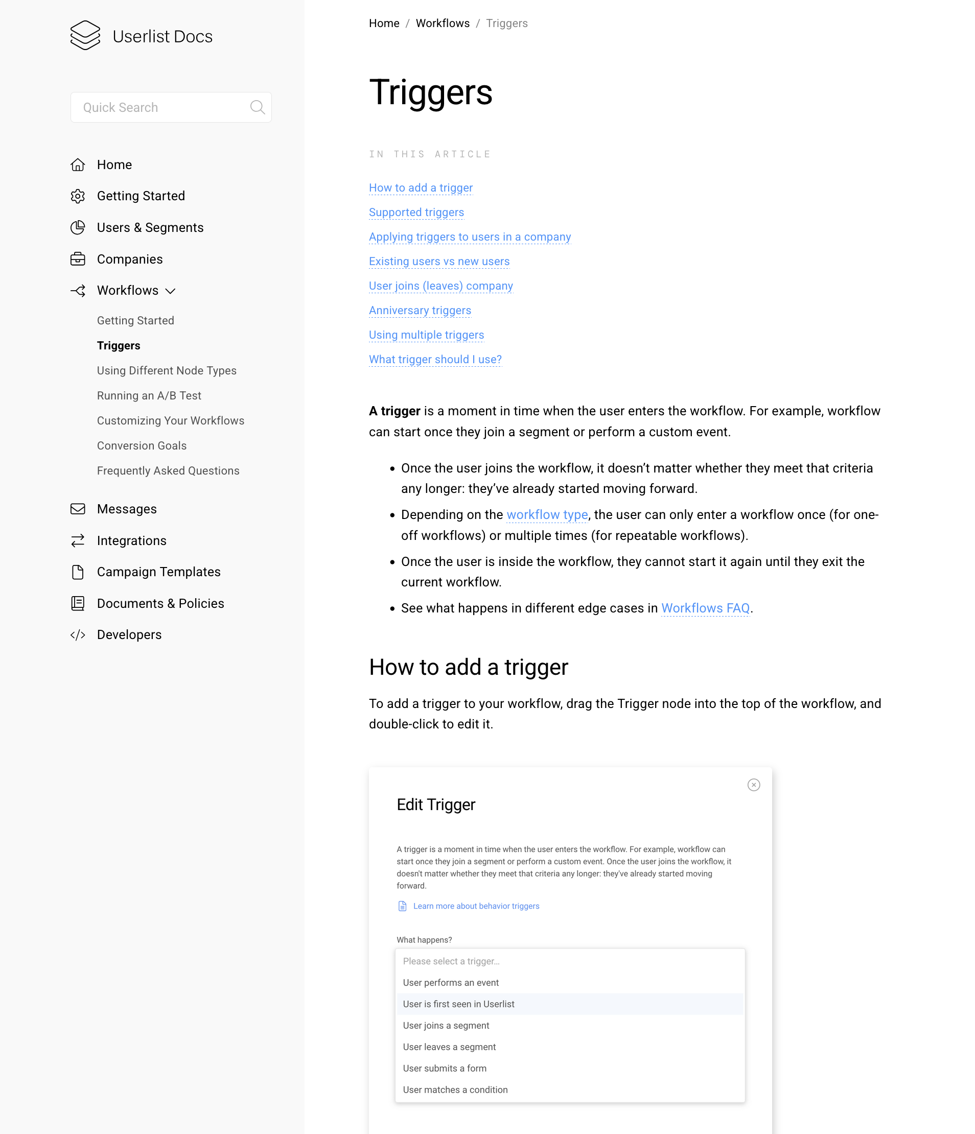
Docs redesign
Now that the product was nearly finished, there was a little bit of work still left: updating the docs and marketing website content. Both required a full redesign, plus a set of new screenshots.
We started working on the docs as soon as the product was good enough for making screenshots.
Before:
After:
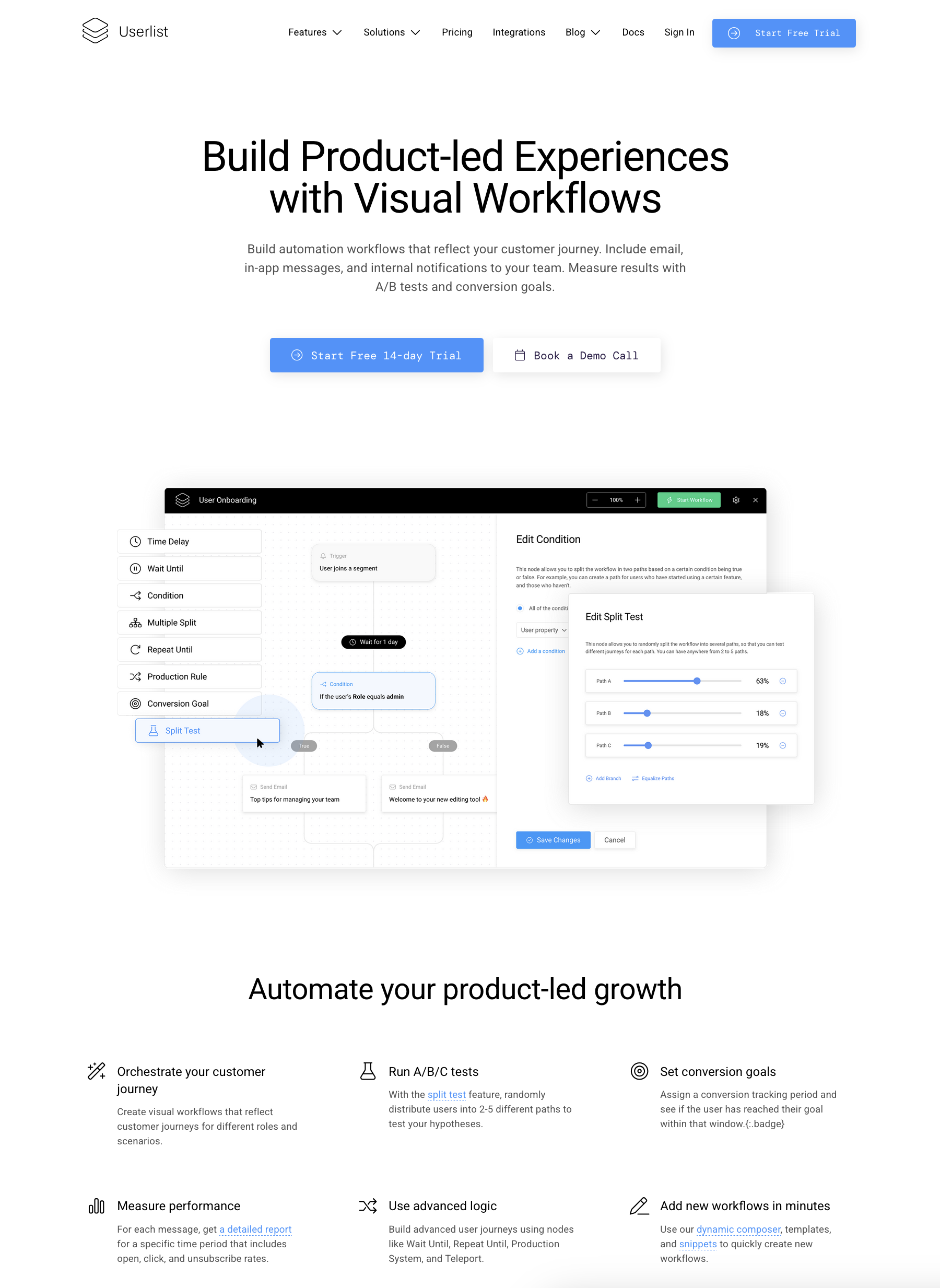
Marketing website update
Having the homepage ready is one thing; updating all website pages is a different story.
Our marketing website is custom coded and has a modular structure, so the amount of work wasn’t that bad.
Here’s what we did:
- Coded a handful of new modules (e.g. illustrated section headers)
- Tweaked CSS throughout the website to match the new style
- Made a huge new features overview page — it’s been on our wishlist for a while
- Updated every feature page (e.g. visual workflows and segmentation) with new screenshots and illustrations
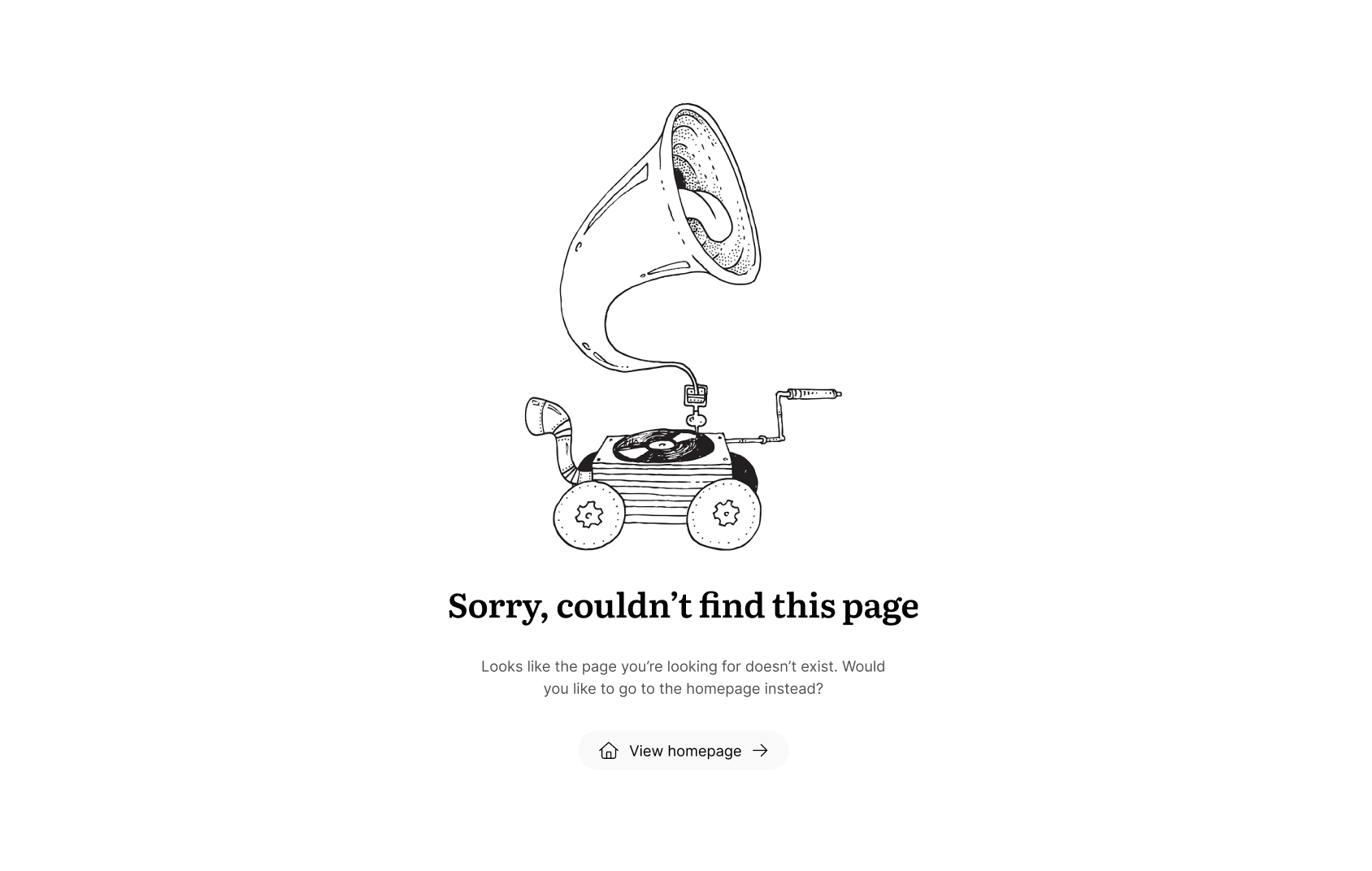
- Designed new fun layouts for service pages like 404
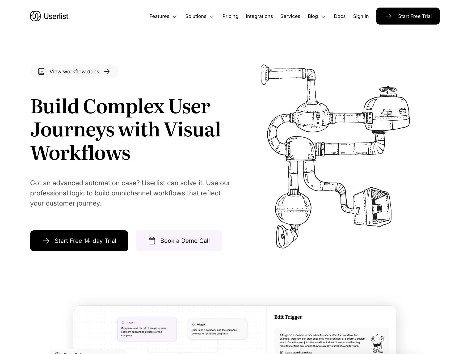
Here’s a typical feature page, before:
And after:
There’s also a lot of “invisible” work, e.g. landing pages and 404 pages:
Who made this happen?
These awesome people made the redesign happen:
- Benedikt Deicke — led the technical implementation and designed the logo mark
- Jane Portman — did creative direction and design for the whole thing (that’s me, and I’m a designer by trade)
- Leo Euclides — did all the front-end development and components
- Mia Sinek — tested the new version inside out
- Krista Melgarejo — helped with marketing and promotion
Takeaways
The project lasted for 6 months instead of 3-4 months we had planned for. We’re exhilarated to get this out to our users. This design should serve us well for the next few years.
Hope you’ve enjoyed reading this story of software craftsmanship.
If we inspired you to switch to Userlist right this second (haha, chuckle from sales), then book a demo and let’s discuss your implementation.
Onwards and upwards!
Don’t wait for the muse. Apply this step-by-step method to write high-performing email campaigns in hours, not weeks.