
Over the last month, we embarked on the ambitious project to rebuild the entire Userlist website (including the knowledge base) from scratch. Here’s a story why it was necessary, and how it all worked out.
Why rebuild a perfectly good website?
Our previous website served us well for almost three years, but it started to feel bloated and clunky. It was Wordpress-based, and suffered from an unhealthy dose of plugins and a heavy (even though beautiful) theme. The website pulled in tons of styles and scripts from various sources, and most of them felt unnecessary.
Creating new pages took some time, and it was hard to reuse components across different pages. Updating similar components across multiple pages was a laborious manual task, which lead to a few situations with broken links, etc.
Most importantly, we wanted to integrate our knowledge base and documentation into the main website. Here’s why we wanted custom docs:
-
Great SEO potential. Our knowledge base includes a lot of quality content (like our campaign templates) that isn’t just useful for our customers, but for everyone running a SaaS business. Having them on a sub-domain meant losing SEO juice.
-
The not-so-ideal user experience of our previous knowledge base. It was lacking a global navigation, which made it hard to browse around and learn about new aspects of Userlist. We simply outgrew the simplistic layout offered by our helpdesk out of the box.
-
We didn’t enjoy the editing experience in our previous knowledge base tool. It came with a basic WYSIWYG editor which was fine for regular content, but editing tables or code snippets was painful and took ages.
Our process for rebuilding the website
We knew that rebuilding our entire website from scratch wasn’t going to be a quick and easy task. We made the very deliberate decision to not make this a website redesign project. While we certainly have ideas for a design refresh, we didn’t want to get lost in a big rebranding project.
We also decided to split the process into two phases: recreating the marketing website, and migrating the knowledge base. Again, the idea was to turn these into smaller, more predictable projects with shorter turnaround time.
Both decisions were made according to the Shape Up process that we adopted earlier this year. It’s been working well for our team.
Phase 0. Research and experiments
Before we got started on the project, I spent some time researching potential tech stacks. We tried a couple of tools, but ultimately settled on the tools I already knew: Middleman as static site generator, Netlify for hosting, and no CMS whatsoever. Instead, we decided to manage content in a repository on GitHub. This might change in the future, but right now this works well for both Jane and me.
Sidenote. Jane started out editing content via GitHub’s editing feature on the website, but ultimately ended up with a local development setup using a text editor and GitHub Desktop. I’m very impressed how well she’s able to work with this setup.
Note from Jane. “It’s my first time managing a website without a CMS, and I feel immense benefits of quickly browsing and editing the files directly. It’s much faster than clicking around a web-based interface.”
Phase 1. Marketing website
We started by analyzing the content of our existing website. We reviewed all pages, and compiled a list of commonly used sections. Jane went ahead and recreated the design of all sections in Figma. Afterwards, I recreated each of them as reusable sections. The sections provide the HTML markup and CSS styling, and can be composed for each page using YAML front-matter.
To make things reusable, we also allow referencing predefined sections, as well as groups of sections. This allows us to have things like a collection of all our testimonials in one place and predefined groups of sections for things like landing pages. Here’s a shortened version of our customer success automation landing page:
1
2
3
4
5
6
7
8
9
10
11
12
13
14
15
16
17
18
19
20
21
22
23
24
25
---
title: Automate Your Customer Success Touchpoints
sections:
  - type: hero
    title: "Automate Your Customer Success Touchpoints"
    description: |
      Reduce the workload for your customer success team with Userlist.
      Automate your touchpoints throughout the customer journey based on the
      things they do (or don't do) in your SaaS product."
    actions:
      - label: Start Free 14-day Trial
        url: https://app.userlist.com/sign-up
        icon: arrow-right
        type: primary
      - label: Book a Demo Call
        url: /demo/
        icon: calendar
        type: secondary
  - type: image
    image: /assets/Userlist-Hero-Preview.png
  - $ref: logos/default
  - $ref: testimonials/anna-jacobsen
  - $ref: features/customer-success
  # ...
---
We ended up building about 25 different section types. Most of them are reused across the entire website, but some are specific to a single page. With all this in place, recreating all existing pages of our website only took a couple of days, and new pages can be created in a matter of minutes.
Admittedly, we also improved some design elements during this process. The new website features a much nicer dropdown menu for the top navigation, as well as new calls-to-action on blog posts (like this one). These CTA blocks can also be automatically updated across all existing posts, should we decide to promote a new lead magnet.
Once we were done with phase 1 we released the new website and shut down our old one. It felt good to have a snappy and lean new website out there within about two weeks.
Note from Jane. “I absolutely love the reusable sections, this could never be possible in our previous WordPress site. It’s a whole library of living breathing content blocks at our fingertips.”
Phase 2. Knowledge base
With the marketing website done and the basic infrastructure in place, we embarked on phase 2 of this project: migrating the knowledge base.
We took inspiration from the documentation pages of Segment, AppSignal, Stripe, and a couple of others. Ultimately, we created our own version of a clean, easy to read, and fun to browse documentation site.
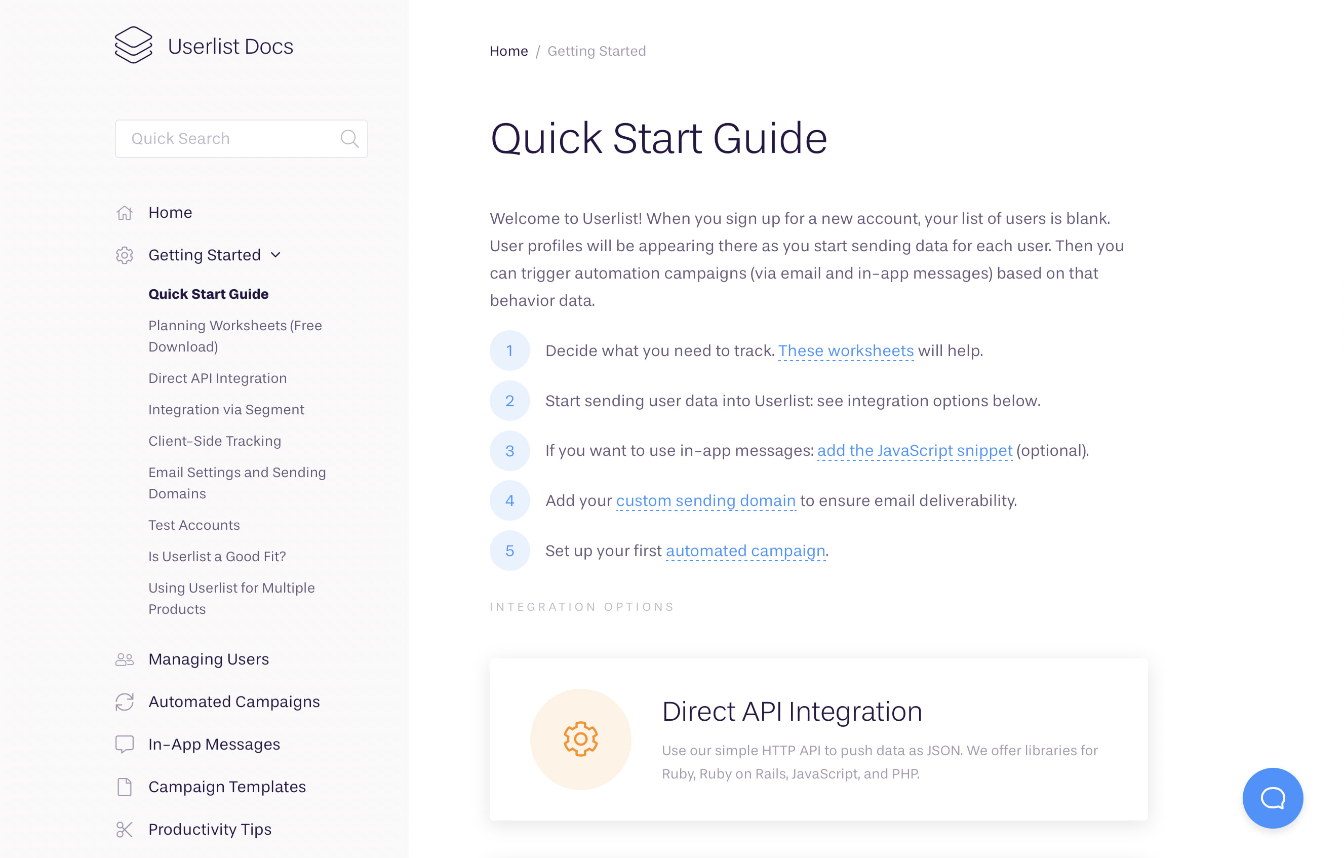
The entire documentation is based on markdown files organized in folders, using YAML front-matter to specify some metadata. We auto-generate the navigation in the sidebar based on the file structure and metadata. As a result, adding new pages is as simple as adding a new file in one of those folders (or even creating a new one if necessary).
All pages automatically generate a list of related articles at the end. This is based either on the children in the current folder (for index pages), or a list of other pages specified in the front-matter. We also automatically generate table of contents for all pages based on the h2 headlines on the page.
A couple of changes to Middleman’s link_to helper allow for links that automatically update their titles based on the target page’s metadata, and we finally have nice syntax highlighting for code snippets using Rouge.
The biggest nut we had to crack was the docs search engine. As it is part of our static website, there is no way to query a database on the server side. After looking at some solutions, we decided to use Lunr.js for the search implementation. It’s a small JavaScript library that runs in the browser instead of querying a third-party server. We build the search index during the build process, and the first search query downloads it. It’s similar to the size of a regular image, so it loads quickly, and all subsequent queries run super fast.
With all these parts in place, we exported the content of our previous knowledge base via their API and spent the most amount of time on improving the structure and content.
Note from Jane. “One of my favorite new features is being able to link to articles without providing their name (it’s displayed automatically). It’s such a relief, as the knowledge base is constantly updated. I also love having folders with a custom taxonomy, which allows for clean article URLs like /docs/workflows/faq/, etc.”
Summary
All in all, we spent about a month on this project with varying levels of involvement for both of us over that timeframe. We think it was a worthwhile investment into a better setup that ultimately allows us to publish new content faster than ever before, while keeping things lean and flexible.
Don’t wait for the muse. Apply this step-by-step method to write high-performing email campaigns in hours, not weeks.