

“You need to get comfortable being uncomfortable.”
This was the blunt feedback one of our early adopters gave us during his onboarding call.
As co-founders, we’d spent the past several months doing customer research for Userlist, collecting a round of pre-orders, and using our findings to build a very raw MVP. Now, we were finally ready to invite our first few customers into the product.
But when the time came for onboarding calls, we hemmed and hawed — all three of us nervous about showing people real, actual product screens, and answering tough questions about the MVP’s core features.
But in the end, it turned out that our early adopter was right. We took his advice — we showed him the actual product, got deep into a features discussion, and lo and behold: he walked away so eager to come on board!
This article is a continuation of that sharing process: below, we’ll explain our product decisions and show our progress to everyone, not just those who pre-ordered.
To recap, here are the initial core features of the app that customers can expect:
- Managing the user list and tracking each individual user journey.
- Sending automated email messages based on user behavior.
- Sending email broadcasts (like newsletters or announcements).
Now, I’ll walk you through the key screens and explain some of our product decisions. Our design choices were largely based on customer research, but also on my own experience with other email automation tools.
Disclaimer: these are merely design layouts which represent our current product vision. Since the core part of our strategy is promptly acting on user feedback, virtually anything is subject to change at any time.
Don’t wait for the muse. Apply this step-by-step method to write high-performing email campaigns in hours, not weeks.
User list
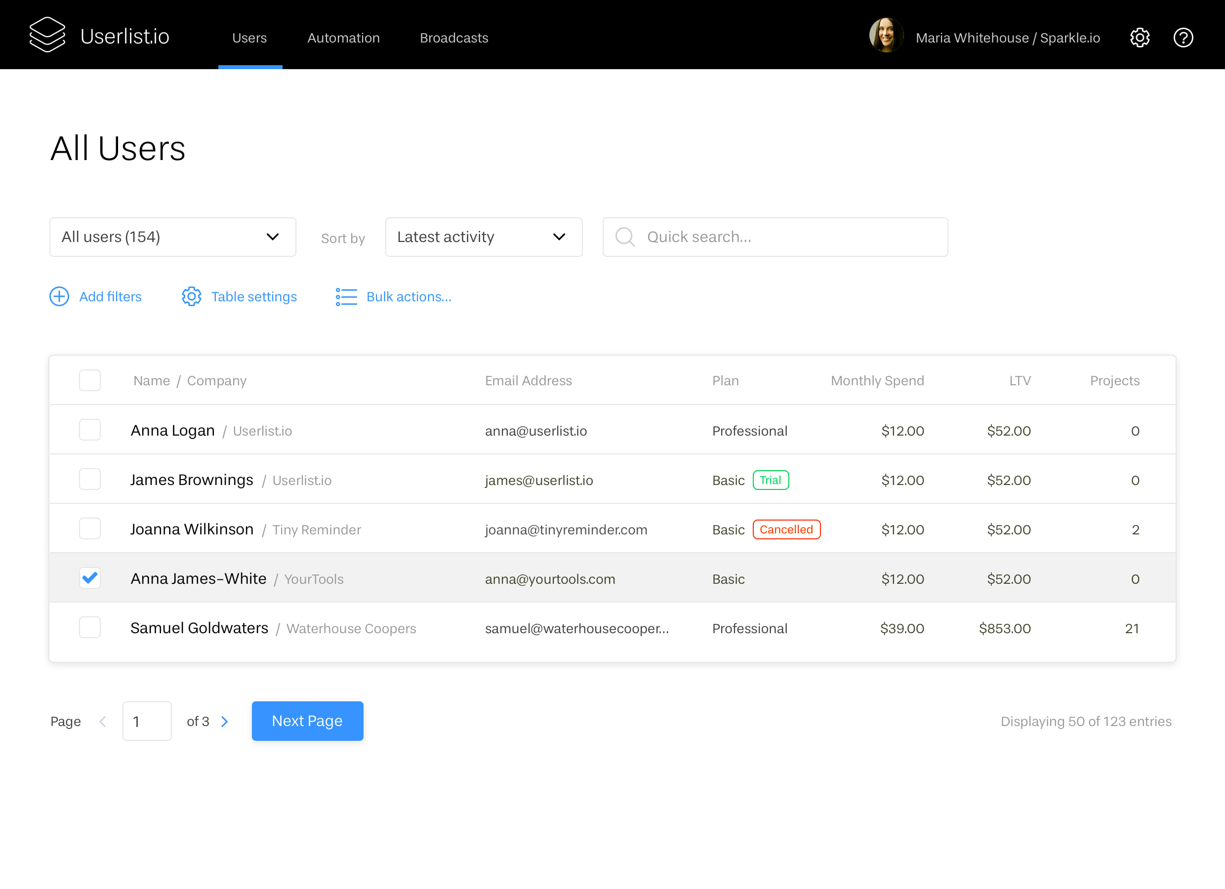
The heart of the product is the user list — hence the name. This simple admin panel allows SaaS founders (our customers) to see who exactly their users are, with names and key details like LTV or plan information.
One of the early frustrations with my previous SaaS product was the lack of such a user list. When I launched the beta version of that product, I realized that there was no UI to see my new users (unless I wanted to build a custom admin dashboard, which comes with a development cost). And my analytics tools only showed faceless data with session IDs! As a result, I opted for Intercom, but I can still remember that feeling — not being able to monitor such obvious information was frustrating.
- The columns can be customized to include properties specific for your business. For this sample customer, a fake company called Sparkle.io, it’s the number of projects that we want to see at a glance.
- It was important to make this table full width, so the filters are on top instead of being arranged in a side panel. Lack of horizontal space in tables can drive laptop owners crazy!
From the user list, the founder can navigate to each individual profile. Let’s see what these profiles look like.
User profile & activity feed
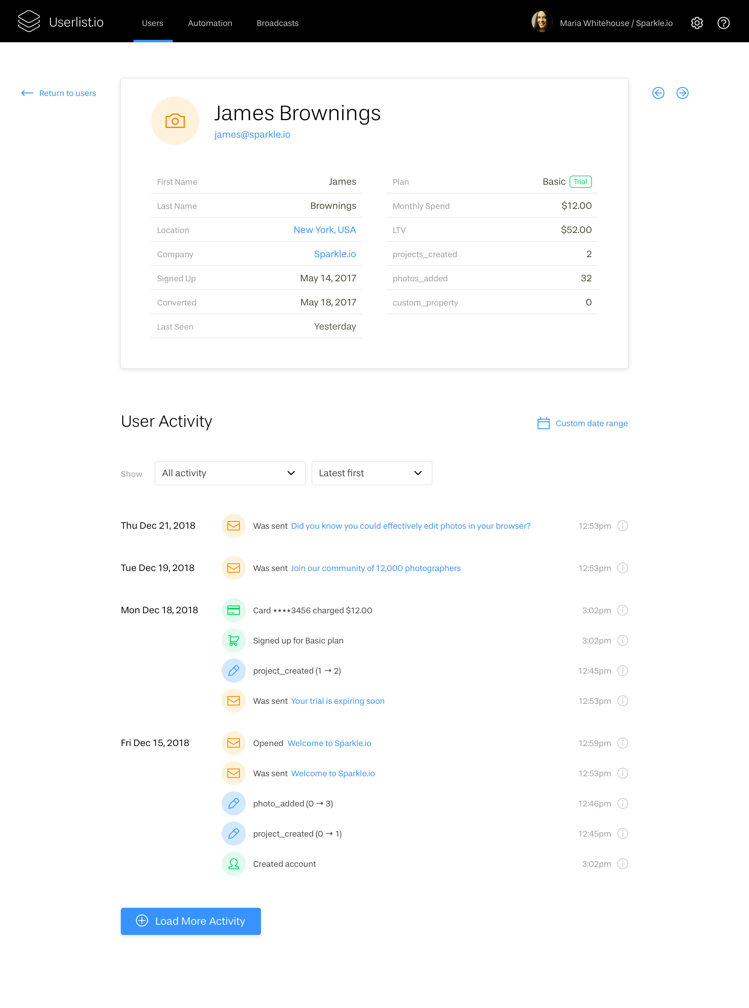
The goal for this screen is to provide an overview of the user data (including custom properties), and give us an insight about user activity.
The activity feed includes several types of events:
- General user activity like creating an account
- Custom events — what users are doing in the app (e.g. creating projects or adding content)
- Money-related events like converting from trial to paid, or being charged monthly
- Communication-related events — what messages were sent using our tool, and when they’re opened or clicked
Our goal is not to get as granular as tracking clicks or mouse movements: analytics tools like FullStory can do that much better. Instead, we want to paint a larger picture. We want to help you see what exactly led to a conversion, and how communication lines up with other user activities — without having to switch between multiple tools.
Automation campaigns
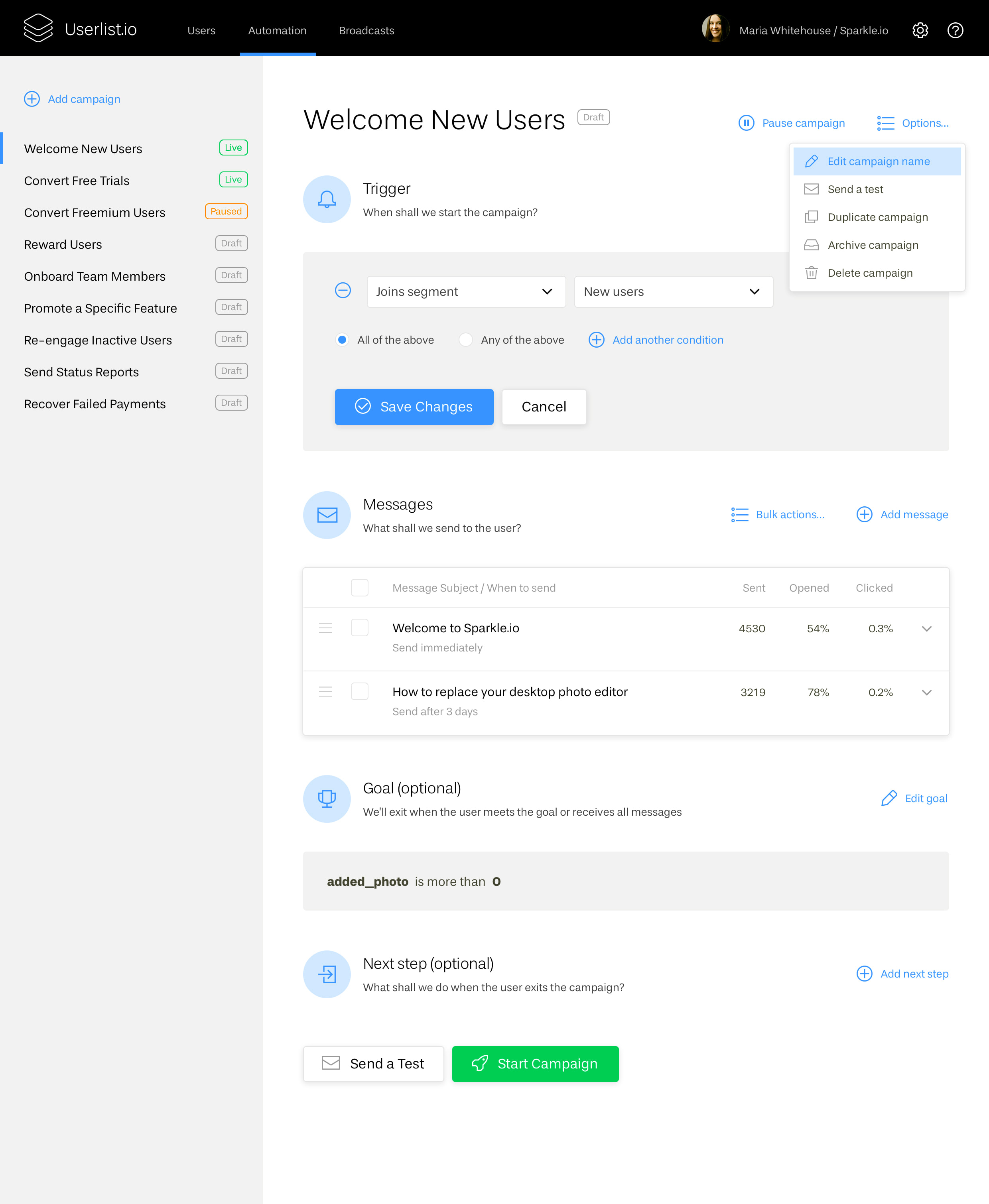
Behavior-triggered campaigns are the core of our automation. This screen shows how you can set up a campaign using four sections:
- Trigger — a moment in time (typically an event) when the user enters the campaign. Once they do, it doesn’t matter whether they meet that criteria any more: they’ve already started advancing through the messages.
- Messages — a list of messages that will be sent to the user once they enter the campaigns. The messages list features email stats (total sends, opens, and clicks) and allows for reordering and bulk actions.
- Goal — an optional exit condition that allows you to terminate the campaign if the user meets the goal. As an example, you have a campaign that promotes a specific feature: there’s no point in sending further encouraging messages if the user already did what you need them to.
- Next step — allows you to advance the user further in your pipeline. In this section, you could transfer the user to another campaign, or move them to another segment.
We had a lot of debates with Benedikt about how the automation system should look and work. We could have designed a visual workflow system, like ones you see in Drip or ConvertKit. But a few things stopped us from doing that early.
First, talking to other founders (and my own experience) shows that their existing automations are not very complex. Second, unlike marketing, where a customer can be passively taken through a hierarchy of content and infoproducts, SaaS users are way more diverse in their ways of using a product. Hardly ever there is an opportunity to determine a logical “tree” that truly requires visual automation. And third, we wanted to get enough user feedback before going down that rabbit hole. Building a visual engine would take 5x time and resources — which is 100% not viable at our early stage with so many unknowns.
Here are some other design decisions taken along the way:
- The left-side panel allows for quick browsing between campaigns.
- Each section (Trigger, Messages, Goal, Next Step) has an icon and a brief explanatory subhead that’s always visible. These explanations should help users understand (and remember) how automation works.
- There’s no global “Save” button — each section is edited and saved on its own. This should eliminate the confusion in updating things.
- Should the user want to edit a campaign that’s already live, we’ll automatically pause it (with a note) and then remind them to resume when they exit the screen. We’ll also send email reminders if the user forgets to resume the workflow. With other software, I remember myself discovering that my critical onboarding automations had been paused for a few months because of editing. I had no clue about it! Technically it was my fault, but the frustration was very real.
Message editing
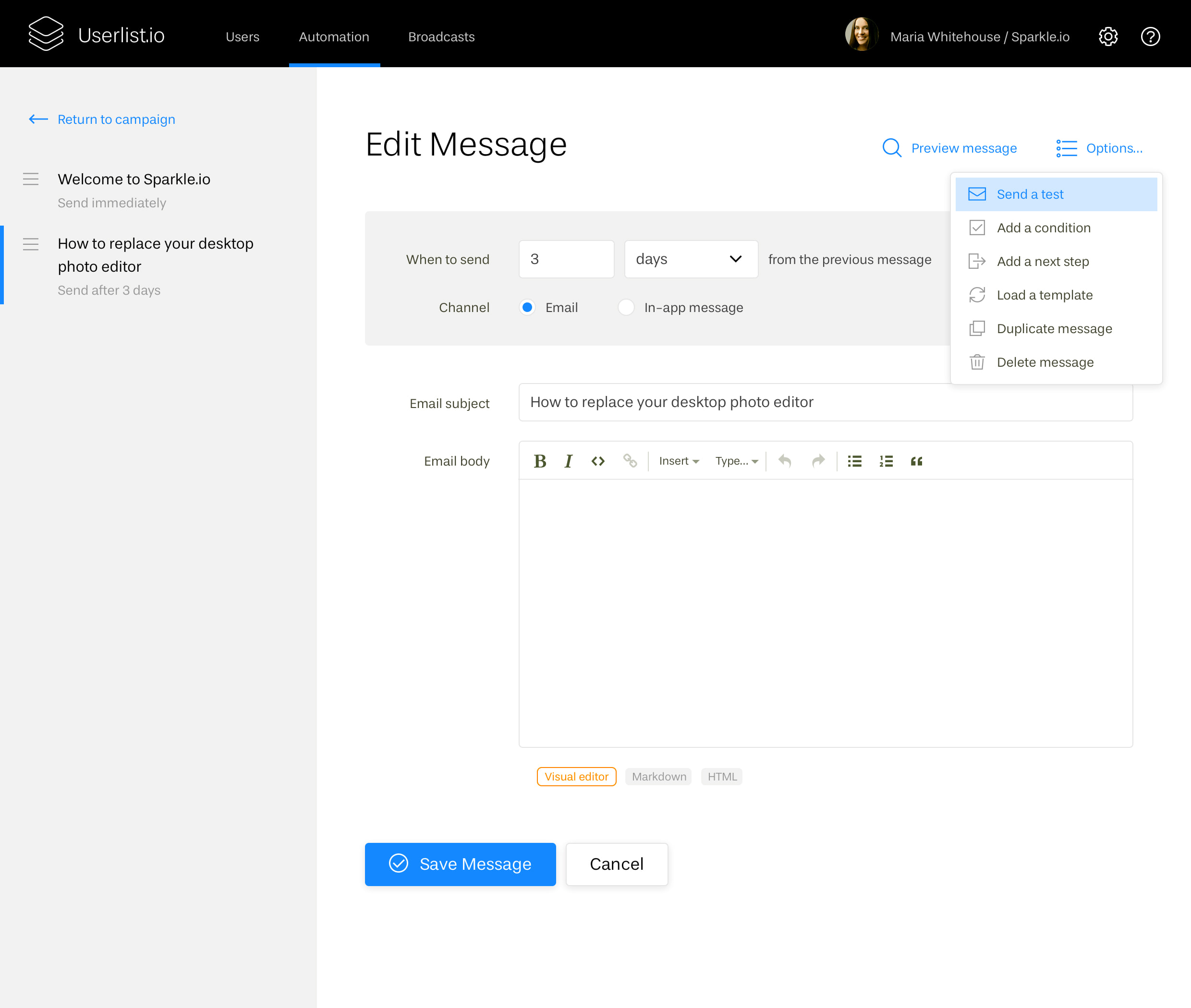
A few design decisions should streamline the editing process:
- The left-side panel allows to quickly browse, reorder, and edit messages inside a campaign. If you used Intercom before, then you’d know that accessing the body of each message requires a large number of clicks which we wanted to avoid.
- Right now we’re planning on sending email messages only, but this screen allows to pick an appropriate channel for each message — like email or informational in-app message.
- We’re big fans of using Markdown for writing, so a simple Markdown editor will be available from day one. It may seem insignificant for those who aren’t raving fans (they can enjoy their traditional rich text editor), but it’s a specific point of delight for us.
Email look & feel
For the MVP, we had planned to have one email template — “plain text but better” (see below). It’s neutral, but very polished: featuring nice typography, structured headlines, and an accurate footer.
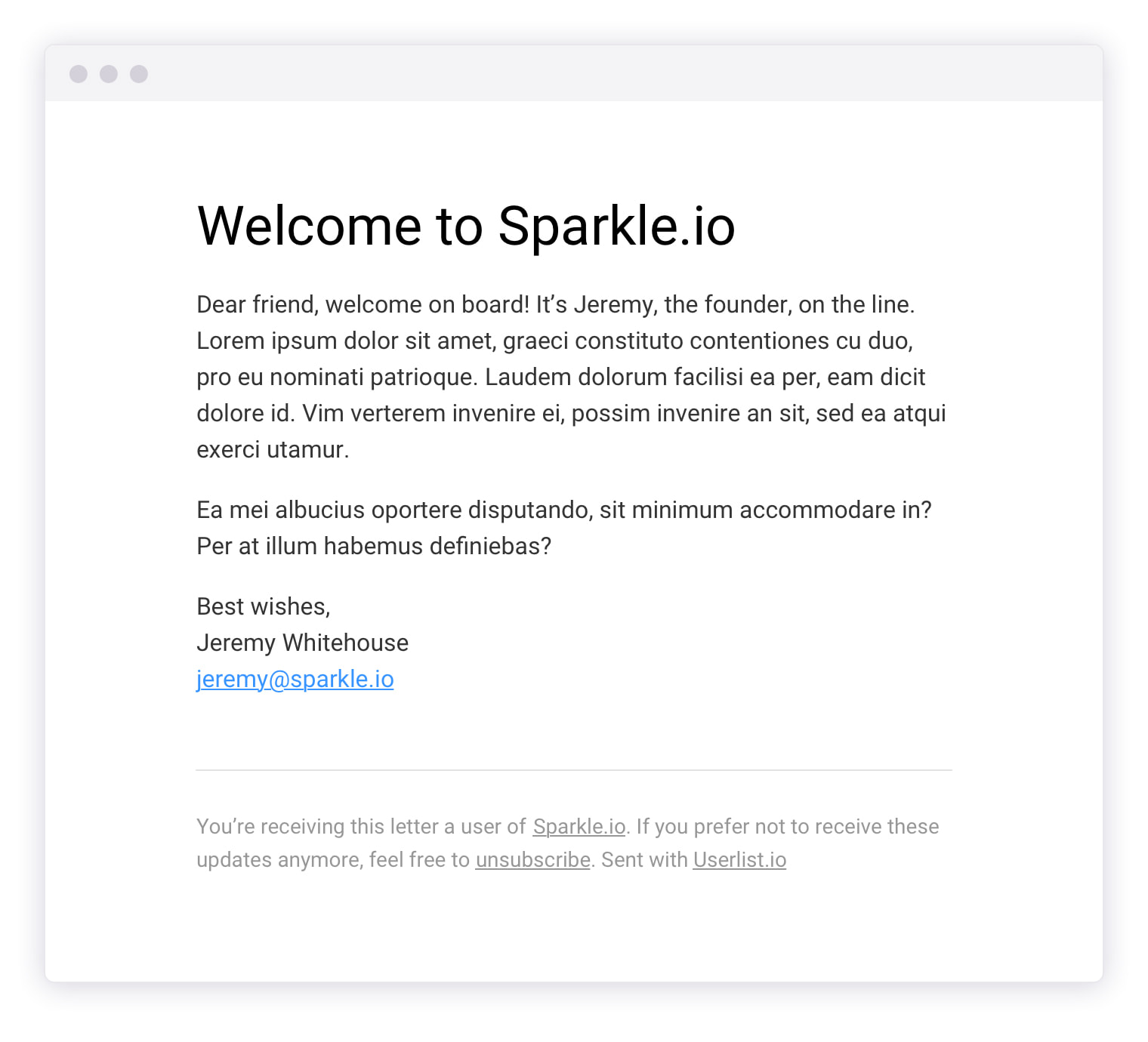
However, our conversations with early paying customers made us change our mind. They liked our styling visually, but a lot of them would still prefer simple emails that look personal — as if they were sent from Gmail. So we will probably give founders a choice between the styled template and the “plain text” template. And down the road we’ll add custom styling, such as picking fonts and colors.
Don’t wait for the muse. Apply this step-by-step method to write high-performing email campaigns in hours, not weeks.
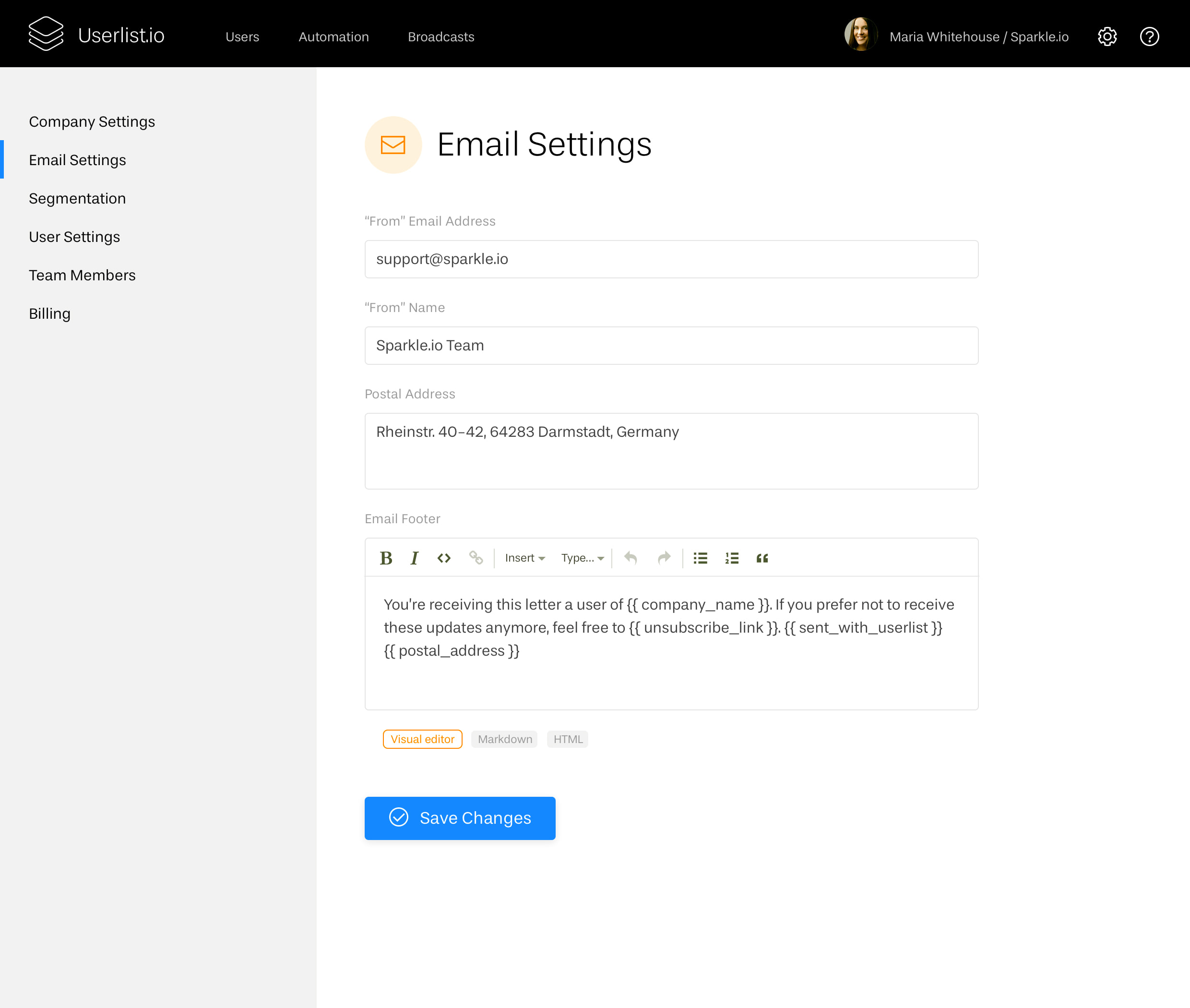
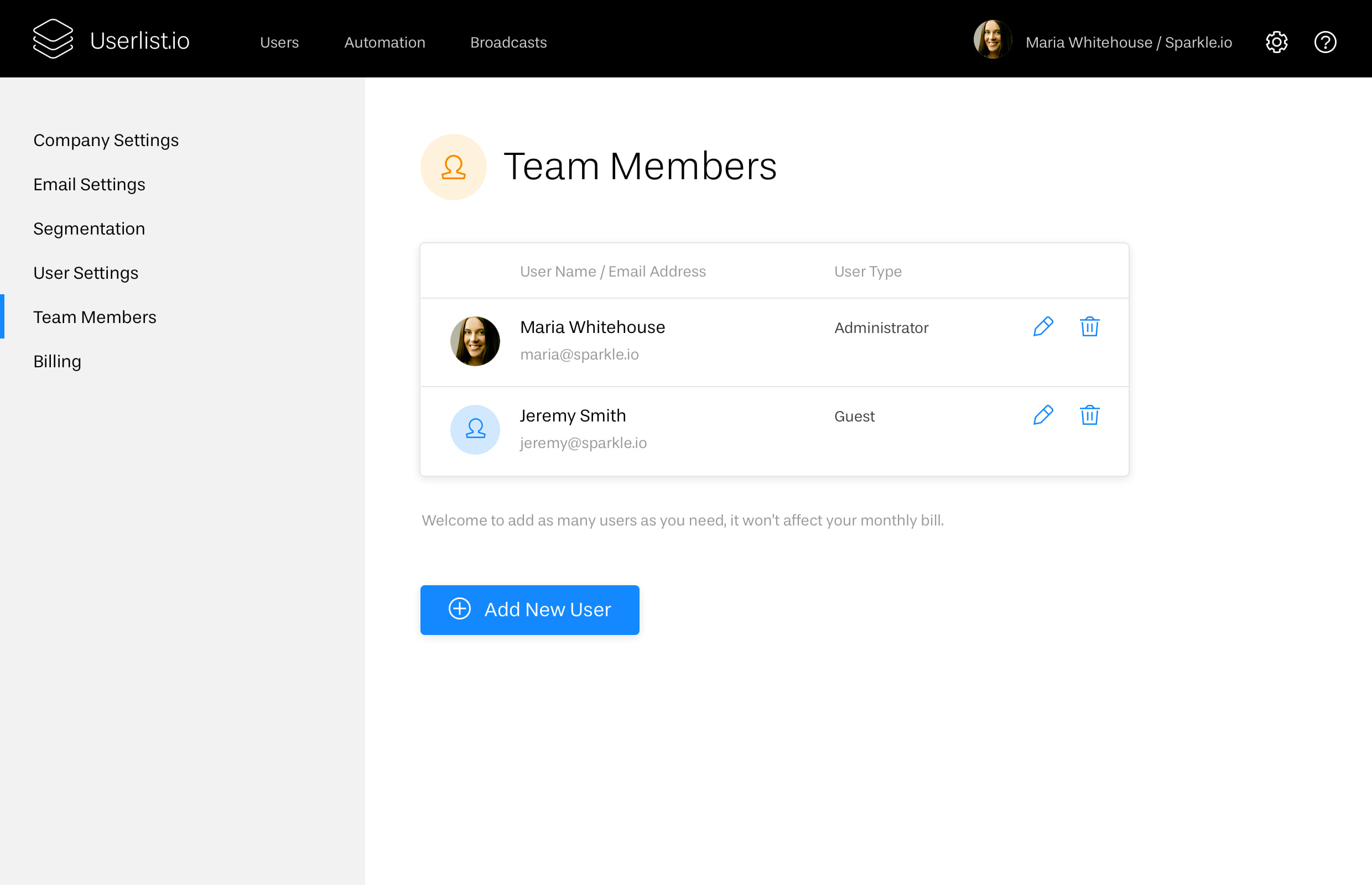
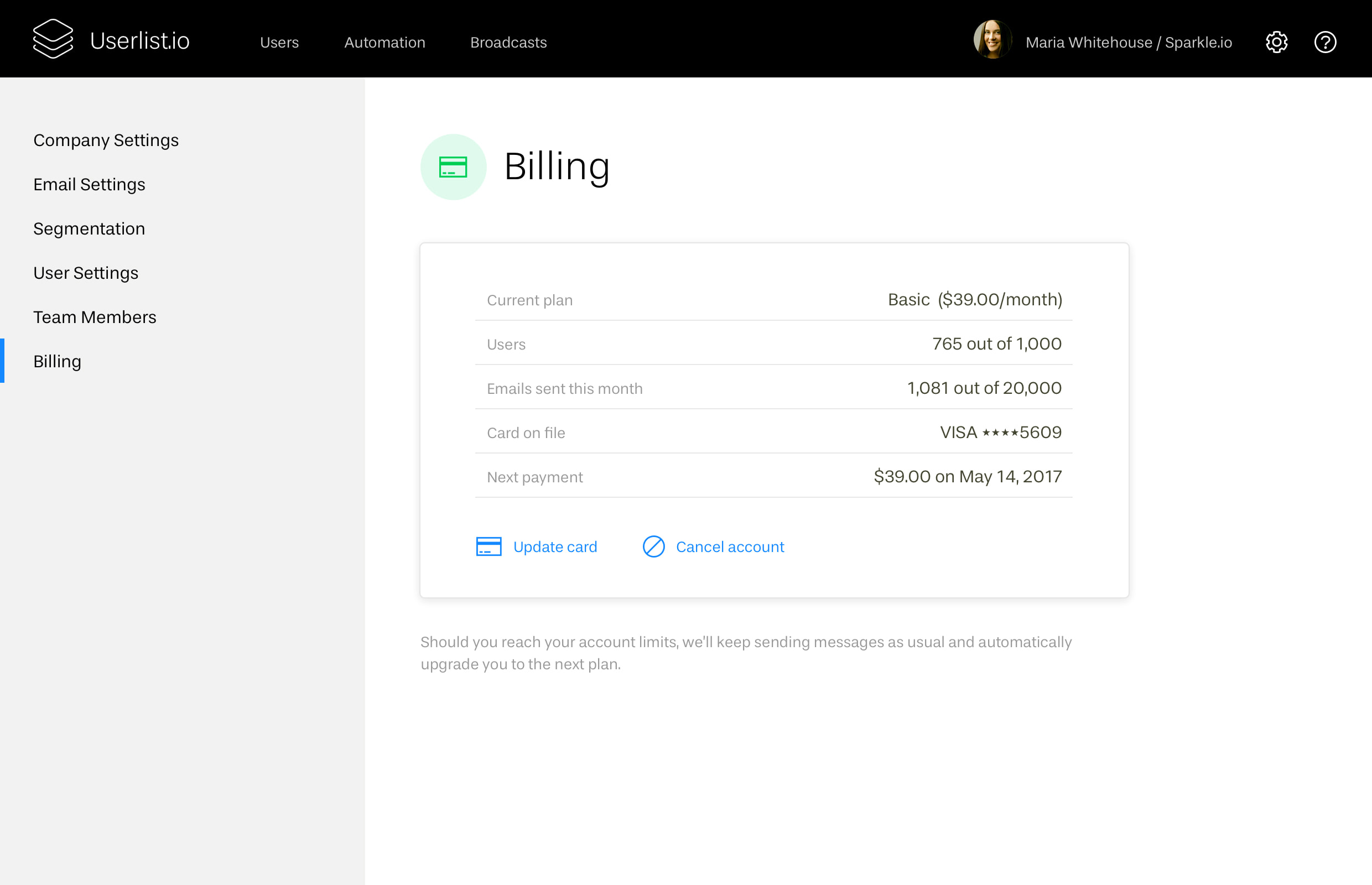
Settings
While none of these features will be implemented now, we have already thought about our settings. The screens below will give you an idea of the settings we’ll have eventually, like multi-user access and fancy billing. Launching publicly without a billing system is a very popular war story among many founders.
Which features do we build first?
Our product strategy is to collect as much early feedback as possible to inform further design decisions. But how do you collect feedback if the product isn’t ready, and you can’t give anyone access yet?
We made a conscious decision to “decompose” the app and give access to features gradually. For round one, which is happening right now, we’re working with the early adopters who pre-ordered the tool. Here’s the scenario we’re following:
- We have a 1-hour onboarding video call with each founder (all three of us participating) to learn more about their business and their existing automation systems. These calls are recorded and transcribed, so that we get written insights for both product development and sales copy.
- Benedikt works with the founders to get their user data flowing into Userlist.
- Claire works with the founders (only those who need guidance) to identify their user’s “minimum path to awesome”, figure out what events to track, and plan automation content accordingly.
- Founders get access to the very raw version of the app, which includes the user list and individual user profiles with activity feeds.
- Founders get access to the automation section, being able to set up campaigns and write their messages.
In order to speed up the feedback loop, we decided to exclude email sending entirely from the first round. This decision dramatically helped us prioritize the features. If we’re not sending anything, then we can omit a big chunk of development work related to that. A good example of that is email and company settings: if you’re not sending anything, then there’s no need to have those yet. Also, email sending requires the largest effort to launch. It’s the most sensitive part where our system interacts with the ultimate users!
We’ve also omitted the broadcast features for now, because they’re rather straightforward and most founders shouldn’t have any problem using them.
Product insights gained from early onboarding
Having held a number of onboarding calls already, we have gained multiple new insights. Here’s the most important one: paying users find the main value in the “sending” part of the app. While user journeys can be tracked using numerous analytics tools (even though founders did like our implementation of the activity feed).
We also confirmed our hypothesis that founders set up fairly simple automations, but experience a lot of pain by having to go to their developer department for every single tweak or task.
All this knowledge will help us focus on the “sending” part of the product, safely leaving out traditional, more robust analytics features (for now or for good).
We look forward to your feedback
Explaining the value of our tool — and what it does exactly — has been an important task for us, so we’d love to hear your feedback:
- Do the screens above meet your early expectations for the product?
- If you already have email automations set up, what kind of emails are you sending to onboard and retain your SaaS users? What would you like to improve?
- Is the described version of the automation engine sufficient for your needs?
You’re also welcome to join our waiting list below, if you haven’t yet. Thanks for reading!
Don’t miss out on new articles. Subscribe to our newsletter and get your monthly dose of SaaS email marketing insights.


