Constant sanity checks are one of the best benefits of having co-founders. I get excited about new ideas very easily — dropping Hiten bombs on the team — but Benedikt and Claire are always out there for a constructive discussion.
One of such stories relates to a mobile app.
Obviously brilliant, at a glance
While brainstorming the ways Userlist could bring value to customers on a daily basis, I woke up one morning with a brilliant idea. A companion mobile app could be a dramatic product enhancement! Look at all these arguments (rather rational):
- Founders often need to check user activity & status on the go
- Push notifications about new users could be those happy moments we get to share with our customers, and provide them with that endorphin rush
- Having a Userlist app on your mobile device is a much more intimate, emotional brand experience
- We could make it look really cool 😊
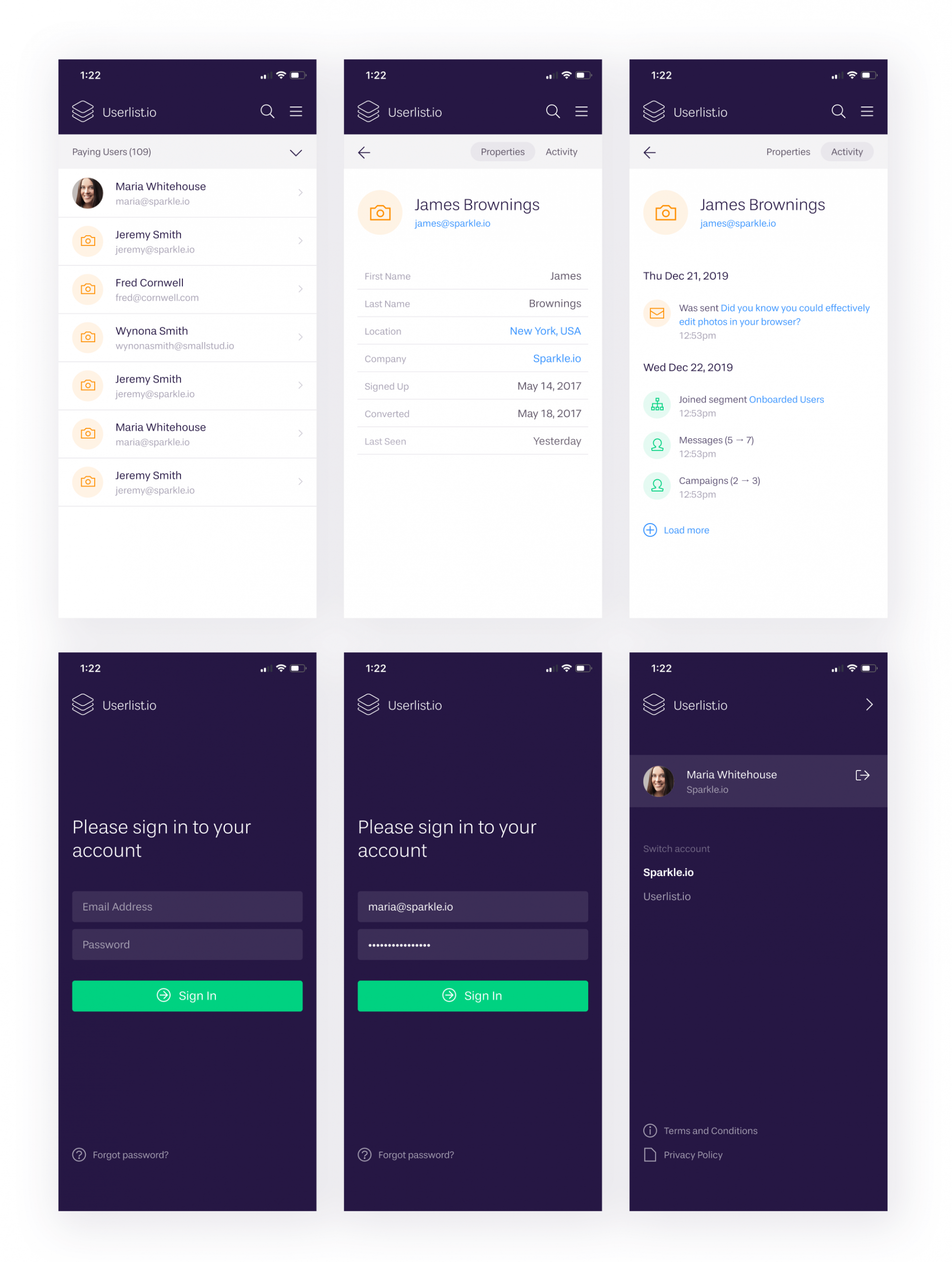
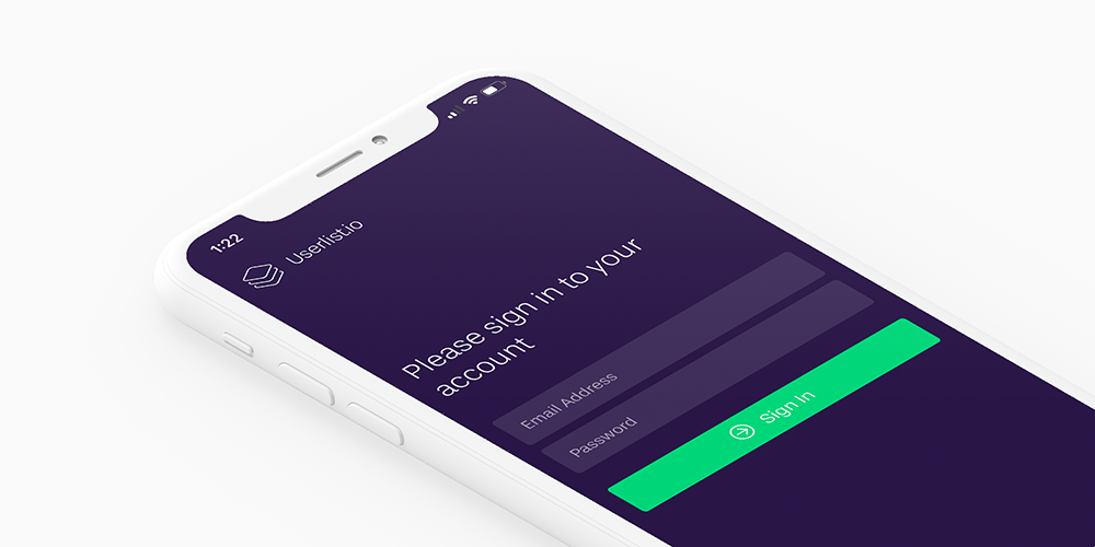
Here’s the design I whipped up. It was supposed to be a clean, read-only UI for browsing your user profiles and checking out their activity.

I was incredibly ramped up about the idea. I was nearly ready to contribute additional personal cash to fund the development, since we don’t have iOS talent in-house.
Debunking the idea
Thankfully the team poked holes in this idea right away. Here are the opposing arguments:
- An iOS app is yet another thing to support (this is always #1 concern for any new feature), and a pretty big one
- We don’t have anyone with iOS skills on the team, so we’d have to allocate cash to fund the development (and keep paying for each update)
- Very important argument brought up by Claire: “new user moments” are only exciting at the very early stage when the number of users is low. Our successful target customer would rather get more new users (beyond the scale of checking each new one personally) and put their customer messaging on autopilot. So this doesn’t align with our customer’s goals!
- We have “bigger fish to fry” as Ruben Gamez says
It wasn’t even a discussion, more like a few minutes of steady idea debunking. Very eye-opening. As a result, these designs only made it as far as my own phone (Figma has very cool real-time preview) and this blog post. It’s amazing how rational the arguments can get for something that you shouldn’t really pursue.
Sidenote. This doesn’t diminish the fact that our web application should be mobile-friendly.
Handy checklist for your next occasion
If you also find yourself carried away with new feature ideas, it’s helpful to always do a reality check first. Here’s a nice checklist (borrowed from The UI Audit):
- Does this feature serve your exact ideal customer, or does it make your product interesting to new customer categories?
- Does this feature serve the user’s big goal, or does it add other goals to their plate (even if solved successfully)?
- Does this feature facilitate the user’s most important daily tasks, or does it add other tasks to their plate?
- Does this feature breed new objects to be managed with the app?
- Does this feature solve a pain, or does it merely add an extra layer of polish?
- What are the development and support (!) costs of building this feature?
- Can this feature be easily replaced by building an integration with another software product?
- What part of the existing user base will benefit from this new feature and start using it immediately?
And please, do run big new features by your team (or your peers) in a real-time discussion. You’d be amazed how a few great minds are better than just one.
Definitely not a linear function.
Don’t wait for the muse. Apply this step-by-step method to write high-performing email campaigns in hours, not weeks.


