Every few years, SaaS brands take a bold leap and shed their old identity to embrace a new one. The success of this strategic shift relies on how well you communicate the new positioning to the target audience. You need a proper announcement to increase brand awareness and improve customer perception.
When done right, a rebranding announcement email generates buzz among potential customers, rekindles customer interest, and re-engages existing users.
Let’s look at the best practices in writing a rebranding or redesign announcement email along with examples from real SaaS brands.
Don’t wait for the muse. Apply this step-by-step method to write high-performing email campaigns in hours, not weeks.
The key elements of rebranding and redesigning announcement emails
A good rebranding email must ensure that recipients understand the purpose behind the rebranding and the benefits it brings. Let’s look at how you can craft one.
Clear and concise messaging
Clearly state what’s going on right at the beginning. Leave no space for confusion. Articulate how the changes will positively impact customers, stakeholders, and the overall brand image. This helps set the context and generates excitement for things to come.
Next, explain the purpose and benefits of the rebranding or redesign and the strategic shifts resulting from it. Let them know what has changed and why.
It’s also essential to mention how the rebrand will affect the customer to clear out any confusion they may have. Some points you may want to include are if there are any changes to the product, pricing changes, feature changes, domain redirects, or if the customer needs to do anything from their end.
Visual elements
To visually communicate the changes, incorporate the new brand identity or design elements in the email. Include the updated logo, brand colors, or redesigned product/service. Visuals help reinforce the new look and feel and provide a tangible representation of the rebranding or redesign efforts.
Make sure this email stands out from all the other emails you send out to customers.
Call-to-action
For the call-to-action, consider what is most important for your specific goals. If customer engagement and feedback are crucial, encourage recipients to share their thoughts, suggestions, or experiences related to the rebranding or redesign.
Provide clear instructions on how they can provide feedback or reach out to your team. On the other hand, if social media amplification is a priority, invite customers to share their excitement about the changes on their social platforms. Encourage them to tag your brand or use specific hashtags to generate buzz and expand your reach.
You can also link to the detailed announcement post at the end of the email or a video that explains the rebranding. Some brands also choose to add a link to explore the new product features.
Rebranding and redesigning announcement emails by SaaS brands
#1. Wise
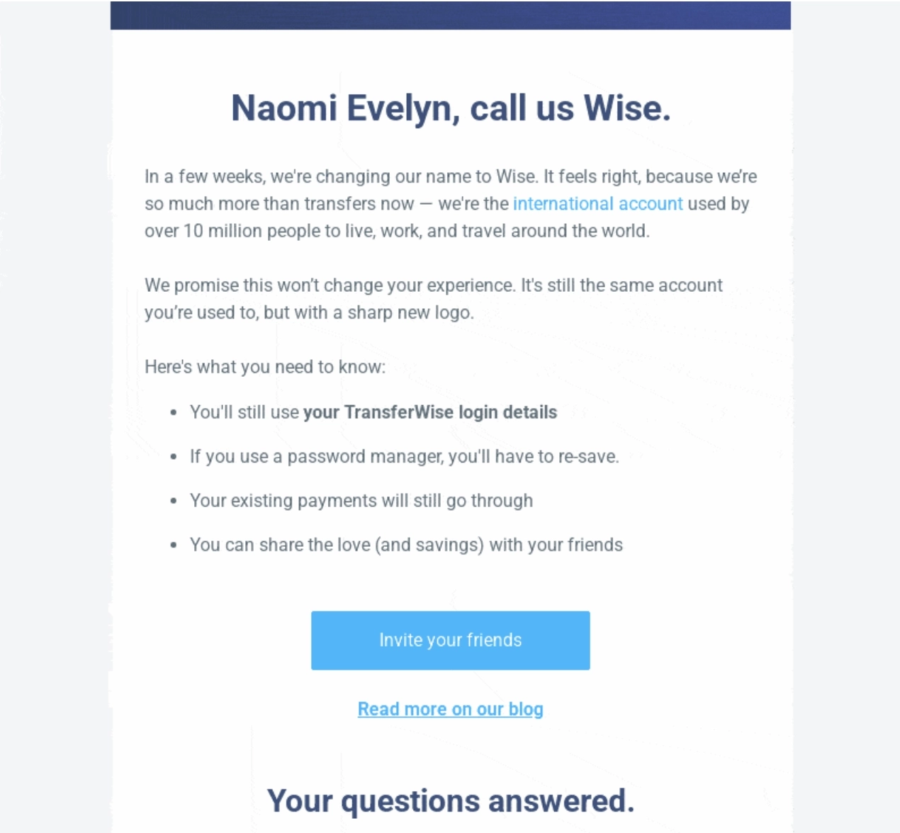
Wise is an international money transfer company.
The email opens by announcing the company’s name change to Wise and briefly stating the reason behind it. It clearly states that the user experience will remain the same. The CTA button encourages the reader to share the news with their friends. A link to the announcement post is linked at the end.
In early 2023, Wise also announced a rebranding in terms of visuals including logo and colors.

This email shows the revamped brand identity of Wise and provides a glimpse into their new face. The customers get to know the purpose behind the change and how they inspired it. It also mentions that nothing has changed in terms of the service and that they can expect better features in the future.
The email features multiple CTAs — one that leads to the revamped website, a product CTA, and one to the more detailed announcement post.
#2. Netlify
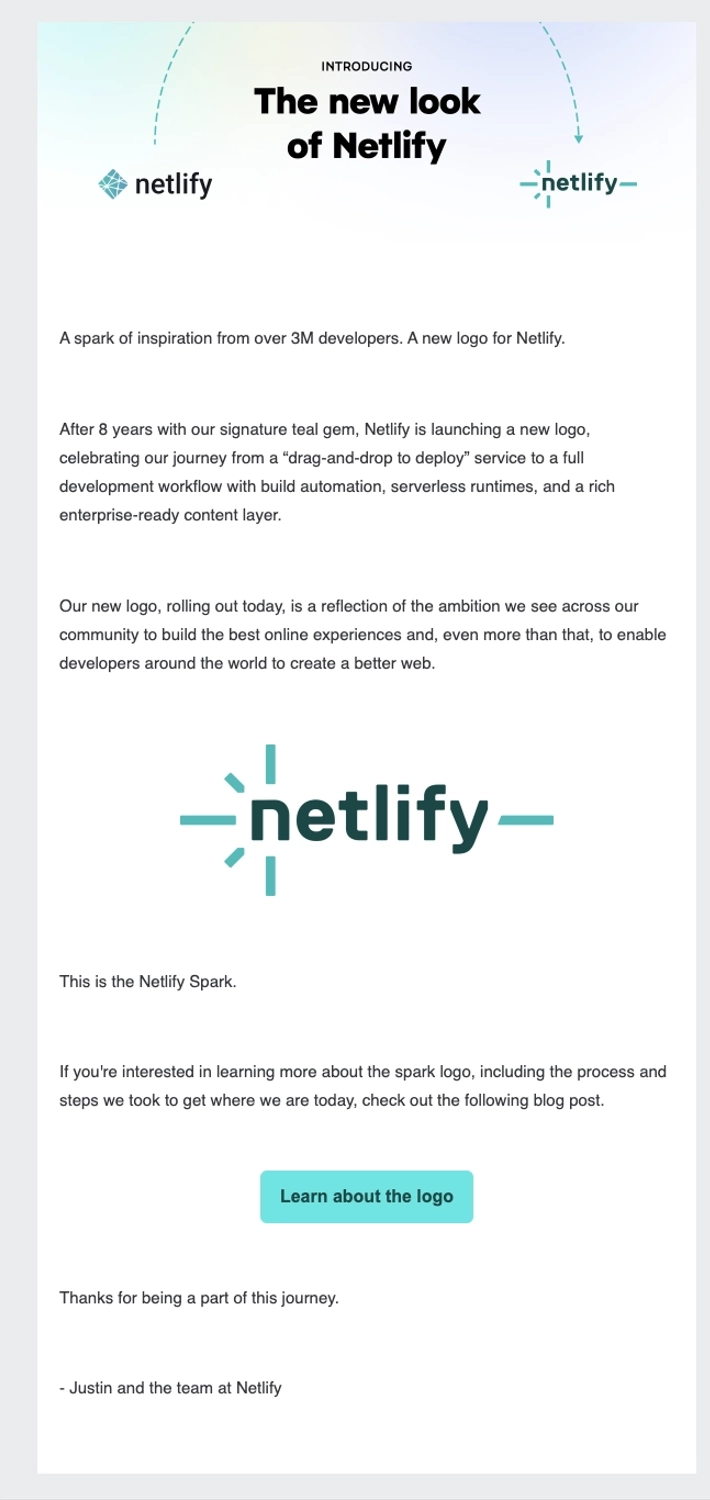
Netlify is a platform for developers to build dynamic websites, ecommerce stores, and web applications.
This short email announces Netlify’s new 2023 logo and thanks the reader for being part of the journey. It mentions what the new logo stands for and how it got there. The email ends with a CTA linking to the blog post about the logo’s evolution and the steps they took.
#3. ConvertKit
Remember that controversial story when ConvertKit renamed to Seva and back in 2018? Here’s their original announcement email.
Subject line: ConvertKit is now Seva
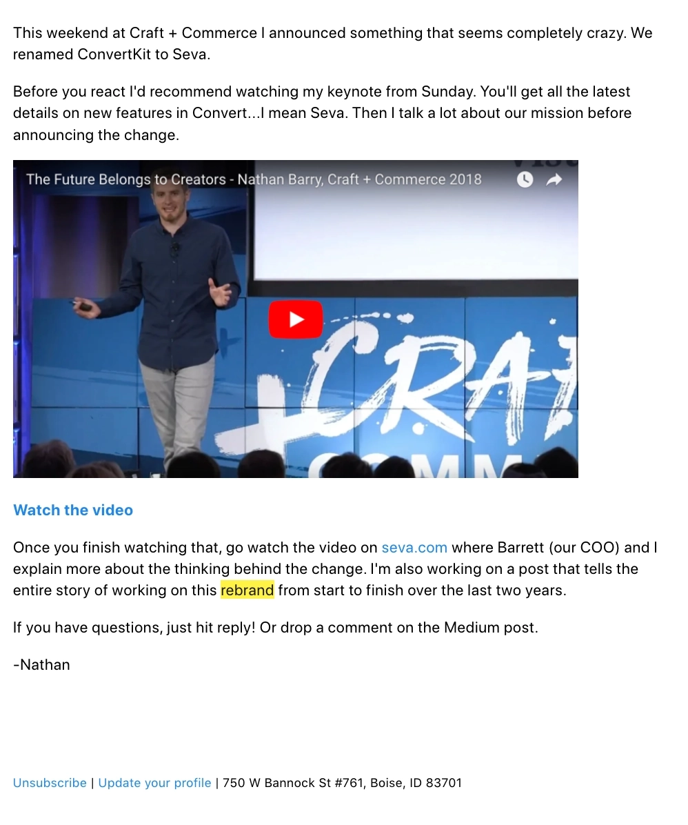
This brief letter-like email from the founder mentions the renaming of ConvertKit to Seva. The readers are asked to watch a video where details of the new features are mentioned. They also link to the website that explains the changes in more detail.
#4. Castos
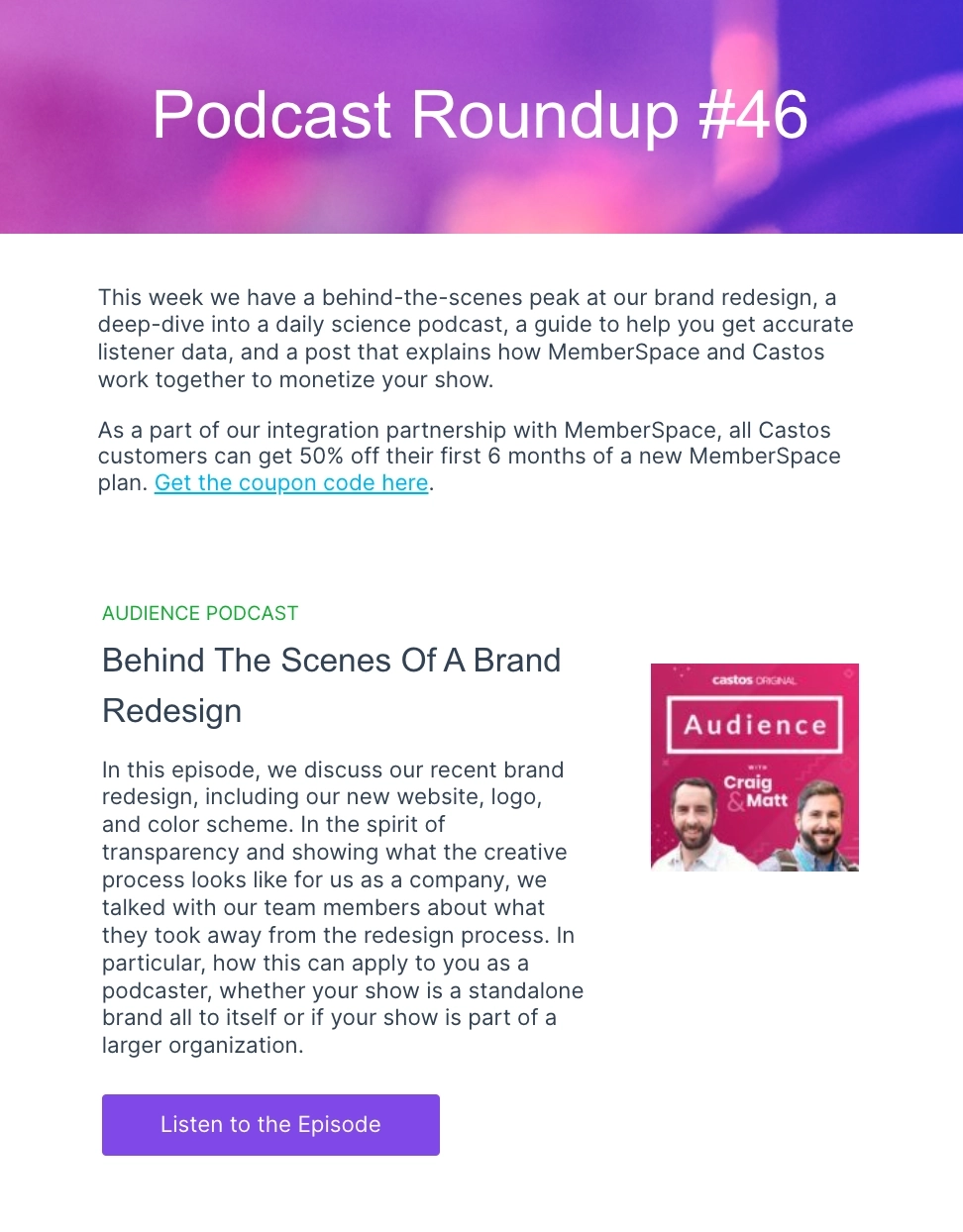
Castos is a podcast hosting platform for creators.
Castos mentions its brand redesign in its weekly podcast roundup newsletter. They include the podcast episode where the team members discuss the takeaways of brand redesign to show what the creative process looks like.
#5. Hunter
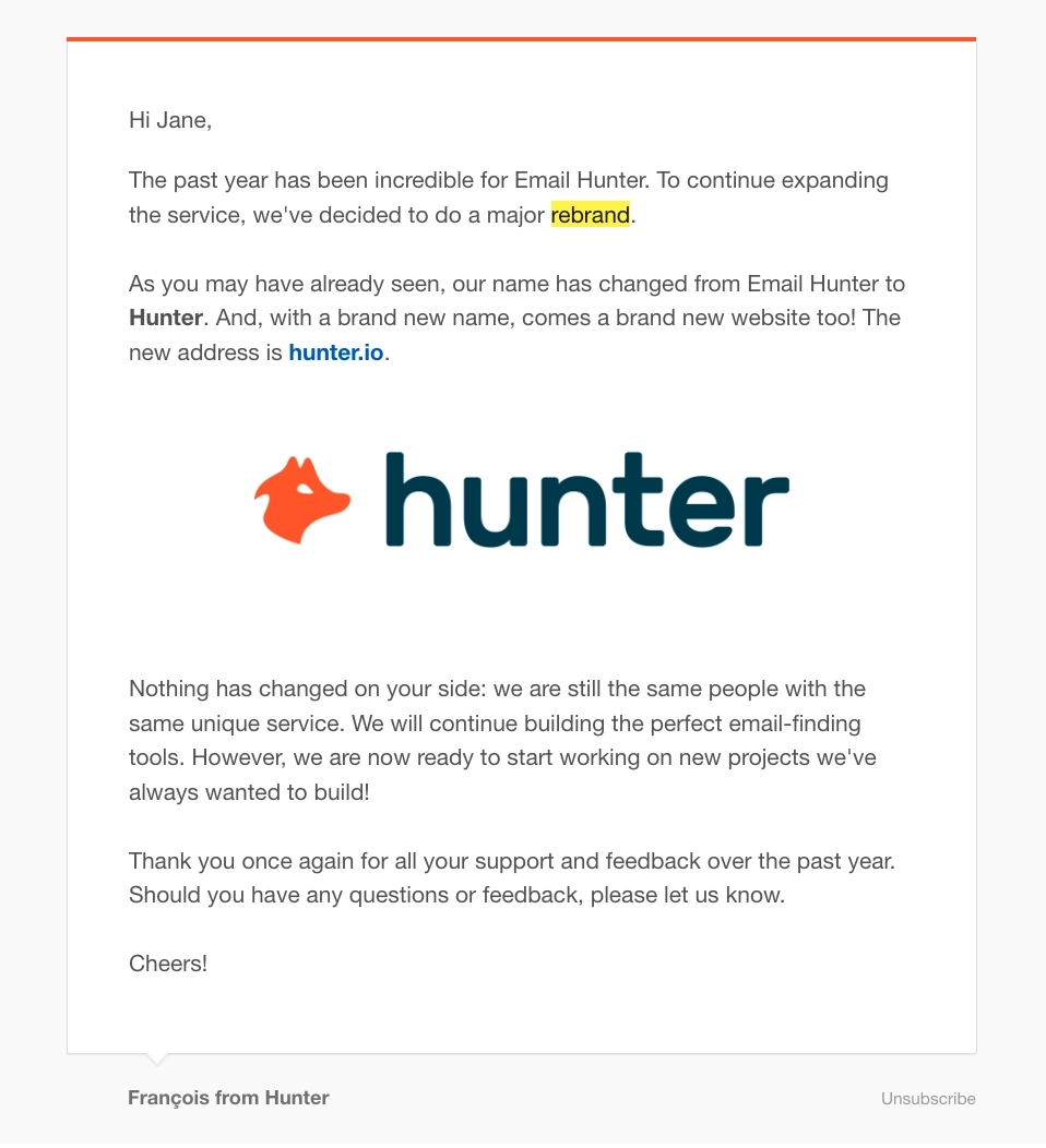
Subject line: Email Hunter becomes… Hunter!
Hunter is a tool for finding and verifying professional emails.
This email was sent out in 2016 when they changed their brand name from Email Hunter to Hunter. It features the new logo and mentions their new domain. Hunter also makes sure to confirm that there are no changes to the services offered.
#6. Summit
Subject line: Big news at Summit ⚡️
Summit is a low-code platform to build sales forecasts, calculators, and simulations.
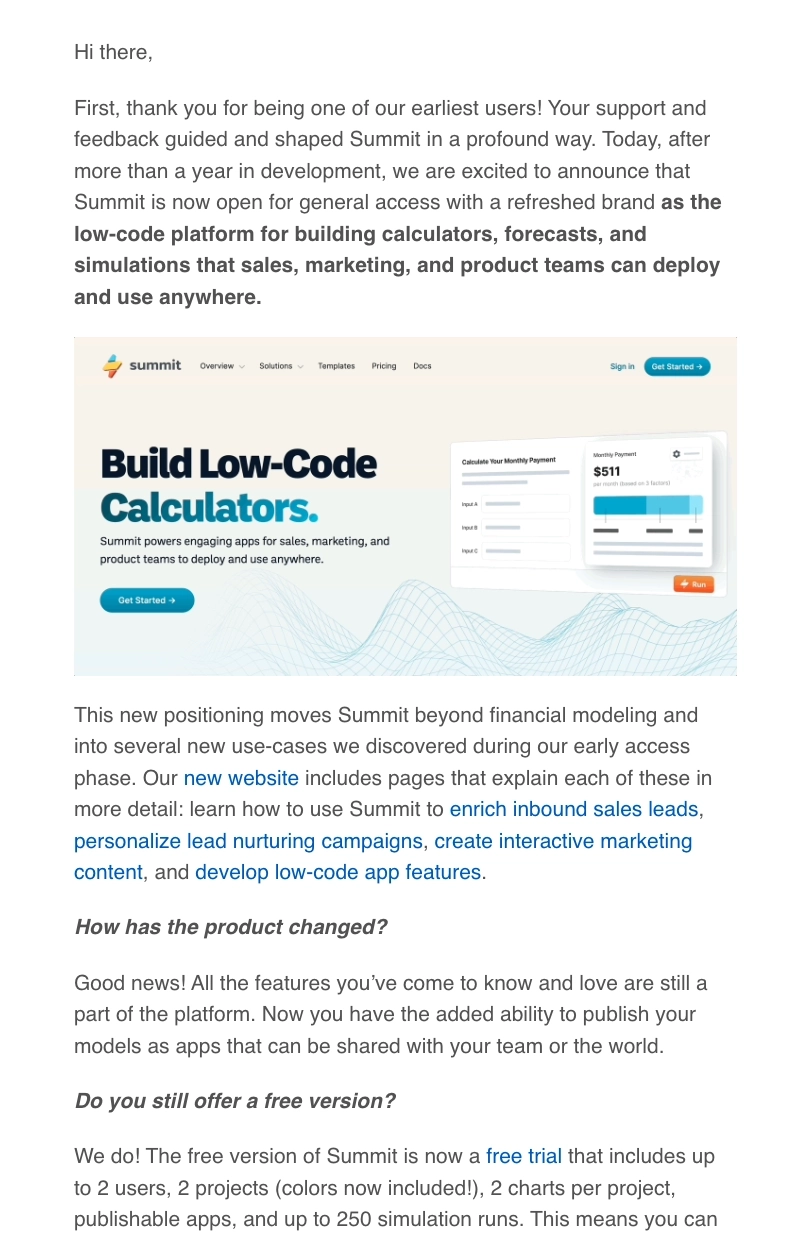
In 2022, the founder of Summit, Matt Wensing changed up the product positioning and introduced a new brand in this email.
Although longer compared to a typical rebrand announcement email, it’s structured properly and has everything the customer would need to know.
The email opens by thanking the reader for being an early user. It then states the new messaging statement and briefly mentions what the new features are. The author has also added two questions that customers may have. The email features multiple links to the new website, the free trial page, and the new features.
#7. Zight
Subject line: Introducing Zight (formerly known as CloudApp)
Zight is an instant visual communications platform for professionals.
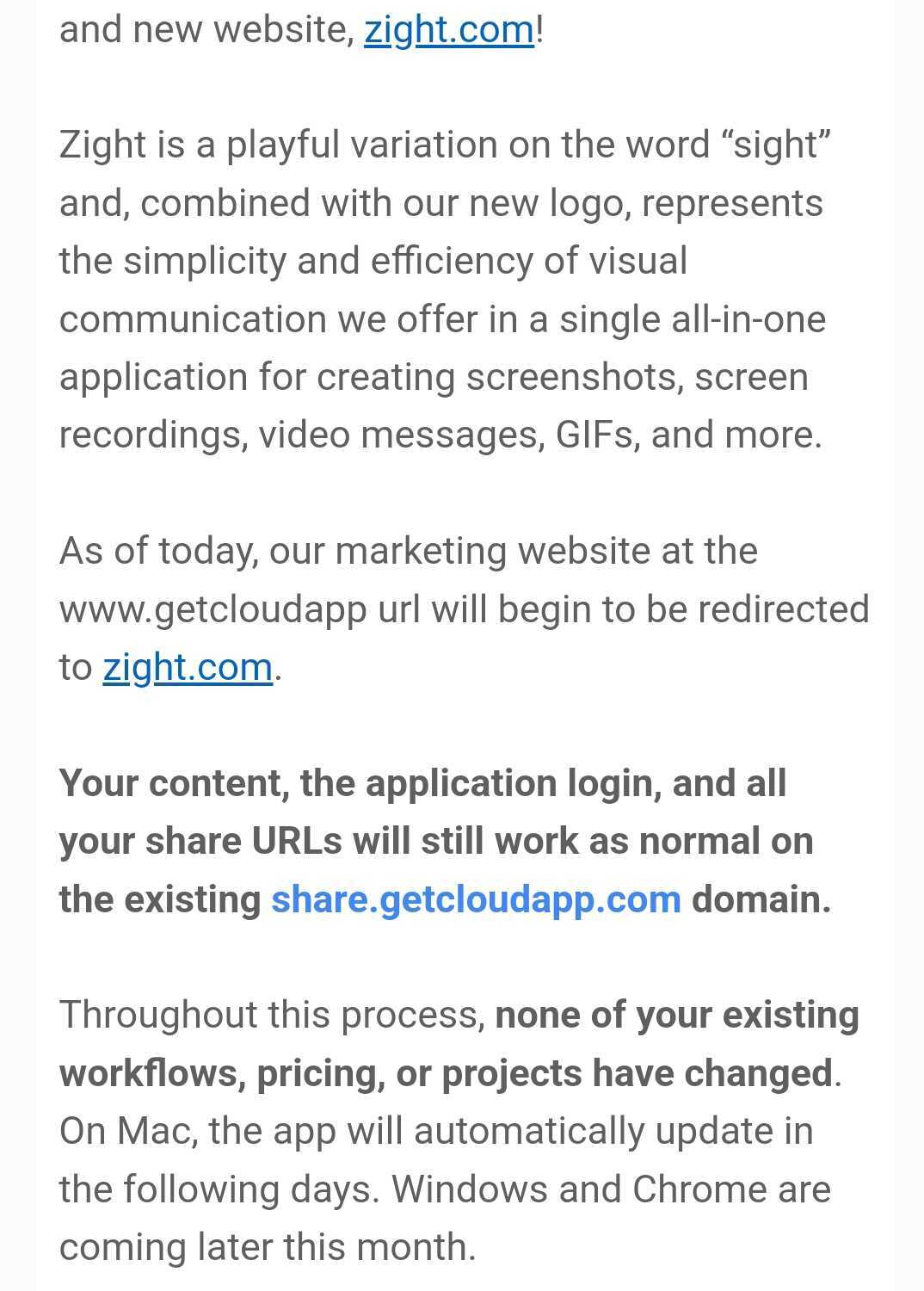
This email is an example of a standard rebranding announcement email that announces the rebranded Zight website and applications. It talks about how the brand name was formed and what it represents.
The email further mentions the changes to domains and other points that concern the customer. The email concludes by thanking the customer.
What can be improved:
A CTA to the announcement post or to any other page could have been added at the end of the email.
Don’t wait for the muse. Apply this step-by-step method to write high-performing email campaigns in hours, not weeks.
#8. Withings
Withings is a fitness and health app that can be used to track activity, heart rate, and more.
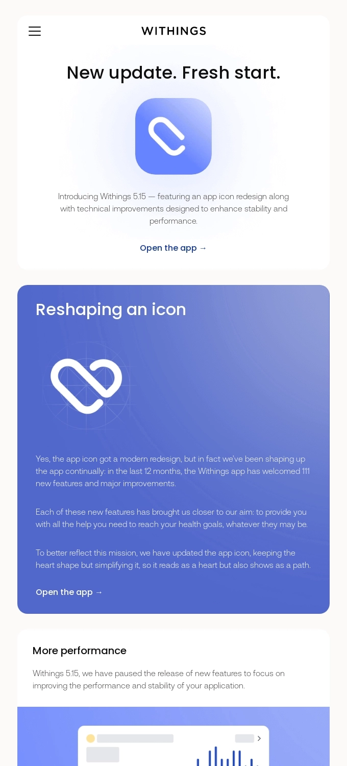
The email features an app icon redesign and also talks about the new features introduced to the app, bugs fixed, and what users can expect in the future. This visually appealing email is divided into sections to highlight each update and it includes a CTA leading to the app.
#9. Anchor
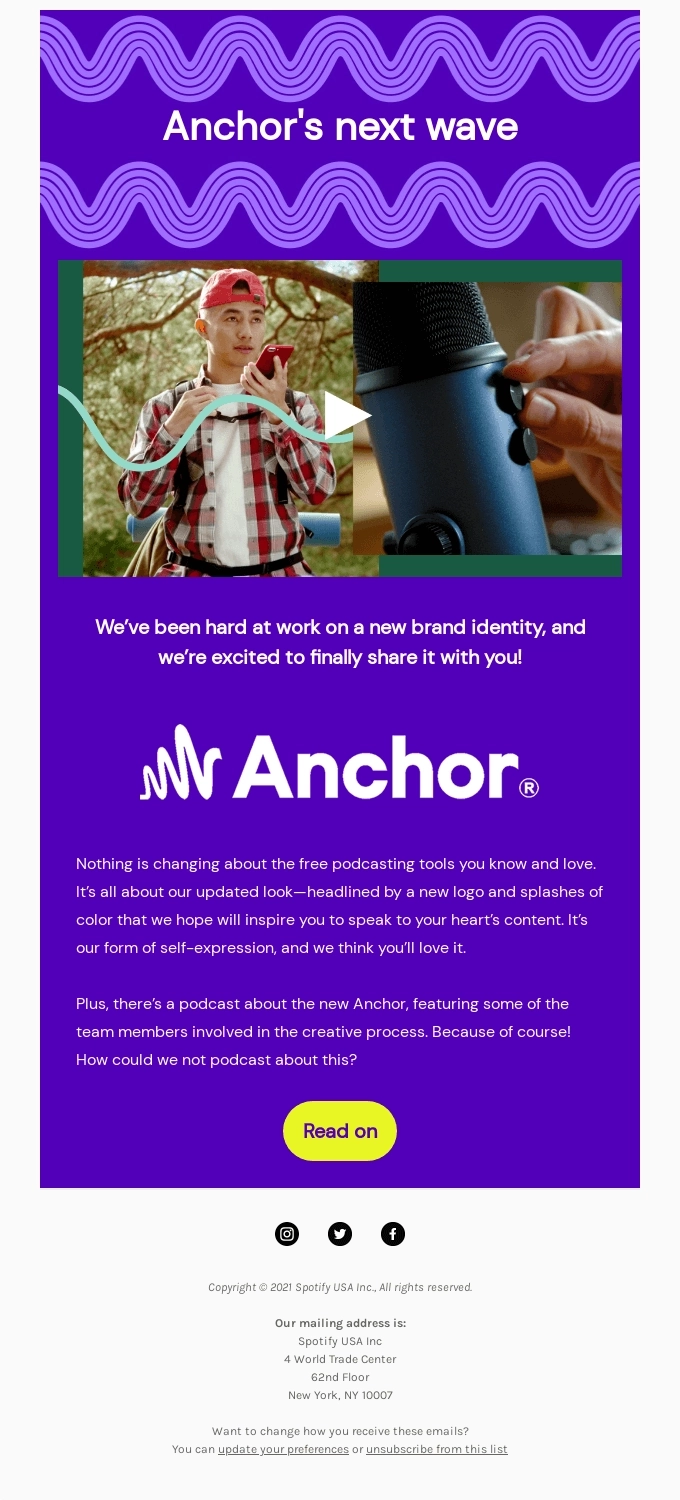
Anchor (now part of Spotify) was a podcast hosting and promotion platform.
This email is about Anchor’s new brand identity. It features the new vivid brand colors and logo and a short video about the rebrand. The CTA leads to the more detailed announcement post on their blog.
#10. Motherboard
Subject line: Important Update — roHealth is now Motherboard
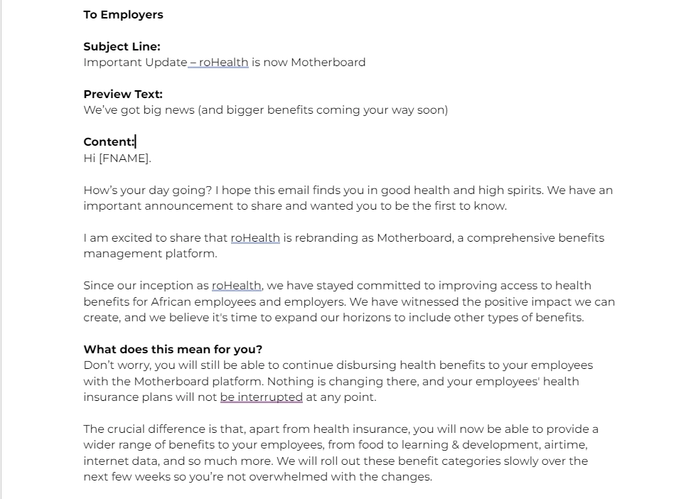
Motherboard is an HR platform that helps manage employee benefits.
This email announces the name change of roHealth to Motherboard and the new features being introduced. The author clearly mentions what this change means for the users and what they can expect after the revamp.
#11. ProdPad
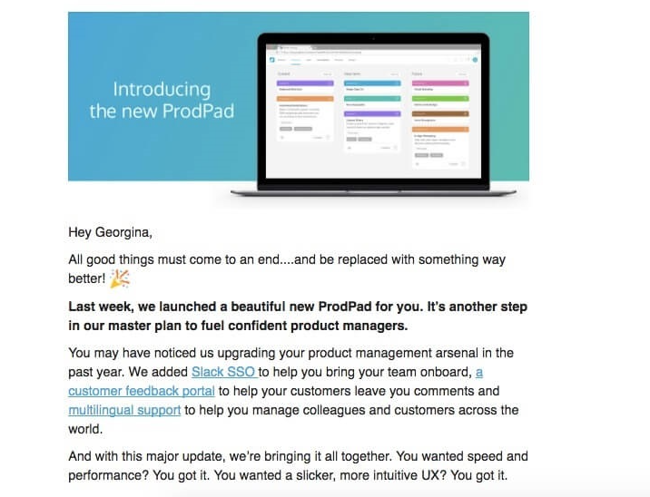
ProdPad is a product management platform for roadmap, idea, and feedback management.
The email announces the launch of new major features on ProdPad. It mentions each feature and links to them so that readers can learn more details.
#12. Stark
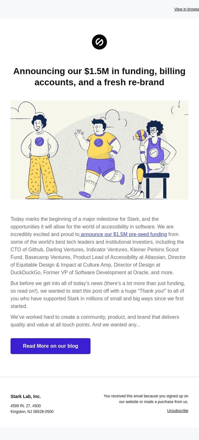
Stark is a suite of integrated accessibility tools for product design and development teams.
This email announces the new re-branding along with the funding and billing accounts feature. However, the content does not mention the re-branding news and only touches on the funding announcement. The email is apparently a copy-paste of the first few lines of their announcement post as seen below:
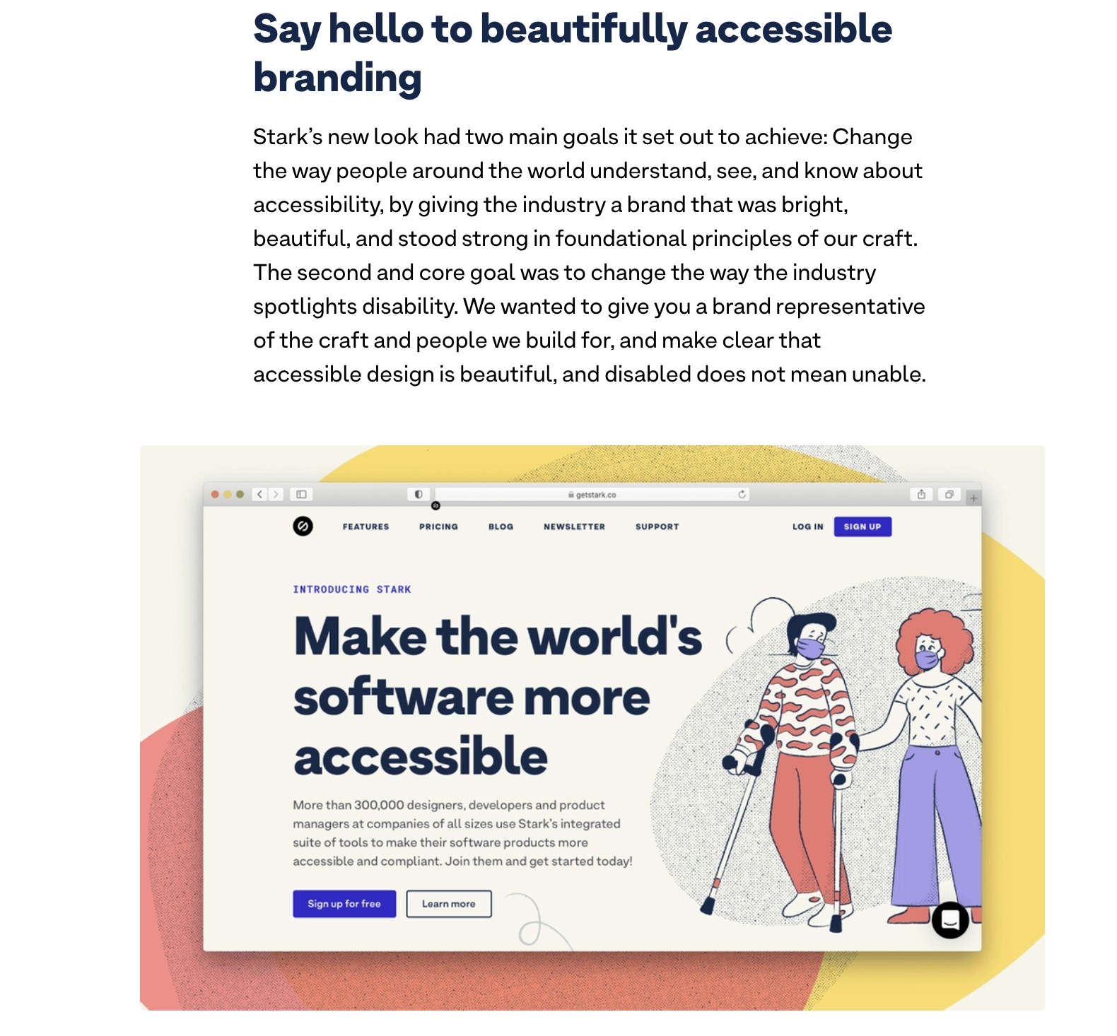
The authors could have added a few sentences about the re-branding and made the email more complete.
We also feel like such big events as funding and rebranding deserve separate announcements. But there must’ve been a reason why they decided to share everything at once.
#13. Typedream
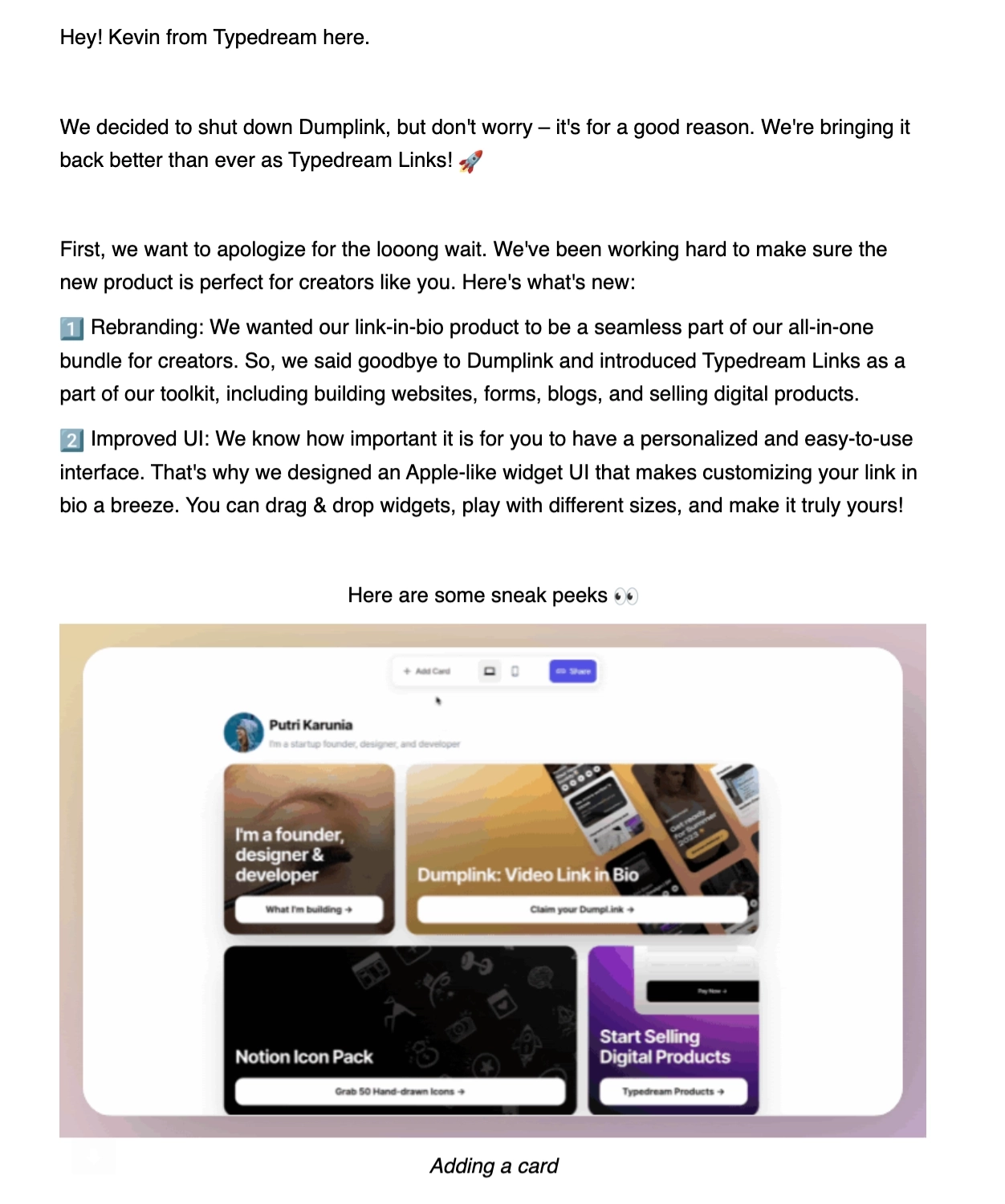
Typedream is a website builder tool for businesses and creators.
This email is about the renaming of Dumplink to Typedream, the new product bundle, and the improved UI. It also includes images that give users a sneak peek of the new features. The CTA leads to the product page where users can try out the new features.
#14. Savvycal
Subject: whoa, did you see what SavvyCal shipped?
SavvyCal is a popular scheduling tool.
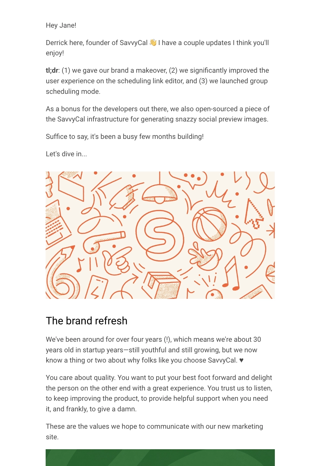
They baked their brand makeover announcement into one of their newsletters. We love the TLDR section in the beginning so the reader immediately gets the important news, even if they’re just skimming through the email.
Note how they used an eye-catching banner (featuring their new colors) along with the CTA to check out their redesigned website.
Announce rebrands effectively
Rebranding and redesigns are important milestones for any business. It’s important to deliver the right message to your employees and convery the brand image correctly right from the start.
Here are the main takeaways from the examples:
- Keep the email brief and clearly mention what the change is about
- Tell the readers why you decided to rebrand
- Mention what will change for the customers and what they need to do
- Include images to help users visualize the change
We hope this helps when you’re writing your rebranding announcement email.
Don’t miss out on new articles. Subscribe to our newsletter and get your monthly dose of SaaS email marketing insights.

