

Whether it’s in a classroom setting or beyond, people don’t learn the same way. Some are fine with reading text, while others learn better through visuals.
Onboarding new users to your product shouldn’t be different.
In this post, you’ll learn how multimodal onboarding helps new users better, the different modalities used in SaaS onboarding emails, and more.
Don’t wait for the muse. Apply this step-by-step method to write high-performing email campaigns in hours, not weeks.
What is multimodal user onboarding?
Multimodal user onboarding uses multiple learning formats to help new users understand how your platform works, so they can eventually experience the product value.
Email marketer Aerin Paulo says that this lets you cater to different learning preferences:
“You’re teaching someone a new thing and you don’t know how they learn. For example, mixing text and visuals makes a ton of sense because for those visual learners, images and GIFs work better. For those that are reading-based learners, you can do a nice, scannable note.
The more familiar they become with navigating your tool, the more likely they’ll be to do it, especially if part of your onboarding series tackles frequently asked questions (which it should!).”
Auroriele Hans, founder and email strategist of AuthorityScribe, adds that it helps keep the new user’s attention so they see the onboarding process through:
“Explaining how to use a technical product to a user who hasn’t seen its value yet is tricky. You don’t have their undivided attention. They’re likely not committed to learning the features and forming a new habit.
For example, product UI images and GIFs are eye-catching and can improve an email’s UX. Plus, they visually convey the text’s message, which can be abstract depending on the product’s complexity. This helps remove the friction of learning the product.”
How multimodal user onboarding helps your customers better
- Users learn by preference. Instead of imposing a singular modality, users learn how your product works through the best learning method that suits them.
- Complex processes are explained better. Using a combination of at least two modalities can help explain a complex onboarding step(s) clearly. For example, text paired with visual elements (i.e. screenshots) are commonly used in onboarding emails.
- Users get to the aha moment faster. Because you let users select the modality that they’re most comfortable with, tthey better understand how your product works and its value.
SaaS emails with multimodal user onboarding
Let’s look at the different learning formats used in SaaS onboarding emails.
Step-by-step guide
This involves a numbered list of steps that guide the user to the product’s aha moment.
Here’s an example from SocialBee.
Subject: welcome to SocialBee! 🐝
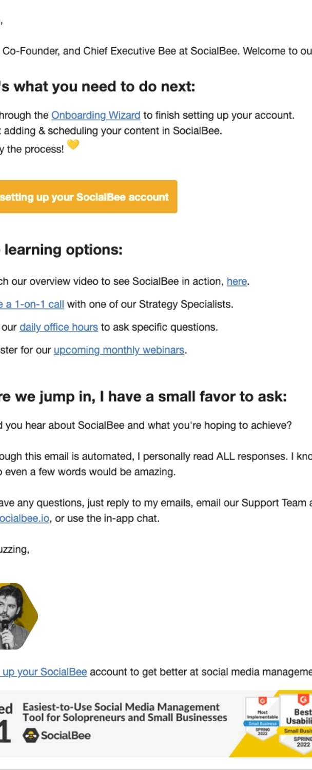
This welcome and onboarding email’s first section highlights the step-by-step process of setting up the account. SocialBee also provides more learning options in the second section.
Subject: Ready to go live?
Source: Really Good Emails
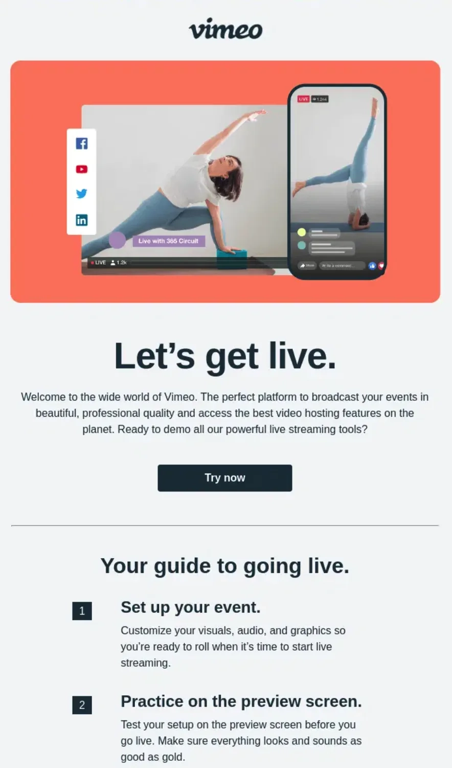
Vimeo’s onboarding email talks about how to go live on their platform in three steps. The main steps are formatted in bold, making it easily skimmable. There are also best practices under each step.
Checklist
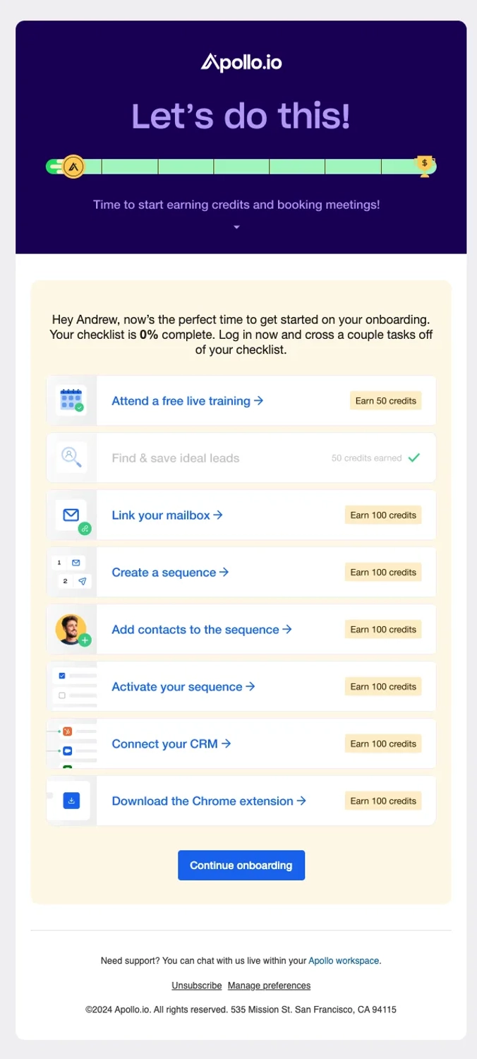
Checklists also feature specific steps but they aren’t necessarily done in a sequence. Completed steps are checked off the list to show progress.
Let’s look at this example from Apollo.io.
Subject: Let’s tackle your onboarding checklist?
Source: Email Love
Apollo gamifies the checklist by letting new users earn credits for each crossed off step.
Subject: Welcome to Lifesum 🌱
Source: Really Good Emails
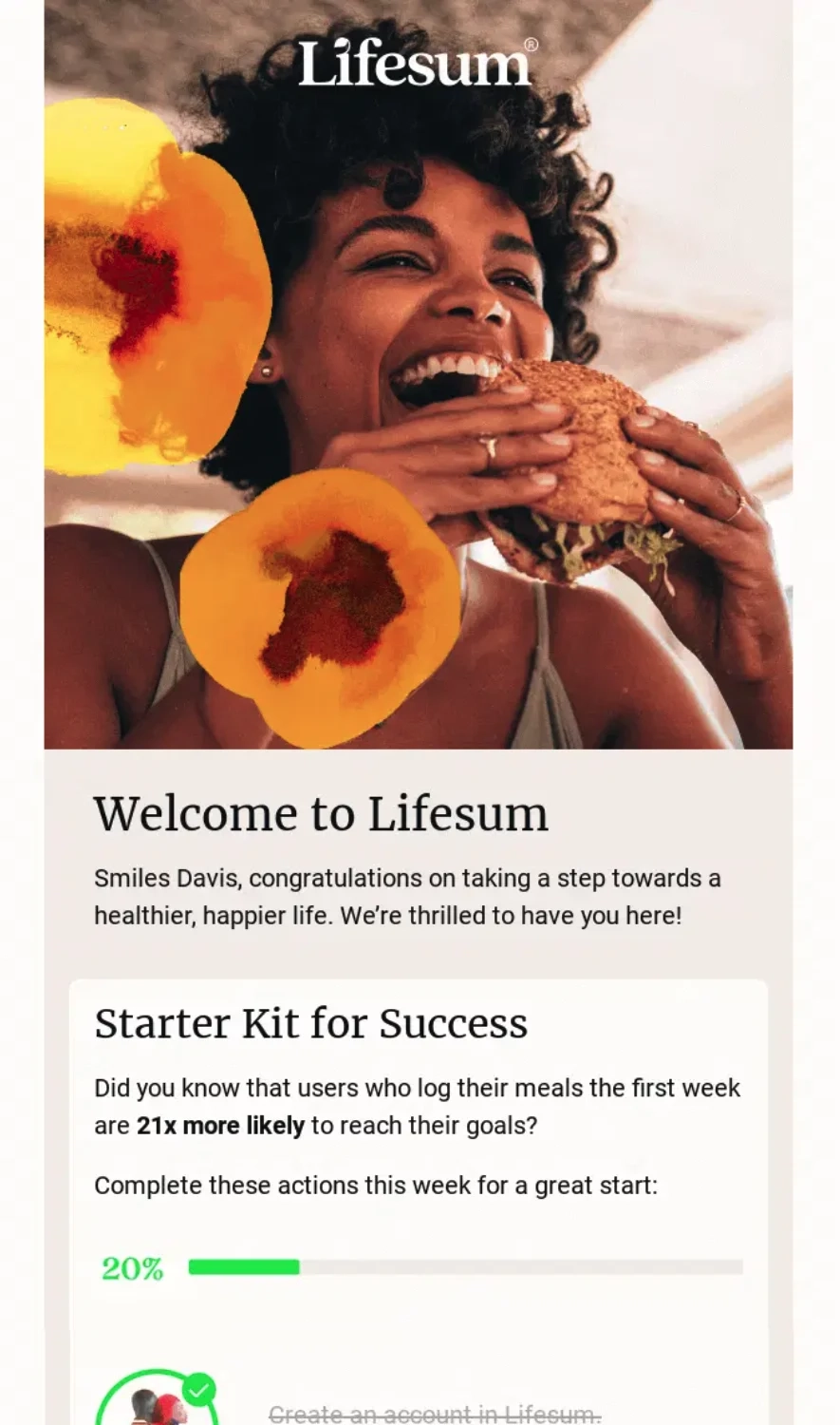
Lifesum’s welcome and onboarding email packages the checklist as the “Starter Kit for Success”, with illustrations accompanying the onboarding steps.
Tips and best practices
Tips and best practices give new users ideas of what already works, and nudges them to try it out for themselves.
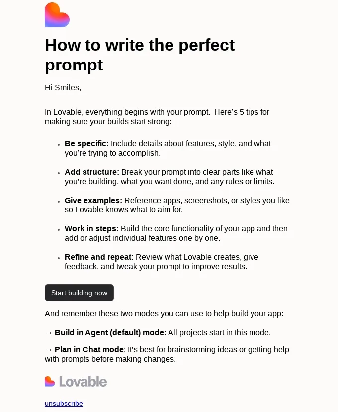
Here’s an example from Lovable.
Subject: How to write the perfect prompt
Source: Really Good Emails
Their email features tips on how to write a good prompt so the user could get their desired results with the platform.
Links to resources
Emails can’t cover everything, which is why onboarding emails might include links to other resources. This caters to users who want to deep dive into certain topics, features, or use cases.
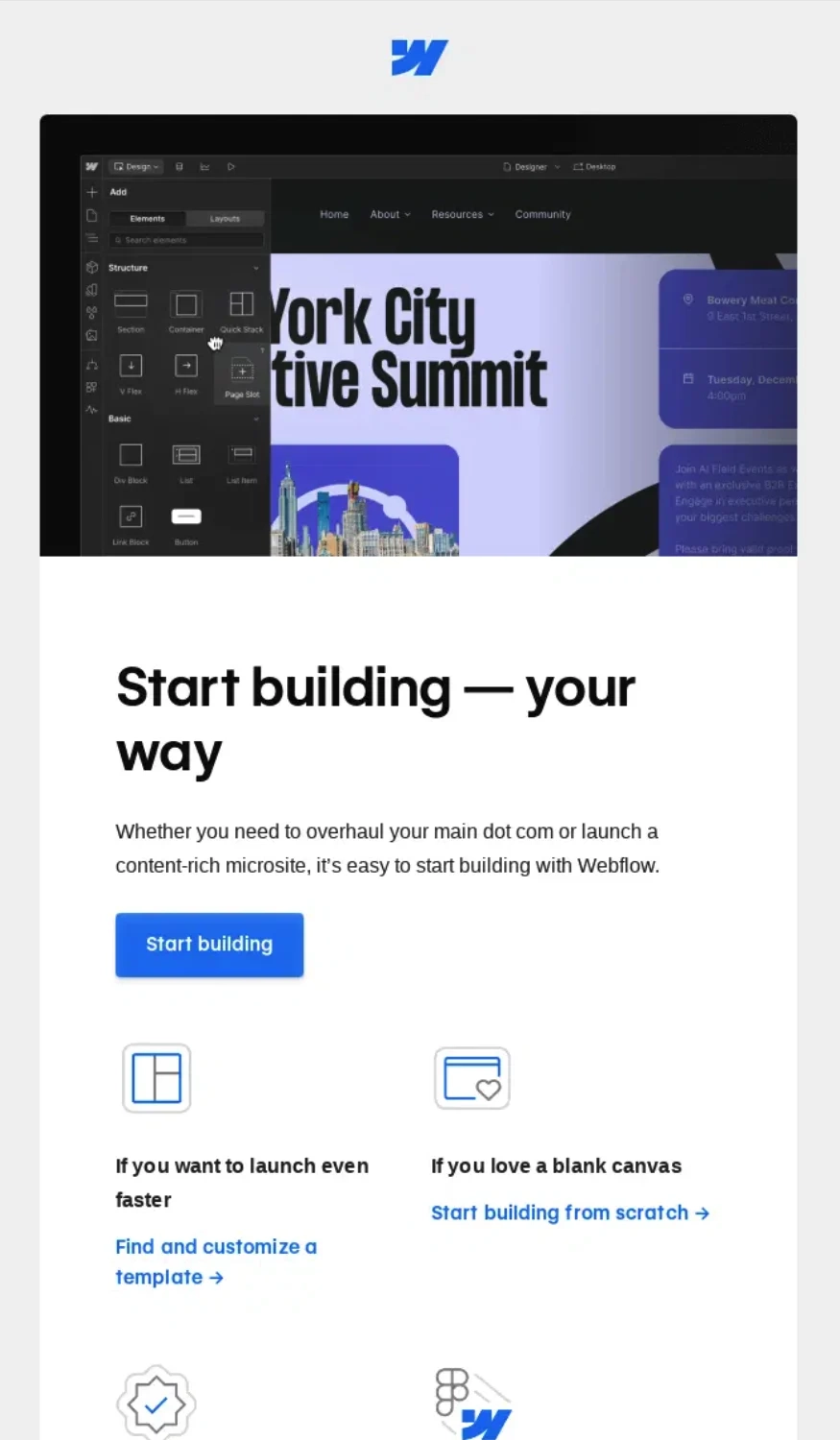
Let’s look at this example from Webflow.
Subject: 4 ways to get started
Source: Really Good Emails
Because they let the user decide how to start, they link to several resources to help with the process such as templates, a directory of certified partners, their academy, and more.
Slide deck
Slide decks are a skimmable visual resource that can help explain your onboarding process in a structured and sequential manner.
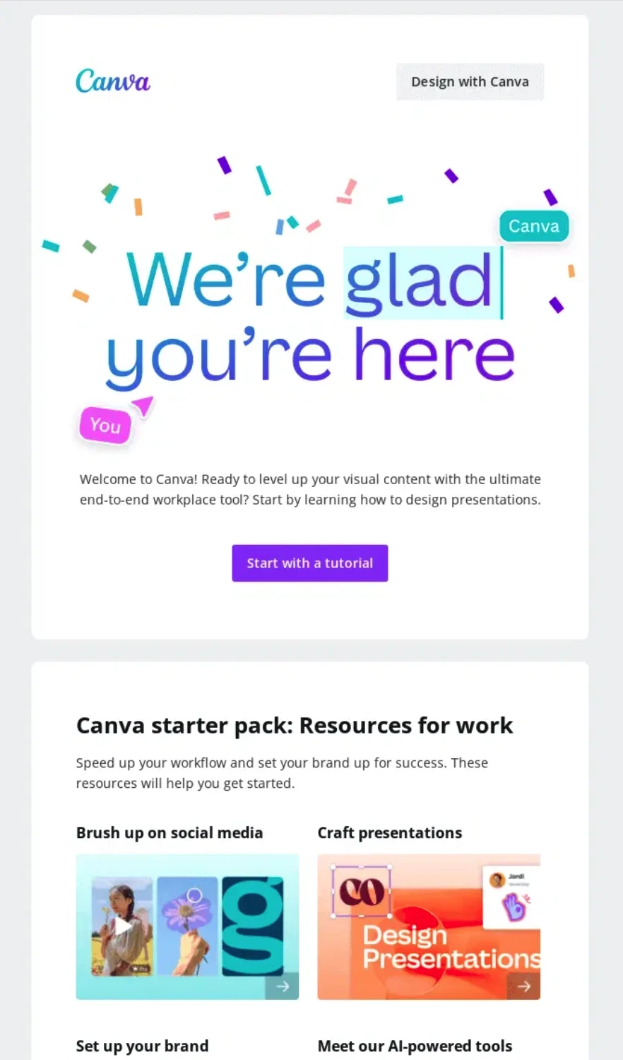
Let’s see how Canva used it for their onboarding email.
Subject: New to using Canva for work? Start here 👉
Source: Really Good Emails
Their email contains a “Start with a tutorial” CTA that links to a short slide deck, hitting two birds with one stone: showcasing the product in action and discussing other features that are great for presentations.
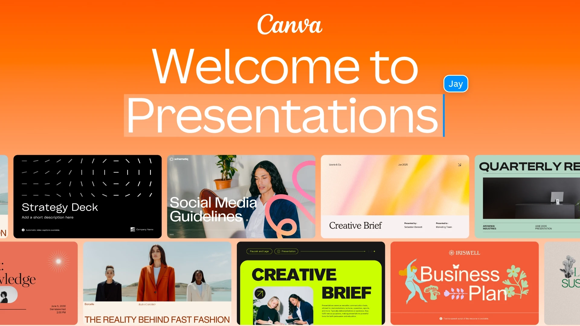
The Canva starter pack section also links to other slide decks about several topics to help the user get started.
Illustrations
Illustrations help explain concepts and onboarding steps visually and make the email more engaging to look at.
Here’s an example from Splitwise.
Subject: Hey there!
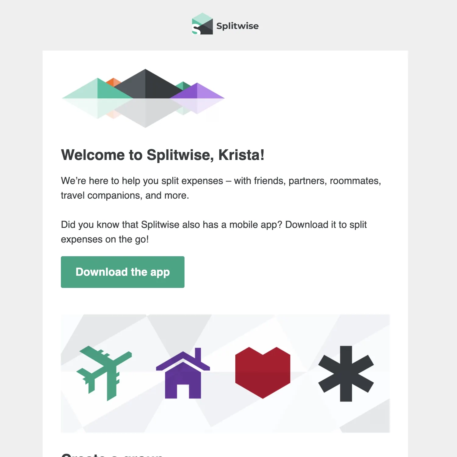
While the onboarding steps are simple enough to be explained through text, the accompanying illustrations help the user visualize what it looks like on the app.
Subject: Add your loved ones.
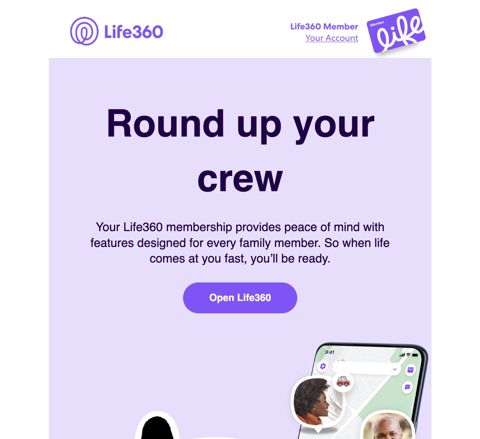
Life360 does a similar thing by placing accompanying illustrations of platform elements and a CTA in each onboarding step.
Screenshots
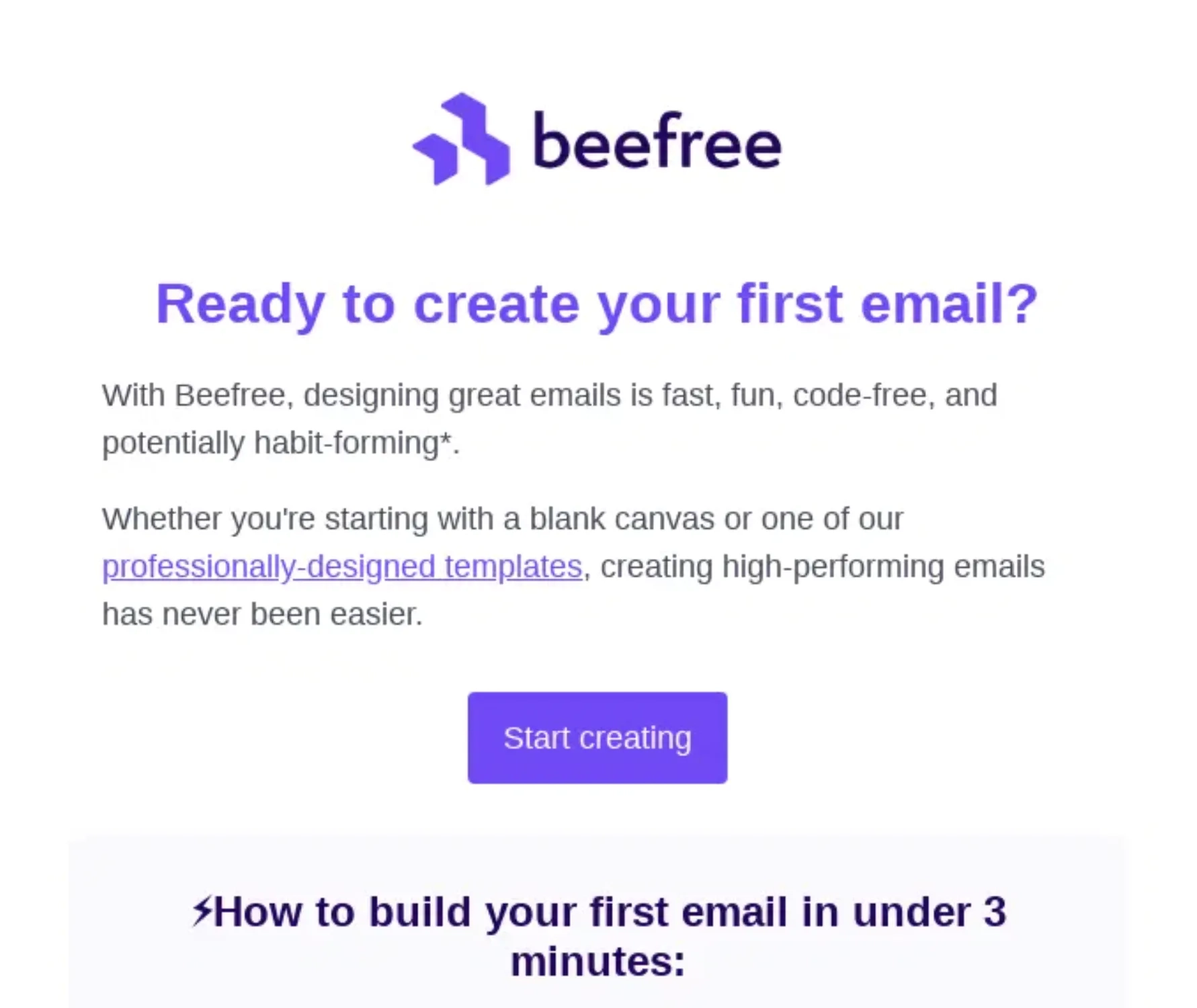
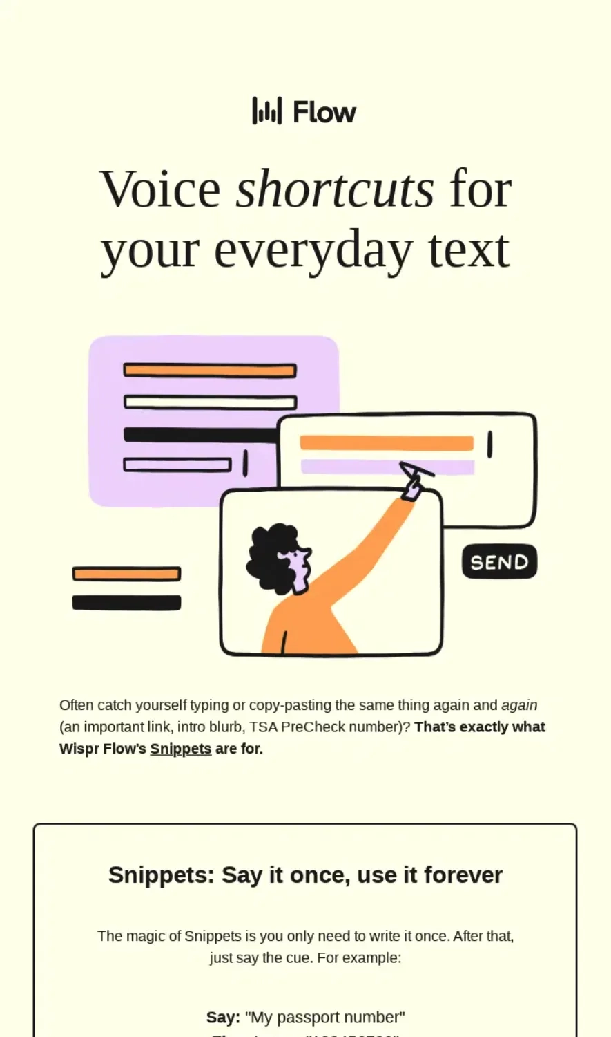
Screenshots are snapshots of the elements inside your platform, giving your new users an idea of what and how they’ll interact with your product.
Let’s look at this example from Beefree.
Subject: Let’s start designing 🎨
Source: Really Good Emails
The accompanying screenshots in each onboarding step tells the user what exactly they should look for to help them create their first email.
Subject: Turn 2 min of typing into 2 sec of speaking 🗣️
Source: Really Good Emails
Wispr Flow’s email talks about their snippet feature. Each use case comes with an accompanying screenshot.
Don’t wait for the muse. Apply this step-by-step method to write high-performing email campaigns in hours, not weeks.
GIFs
Because video embeds are still impossible in email, GIFs are the best dynamic visual elements you canh use to showcase your product in action inside the email.
But unlike videos, GIFs don’t have audio so they are usually paired with text (either in the GIF itself or the email) to better communicate an idea.
Let’s see this example from Notion.
Subject: Notion for teams (2/7):
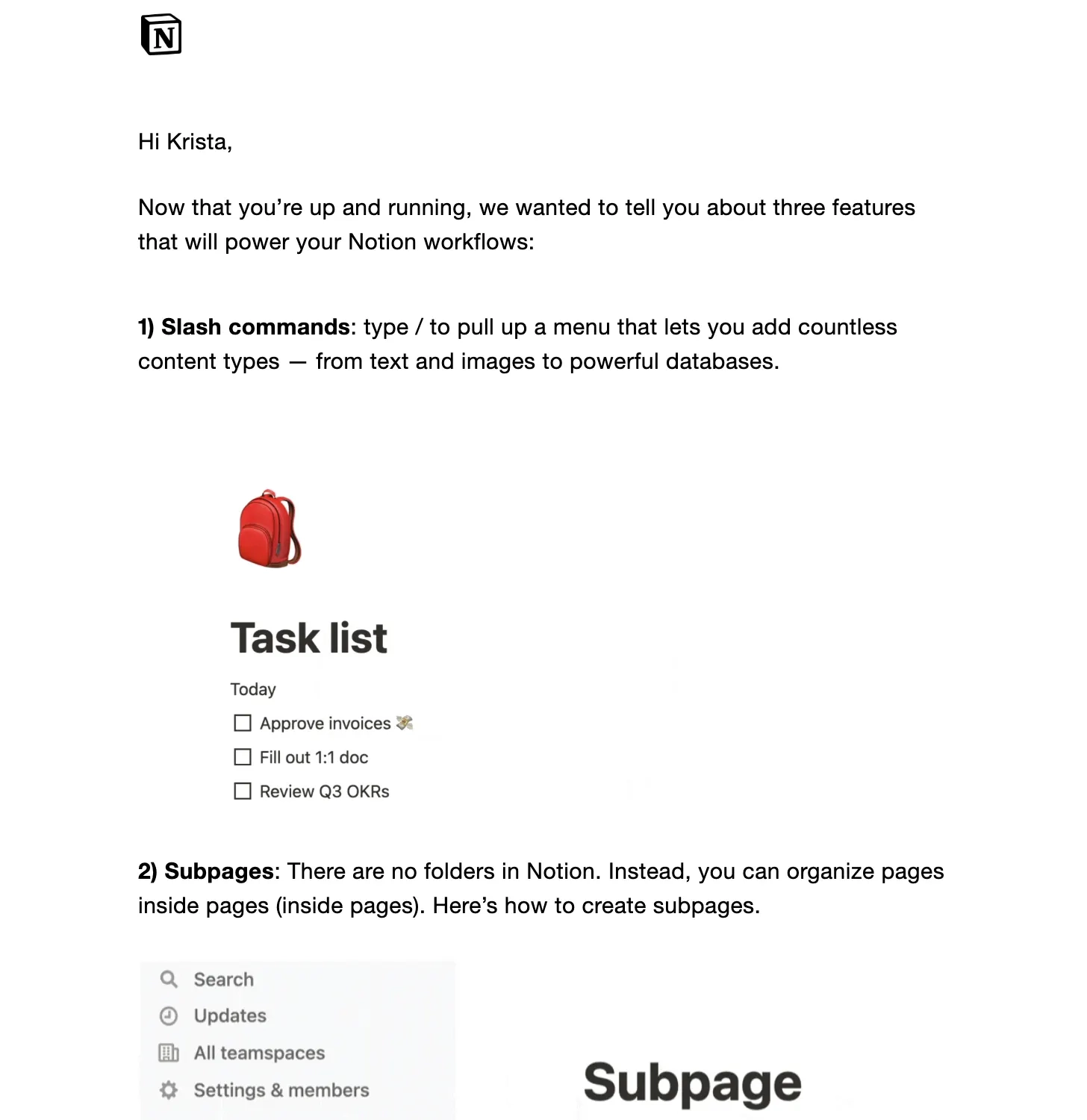
In one of their onboarding emails, Notion included three GIFs with each one showcasing a different feature. The GIF below shows new users how to use the slash command.
Video
Videos combine visuals, audio, and text to convey a message which is why it’s often used in product demos and in-depth training.
But unlike GIFs, users have to be redirected to another page to watch the video.
Here’s another example from Notion.
Subject: You’re all set with Notion! (1/8)
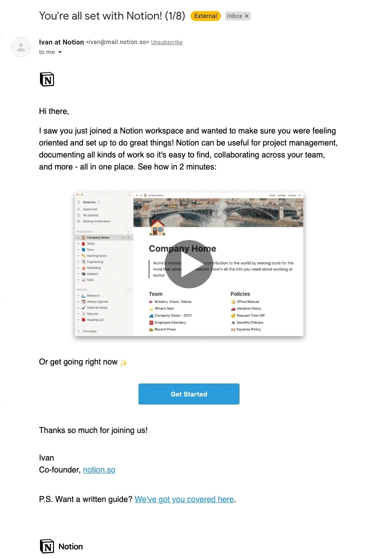
This onboarding email features a short 2-minute video that tells the user about how they can get started with the platform.
Subject: ⌛️ Busy schedule? Training on your time.
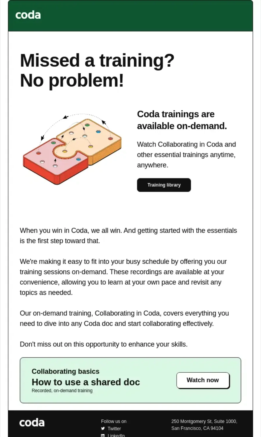
Source: Really Good Emails
This email from Coda talks about their training library where users can watch videos about how to use the product on demand.
Webinar
Some SaaS tools offer onboarding webinars, adding a human touch to the process by letting new users engage with a team member in real time as they learn how to use the product.
Here’s an example from StreamYard.
Subject: Welcome to StreamYard
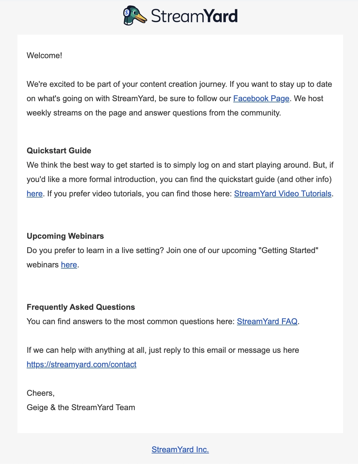
In their welcome email, StreamYard offers a Getting started webinar for those who prefer learning in a live setting.
Cohort training
Some SaaS offer cohort-based training to new users so they can become proficient with the product. Having a dedicated instructor and a group of peers help new users keep accountable with the process.
Here’s an example from Clay.
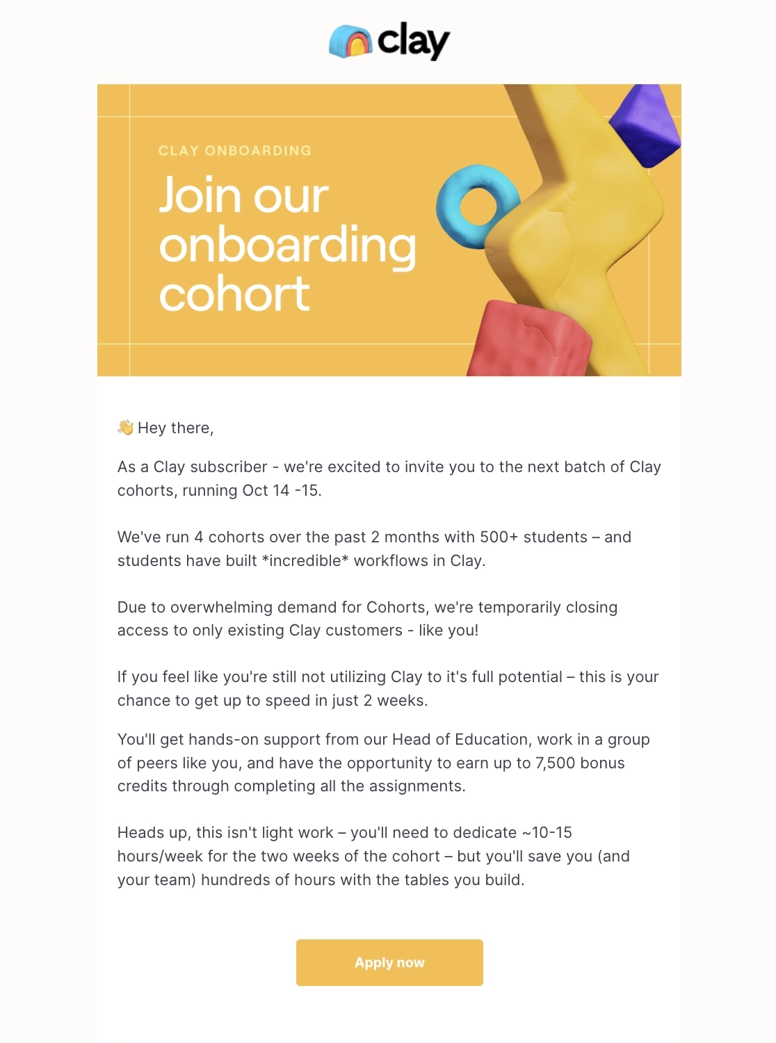
This email talks about the training’s agenda and what participants can expect during the 2-week training. They also use gamified the process, telling the new user they can earn up to 7,500 credits if they finish the course.
Use cases
Some users might be unsure if your product can help with their pain points so use cases are a great way to show them exactly how.
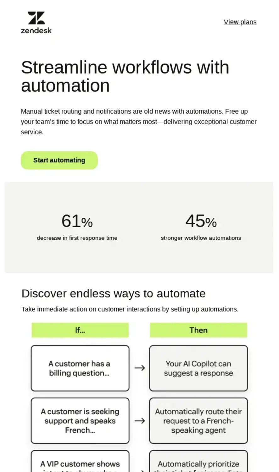
Let’s look at this example from Zendesk.
Subject: Reduce ticket response time by 61%
Source: Really Good Emails
In this email, ZenDesk talks about the tedious work involved in manual ticket routing. They then show how automations can help increase customer service KPIs and some examples of automations users can set up.
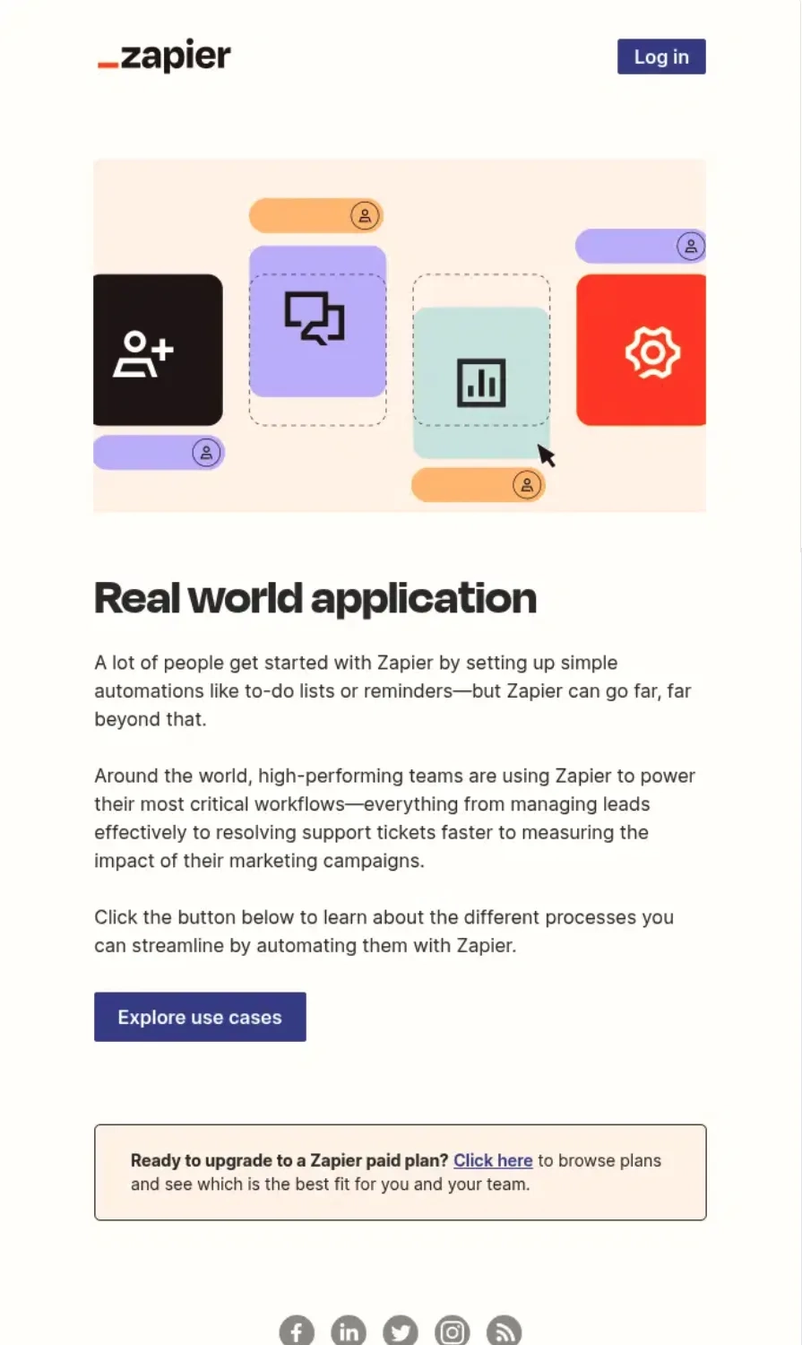
Subject: How top teams automate
Source: Really Good Emails
Zapier’s email gives the reader an overview of how other teams are powering their workflows with the platform. The email ends with a CTA that links to a page of use cases.
Subject: Save time by sending a Loom video with your next Slack message
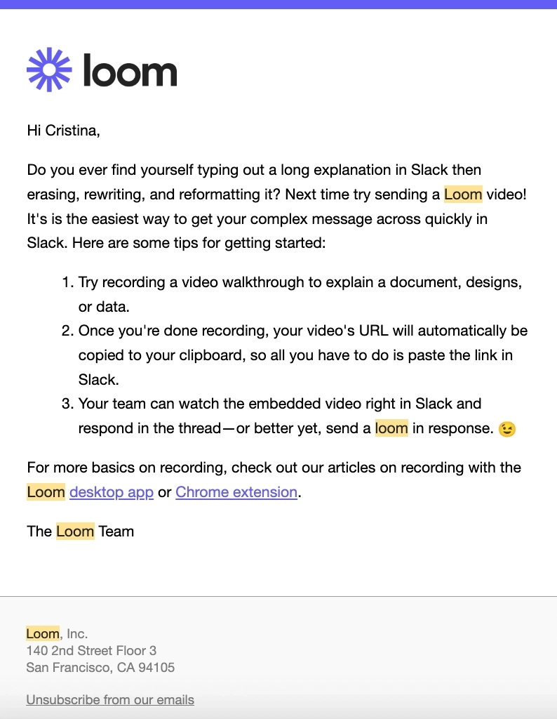
In this example from Loom, they specifically talk about the pain of communicating via Slack and present their tool as the solution. They also give tips on how to record and send a Loom video on Slack.
Templates
Not all users want to build something from scratch. Templates help users immediately build and tweak according to their use case.
Here’s an example from Typeform.
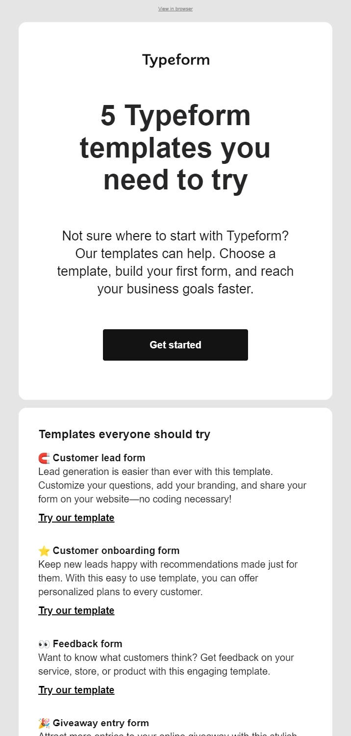
Their email features five form templates that users can easily use and tweak according to their needs.
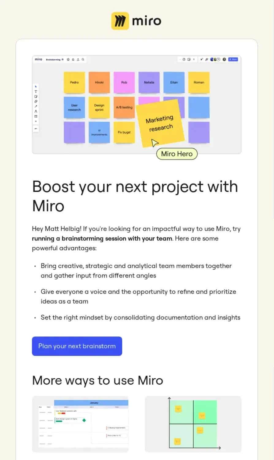
Subject: Recommended: How to Use Miro for Your Next Project
Source: Really Good Emails
Meanwhile, the second section of Miro’s email features templates for a Gantt chart and priority matrix, which is great for team collaboration.
Docs
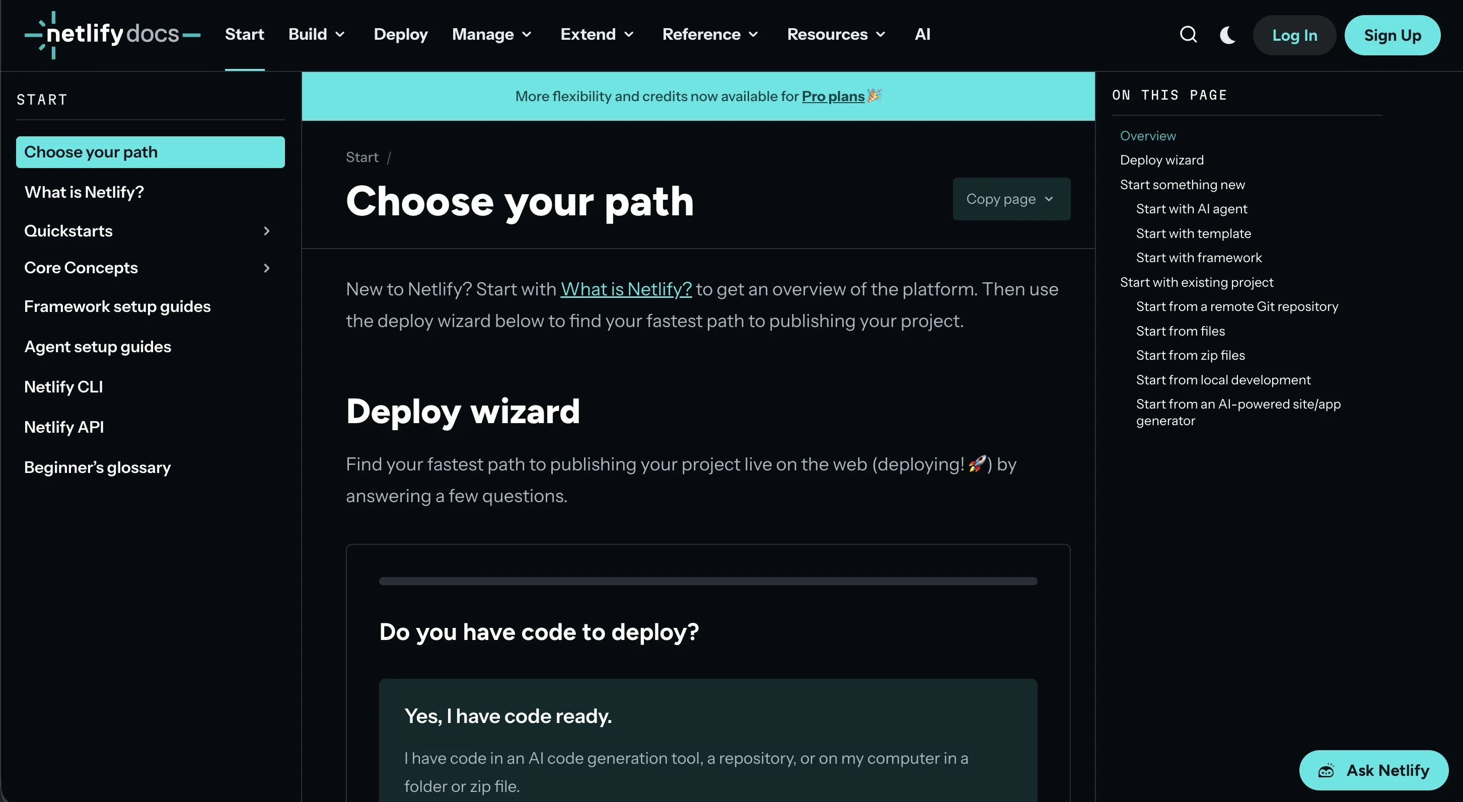
As we’ve already mentioned, it’s impossible to put everything in an email. That’s why for more technical products, you might find links to the docs to help users get started with the tool.
Here’s an example from Netlify.
Subject: Ship your first site in four steps
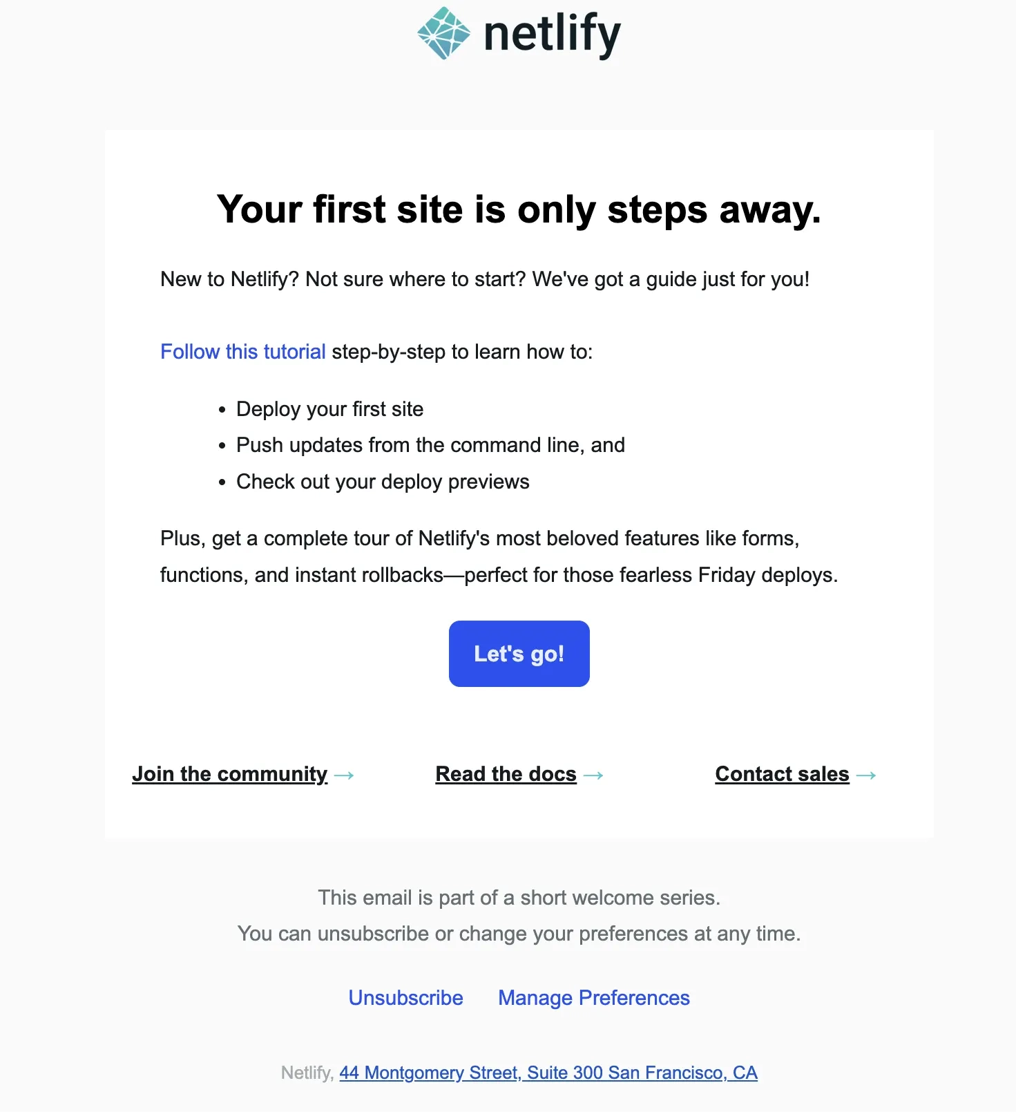
In this onboarding email, the “Follow this tutorial” CTA redirects to their docs page, where new users can choose how they get started with the platform.
Commands
Some technical tools might require typing in commands from the terminal. These commands are often formatted in code style so they’re easily differentiated from other text in the email
Here’s an example from Claude Code.
Subject: Welcome to Claude Code
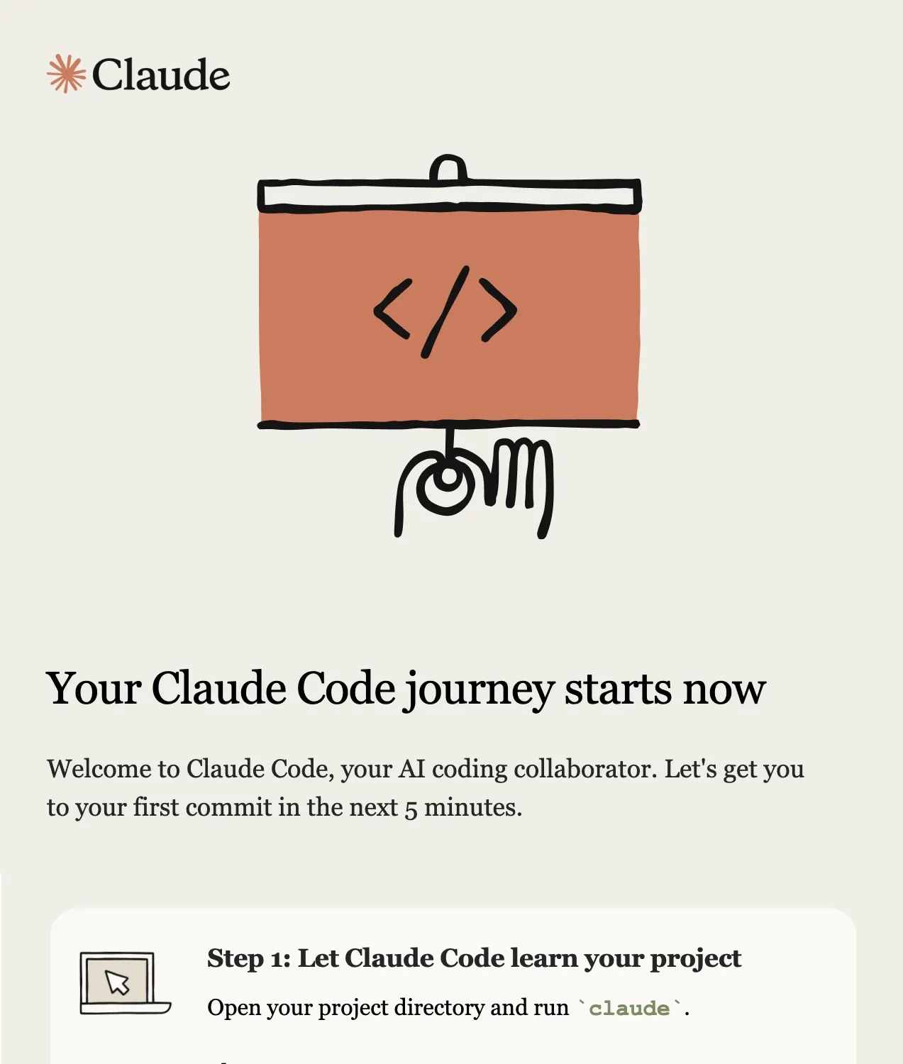
In each onboarding step, we can see the commands in green and code style so the users know what to type into the terminal.
Setup wizard
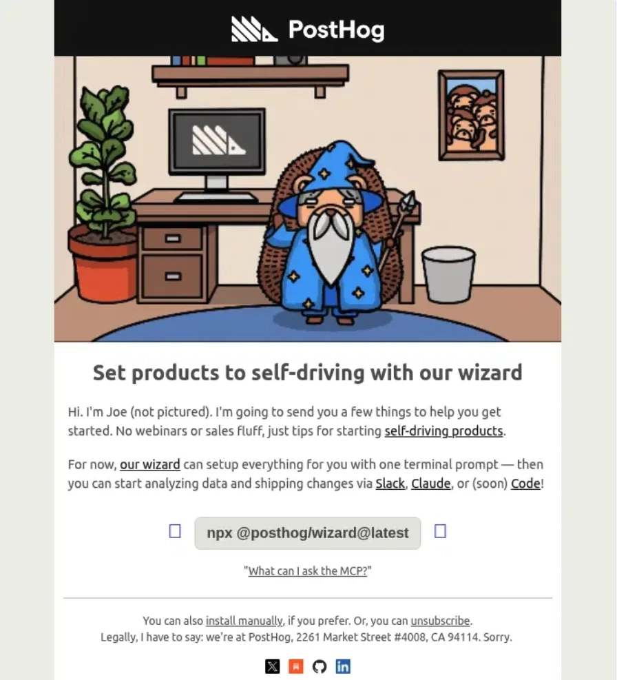
Some SaaS products offer a setup wizard to help new users set the tool up with just a few clicks to minimize the friction.
Here’s an example from PostHog.
Subject: Welcome to PostHog!
Source: Really Good Emails
By offering a setup wizard for their product, PostHog helps new users get to their main product value faster. They also give users an option to do the setup manually in the P.S. section.
Sample prompts
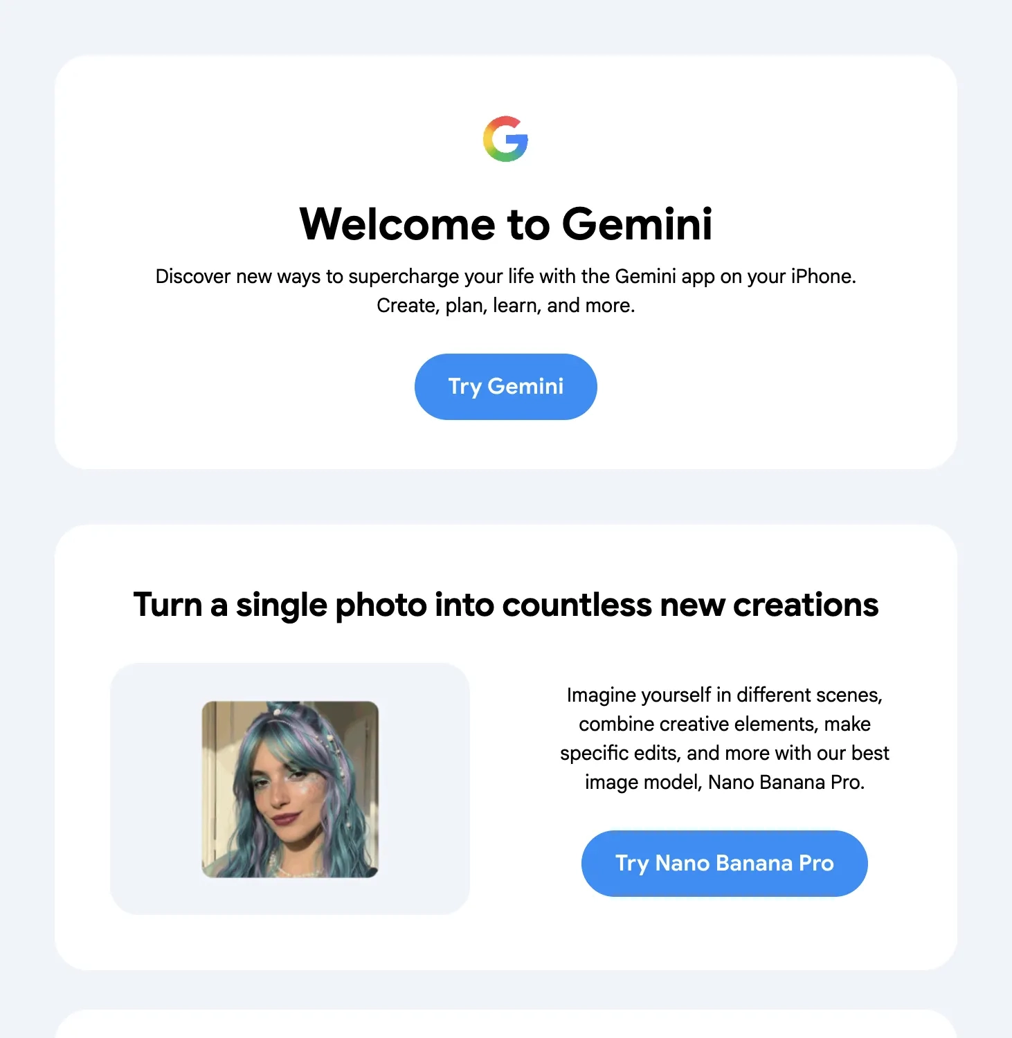
Since there are no straightforward and specific onboarding steps for AI-native tools, onboarding emails may include sample prompts that help users experience the product value.
Subject: Hey [first name], welcome to Gemini
No such thing as one-size-fits-all onboarding
There’s no singular correct way to teach someone how to use your product.
While it’s important to cater to multiple learning preferences, this doesn’t mean cramming everything in a single email or email sequence. Instead, figure out what modalities work best for your product and your user base.
Don’t miss out on new articles. Subscribe to our newsletter and get your monthly dose of SaaS email marketing insights.