We recently received this email from one of our customers:
“I just wanted to let you know that I really enjoyed the onboarding of Userlist. You did a really good job! I particularly liked the welcome video displayed after signup. I was wondering, did you receive much feedback regarding this video? What do people think about it? Were you able to measure the impact this video had on user engagement or retention?”
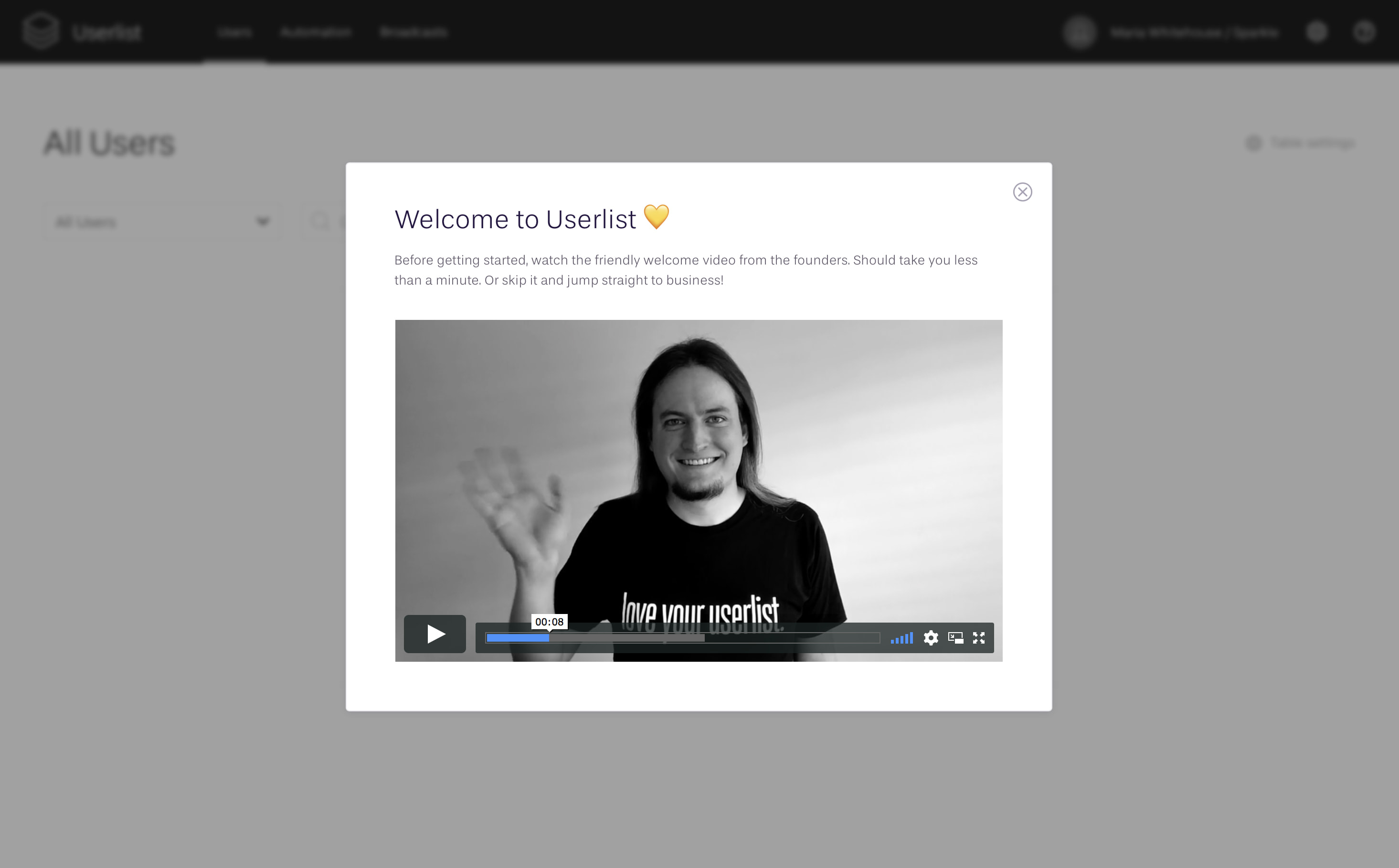
For your reference, here’s the welcome video we’re talking about — it’s displayed in a popup over the blank homescreen, after a user creates their account.
Firsthand, here are the actual answers to our customer’s questions (not very helpful on their own):
- Do we get much feedback regarding this video? Not at all.
- What do people think about it? We don’t know precisely.
- Were we able to measure the impact of this video? We’re still at an early stage when the number of trials doesn’t allow us to A/B test anything in the onboarding workflow. We had this video up from day one of public launch.
But lack of feedback, or ability to measure the impact of this video, isn’t the whole story. There’s so much more thinking behind this little video… It reflects our entire mental system for user onboarding.
Our user onboarding principles
- Inspire, not instruct. Userlist isn’t a plug-n-play product. As a result, successful onboarding for our users often depends on many external factors: launch timeline, developer availability, overall availability of the user to set things up, inspiration to write their campaigns, etc. Our experience shows that an inspired user gets things done without many prompts.
- Tooltips and tours aren’t too effective. They’re often treated as interruptions. Instead, we should be focusing on thoughtful blank states and overall usability of the product. That’s my position as a UX professional, and thankfully Benedikt shares this point of view. I learned about this approach from Samuel Hulick’s book, The Elements of User Onboarding, and it has been working throughout the years.
- Enforcement and monetary rewards yield negative results. The best way to kill genuine interest is to involve money (e.g. a discount), or make something an obligation. For more information and scientific proof, see a great book by Edward Deci, Why We Do What We Do. Our goal at Userlist is to promote genuine interest and good will.
- Treat others as you want to be treated. In the modern world, this means less email, but more thoughtful content available at customer’s fingertips. Your user’s inbox is bombarded all the time, and they very likely signed up for other products, too.
- Build a personal connection. Here’s what worked well for us: not pretending to be a larger enterprise, sharing our process & our values, showing a warm welcome to our users, and maintaining that connection through thoughtful personal support.
The caveat is that monetary rewards, tooltips, and obtrusive nudges do work (to a certain extent). They can be used to trick the user towards the desired behavior, and are widely used by professionals. But it’s a choice they make, while we choose another path.
To these professionals, it might seem that we have poor onboarding — as they don’t see any tooltips or tours. While, in fact, there is a lot happening behind the scenes.
What we do for onboarding
Signup screens. The signup process consists of three screens that collect the most important account information. We ask for the user name, basic company details, and their credit card information (asking for a credit card upfront is a separate topic for discussion).
Welcome video. Then we display a short welcome video — the one that inspired the original question. Our goal with this video is very simple: build a personal connection without interrupting the flow too much. The video is under one minute long, and is easy to skip, so the user doesn’t feel obliged to watch it at all. This all promotes genuine interest and good will to watch it.
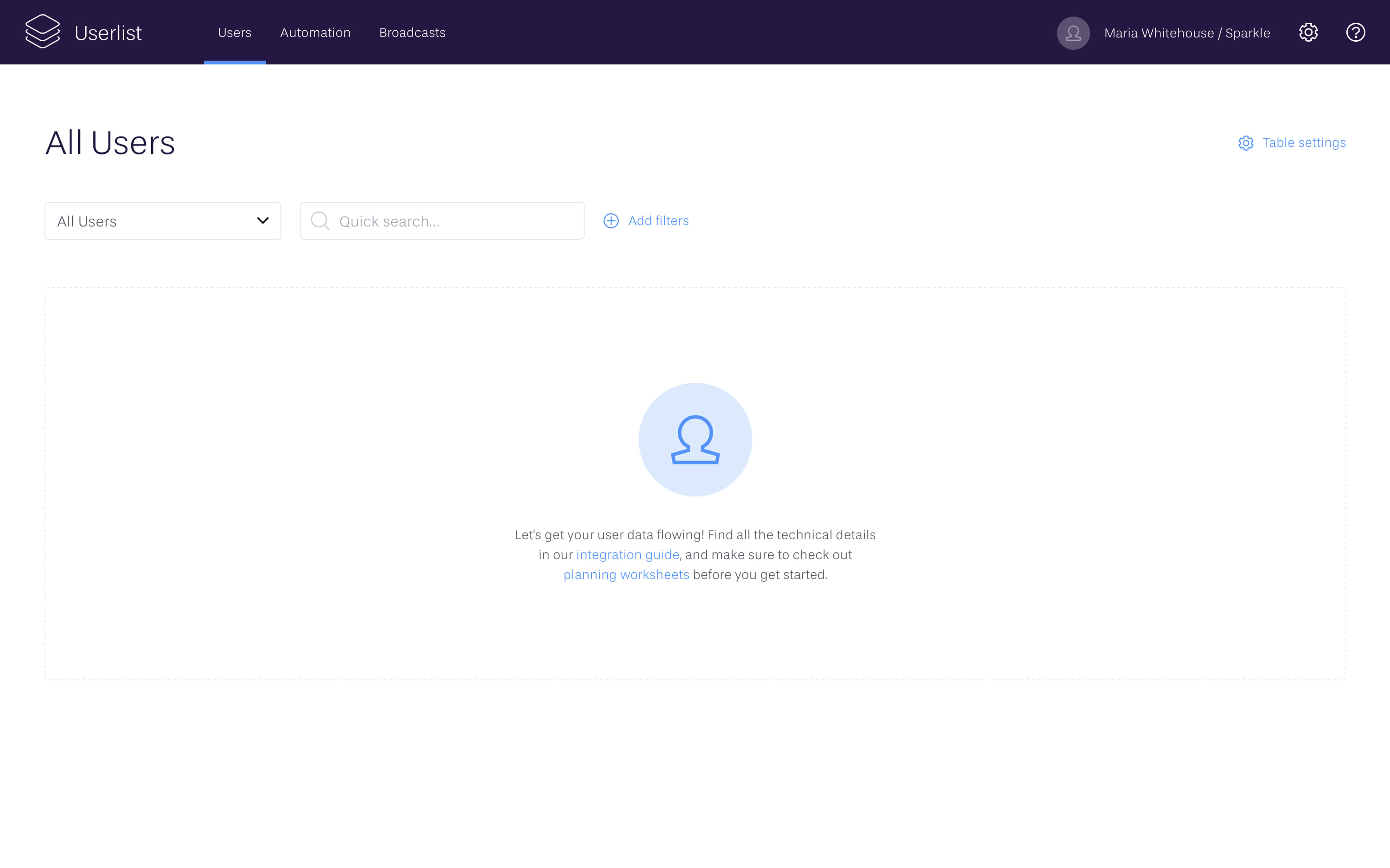
Blank slates. Our blank slates throughout the app have links to relevant help articles. This isn’t obtrusive at all, but makes information more accessible.
Onboarding email campaign. Our email onboarding happens behind the scenes, and is minimized to just a few emails if the user is doing well on their own. Here are the emails inside our Basic Onboarding campaign:
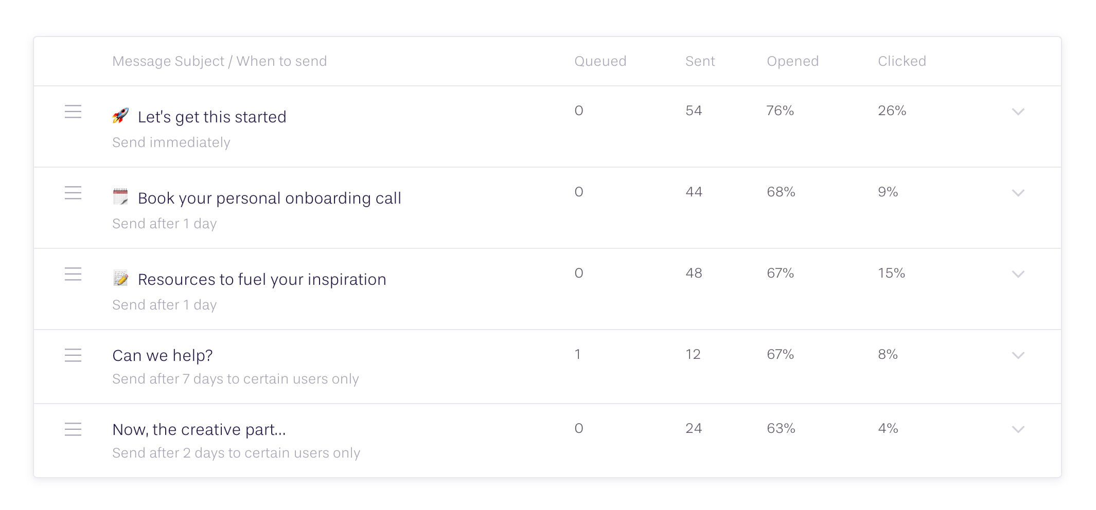
- A short welcome email, greeting & offering help.
- A follow-up email offering a personal onboarding call.
- An email offering multiple resources for inspiration (blueprints, templates, knowledge base, etc).
- A check-in email offering technical help (only if the user hasn’t started tracking data).
- A check-in email offering strategy help (if the user started tracking data, but hasn’t created any campaigns yet).
Then we also send a Trial Expiring email which is wrapped into an individual campaign, based on the user’s trial expiration date (which can change). The language in this end-of-trial message is customized based on whether the user completed the integration or not.
After the trial successfully converts into a paying customer, they’re sent another campaign with more feature check-ins. But that’s a separate topic for discussion.
Onboarding calls. Focused onboarding calls are a large part of our current strategy, and we offer several types of calls (apart from the demos). Each call has its own Calendly link.
- General onboarding call (60 min)
- Technical call with Benedikt (30 min) — we offer this if there’s trouble with the integration
- Strategy call with Jane (30 min) — we offer this if the user needs help with their campaigns structure
Customers don’t take us up on this too often. But when they do, it’s always a great way to provide immediate help and build a personal connection.
Knowledge base. Our knowledge base seems to exist outside the onboarding flow, but it’s the backbone of all other activities. We link to it all the time from the onboarding emails and support conversations. Moreover, if we receive a support request that can be clearly helpful to others, we spend a bit more time and immediately create a help article about it.
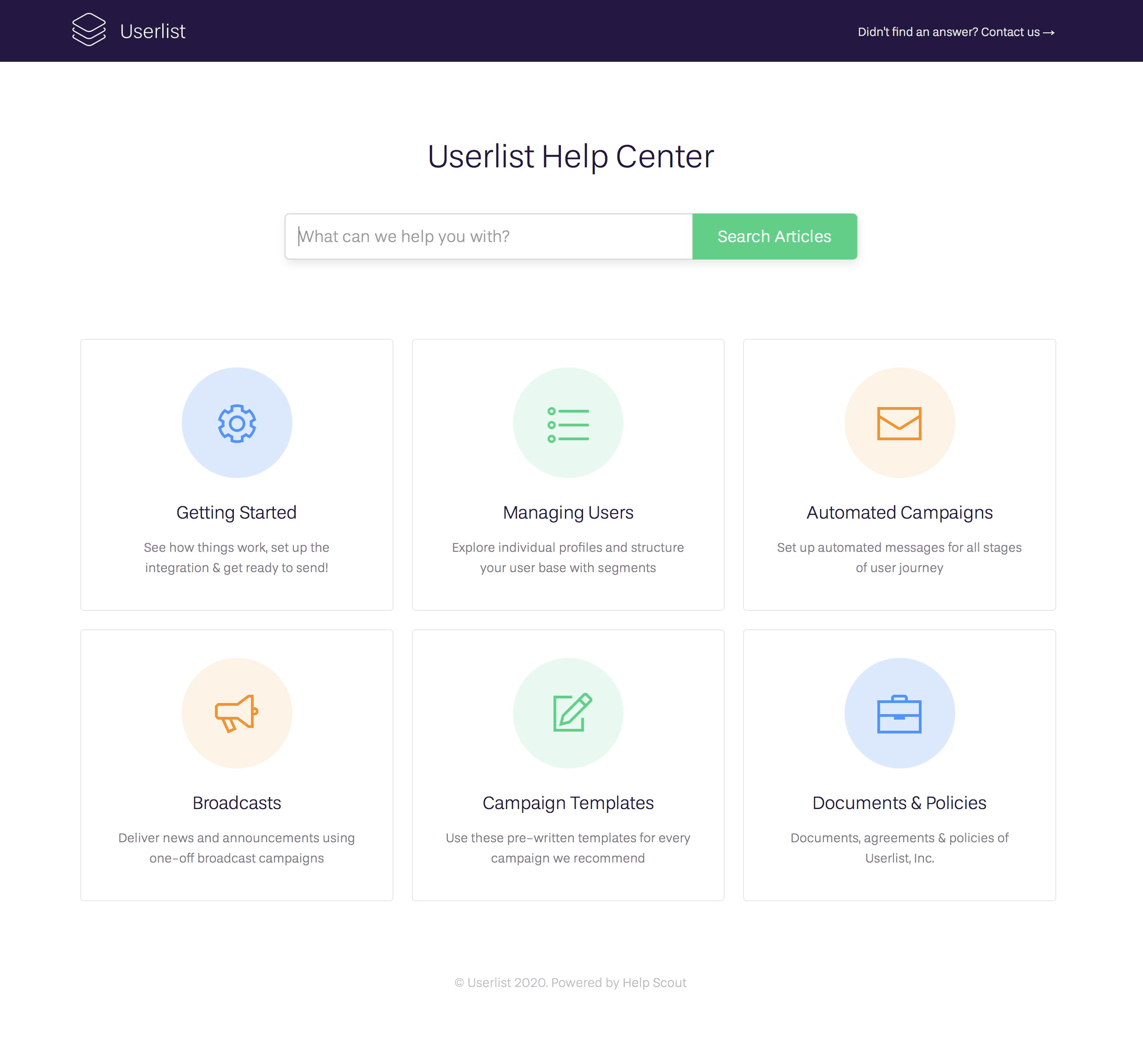
Our knowledge base runs on HelpScout (we love and use them for support) with some advanced customization in visual style.
Closing thoughts
Thanks for taking a peek inside our user onboarding flow!
We don’t have any proof that our system is more effective than any other out there. We don’t have an outstanding trial-to-paid ratio that we can boast about. But we’re certain that this onboarding system represents our values, and helps us onboard new users with maximum care and respect.
Now it’s time to develop your own approach, based on your personality and your customer needs.
— Regards, Jane.
Don’t wait for the muse. Apply this step-by-step method to write high-performing email campaigns in hours, not weeks.


