

With the recurring revenue model — the holy grail of SaaS — comes a responsibility to demonstrate recurring value. This is where report emails come in. They’re a great reminder of how you’re helping users to achieve their goals.
Our team dug deep and came up with this collection of SaaS report emails. These emails come in all shapes and sizes, from plain text reports to complex dashboards sprinkled with recommendations.
In this post, you’ll learn how these report emails benefit your business and your customers, best practices on writing them, and how real SaaS companies are doing theirs.
Don’t wait for the muse. Apply this step-by-step method to write high-performing email campaigns in hours, not weeks.
Why should you send out report emails?
How it helps users
- Performance tracking. Users can see how close they are in achieving their objectives and what they can improve on.
- Data-driven decision making. This helps users decide on the best next step to achieve their goal.
How it helps your business
- Reinforces product value. These emails remind your users of how you’re solving their pain points.
- Create a habit loop. Similar to milestone emails, these recap emails also reinforce the desire to re-engage with your product to achieve more results.
- Reduce churn. When users are reminded of how you’re helping them achieve their goals, the less likely they’ll churn.
- Upsell customers to higher plans. Report emails give you opportunities to upsell users to higher plans or additional features without sounding too salesy.
- Build feature awareness. This also gives you a great opportunity to promote core and new features that can help users achieve more results.
How report emails are implemented
Report emails are just one of many transactional emails. These types of emails are usually sent via the API.
But unlike password resets and billing reminder emails, these are not critical emails — so you should give users a way to opt out.
If you’re using Userlist, you can assign subscription topics to your transactional emails so the users will be able to opt out in their subscription preference center.
Tips on writing report emails
Select the information that is most valuable to the user
Your platform has tons of user data. But which information should you include in these emails?
Ask yourself: “what information would bring the most value to the user?” Depending on the pain point your tool solves, it could be numbers or a specific information.
To illustrate, let’s compare Duolingo and Ahrefs’ report emails.
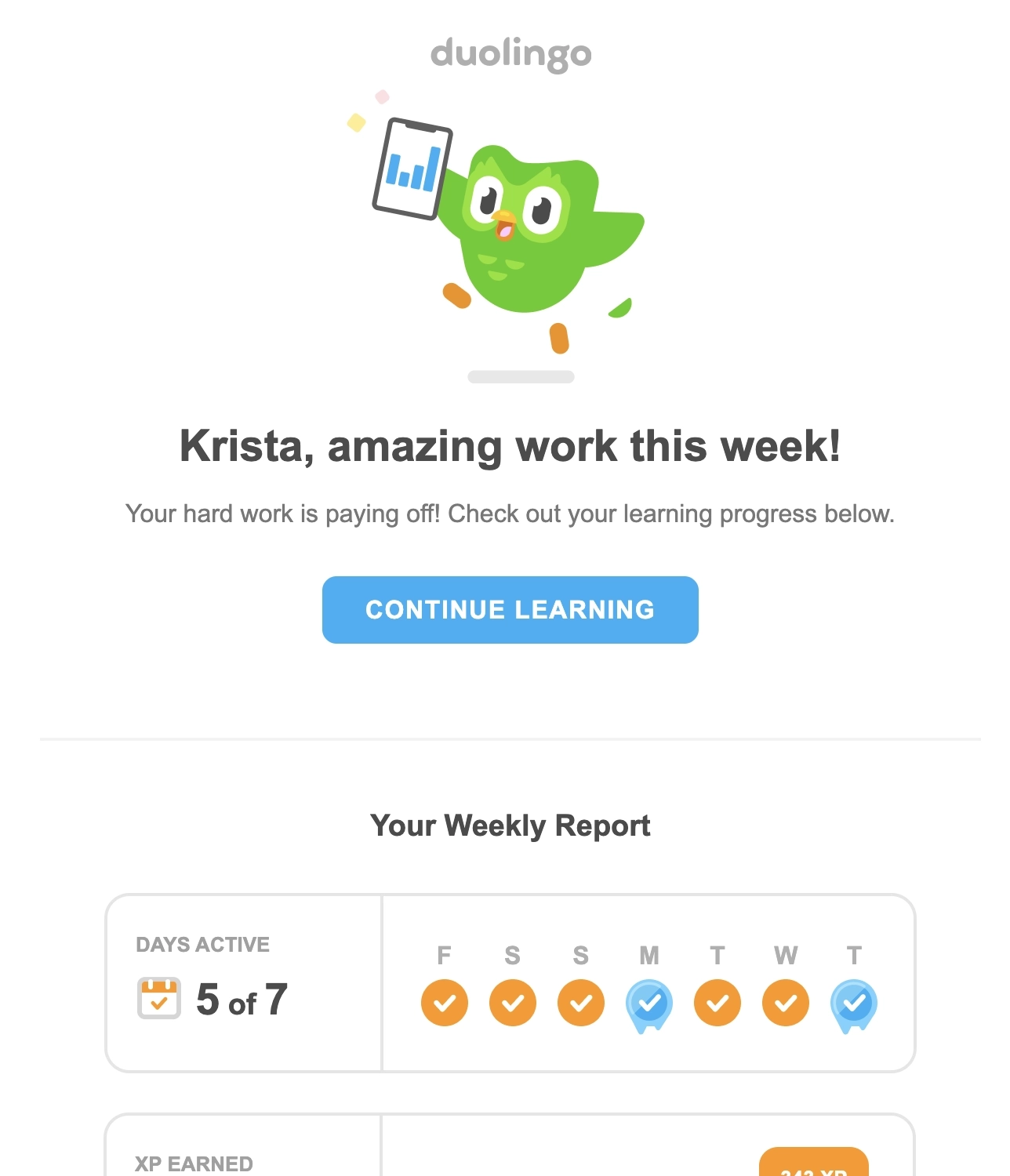
Duolingo’s weekly report email only shows numbers. Meanwhile, the email from Ahrefs includes numbers, keywords and page links.
Focusing on the most important information also keeps you from including too much data that could overwhelm your reader. Should they want more information about their weekly/monthly performance, include a CTA in the email that takes them to your tool’s analytics page.
Include visual elements
Instead of just presenting numbers in tables, use graphs or charts to visualize your data. This is especially effective in demonstrating progress.
In the previous example, Duolingo uses bar graphs to show learning time spent each day during the week.
But if you’re just presenting the number for a metric, play around with icons, font sizes, and colors so it’s easier to distinguish one number from another.
Include helpful tips to promote important features or recent product updates
Whether it’s a power user or a newly onboarded one, including helpful tips based on user data reminds them of how you’re helping them solve their pain points.
This tip could come in the form of promoting a feature or a link to your docs or another resource.
Promote important features or recent product updates
Don’t forget that you can include content sections. Take this opportunity to promote important or new features to keep users aware about your platform’s continuously evolving capabilities.
Be mindful of sending zero reports
Depending on your strategy, sometimes it’s better to skip on sending out the report email if the numbers are zero.
If there’s been no activity on the account, consider sending a re-engagement email instead.
Don’t wait for the muse. Apply this step-by-step method to write high-performing email campaigns in hours, not weeks.
Recap email examples
#1. Kit
Subject: Your week with Kit
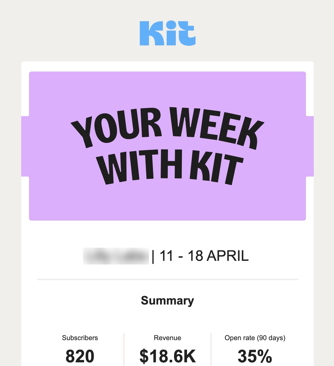
Kit is an email marketing tool for small businesses, creators, and entrepreneurs.
Their weekly recap email is divided into four sections. The first shows the general weekly summary showing three numbers: total number of subscribers, revenue generated for the period, and 90-day open rate. The succeeding sections break down these figures further: number of new subscribers, performance of the emails sent during the week, and number of sales.
The email includes tips on how the user can improve in growing their email list and build their sales funnel.
#2. Toggl Track
Subject: Your Weekly Overview of Tracked Time | [date range]
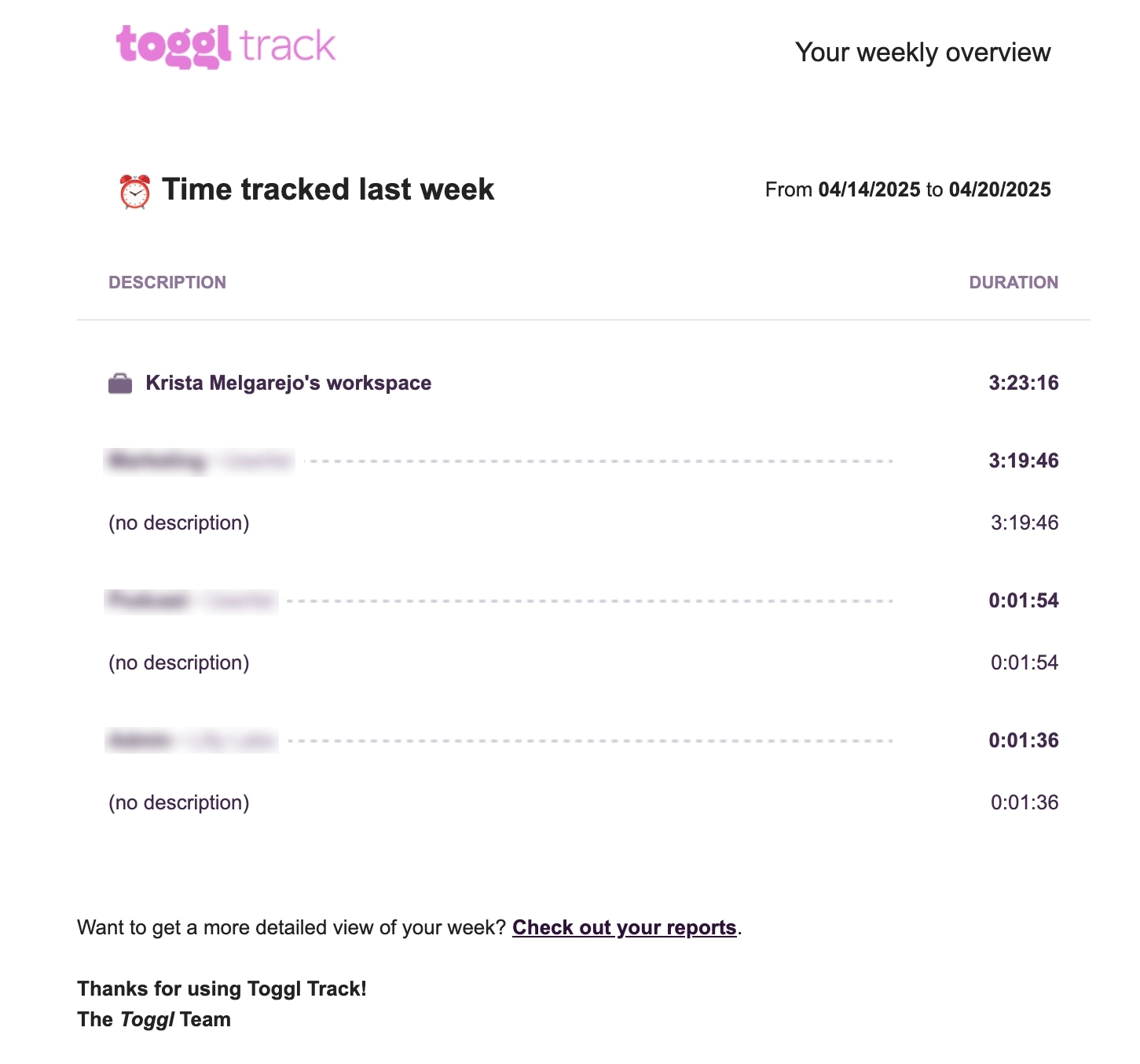
Toggl Track is a tool that helps users track time on various tasks and projects.
Their weekly report email is a simple one. It shows the user’s time logs for each client and project they’ve worked on during the week. Should the user want more details, they included a text CTA that redirects the user to their reports page.
#3. Publer
Subject: Analytics PDF reports for [date range]
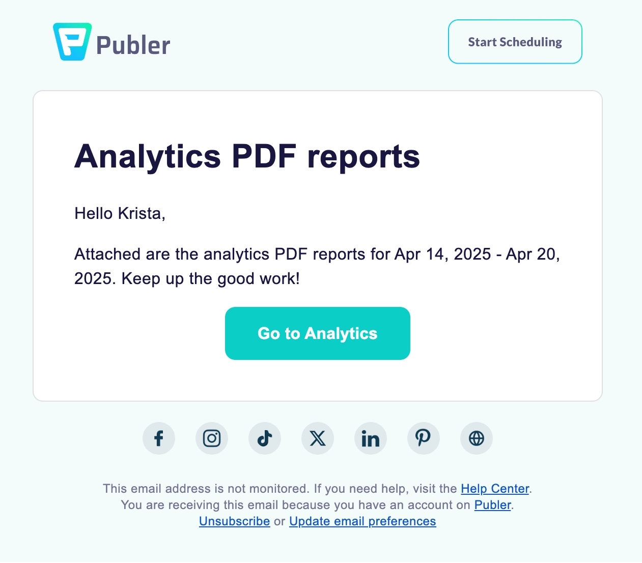
Publer is a social media management and scheduling tool.
They do their recap email by giving the user a PDF export of their weekly analytics report. Here’s a preview of what the attached PDF report contains:
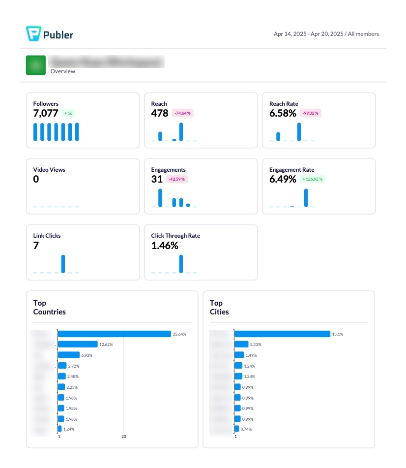
Should the user want to know more, the CTA button redirects them to the Analytics page.
What can be done better?
They can include a few important numbers on the email (i.e. reach rate, engagement rate) to give the user an overview of their weekly performance.
#4. Backlink Pilot
Subject: [Month + Year] Backlink Report
Backlink Pilot is a free link building CRM that replaces messy spreadsheets.
Their monthly report email shows how the user’s stats have changed from the previous month. They include a CTA if the user wants to know more about their link’s performance.
Backlink Pilot gives the user the choice to opt out of these monthly reports in the footer — kudos.
#5. DataCamp
Subject: You earned [NNNN] XP this week + new Polars course!
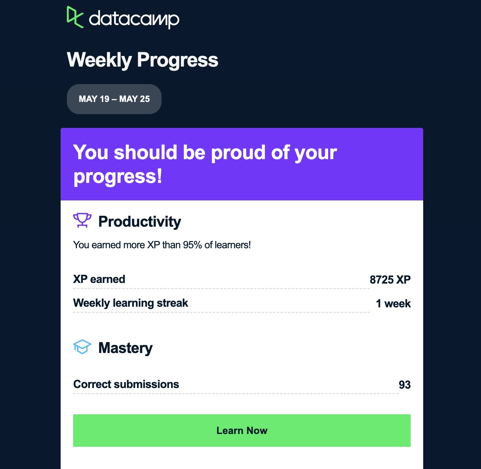
DataCamp is an online learning platform that focuses on teaching users comprehensive skills they need to become data scientists.
The first part of their email summarizes the user’s stats for the week and their milestones, ending the section with a CTA to continue learning. DataCamp uses the rest of the email to promote a feature, a new course, a project, and other resources.
#6. Clay
Subject: Your week in Clay [date range]

Clay is a platform that helps users scale their cold outreach with enriched lead data.
The first section gives an executive summary of the weekly performance. The succeeding sections summarizes the enrichments performed, and the enrichment tools used during the week. They include CTAs to encourage the user to continue using their tool.
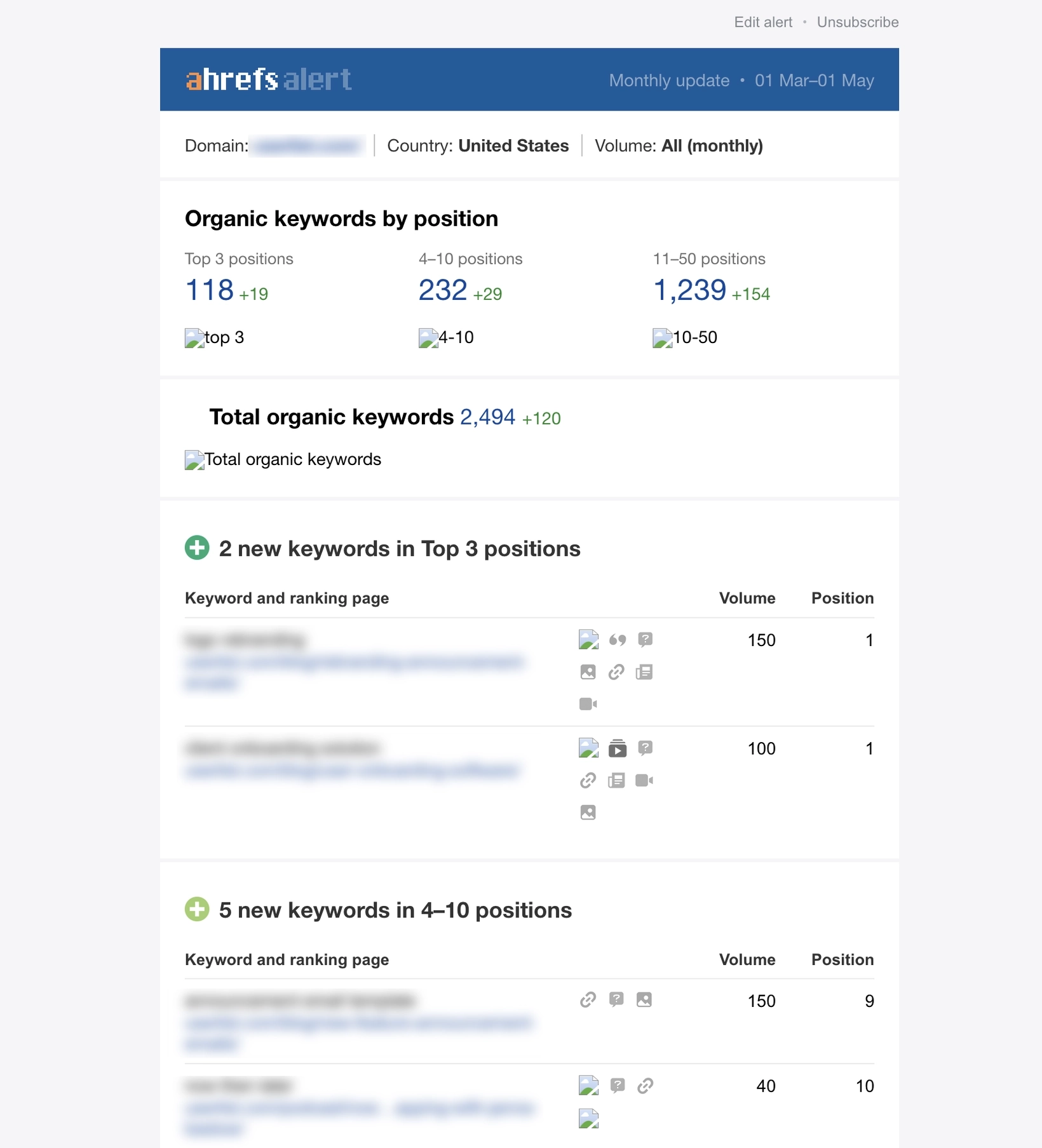
#7. Ahrefs
Subject: XXX new keywords - yourdomain.com
Ahrefs is an SEO suite that has tools for link building, keyword research, competitor analysis, rank tracking, site audits, and more.
This monthly report email from Ahrefs gives an overview about the top ranking keywords of the user’s domain.
The first section talks about the distribution of organic keywords from the top 3 to the 11-50 positions. This is further broken down in the next sections which show the new ranking keywords and the corresponding pages.
#8. Buffer
Subject: 📊 Weekly Report: See how your post performed
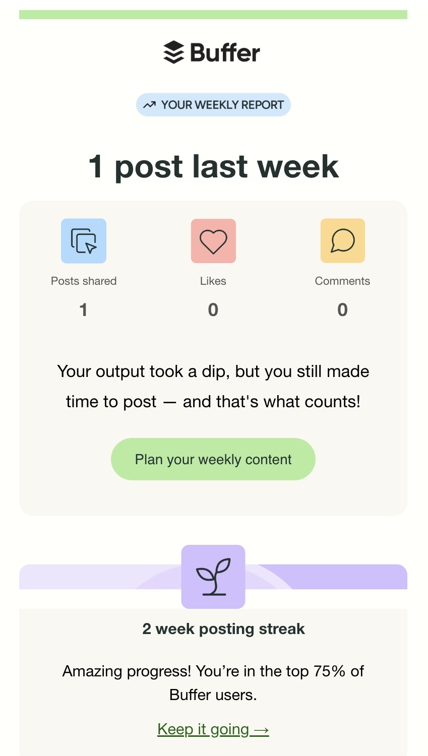
Buffer is a social media management platform.
The first section of their email talks about how many posts went out during the week, followed by a CTA that aims to increase the number of posts. The second section highlights the posting streak, and encourages the user to keep up the good work. The last section shows a tip on how to optimize the best posting time.
#9. Front
Subject: Your Front insights are ready - [date range]
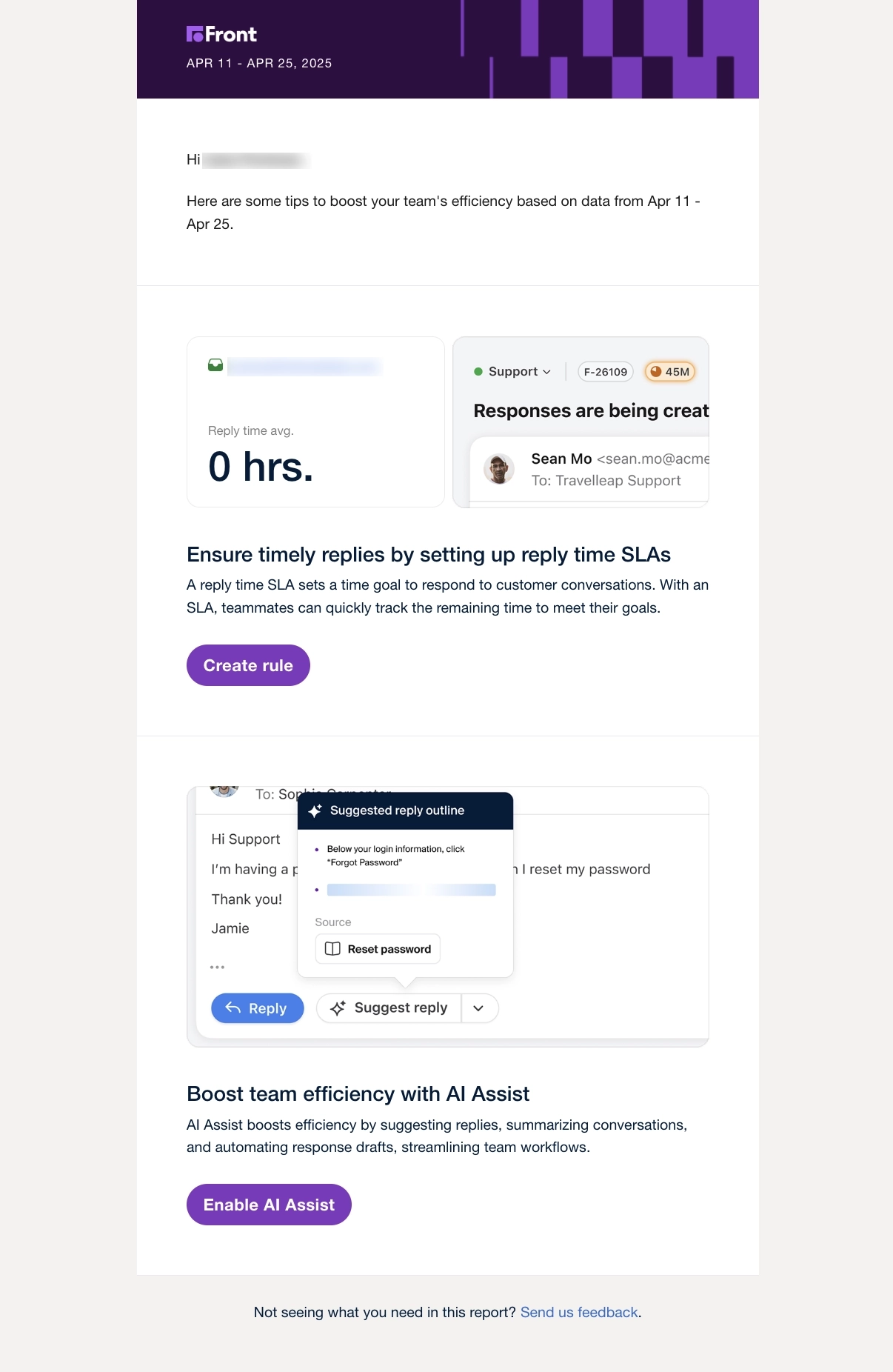
Front is a platform that empowers customer service teams by bringing all communications in one place.
The tool’s key metric is the average reply time. Front gives the user a tip on how to improve it by using their SLA rules feature, followed by a CTA to create the rule. The last section highlights their new AI assist feature and talks about how this can boost team efficiency.
#10. Duolingo
Subject: 🗞 Your weekly progress report
Duolingo is a popular language learning platform.
Their email makes use of visuals to present the user’s performance for the week. Duolingo used bar graphs to compare experience points and learning time earned during the period versus previous weeks. For data that can’t be graphed, they included icons alongside the numbers to make it fun and eye-catching.
What can be done better?
They should also place a CTA at the end of the email because after seeing their stats, the user would feel motivated to learn more.
#11. Miro
Subject: [Name] team Weekly Digest
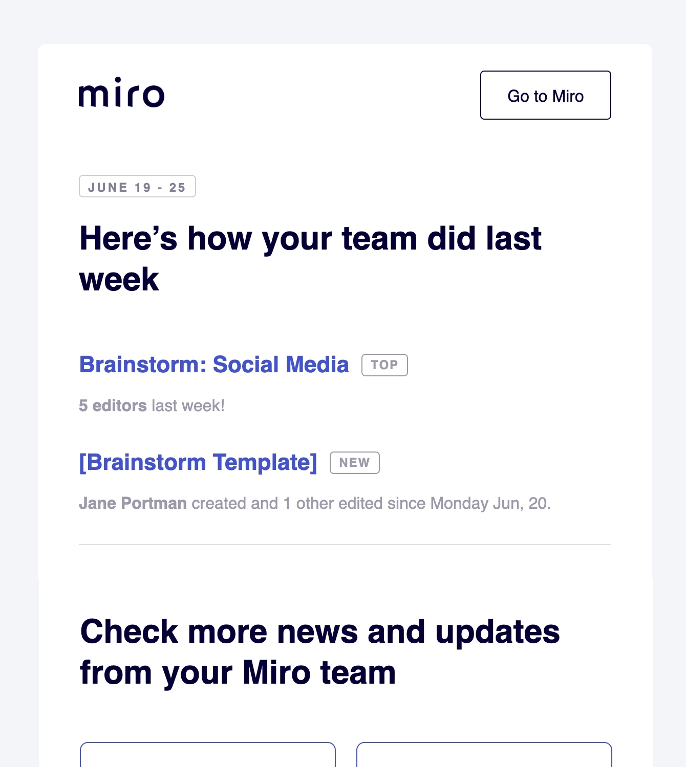
Miro is an online collaborative whiteboard platform.
The first section shows a summary of what boards were created during the week. The second section shows the other updates from the same period: active members, active boards, and new members of the team. The last section highlights the team’s “Miro Heroes” which are users who’ve worked on a lot of boards.
Don’t miss out on new articles. Subscribe to our newsletter and get your monthly dose of SaaS email marketing insights.
#12. Judoscale
Subject: [Month] autoscaling: You save $XXX
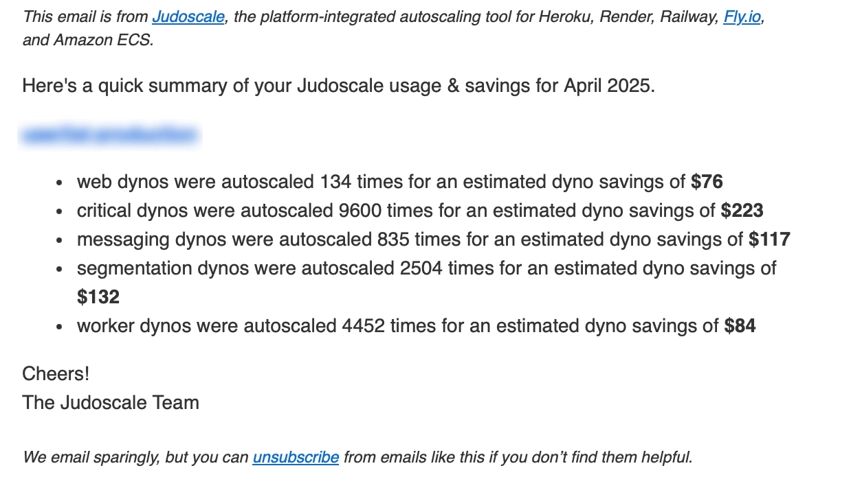
Judoscale is a dedicated autoscaler for Heroku, Render, Railway, Fly.io, and Amazon ECS.
They went with a plain text email format for theirs, which shows the monthly summary presented in bullet points. Aside from showing the autoscaling processes performed during the month, they also show the equivalent dollar value saved from doing so.
#13. Snyder
Subject: Activity report
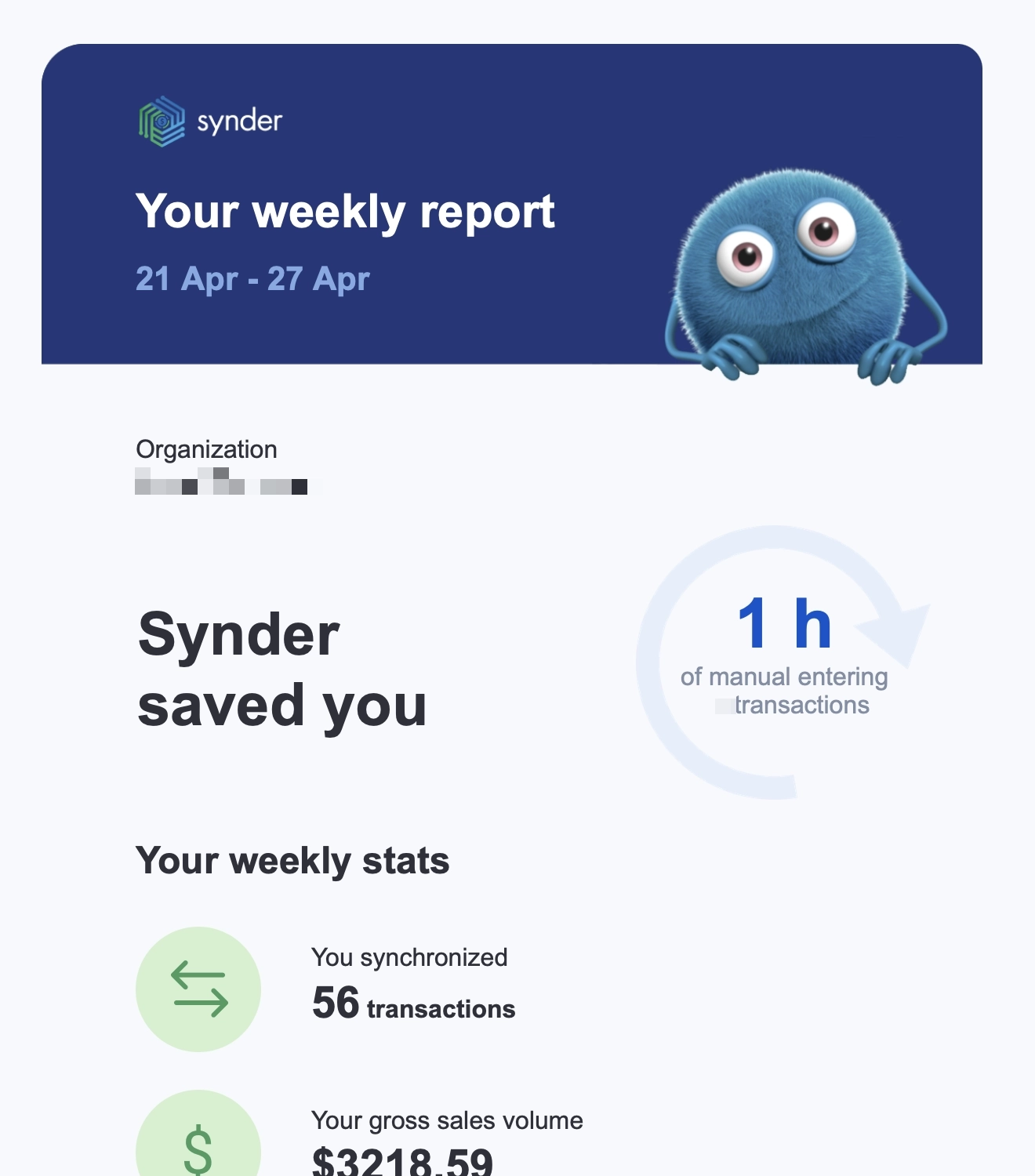
Snyder is an accounting automation platform.
The email’s highlight is the hours saved from manually entering financial transactions. The next section shows the other stats and promotes features that the user hasn’t used yet. They also include a CTA that redirects readers to the platform should they want to see more statistics for the week.
#14. Postmark DMARC Weekly Digest
Subject: DMARC weekly digest for [domain]
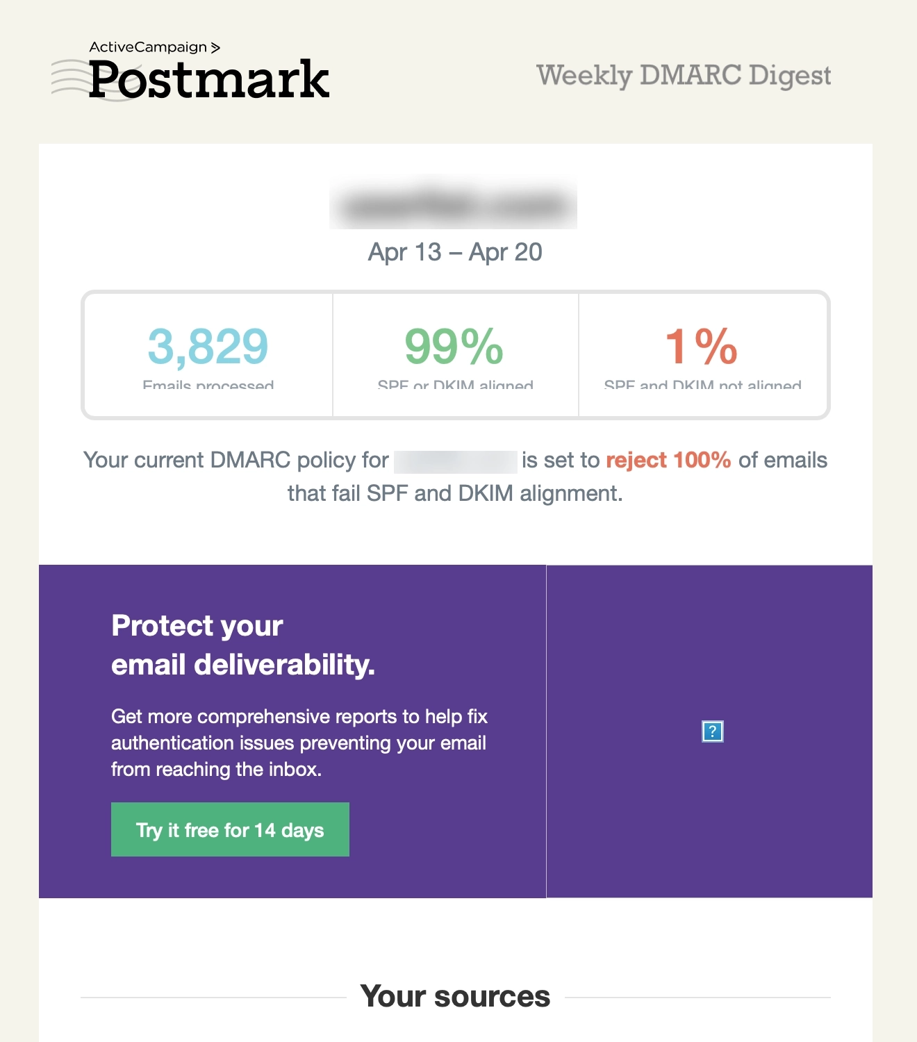
DMARC Weekly is a free weekly DMARC monitoring from Postmark
The first section shows a general summary for the week, showing numbers for emails processed, percentage of SPF or DKIM aligned and unaligned emails. The rest of the email shows a breakdown of the email domain sources and the forwarded email sources.
Their email also has promotion sections. They encourage the user to sign up for a free trial of Postmark to get more detailed reports.
#15. OpenPhone
Thanks to Brian Sun of Ottomate for sharing this example.
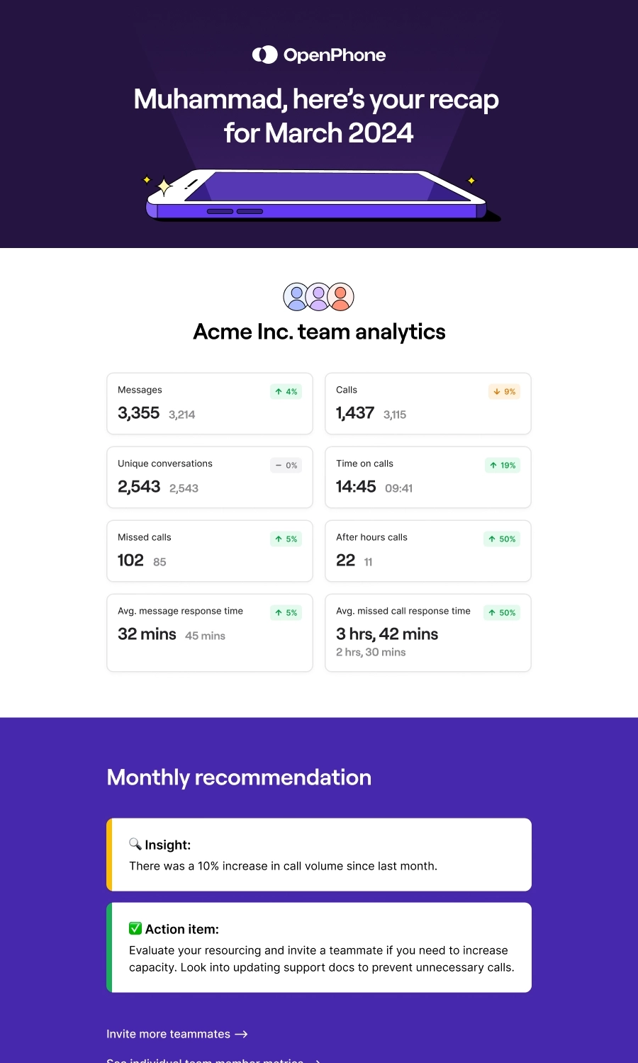
OpenPhone is a voice over internet protocol service.
This monthly report email is divided into four major sections. The first section talks about the team’s analytics, comparing the numbers for the current month and the previous month. The second section shows the general insight on the month’s numbers, and OpenPhone provides a tip on how to increase the team’s capacity.
The third section shows the individual statistics, which also shows the numbers for the current and previous month. The fourth section is an invite your teammate section which includes a CTA and a list of how their platform benefits teams.
#16. Grammarly
Subject: You’re taking your writing to the next level
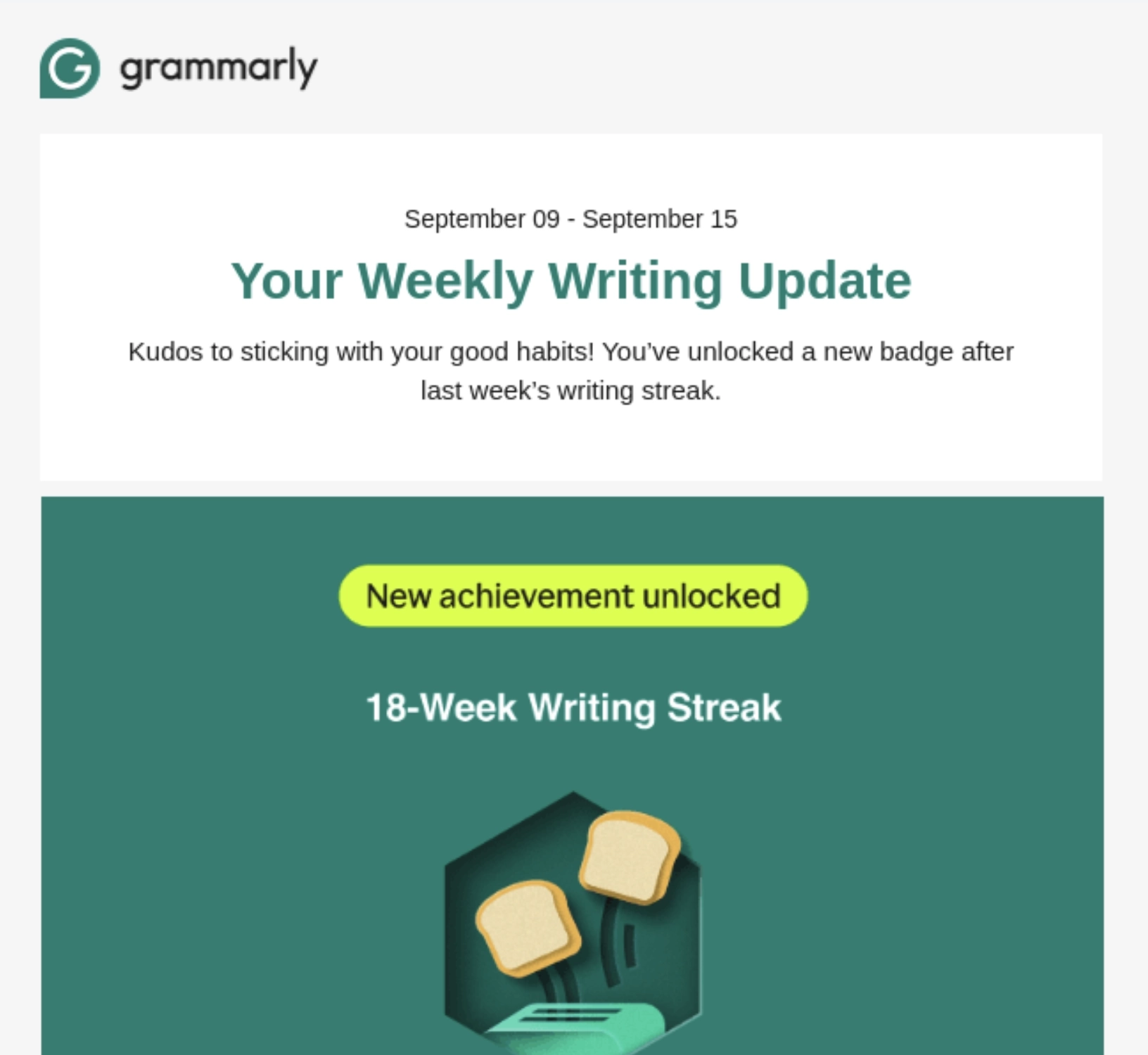
Grammarly is an AI-powered writing assistant tool.
The first section celebrates a user milestone for reaching an 18-week streak of writing with Grammarly. The next few sections then break down the user’s stats and see how they compare with other Grammarly users.
This is then followed by a tips and resources section so the reader can maximize the platform. This is then followed by a promotion for their snippets feature and a nudge to activate all Grammarly features.
#17. Mailmodo
Subject: Your Weekly Email Marketing Summary and Stats 🎯
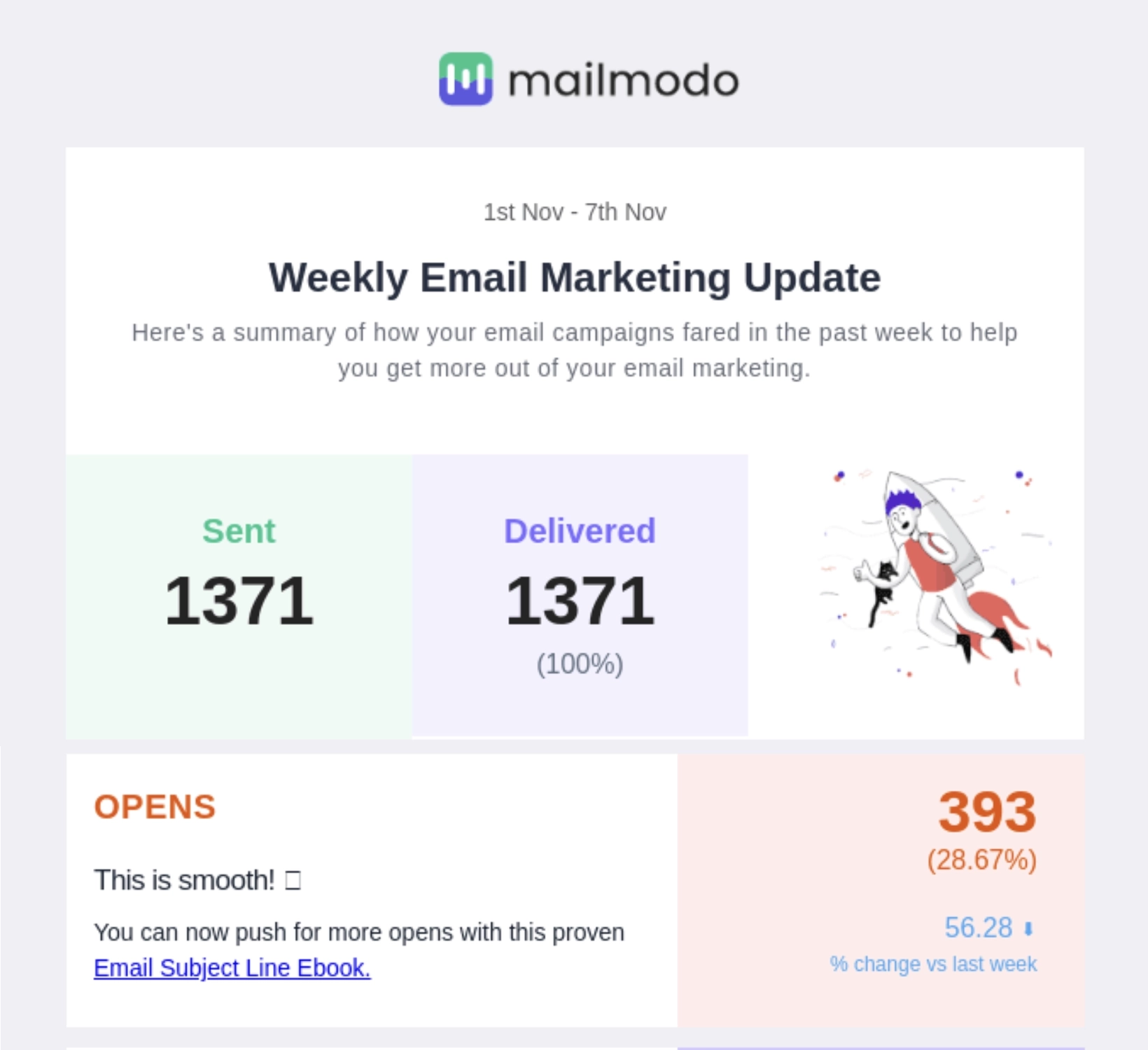
Mailmodo is an interactive email marketing platform for small to medium-sized businesses.
Their email starts off with showing the major email marketing stats and how it compares to the previous week. Notice how they give a tip for each stat so the user can continue improving. The next section shows the best performing campaign for the week and its stats.
Mailmodo uses the third section to promote features, ending with a CTA to unlock them. The last section encourages the reader to share their email templates with the community and talks about what the reader would get in exchange.
#18. Fitbit
Subject: Your weekly progress report from Fitbit!
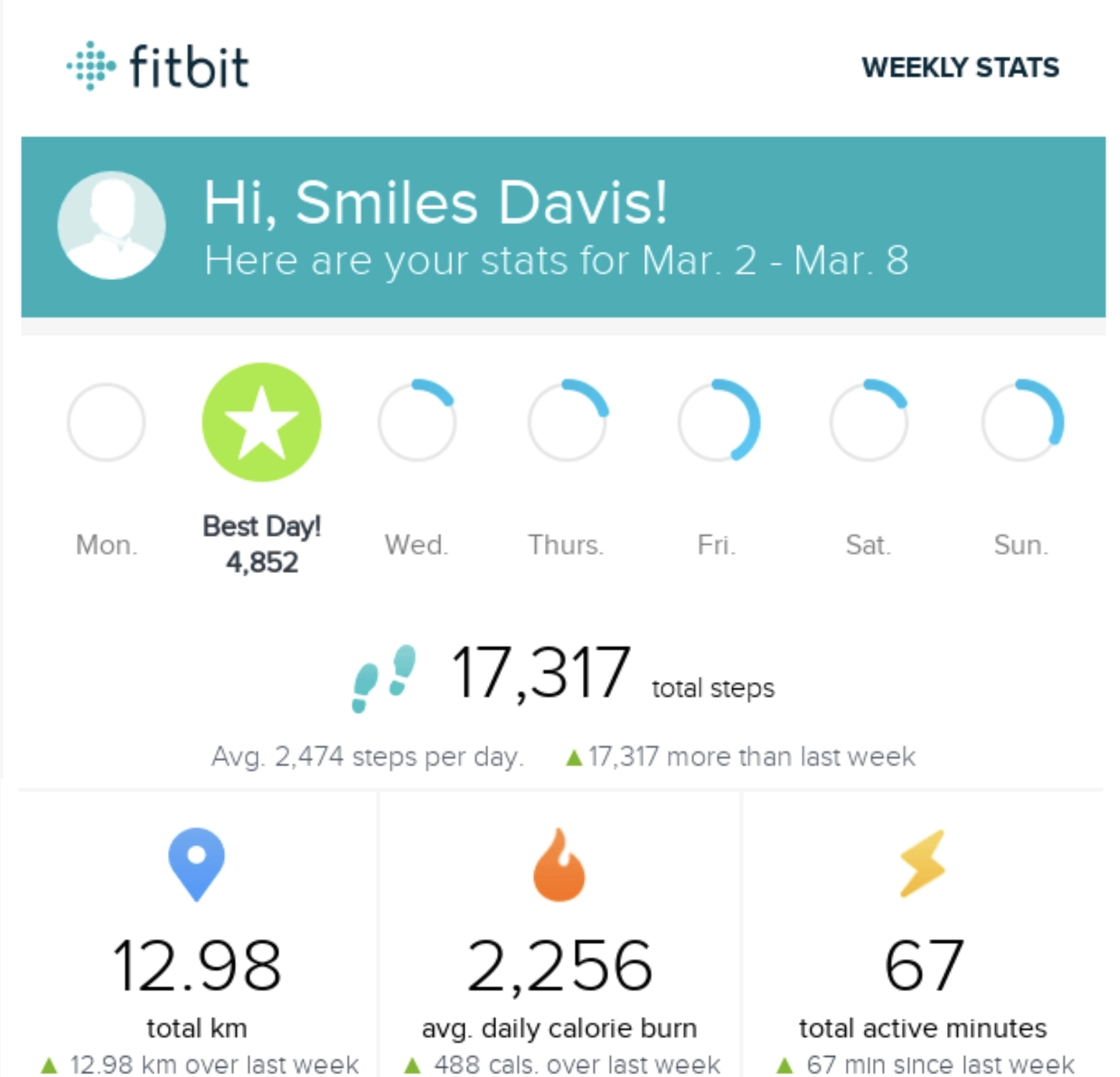
Fitbit is an all-in-one personalized fitness app that lets users track their activity, goals, and progress.
This weekly progress email starts off with the user’s step count, highlighting the best day and how their performance compared to last week. They present the rest of the stats in a gallery form, making it easier to skim.
#19. Loom
Subject: Your [Month] Loom Review 💜
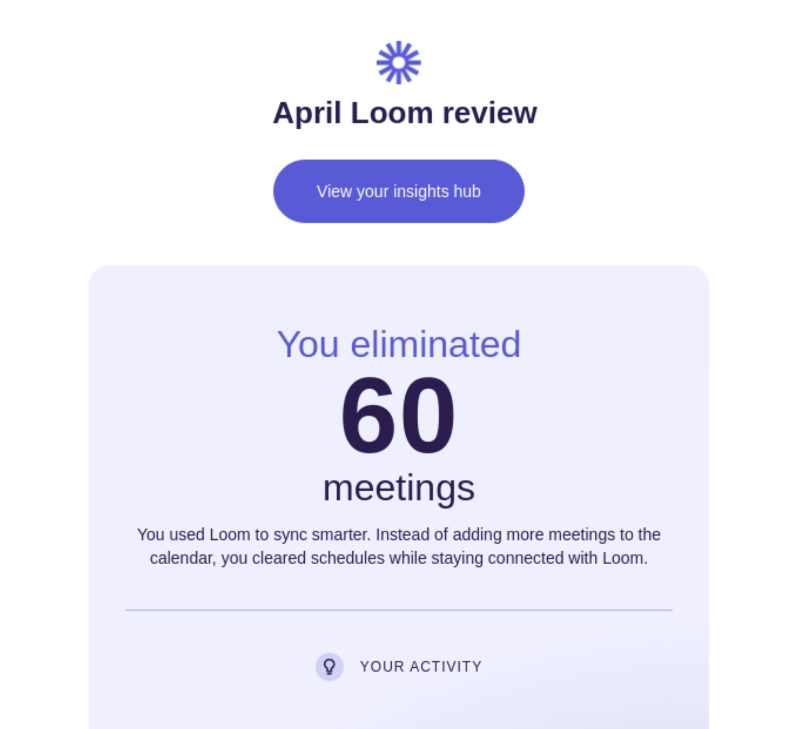
Loom is a screen recording and video messaging tool.
Their monthly report email is divided into three major sections. The first section focuses on the user’s activity, highlighting how many meetings were eliminated because of it. The second section talks about the time saved from watching videos versus going to meetings. The last section shows the interaction with other team members, which ends with a CTA to invite more team members. The email ends with another CTA to view the insights hub should the reader want to learn more.
What can be done better?
- The email can do without some information (i.e. your top connections) to make it concise
- They can omit the last CTA (“View your insights hub”) since it immediately follows the “Invite Your Team” CTA, which can overwhelm readers
#20. Heroku
Subject: Your Heroku activity report.
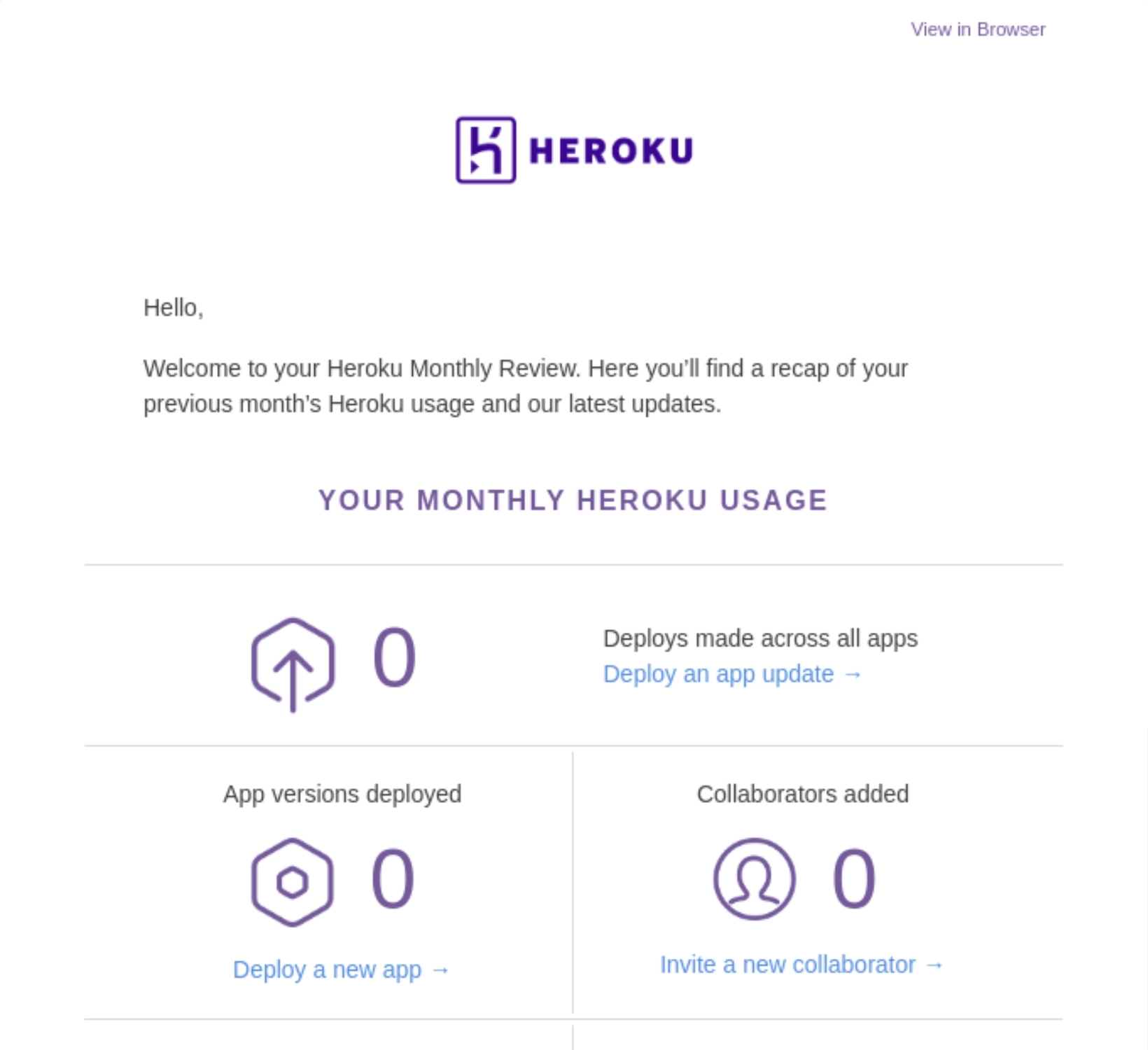
Heroku is a cloud platform that lets companies build, deliver, monitor and scale apps.
Their monthly report email shows usage stats, presented in gallery form for easier skimming. They include a CTA for each stat to encourage increase of usage.
Heroku included sections to promote their business and a customer success story.
#21. YouTube
Subject: [Channel name], see your January updates: new ways to earn on YouTube and more
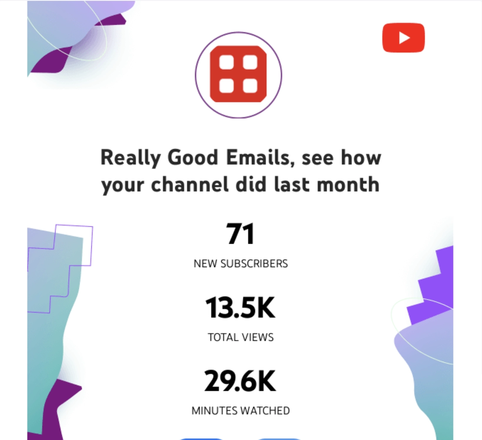
YouTube is a popular video sharing platform.
Their monthly recap email highlights the 3 most important numbers: new subscribers, total views, and minutes watched. YouTube encourages social sharing of the stats by including social media sharing buttons. This is then followed by a CTA should the user want to see more stats for their channel.
YouTube also took this opportunity to tell the reader about their latest product updates.
#22. Algolia
Subject: Algolia Usage on application [account name], [date range]
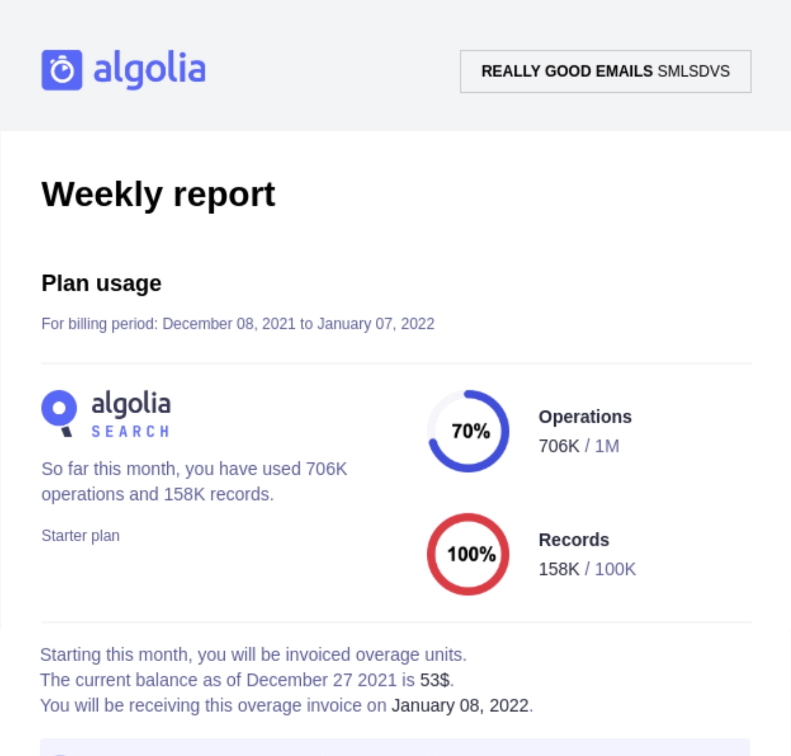
Algolia has software and tools to help users create efficient, flexible, and insightful search and discovery experiences for their sites and apps.
This weekly summary email is divided into two major sections: plan usage and analytics. The plan usage section shows the user’s operations and records usage for the billing month, also giving a tip on how to avoid overages. The analytics section details the searches done on the platform, showing the keywords and the number of searches.
The email’s footer includes an option to opt out of the weekly summaries.
Time to set up your report emails
Report emails are a great way to remind users of how they’re moving towards their goals and how your tool is helping them do that.
Here are other great ways to leverage user data:
- 15+ Milestone Email Examples: Celebrating User Anniversaries & Achievements
- Celebrating the New Year with a Bang: 20+ SaaS Year-in-Review Email Examples
If you need more help, welcome to book a demo call or check out our done-for-you services.
Don’t wait for the muse. Apply this step-by-step method to write high-performing email campaigns in hours, not weeks.